Pie Chart Control in the Power Apps
The Pie chart control is used to show the Labels and their corresponding value of that label.
The Pie chart has the following properties: 1. Items The Items property specifies the source of data that appears in a control such as a gallery, a list, or a chart. 2. ShowLabels The ShowLabels property specifies whether a pie chart shows the value that is associated with each of its wedges. 3. Explode The Explode property specifies the distance between wedges in a pie chart. 4. LabelPosition The LabelPosition property specifies the location of labels in a pie chart relative to its wedges. 5. X The distance between the left edge of a control and the left edge of its parent container (screen if no parent container). 6. Y The distance between the top edge of a control and the top edge of the parent container (screen if no parent container).
1. Excel as the DataSource We can use the Excel table as a data source to create a pie chart in Power apps. The following excel file is used for this exercise Chart-controls.xlsx. You can download it by clicking on the link.
The name of the Table is Table1.
| Name | Marks |
|---|---|
| Suman | 45 |
| Jyoti | 97 |
| Akshay | 67 |
| Laveena | 87 |
| Lata | 46 |
| Anjali | 85 |
| Rohan | 48 |
| Sumit | 97 |
| Ashish | 70 |
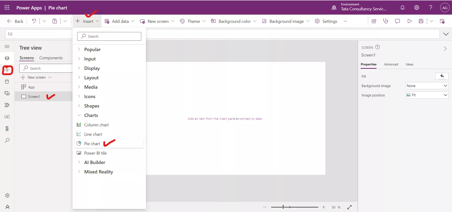
Step 1: Add the Excel table in the Power app using Add Data section. Insert a Pie chart control to the screen by clicking on + Insert and then from the Charts section click on Pie chart.
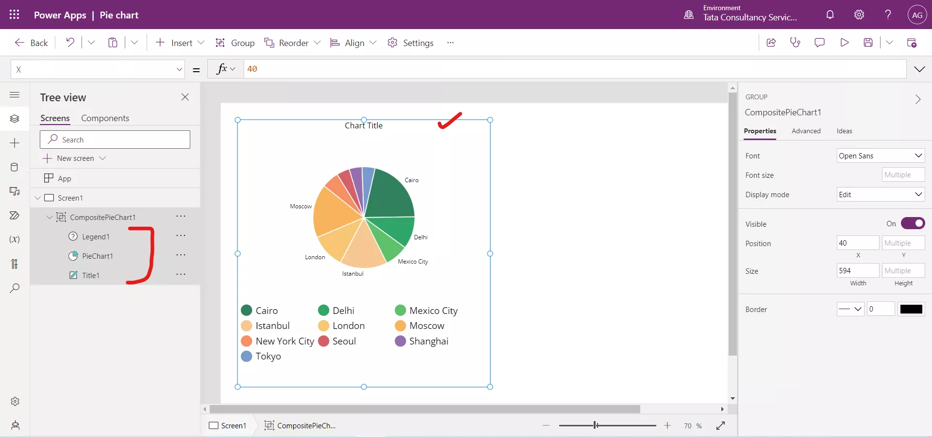
Step 2: The Pie chart control is a group of three controls.
- A Label for the title,
- The chart graphic, and
- A Legend
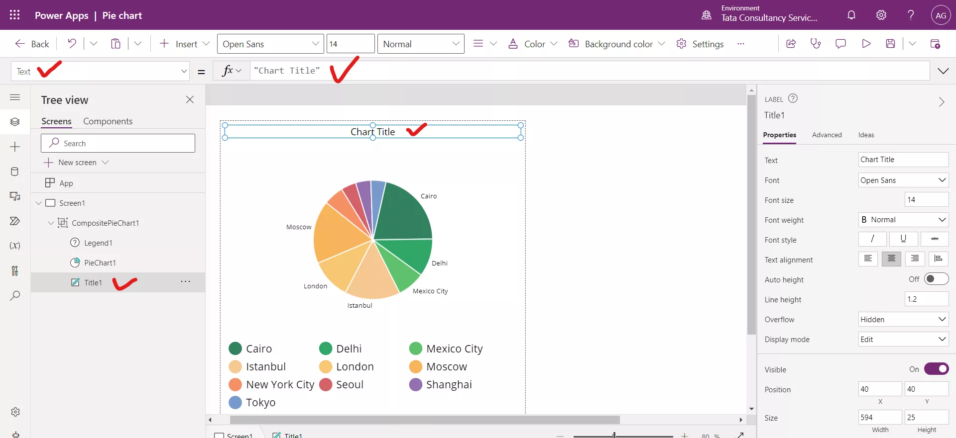
Step 3: There is a Text label control in the group, used to specify the title of the chart. By default, its name is ‘Chart Title’. We can modify it as per our requirement.
After updating the text of the Label control.
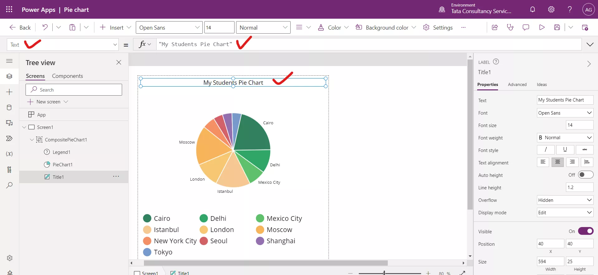
Step 4: Select the Pie chart control and set its Items property to the data source.
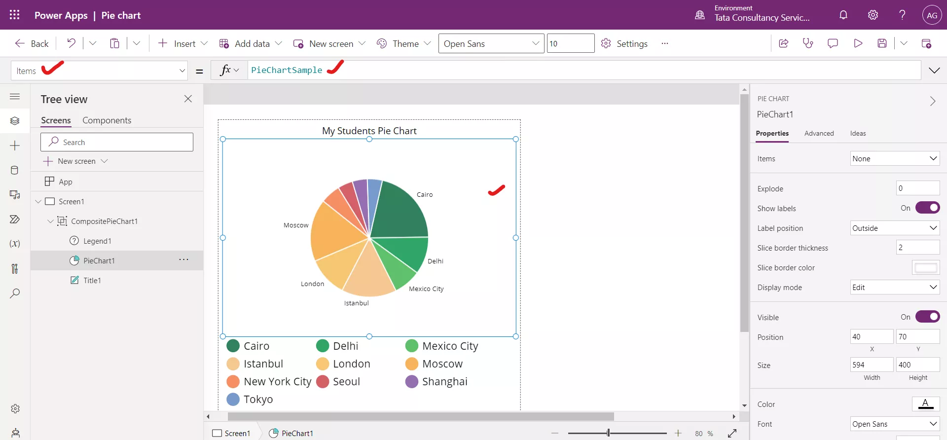
After setting the Items property to the data source Table1.
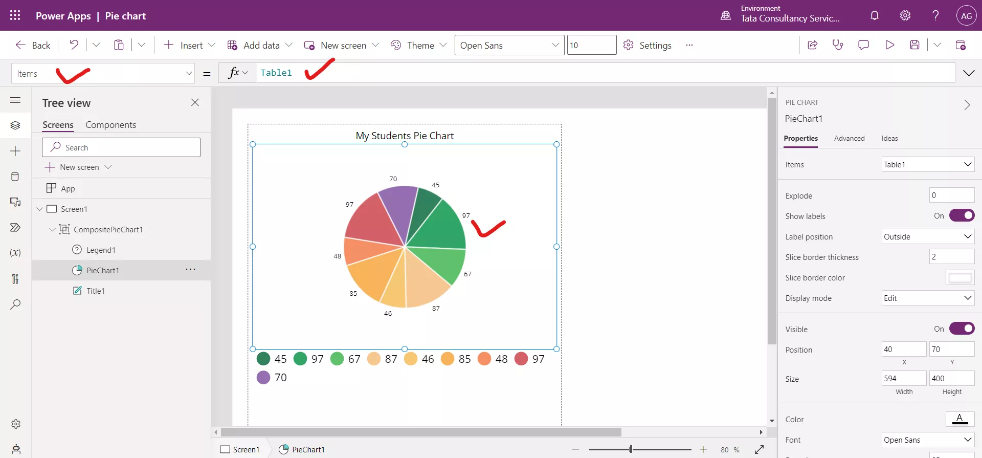
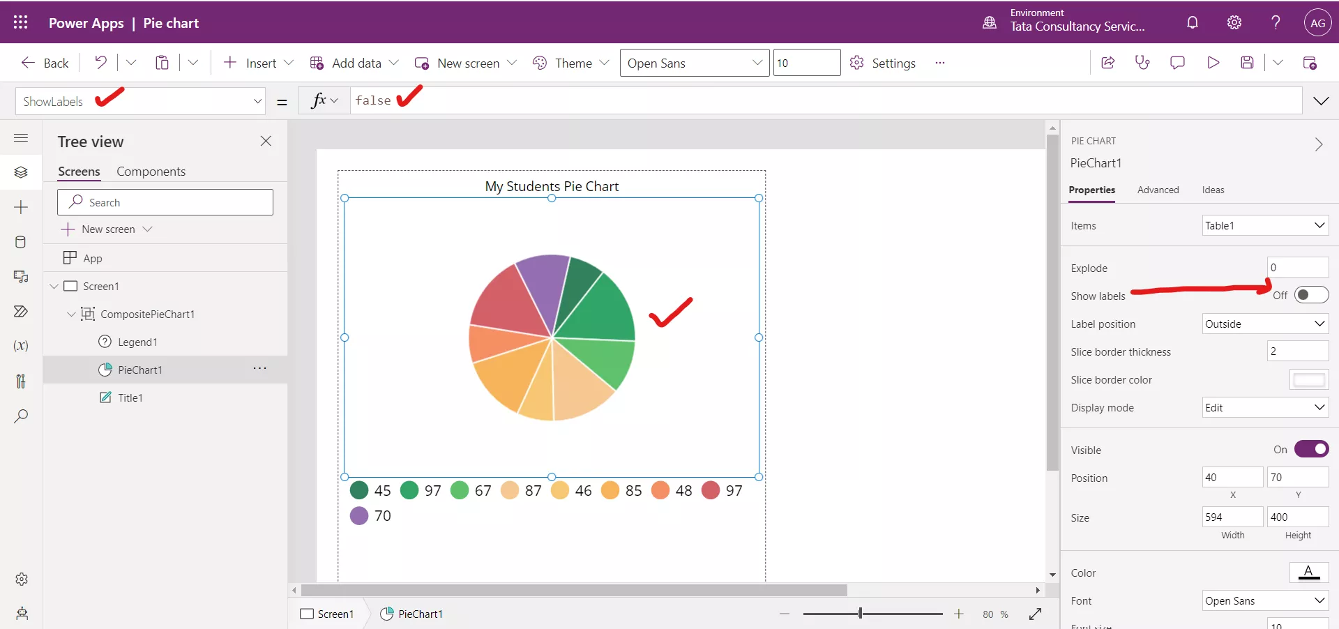
Step 5: We can set the ShowLabels property to true or false. By default, it is true.

After setting it to false.
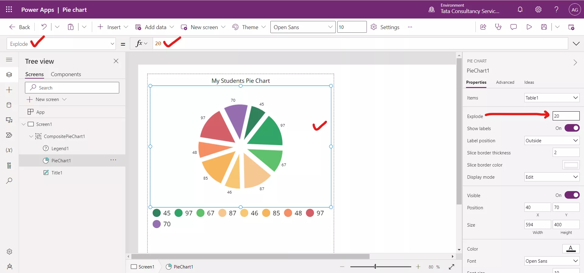
Step 6: Set the Explodeproperty to the value 20. By default, it is 0.
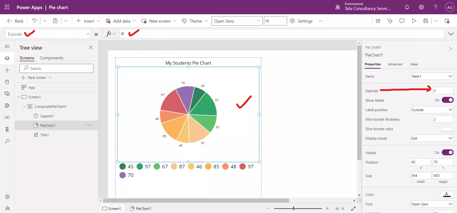
After setting the value.
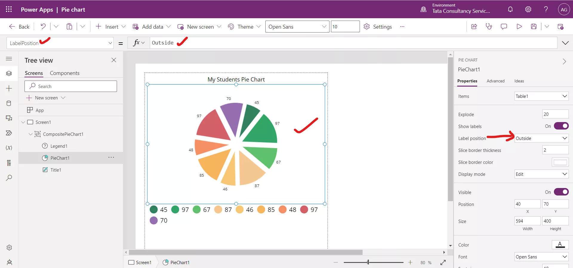
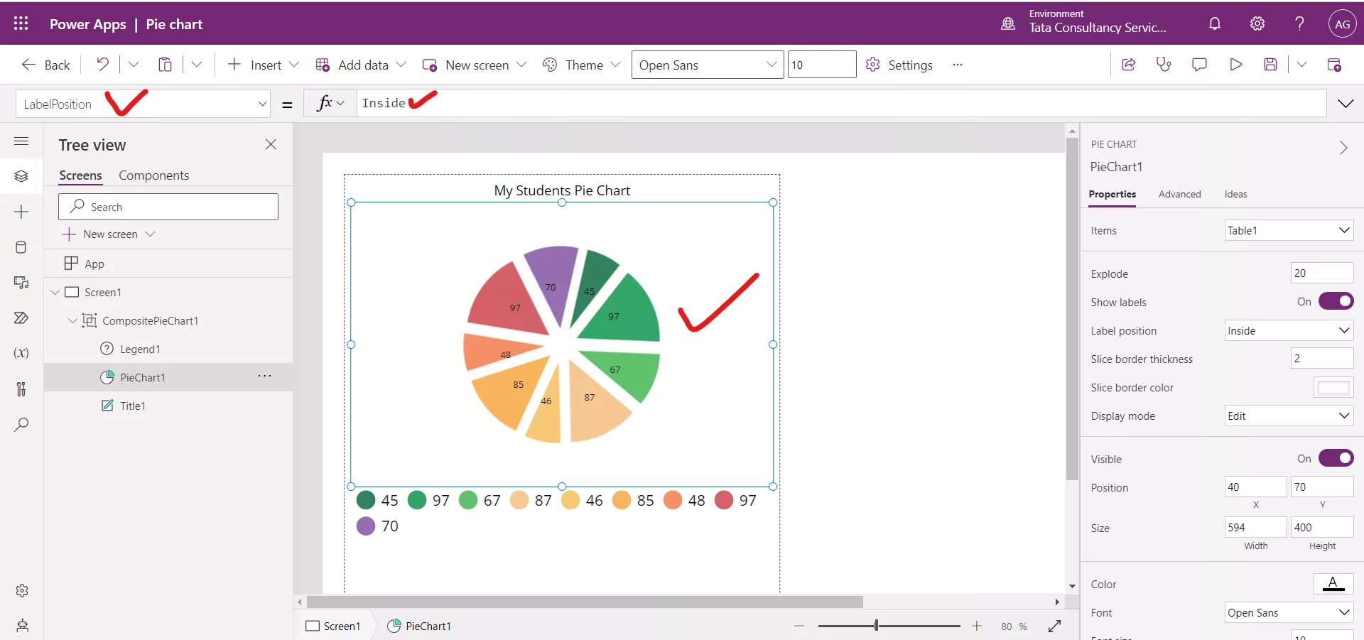
Step 7: Set the LabelPosition property to the value Inside. By default, its value is Outside.
After changing the Label position value to Inside.
2. Sharepoint as the DataSource
We can use the pie chart control with Sharepoint as a Data source.
| TeacherID | Teacher name | Teacher Qualification | Teacher salary | Expenditure |
|---|---|---|---|---|
| 1 | Sushmita | B. Tech | 26,000 | 20,000 |
| 2 | Anjali Sharma | MBA | 28,000 | 22,000 |
| 3 | Lata Verma | BBA | 22,000 | 18,000 |
| 4 | Alia | M. Tech | 34,000 | 25,000 |
| 5 | Vicky | Engineer | 13,000 | 6,000 |
| 6 | Aakansha | LLB | 45,000 | 23,000 |
| 7 | Shilpa Shetty | Yoga guru | 60,000 | 15,000 |
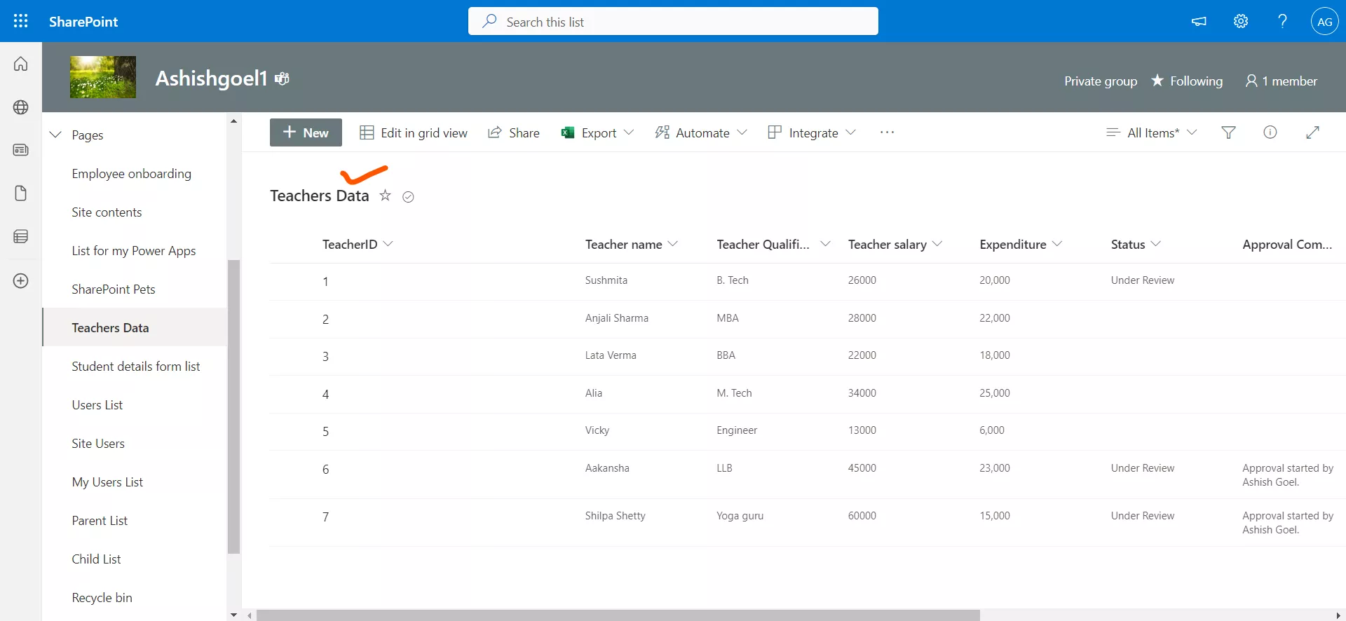
Step 1: Add the sharepoint list in the power apps by using Add data section. Add one more Pie chart control and set the Items property to the ‘Teachers Data’, i.e., name of our sharepoint list.
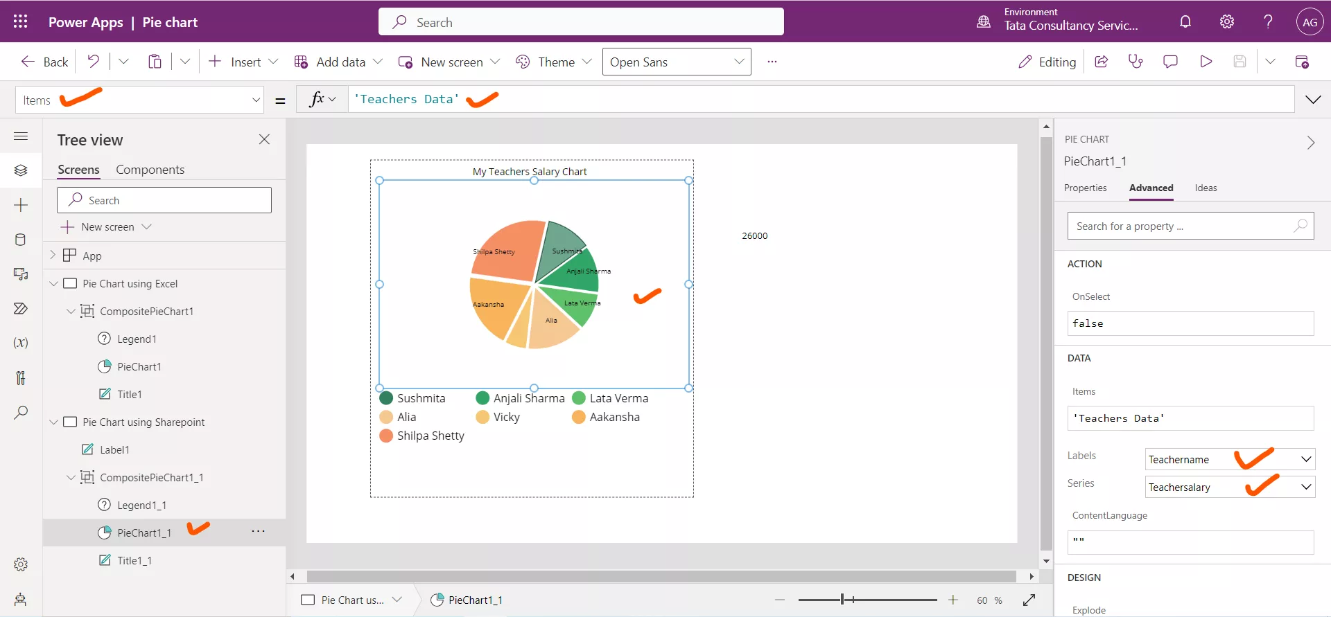
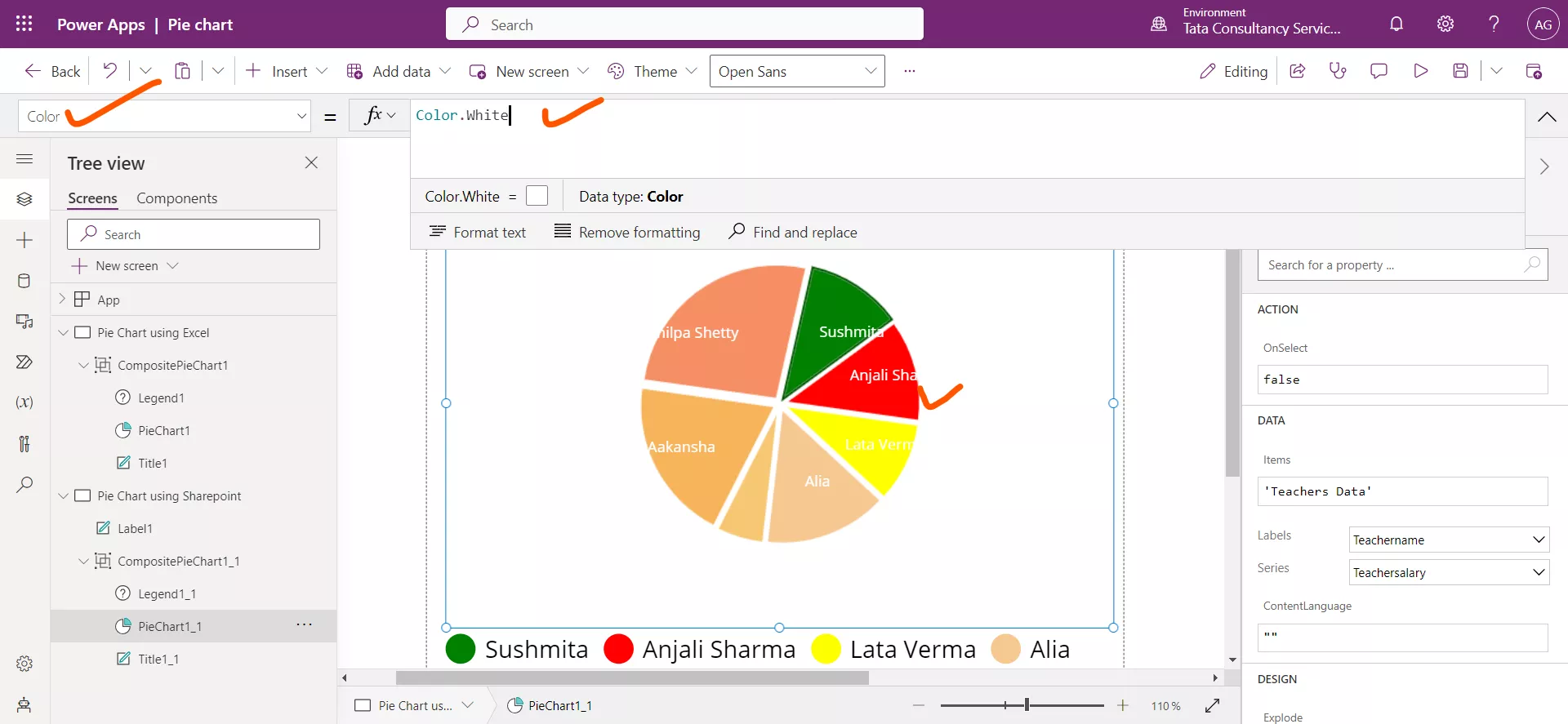
We can see that we specify in the Labels the Teachername column and in the Series we are specifying the Teachersalary column from the sharepoint list. In the dropdown we can see all the columns including those that are created automatically when we create a list.
Step 2: In the ItemColorSet property we can specify the different color values of the control. We can give the color values directly or by using the RGBA format.
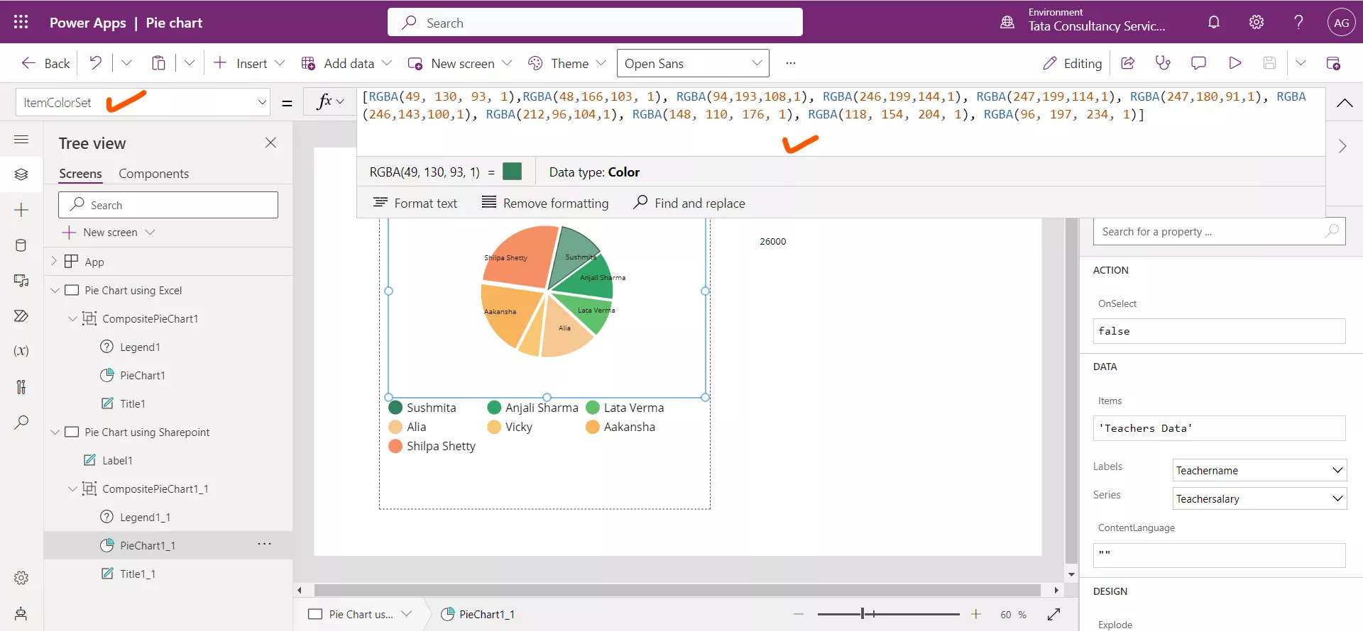
Suppose we are specifying for the first three values only and leave the rest.
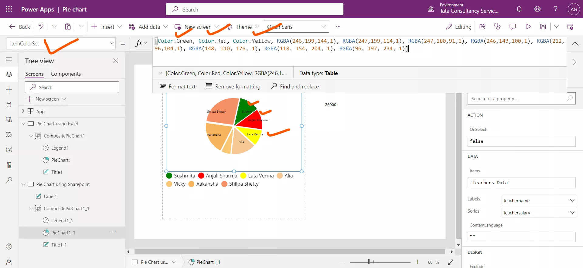
Step 3: The Color property specifies the text color inside the control. Suppose we are giving this value to Color.White.
Step 4: Add a Text label control and set its Text property to the following powerapps formula:
Power Apps Formula
Here, PieChart1_1 is the name of our graphic control and by leveraging its Selected property we are fetching the entire record. From the record by using the dot notation concept we are extracting the ‘Teacher salary’ column value.
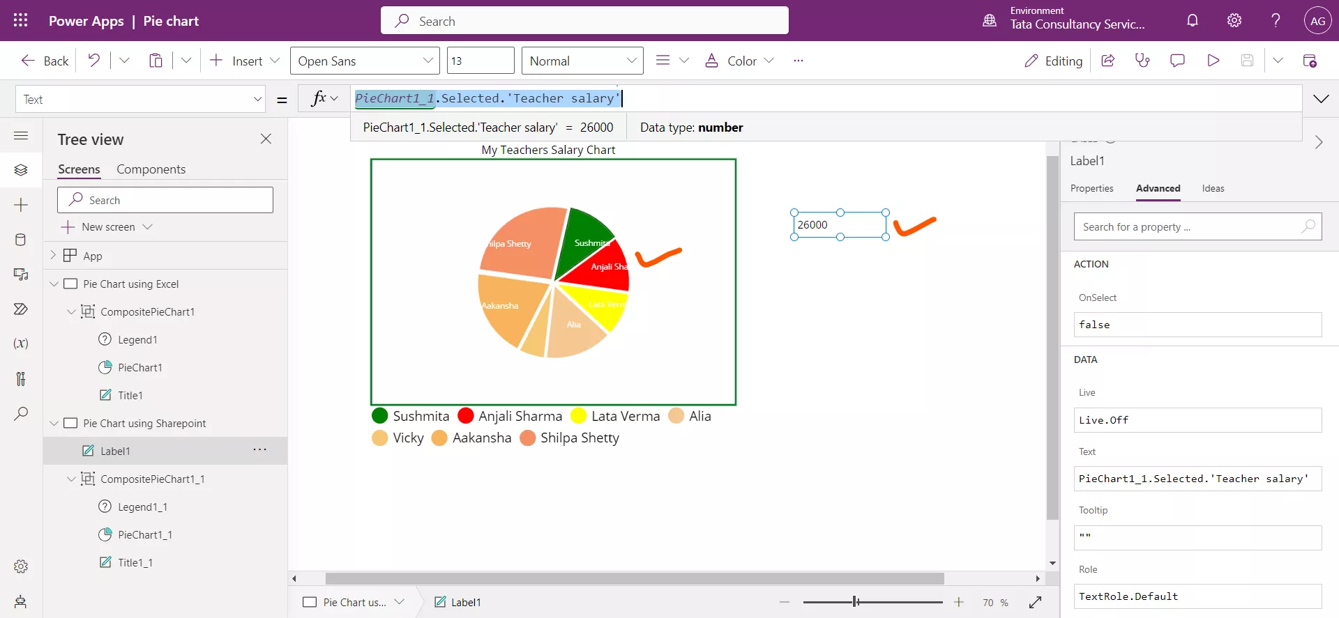
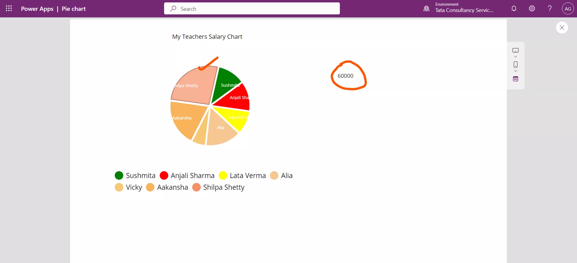
Put the preview mode and try by clicking on the various slices of the pie chart. Suppose we click on the Slice of Shilpa Shetty. The value in Text label changes to 60000, i.e., the Shilpa Shetty Salary.
