Controls in Canvas Power Apps
In Power Apps, we have a variety of user interface (UI) elements. We can configure the appearance and behavior directly from the toolbar, Properties tab, or formula bar. These UI elements are called Controls. Many of the controls in Power Apps are just like the controls that we have used in other apps, such as labels, text-input boxes, drop-down lists, navigation elements, and so on.
1. Add controls to the App
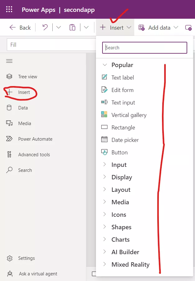
When can insert the power apps controls into our canvas app, by either selecting the insert tab from the left side rail, or we can select the + Insert button from the control ribbon at the top of the screen.
There is a search input field functionality to help us quickly find the controls we are looking for.

We can configure the appearance and behavior of a control by setting one or more of its properties. Each type of control has a different set of properties. Some properties, such as Height and Width, are common to almost every type of control, but other properties, such as ChevronFill are specific to only certain Controls.
A few common controls that can add interest and impact to our apps include:
- Forms - These controls show details about our data and let us create and edit records.
- Data table - The Data table control shows data from a data source in a format that includes column headers for each field that the control shows. As an app maker, you have full control over which fields appear and in what order. Like the Gallery control, the Data table control maintains a Selected property that points to the selected row. Therefore, you can link the Data table control to other controls.
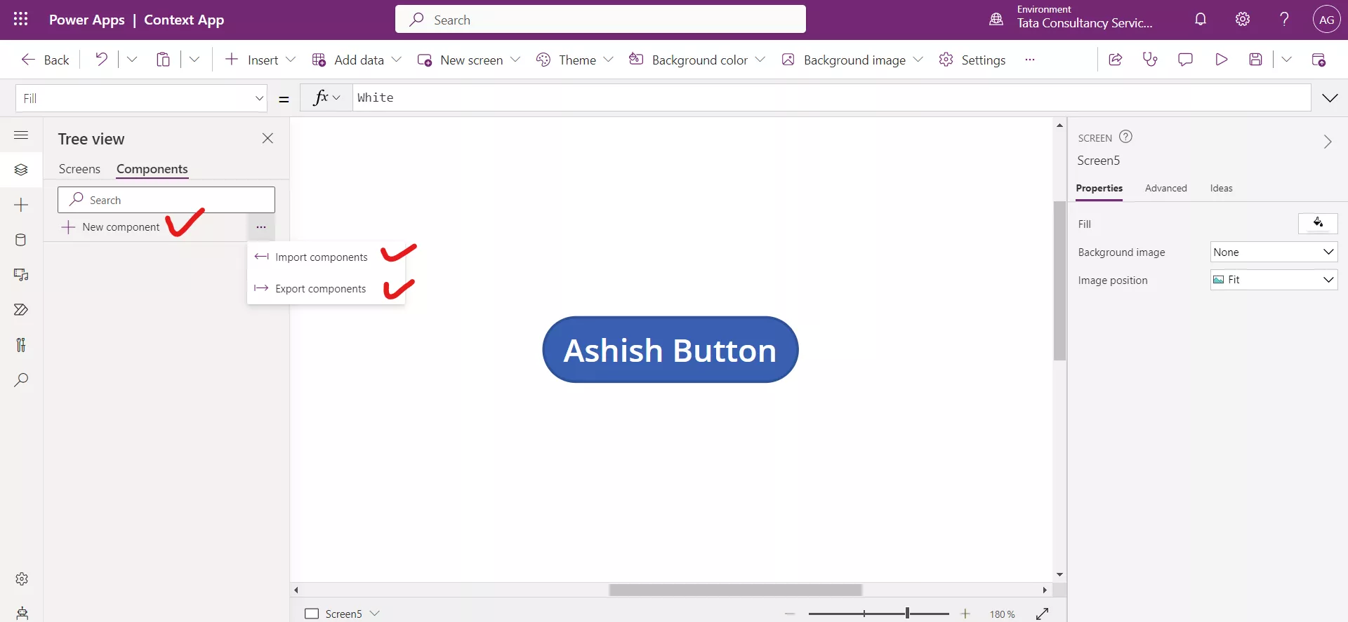
- Custom - Components are reusable building blocks for canvas apps so that app makers can create custom controls to use inside an app, or across apps using a component library. Components can use advanced features such as custom properties and enable complex capabilities.

2. Core properties of controls
Each control has a specific set of properties. The properties available are different based on the control type. This is because each control has a slightly different use case and look and feel when users interact with the app. However, there are a few control properties, such as Visible, X and Y that are present for all controls. (The exception is the Screen control, which does not have an X or Y property.)
Some of the common control properties are:
- Default - The initial value of a control before it is changed by the user. For example, when working with a Drop-down control we could set the default value to appear when users see the control.
- DisplayMode - Values can be Edit, View, or Disabled. Configures whether the control allows user input (Edit), only displays data (View), or is disabled (Disabled).
- Items - The source of data that appears in a control such as a gallery, list, or chart.
- OnChange - How the app responds when the user changes the value of a control. For example, when a user selects a different value in a Dropdown control.
- OnSelect – The OnSelect property defines how the app responds when the user taps or selects a control.
- Reset - Whether a control reverts to its default value.
- Text - Text that appears on a control or that the user types into a control.
3. Rename the controls
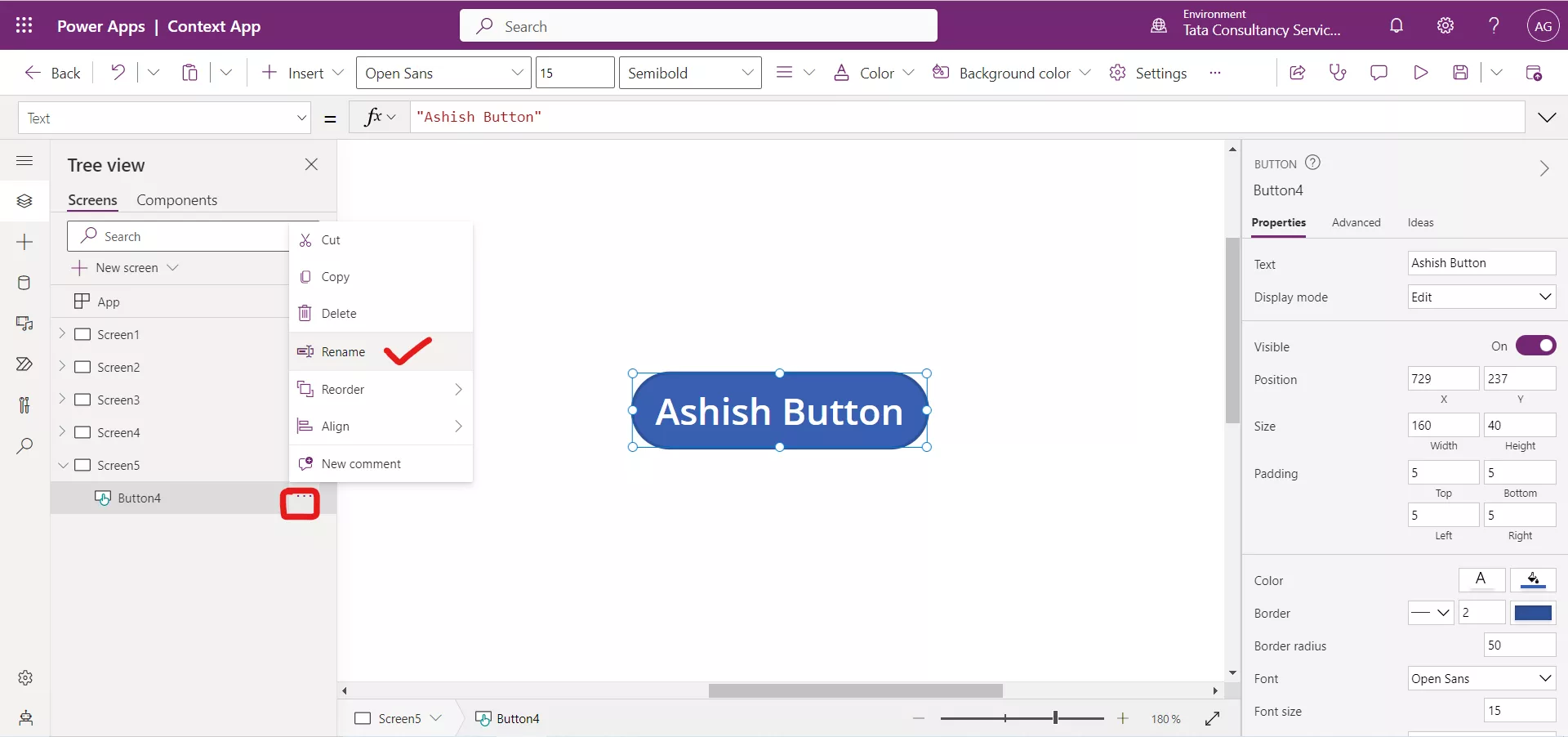
To rename the control, follow the following steps:
Step 1: Click on the three dots (...) adjacent to the name of the control and click on Rename.
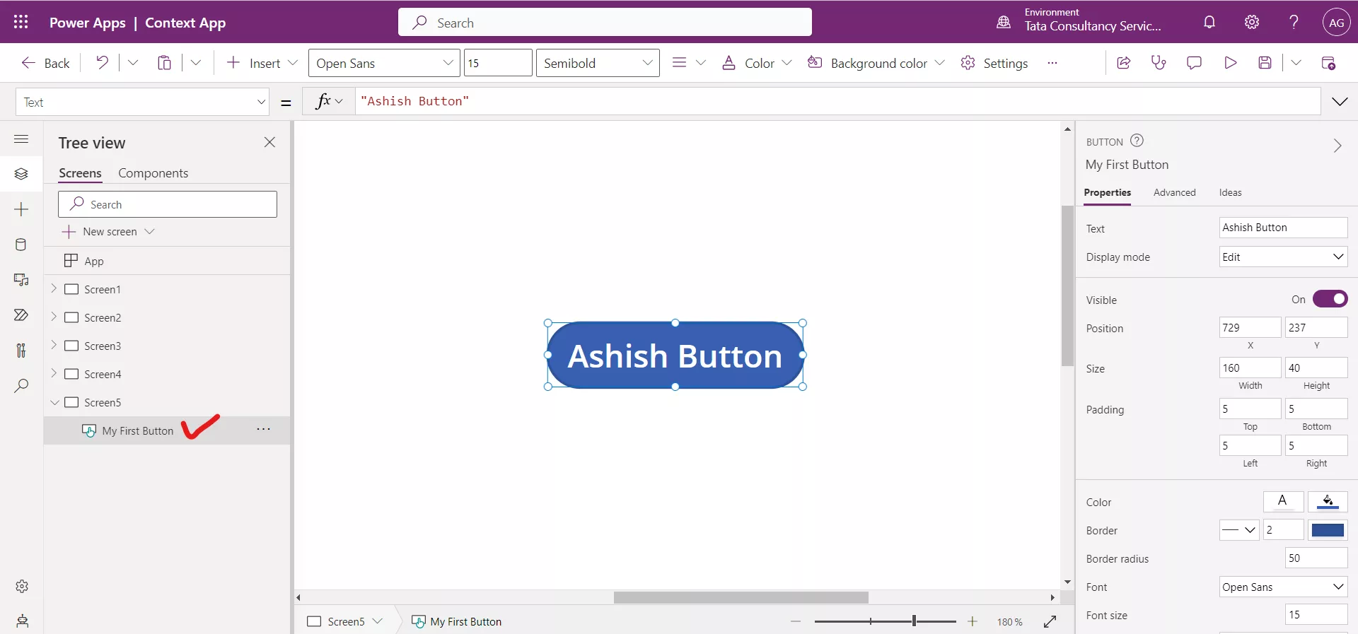
Or alternatively, double click on the name of the control to change the name of the control.

Step 2: Type the new name and click elsewhere.
