Color in Power Apps
In powerapps, we can specify colors of the controls in many ways:
a) By using the Color
We can specify colors by using the dot notation.
Example: i) Color.Yellow
ii) Color.Orange
b) By using the ColorValue function
We can specify text strings such as color names and hex-code notation (#).
Example: i) ColorValue("AliceBlue")
ii) ColorValue("#F55467")
c) ColorFade function
The ColorFade function in Power Apps returns a brighter or darker version of a color. The amount of fade varies from -1 or -100% (which fully darkens a color to black) to 0 (which doesn't affect the color) to 1 or 100% (which fully brightens a color to white).
Power Apps Syntax ColorFade( Color, FadeAmount )
- Color - It is the required parameter. A color value such as Color.Red or the output from ColorValue or RGBA.
- FadeAmount - It is the required parameter. A number between -1 and 1. -1 fully darkens a color to black, 0 doesn't affect the color, and 1 fully brightens a color to white. You can also use a percentage from -100% to 100%.
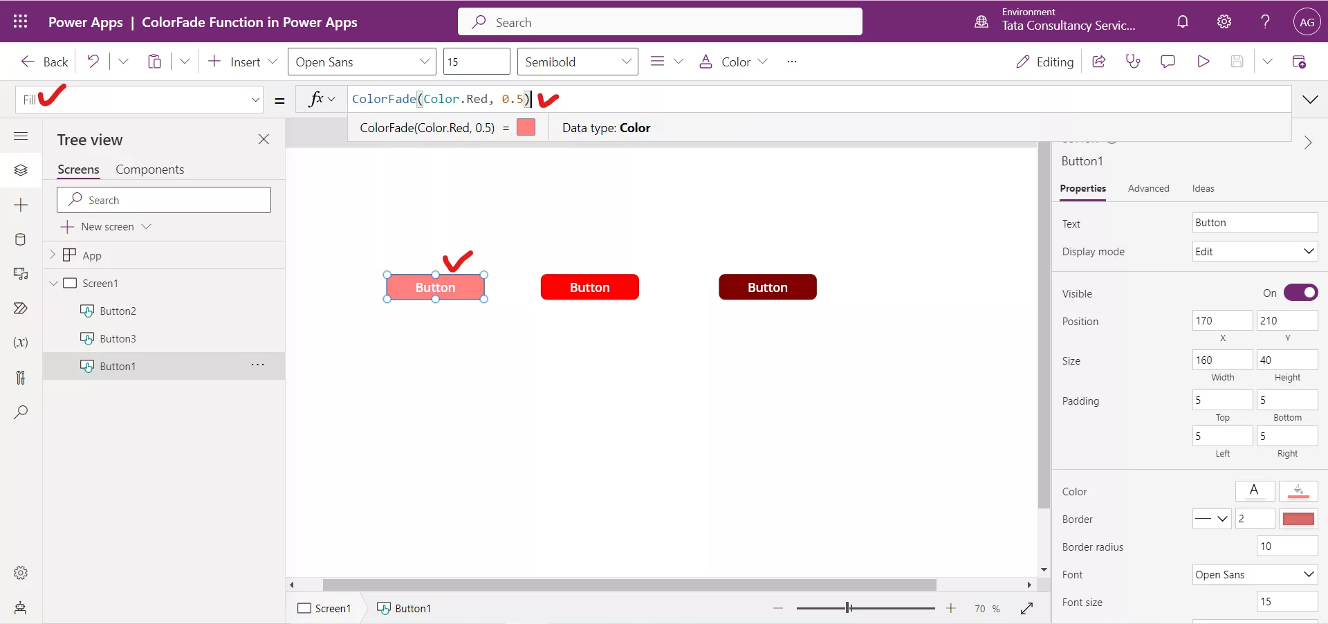
Example:Step 1: Insert a Button control and set its Fill property to the following formula.
Power Apps Formula

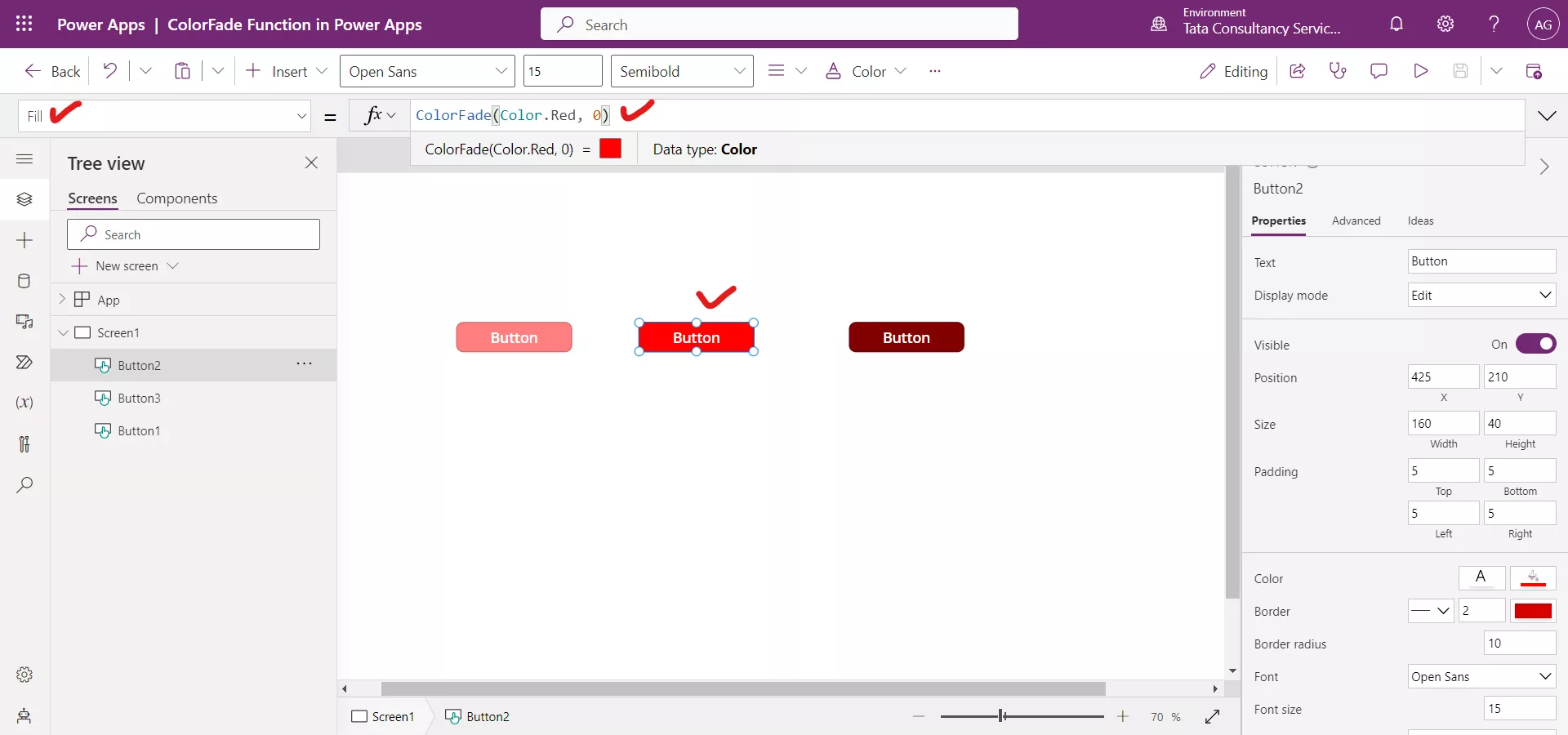
Step 2: Insert another Button control and set its Fill property to the following formula.
Power Apps Formula

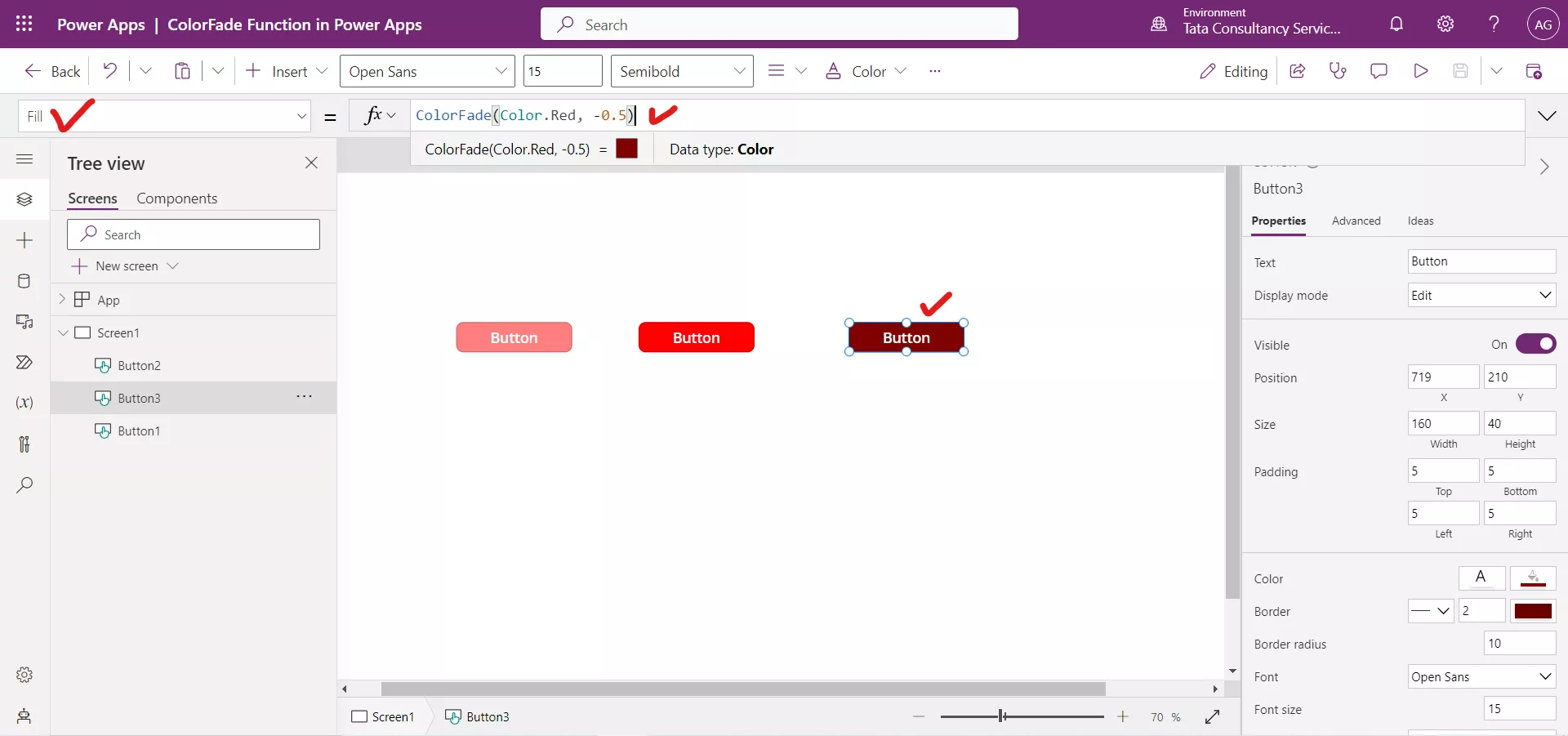
Step 3: Insert another Button control and set its Fill property to the following formula.
Power Apps Formula

d) RGBA function
The RGBA function specifies the red, green, and blue components of a color from 0 to 255, and specify an alpha channel from 0% (fully transparent) to 100% (fully opaque).
Example: RGBA(255, 0, 255, 25%)
Several properties of a control are impacted by the color value:
1. Color
The Color property specifies the color of text in a control.
2. Fill
The Fill property specifies the background color of a control.
3. BorderColor The BorderColor property specifies the color of a control's border.
4. FocusedBorderColor The FocusedBorderColor property specifies the color of a control's border when it has focus.
5. DisabledBorderColor The DisabledBorderColor property specifies the color of a control's border if the control's DisplayMode property is set to Disabled.
6. DisabledColor The DisabledColor property specifies the color of text in a control if its DisplayMode property is set to Disabled.
7. DisabledFill The DisabledFill property specifies the background color of a control if its DisplayMode property is set to Disabled.
8. HoverBorderColor The HoverBorderColor property specifies the color of a control's border when the user over the control.
9. HoverColor The HoverColor property specifies the color of the text in a control when the user keeps the mouse pointer on it.
10. HoverFill The HoverFill property specifies the background color of a control when the user keeps the mouse pointer on it.
11. PressedBorderColor The PressedBorderColor property specifies the color of a control's border when the user taps or clicks that control.
12. PressedColor The PressedColor property specifies the color of text in a control when the user taps or clicks that control.
13. PressedFill The PressedFill property specifies the background color of a control when the user taps or clicks that control.