Date Picker control in Power Apps
A control that the user can select to specify a date from a calendar.
The Date Picker control has the following properties:
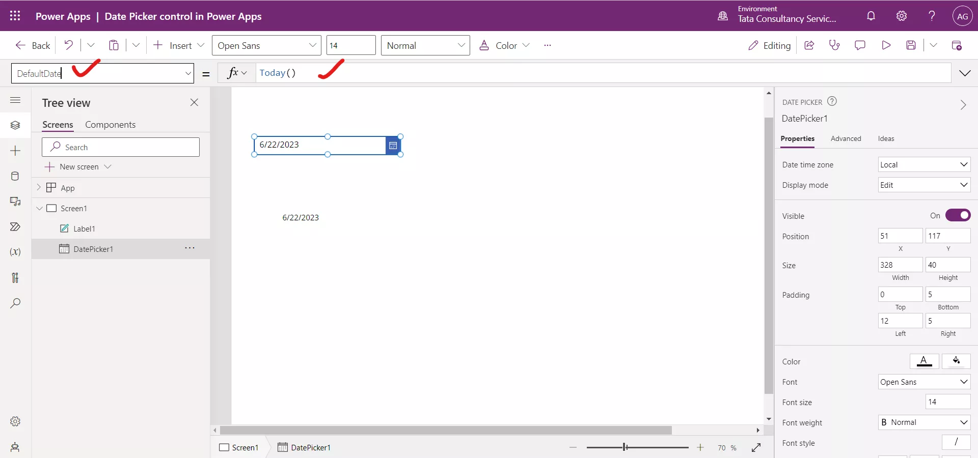
1. DefaultDate The DefaultDate property specifies the initial value of a date control unless the user changes it. By default, the default date is set to the Today() function.
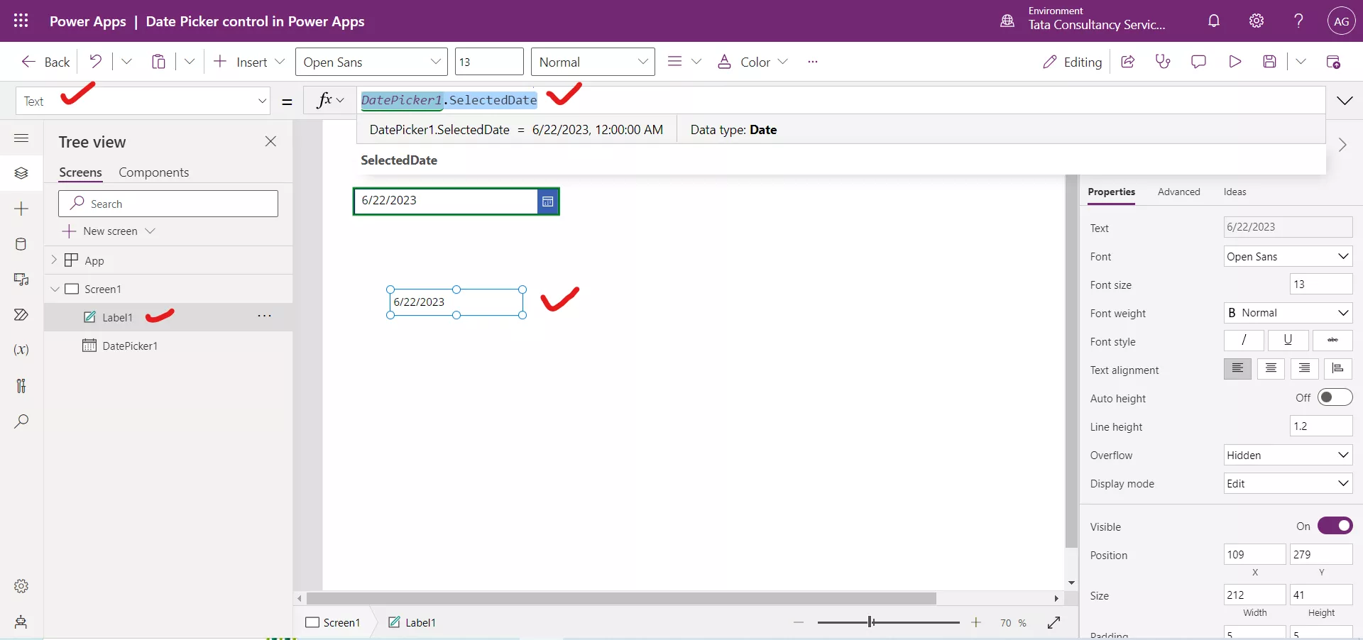
2. SelectedDate The SelectedDate specifies the date currently selected in a date control. This date is represented in local time.
Power Apps Formula
Here, DatePicker1 is the name of the Date Picker control.
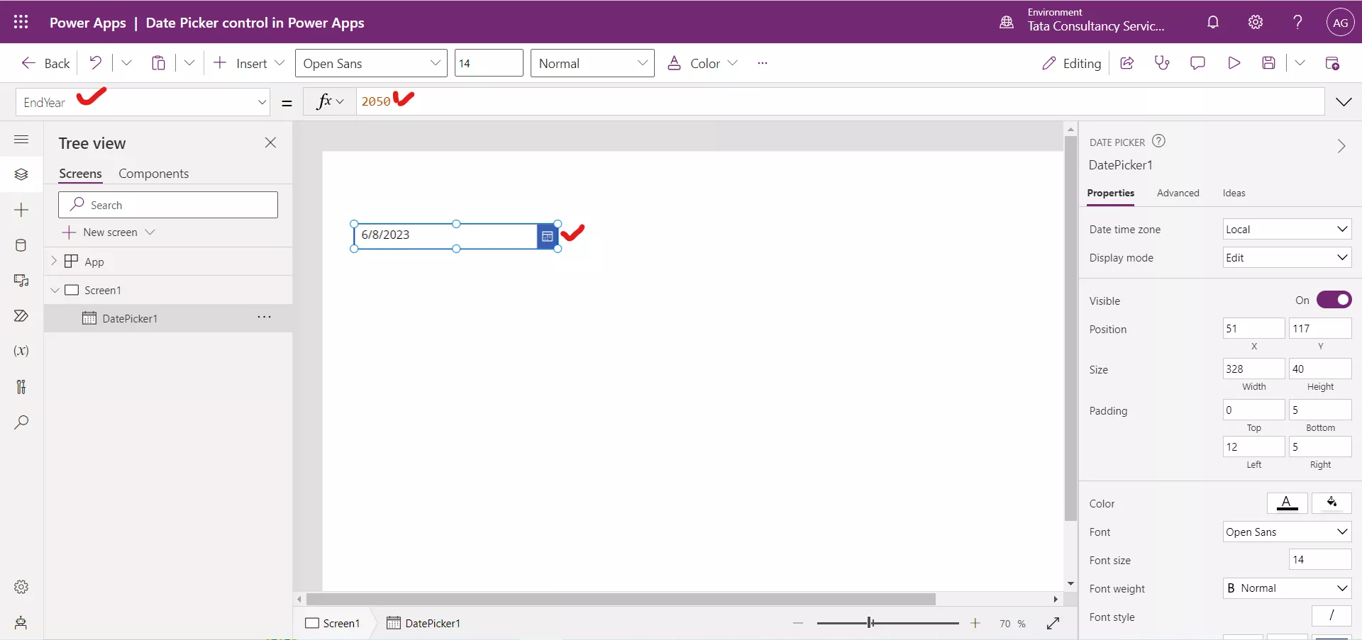
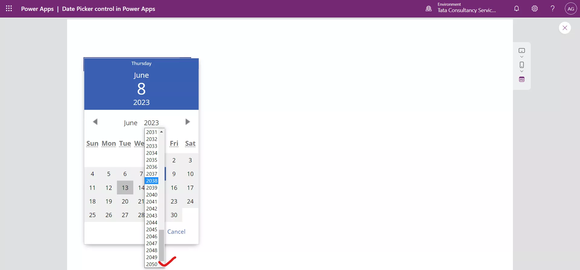
3. EndYear The EndYear property specifies the latest year to which the user can set value of a date-picker control. By default, its value is 2050.
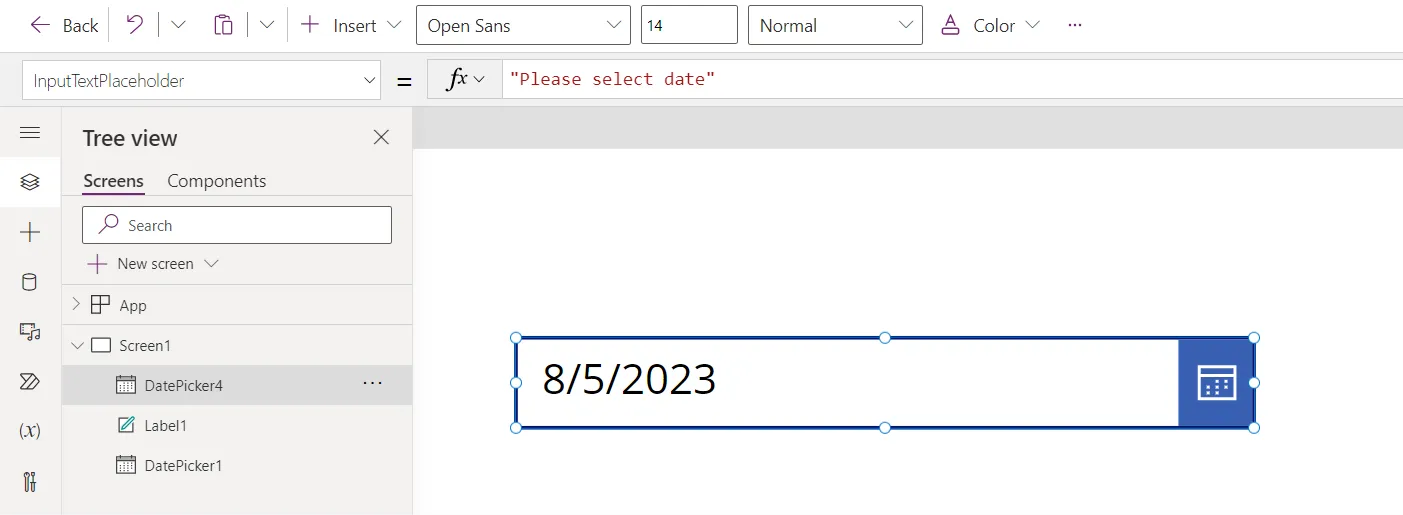
4. InputTextPlaceholder The InputTextPlaceholder property specifies the instructional text that appears if no date is selected and no DefaultDate is given.

We can write the text “Please select date” in this property value.

When we select any date, it is not shown.
5. IsEditable The IsEditable property specifies whether the Date Picker text can be edited. If false, the date can only be changed by using the calendar.
6. Reset The Reset property specifies whether the Date Picker control should be reset to the DefaultDate value. It takes a boolean value i.e., true, or false.
7. Size The Size property of the control specifies the font size of the text that appears on a control.
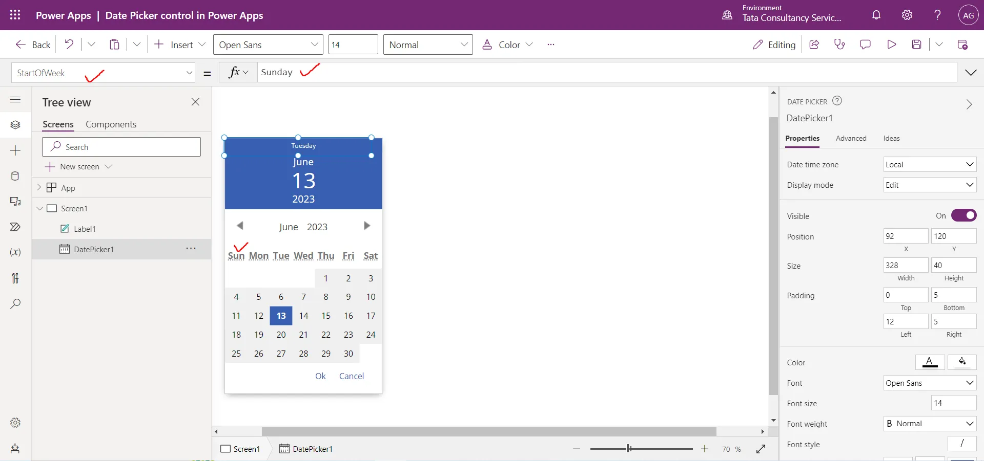
8. StartOfWeek The StartOfWeek property specifies the day of the week to display in the first day column of the date-picker control. By default, its value is StartOfWeek.Sunday.
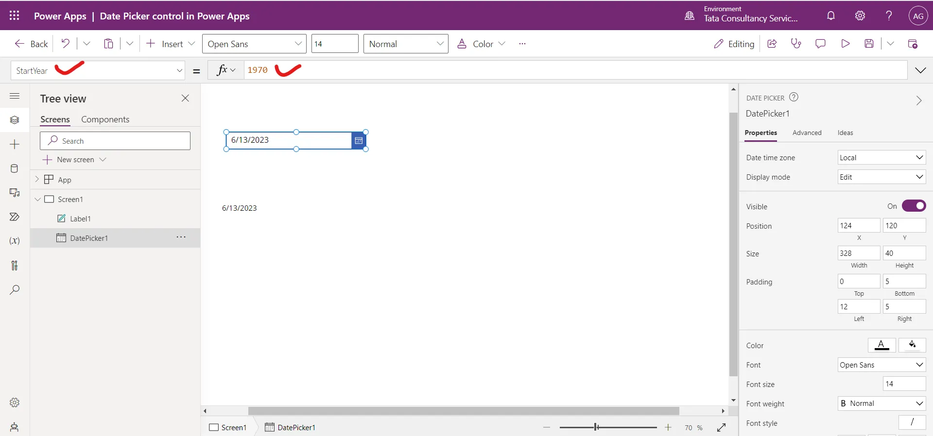
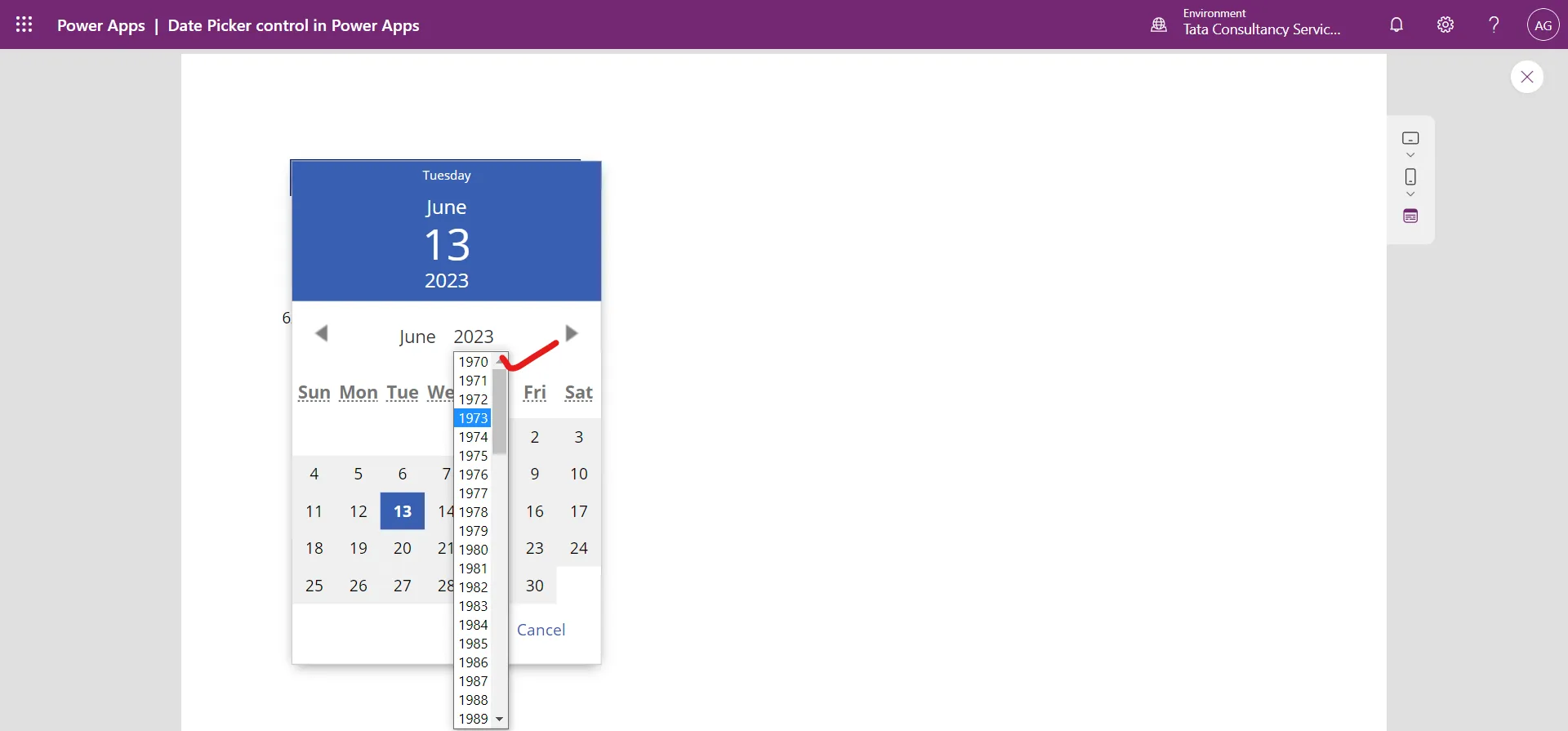
9. StartYear The StartYear property specifies the earliest year to which the user can set the value of a date-picker control. By default, its value is 1970.
10. Visible The Visible property specifies whether a control appears or is hidden. It takes boolean value true or false, or a formula that returns a boolean value.
11. X The X property specifies the distance between the left edge of a control and the left edge of its parent container. If the control has no parent container, then the screen itself acts as a parent container for the control.
12. Y The Y property specifies the distance between the top edge of a control and the top edge of the parent container. If the control has no parent container, then the screen itself acts as a parent container for the control.
13. IconFill The IconFill specifies the color of the calendar icon. By default its value is RGBA(255, 255, 255, 1).

14. IconBackground The IconBackground specifies the background color of the calendar icon. By default its value is RGBA(56, 96, 178, 1).
15. Fill The Fill property specifies the background color of a Calander control. By default its value is RGBA(255, 255, 255, 1).

16. Color The Color property specifies the color of the date shown in the DatePicker control.

17. Format The Format property specifies how the date is visible in the DatePicker control.
a) DateTimeFormat.ShortDate: This is the Default value. If we select 5 August 2023, it is shown in the DatePicker as shown in the following image.

b) DateTimeFormat.LongDate: The DateTimeFormat.LongDate format displays the date as DayOfWeek, MonthName Day, Year. For example, if we select 5 August 2023, it is shown in the DatePicker control as shown in the following image.
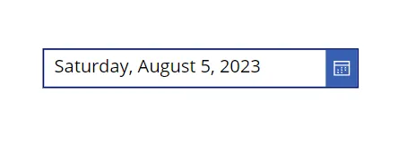
There are several formats available for the DatePicker control. If we select 5 August 2023, it is shown in the DatePicker control as shown in the following images.
i) "dd/mm/yyyy" If we the format “dd/mm/yyyy”, the output is shown in the following image.

ii) "dd/mmm/yyyy" If we the format “dd/mmm/yyyy”, the output is shown in the following image.

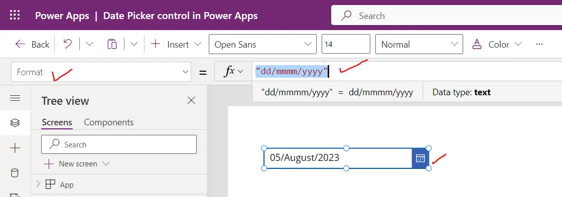
iii) "dd/mmmm/yyyy"
If we the format “dd/mmmm/yyyy”, the output is shown in the following image.
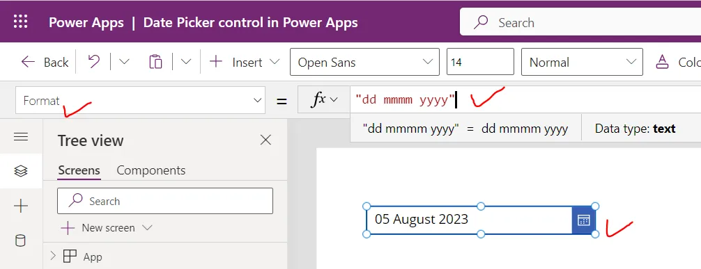
iv) "dd mmmm yyyy"
If we the format “dd mmmm yyyy”, the output is shown in the following image.
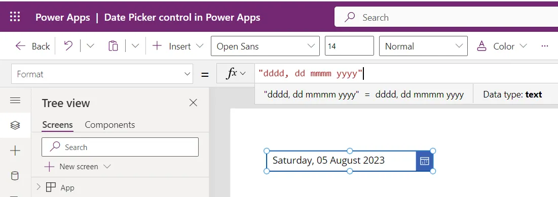
v) "dddd, dd mmmm yyyy"
If we the format “dddd, dd mmmm yyyy”, the output is shown in the following image.
