Designing the Form control in Canvas Power Apps
In the Power Apps Studio, from the Edit pane on the right, we have three primary design controls: Snap to Columns, Columns, and Layout.
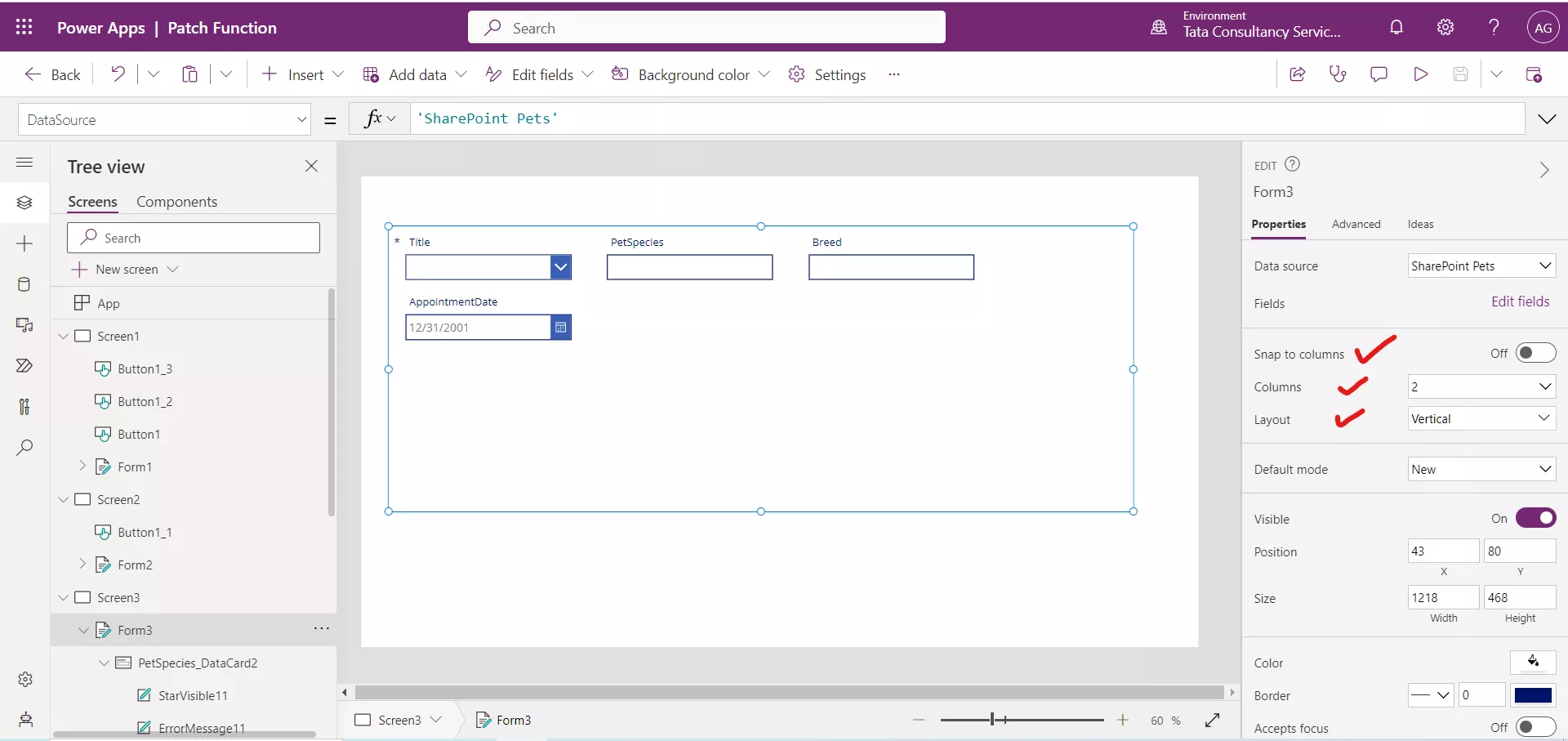
1. Snap to columns
The Form control is composed of one or more card control and by default, cards are placed in a single column for phone apps and three columns for tablet apps. We can specify how many columns a form has and whether cards should snap to them as we configure the form.
The Snap to columns allows us to control if the cards on the form have the width locked to the columns available in our form. For example, if we choose a 3-column layout, then we can get our card and set its width to 1, 2 or 3 columns width on our form.
For example, in the following figure, the Name, and First Name column span to two columns width. All other columns span only one column.
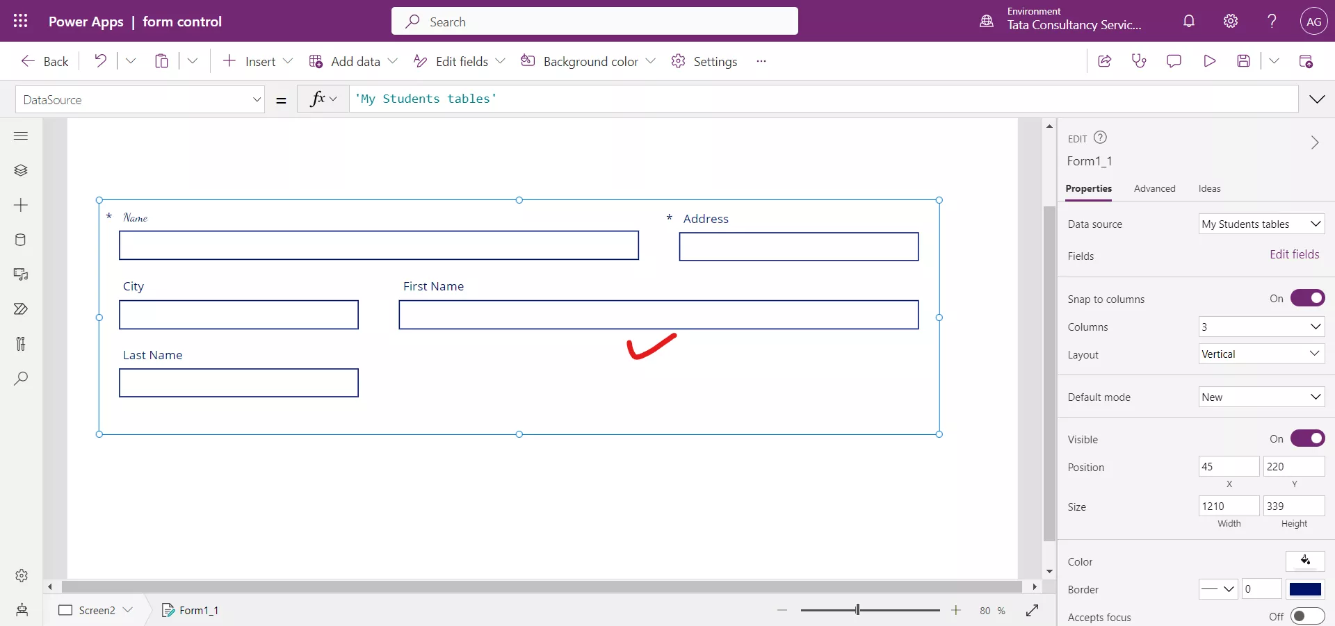
Alternatively, we can turn off Snap to columns, and then set the width of each card to any size we would like. Using the 6 or 12 column layout gives us the most sizing flexibility and is preferred over setting Snap to columns to Off.
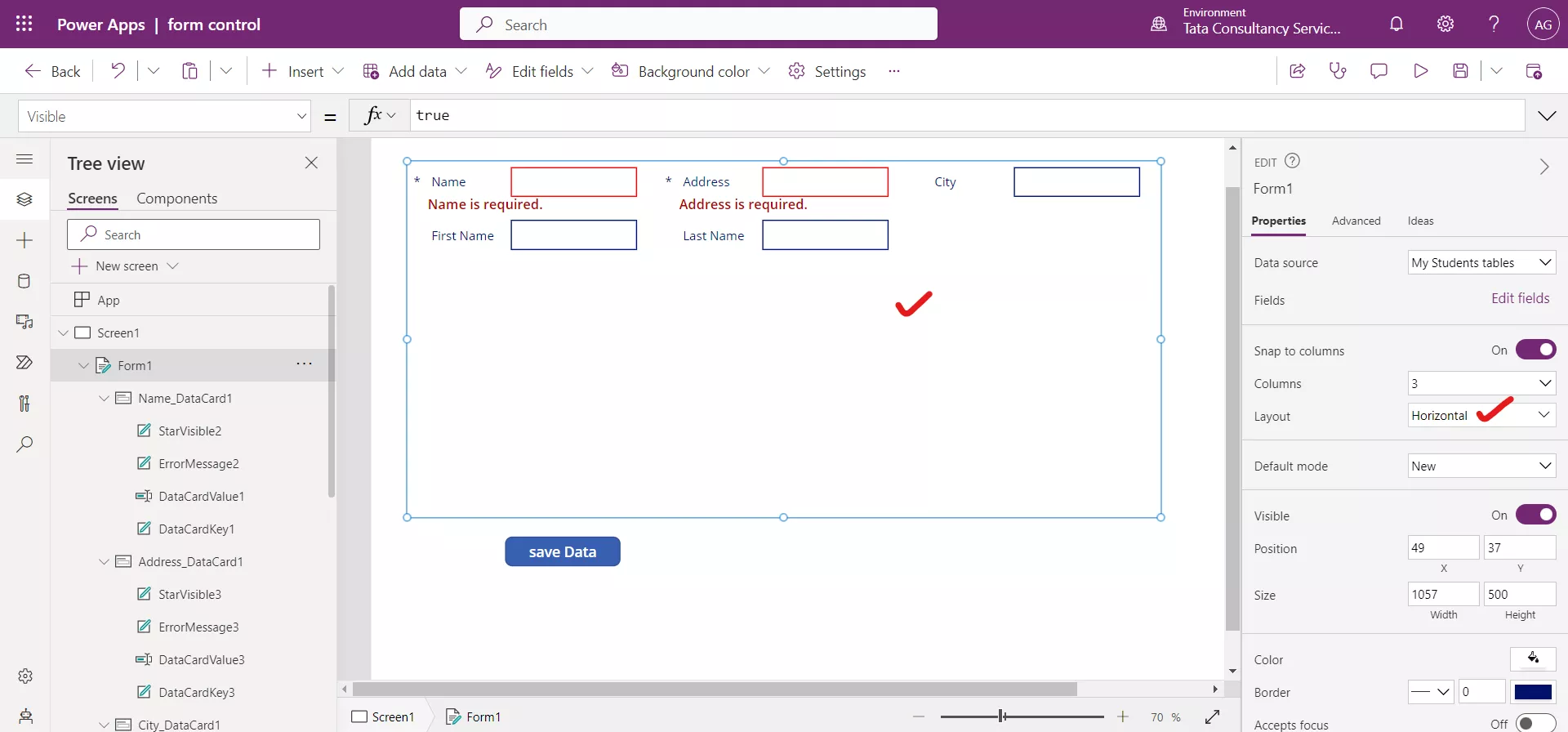
2. Layout The Layout option is set to Horizontal or Vertical. This will change the default placement of the label. a) Vertical In Vertical layout, the label is above the input control.

b) Horizontal In Horizontal layout, the label is on the left side of the input control.
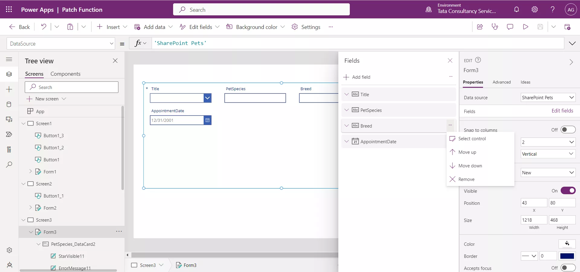
3. Change the order in which fields appear To change the order in which fields appear in the form control, follow these steps:
- Select the form in the app or find name of the form in the tree view.
- Under the Properties pane, select Edit fields next to Fields.
- Right-click on the ellipsis (…) next to each field to bring up more options. Select from Move up, Move down, or Remove.
Additionally, we can reorder the cards by using drag-and-drop functionality within the Fields pane to move columns up and down the list.
4. Font Select the DataCardKey control, and select the Font property from the dropdown. Change the font style from the formula bar. Select all DataCardKey by holding down the Ctrl key and click on the controls in the data cards.
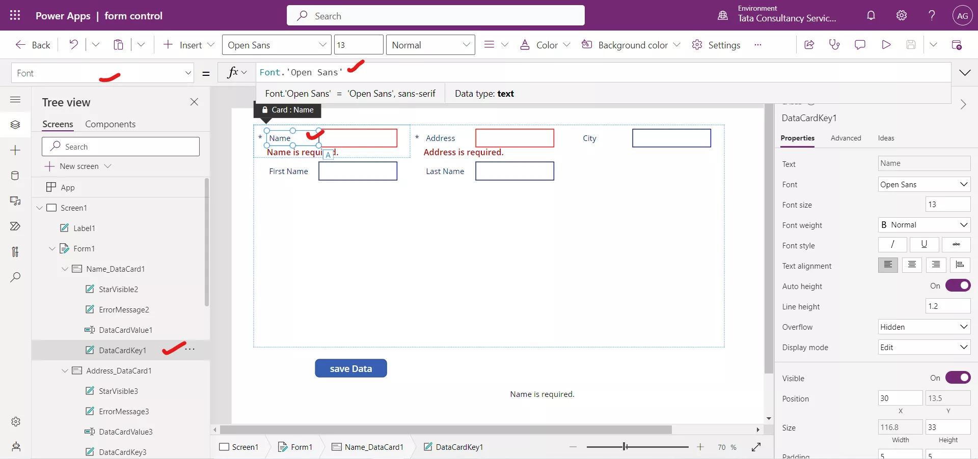
There is a list of Font style, we can choose from that.
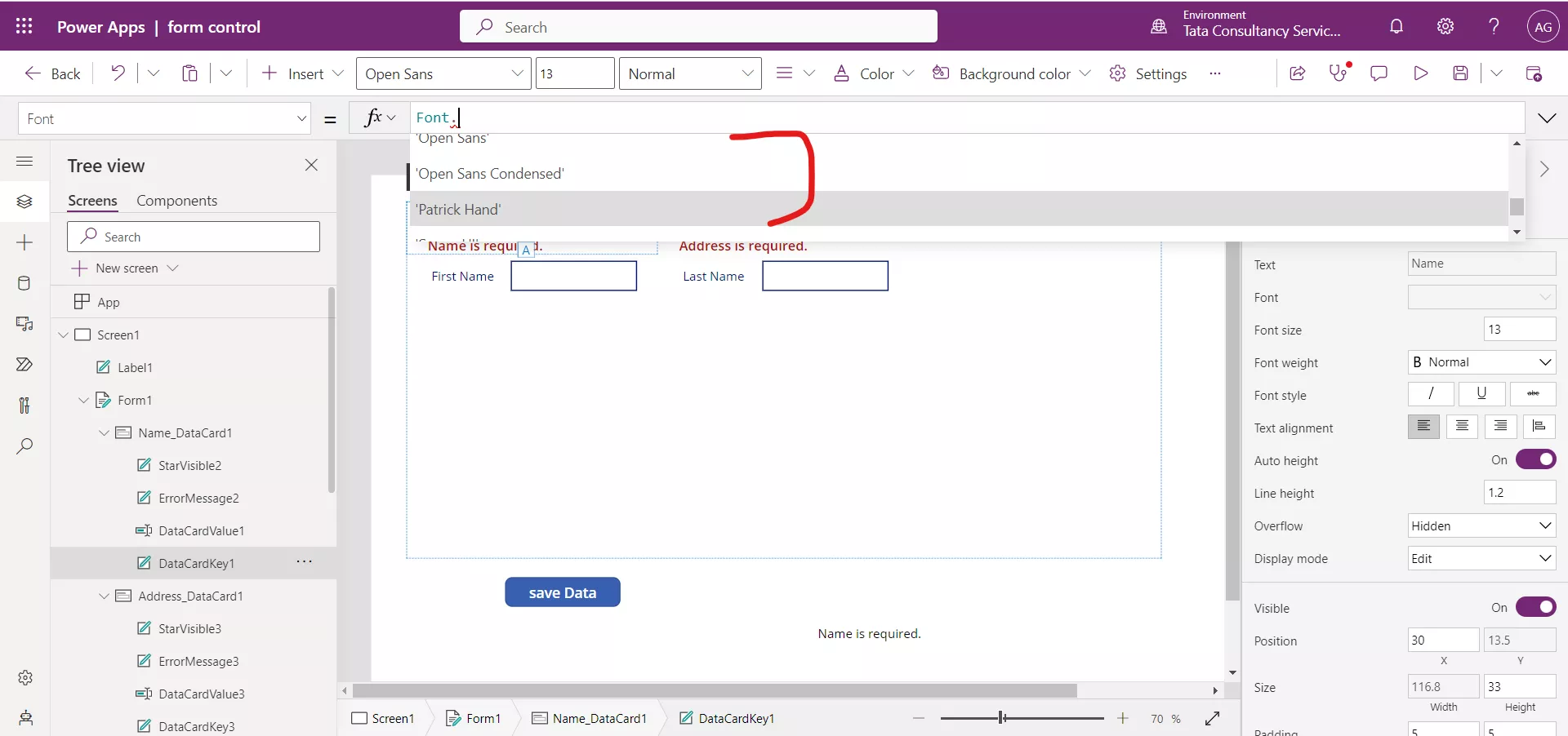
After choosing a different font. The result is shown in the following image.
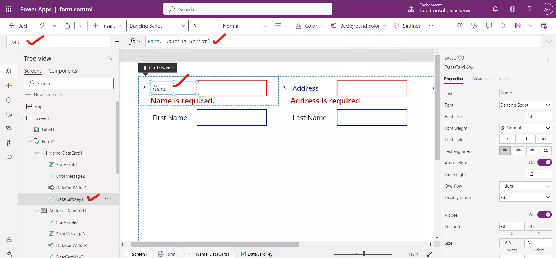
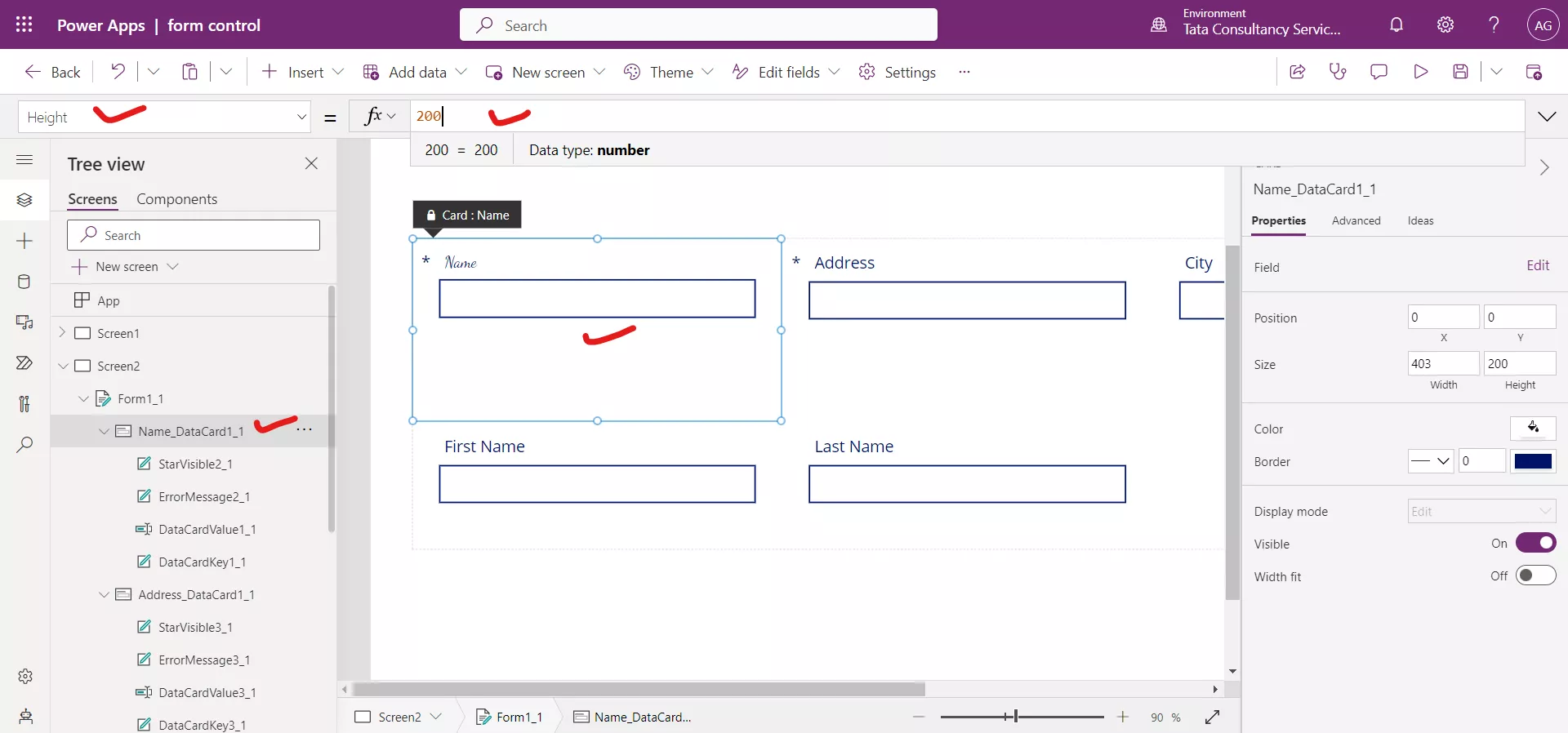
5. Height By using the Height property, we can change the height of the card, changing the height on one card will affect the whole row.
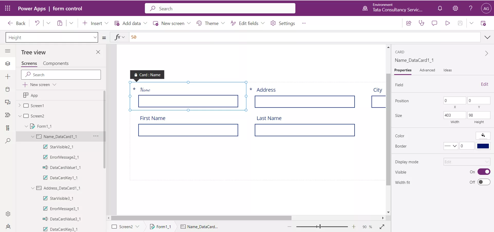
The effect on the whole row is shown below.
6. Star Visible We have added an Edit form control in Power Apps and Add it to a data source. Now add a Text label control and write the text as “Designing the Form control in Power Apps”.
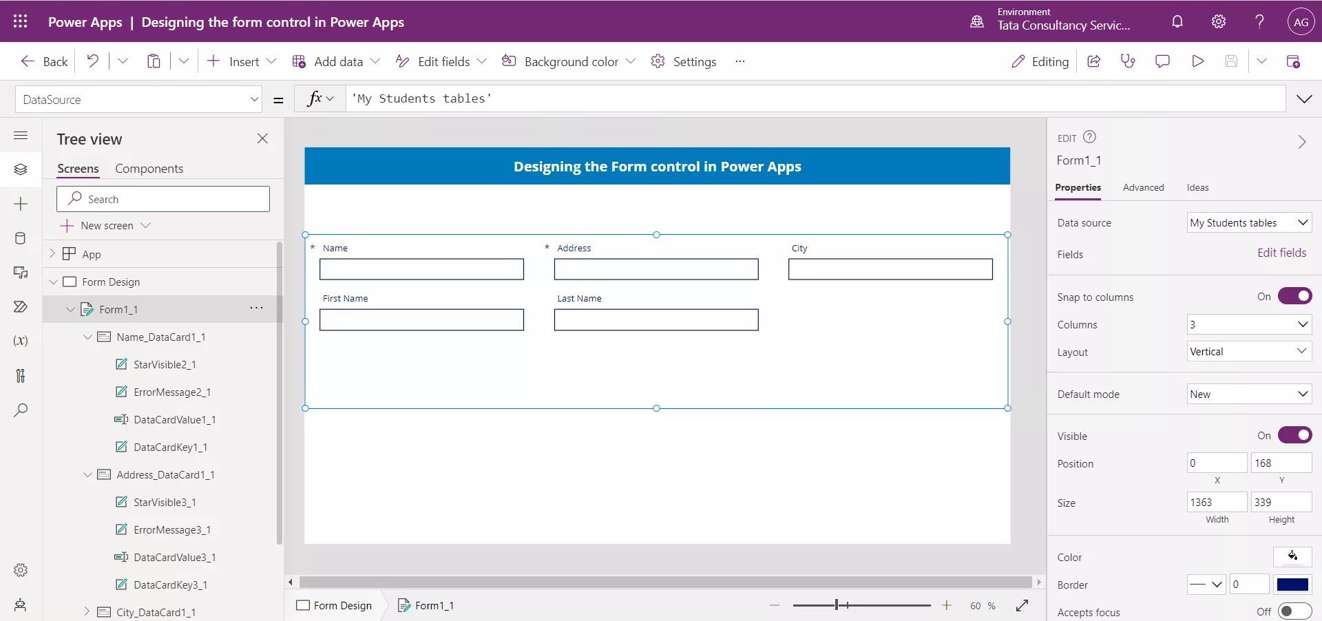
Now we can see the data card in the form control, each card control contains the four controls, select the StarVisible control which is a Text label control.
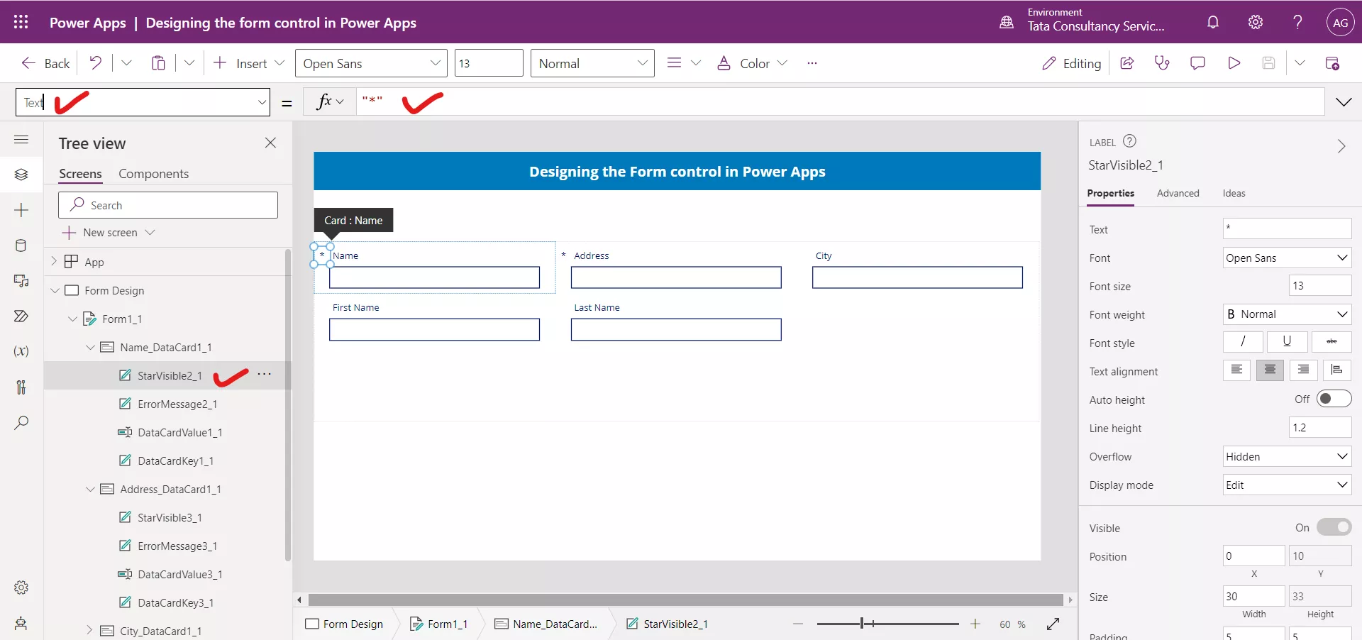
We can see that the Text property of the control is set to “*”. And the Visible property to the following formula:
Power Apps Formula
Here, Parent is the respective Data card control of the selected control.
If we see the Parent’s Required property, we can see that its value is set to true.
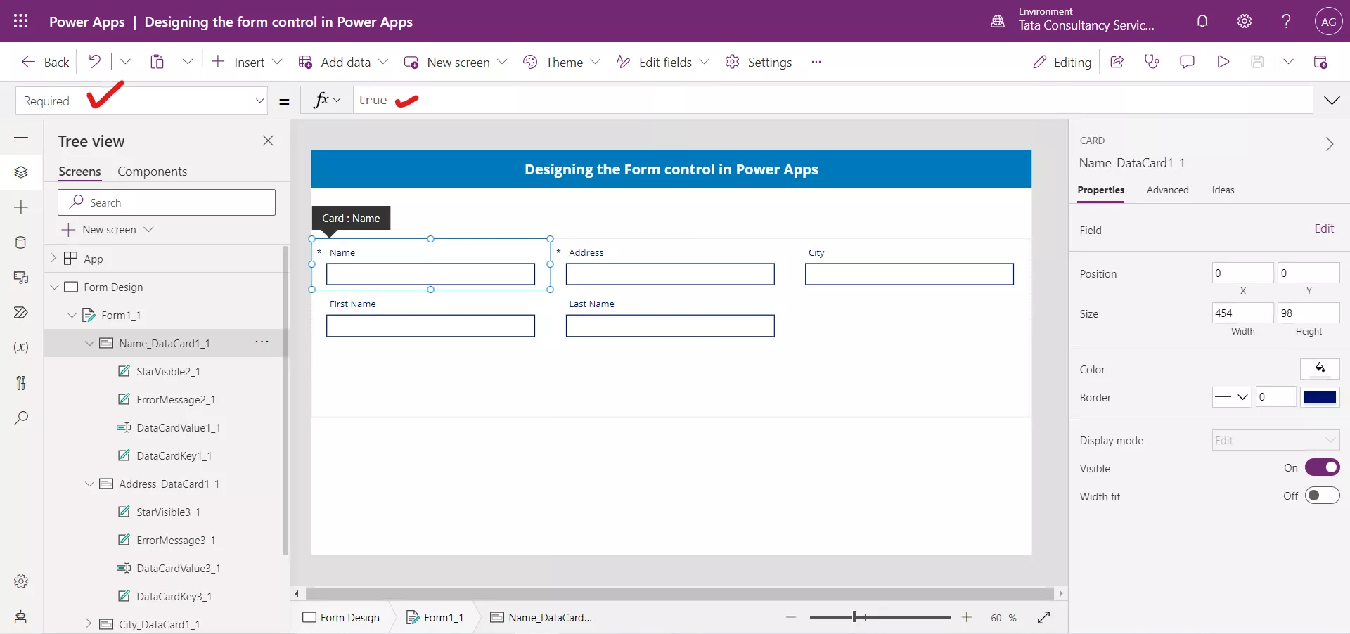
The StarVisible is available in all the Data cards which makes the app having many controls, we can reduce that without affecting our functionality. It means when we set data card required the Star (*) is shown otherwise not.
Remove the StarVisible control and select the DataCardKey and updates its Text property.
PowerApps Formula
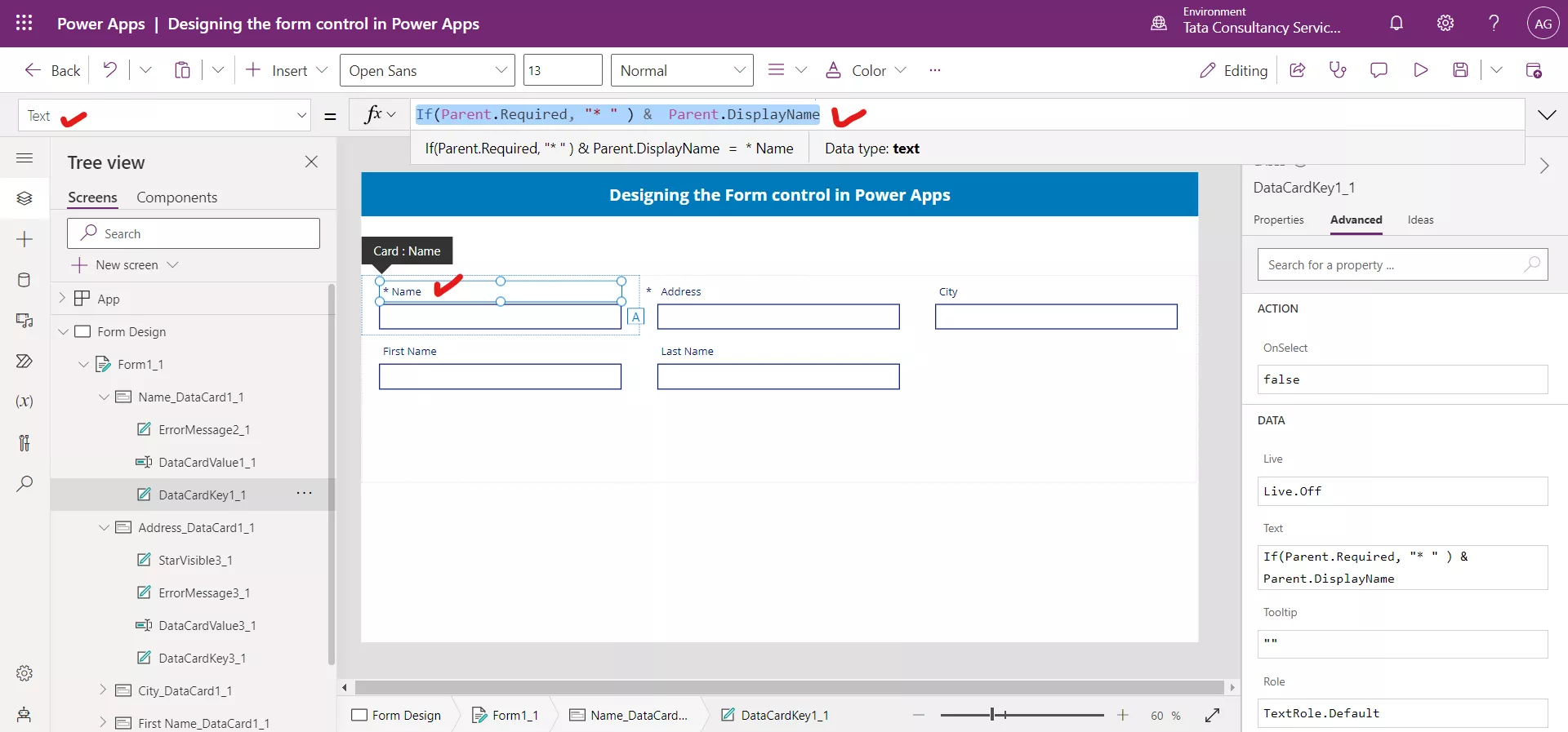
Select all the DataCardKey and update their Text property as above. And remove their StarVisible control from Power Apps.
7. Rounded Corners
As the Text label control has not rounded borders, so in order to have rounded border of the header we can leverage the Button control in power apps.
Add a Button control and set its Text property to the “Designing the Form control in Power Apps”. And set its Border radius to 50 from the right-hand side Properties window opened when we select the control.
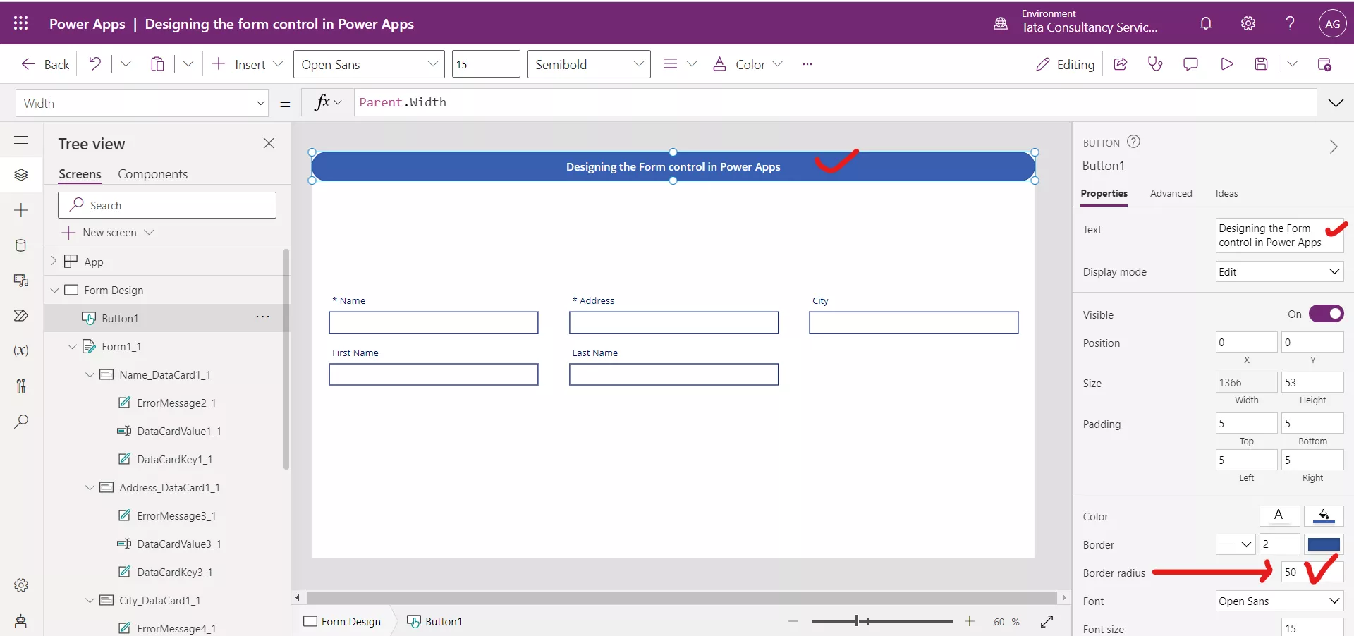
Set the Width property of the button to the following formula.
Power Apps Formula
Here, Parent is the screen control. So, the control has the same width as the screen has. Also, set its X and Y property to 0.
As the form control is not has not border radius property, but we can leverage the border radius in form using the button control.
Let’s add a Button control, and clear its Text. And set its Height property to the following formula.
Power Apps Formula
And set its Width property to the following formula.
Power Apps Formula
And set its X property to the following formula.
Power Apps Formula
And set its Y property to the following formula.
Power Apps Formula
And set its Fill property to the following formula.
Power Apps Formula
Click on Button control and click on Send to back.
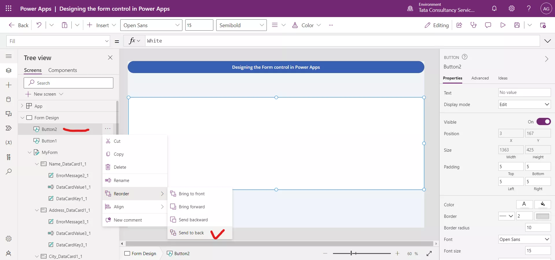
When we click on the Send to back the app is look like the following image.
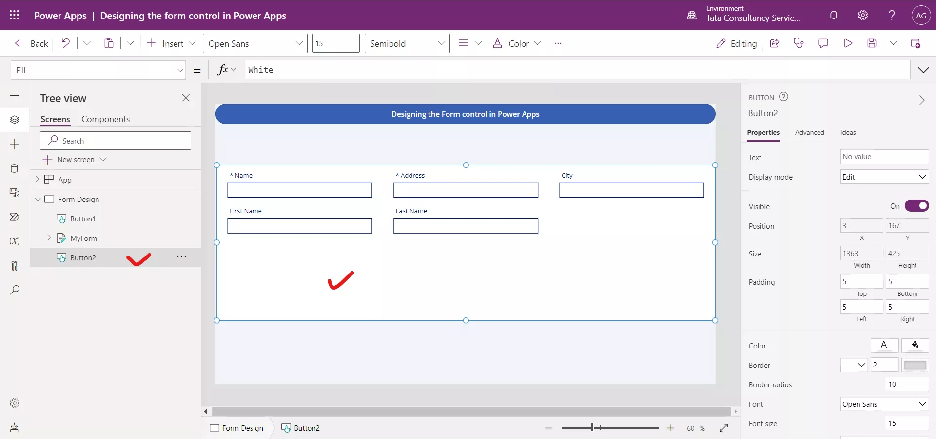
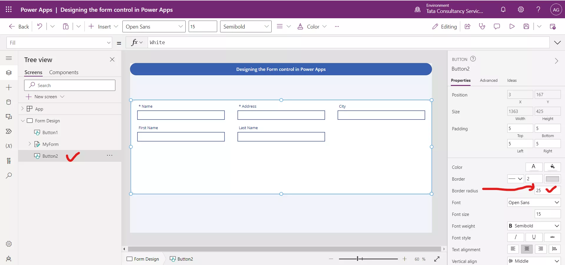
Select the Button control and set its Border radius to 25 or as required.
Play the app in the Preview mode.
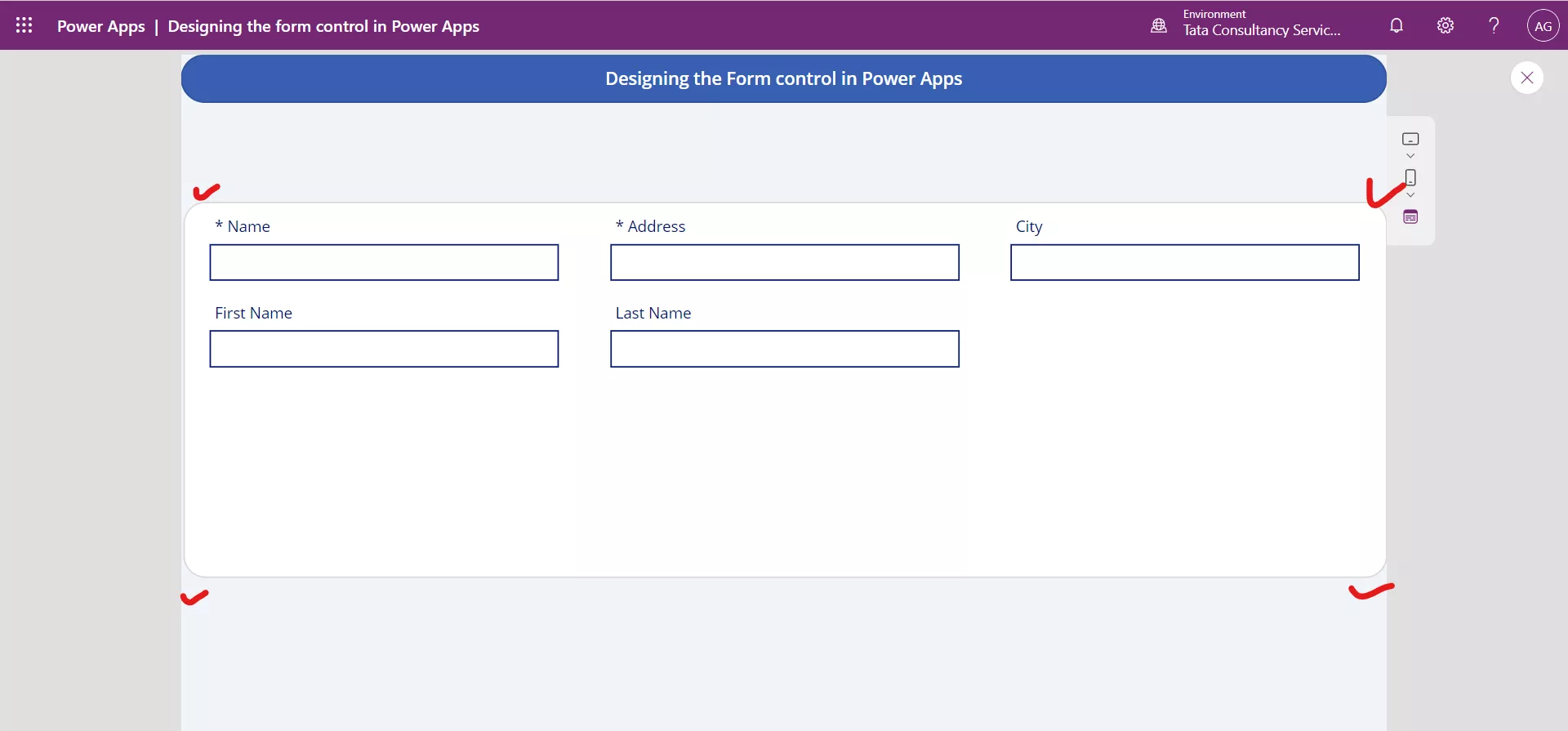
Now we can see that the form control now has the rounded edges.
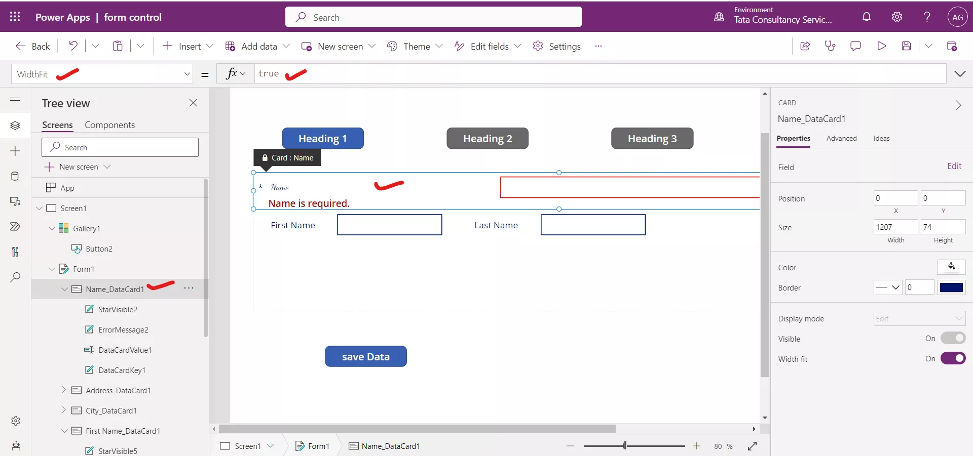
8. WidthFit property of a Card control
The WidthFit property specifies whether a control automatically grows horizontally to fill any empty space in a container control such as an Edit form control. If multiple cards have this property set to true, the space is divided between them.
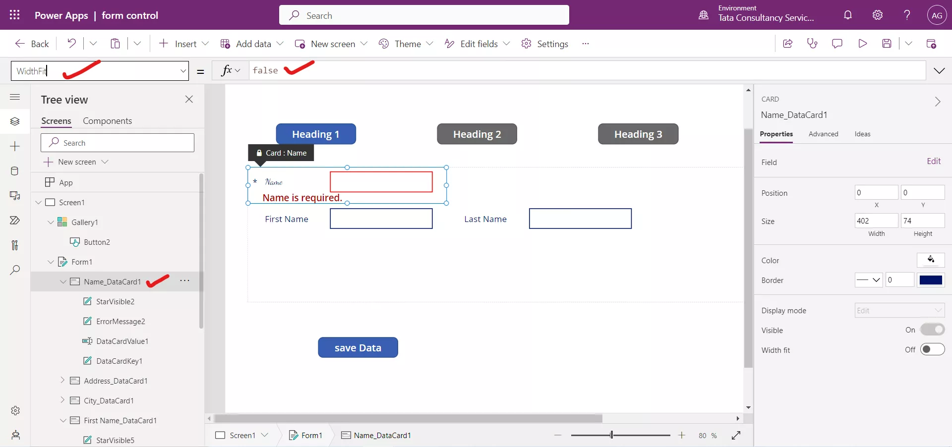
The effect of WidthFit property is shown below.
