Group Controls in Canvas Power Apps
Group controls in Power Apps allow you to group related controls together and apply common settings to them, such as formatting and visibility. This can help us organize our app's user interface and improve its usability.
To create a group using the Group control, follow these steps:
Step 1: Select the controls we want to group together.
Step 2: Right-click on one of the selected controls and choose Group from the context menu.
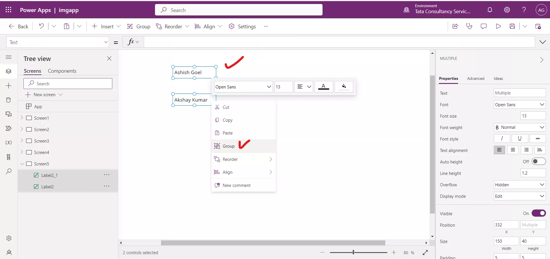
Step 3: The selected controls will be enclosed in a Group control.
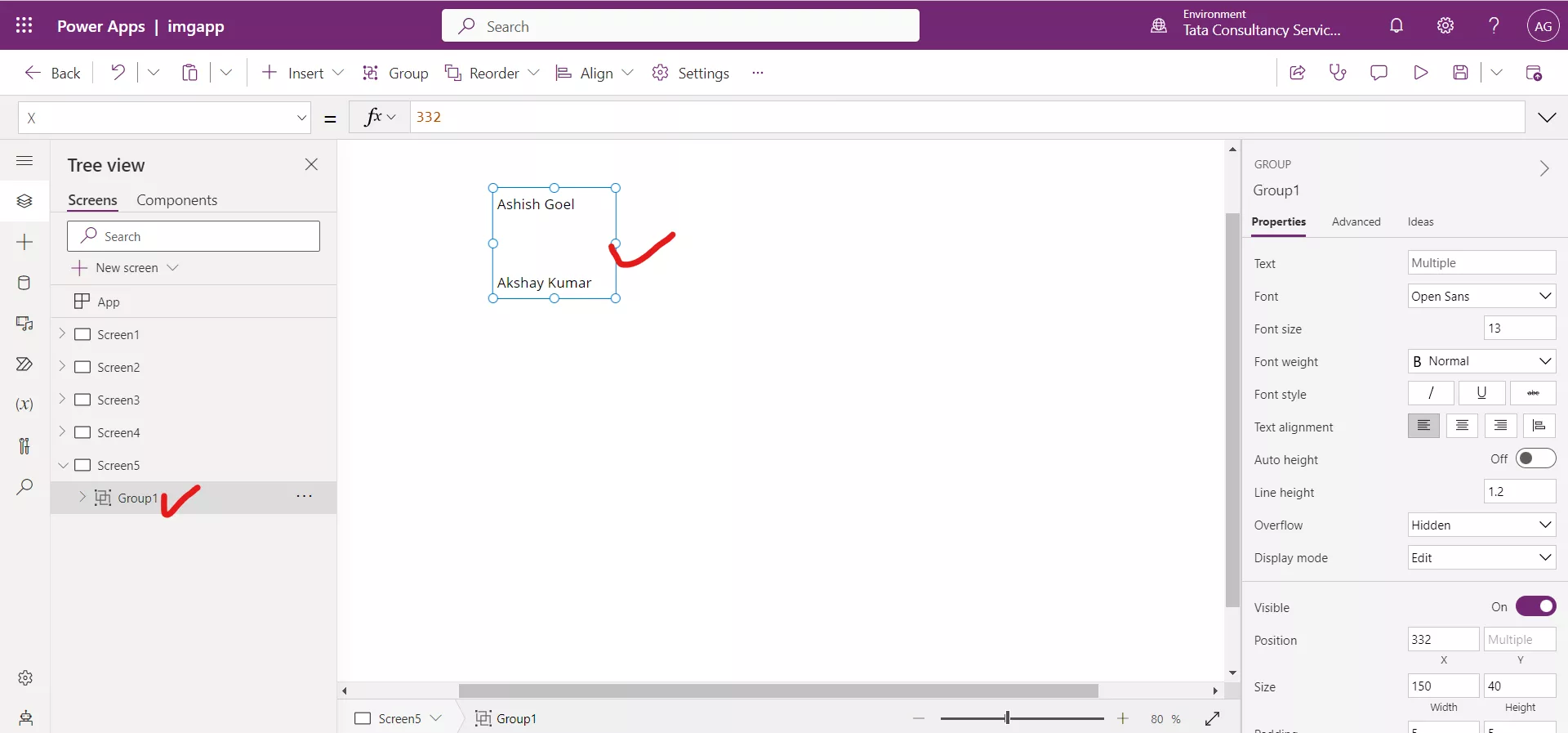
If we highlight the group, we will see all the common properties that we can change on the right pane or from the properties dropdown.
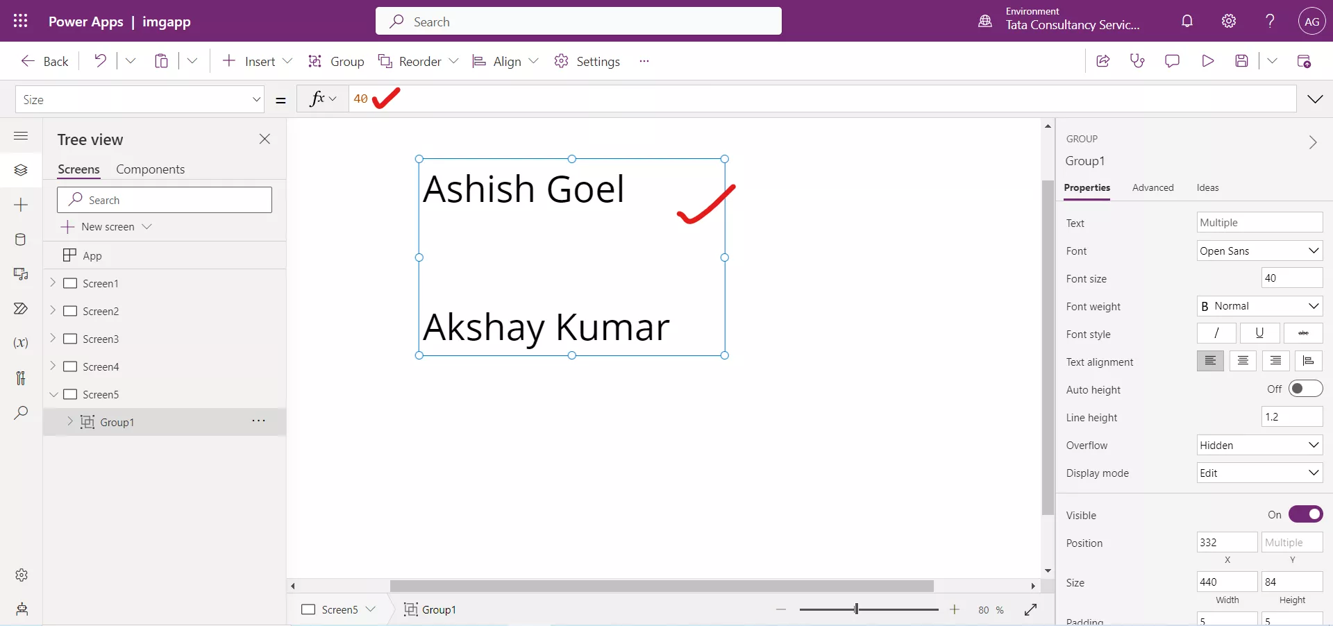
So, since both labels have the font size property in common, we can change the font size of both elements to 40 in one click instead of having to do it for each of the two elements.
Select the group and change the Size property value to 40.
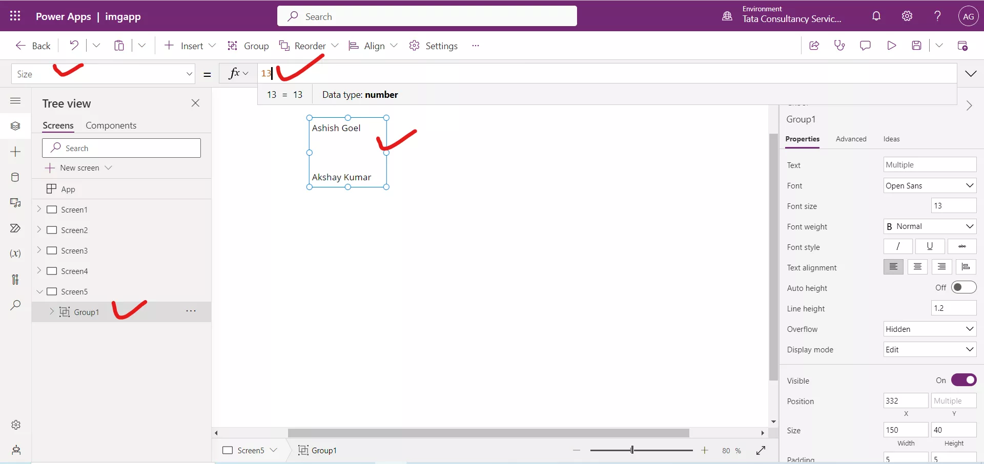
After changing the value, the result is shown in the following image.
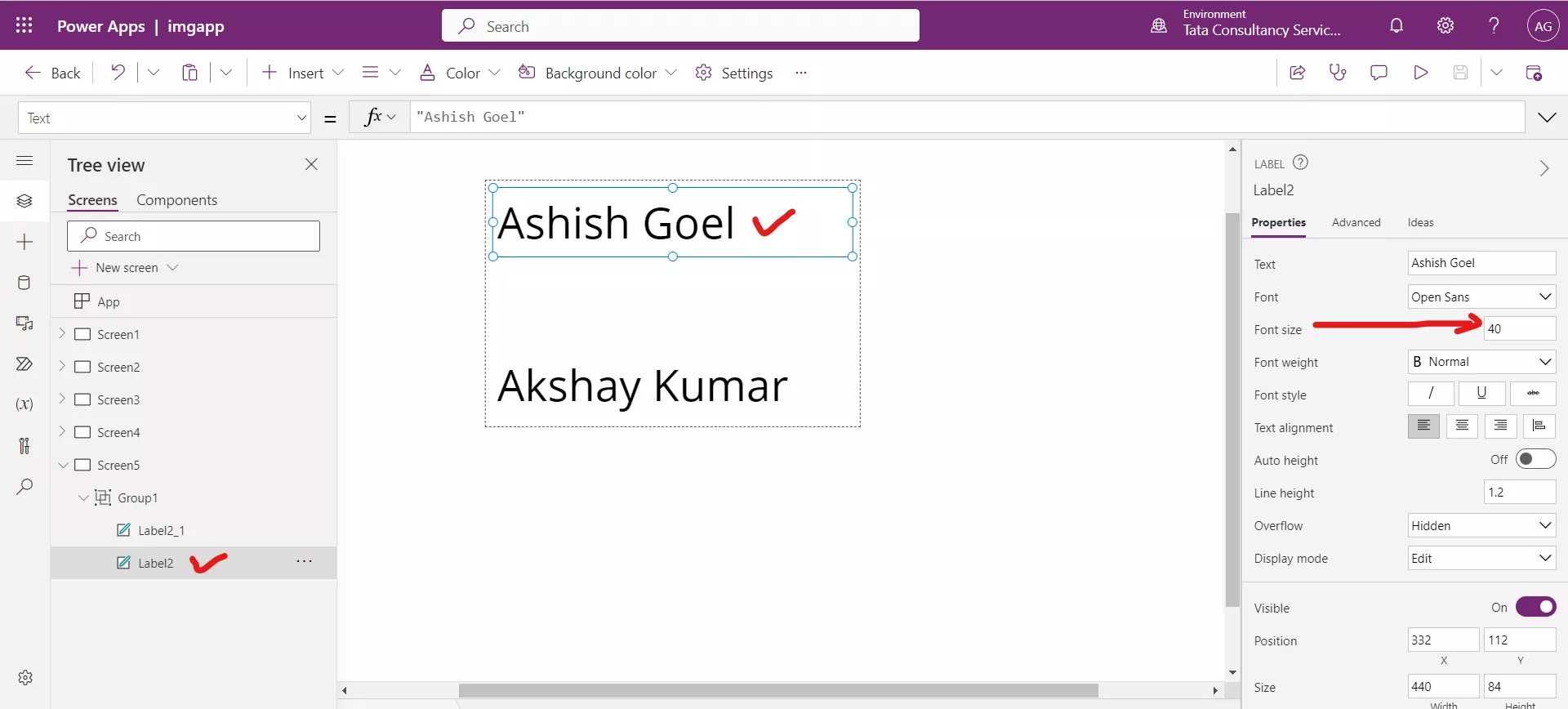
If we click on Label2 and check the Size property on the right pane, we will see that its value is 40 as well. It means any property specify on the group applies to the individual controls of the group.
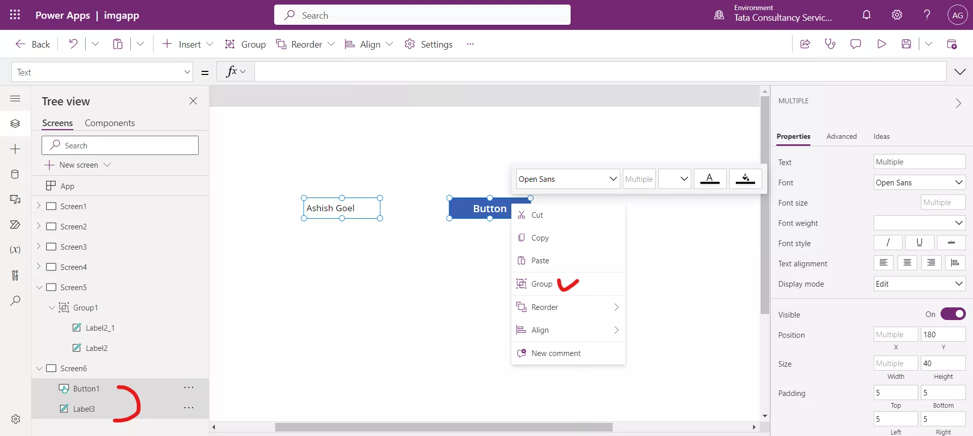
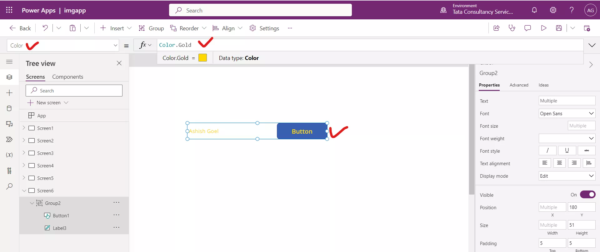
It is not necessary to have the same controls in the group. For example, if we create one label and one button, we can group them together.
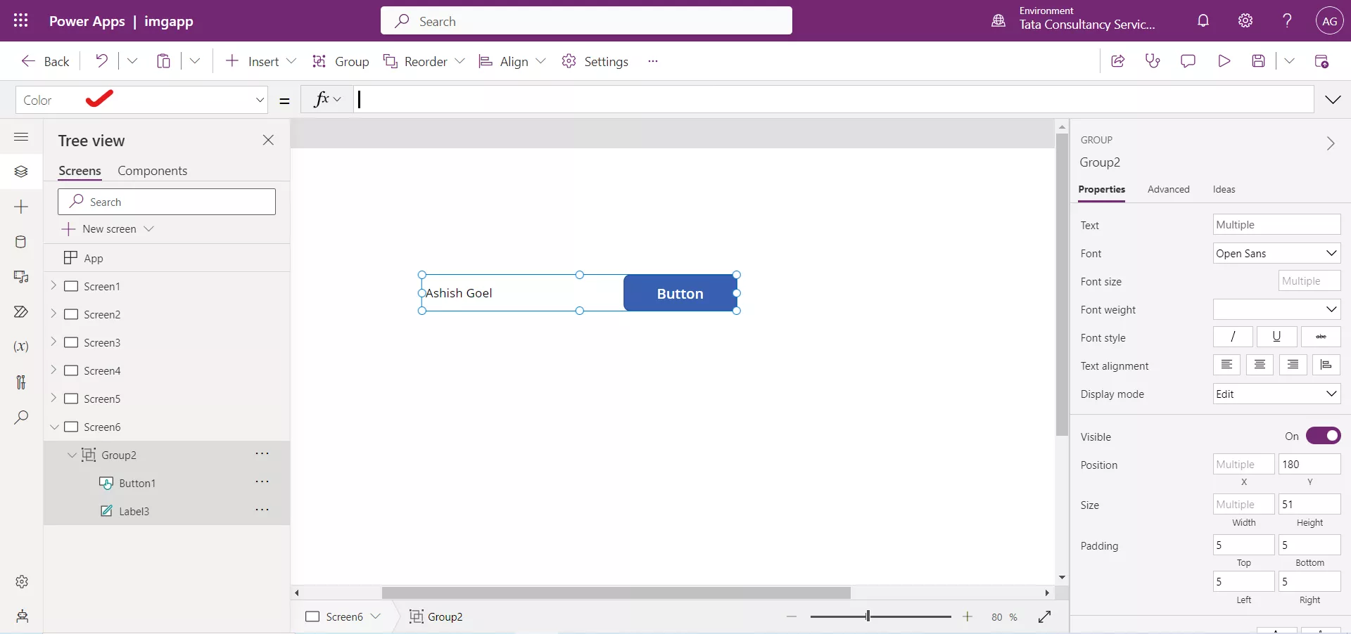
The different controls in the group, could still have shared properties. For example, we can change the Color property for this group.
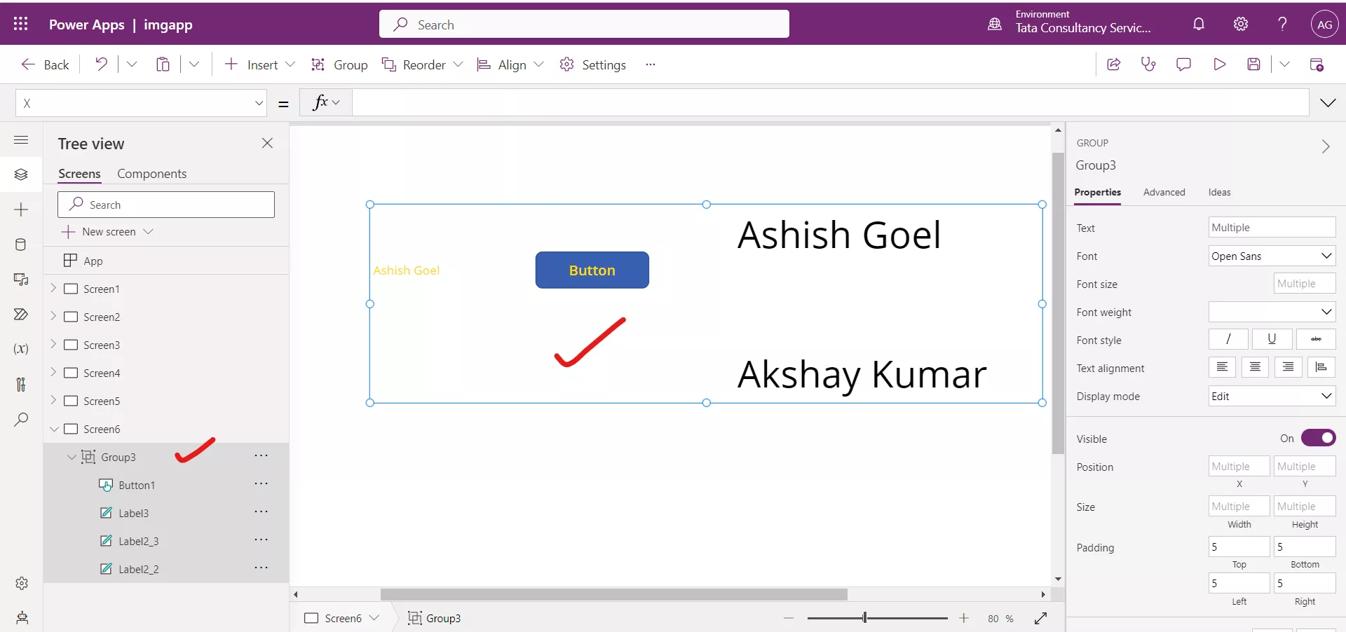
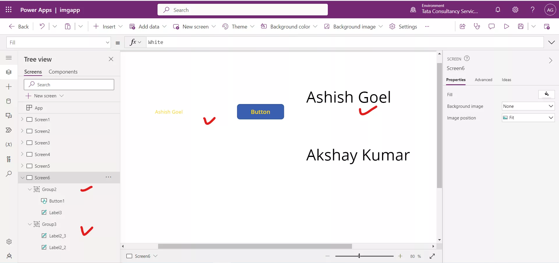
We can also have groups of groups. We have two groups Group2 and Group3 on Screen6.
Select the groups from the Tree view by pressing the Ctrl key, that we have created and select Group from the context menu.
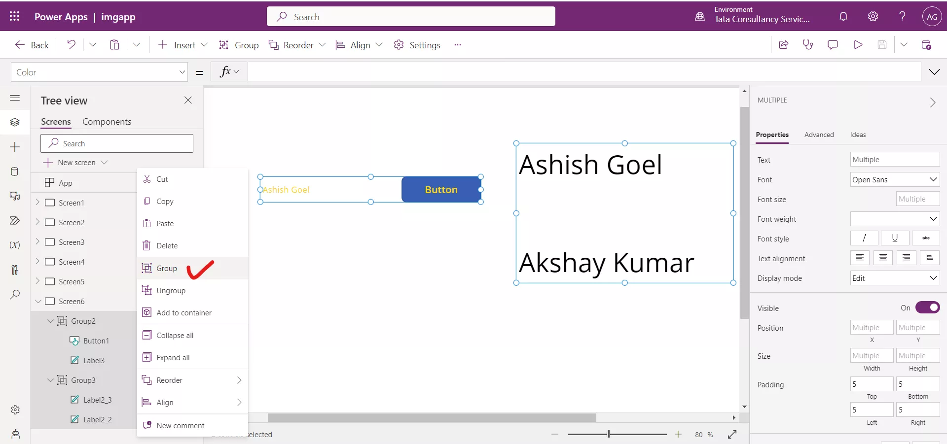
The groups merges into one.
