Containers in Power Apps
The containers in power apps are used to group logically related controls and make it responsive.
Step 1: Click on + Insert and then select the Horizontal container from the Layout.
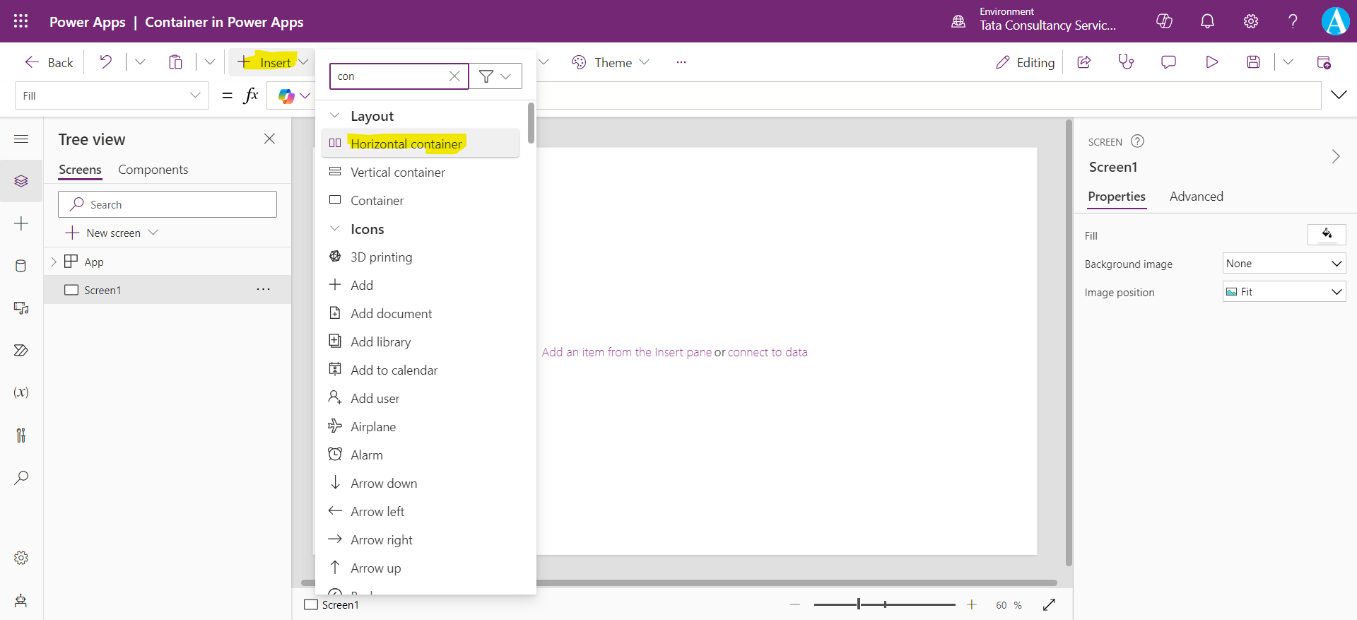
Step 2: We have many properties related to the containers. One of them is Direction property of the container.
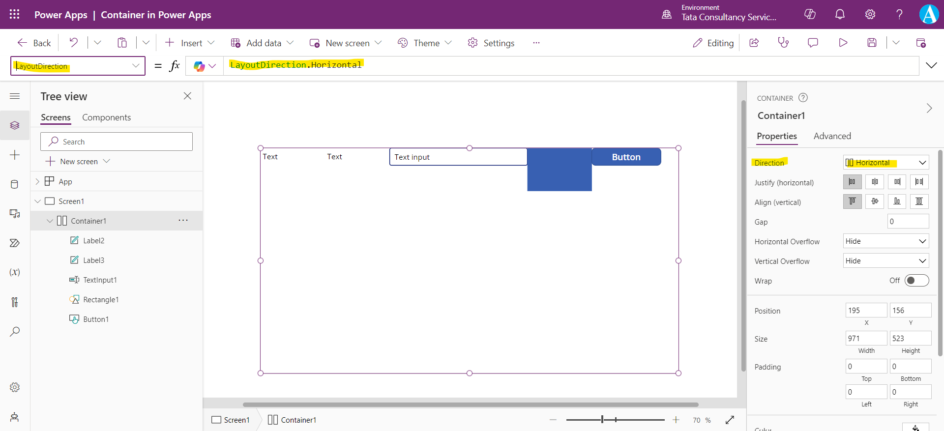
The Direction property defines in what direction the container layouts its child components. We have two directions Horizontal and Vertical.
To see its effect let us some controls in the container.
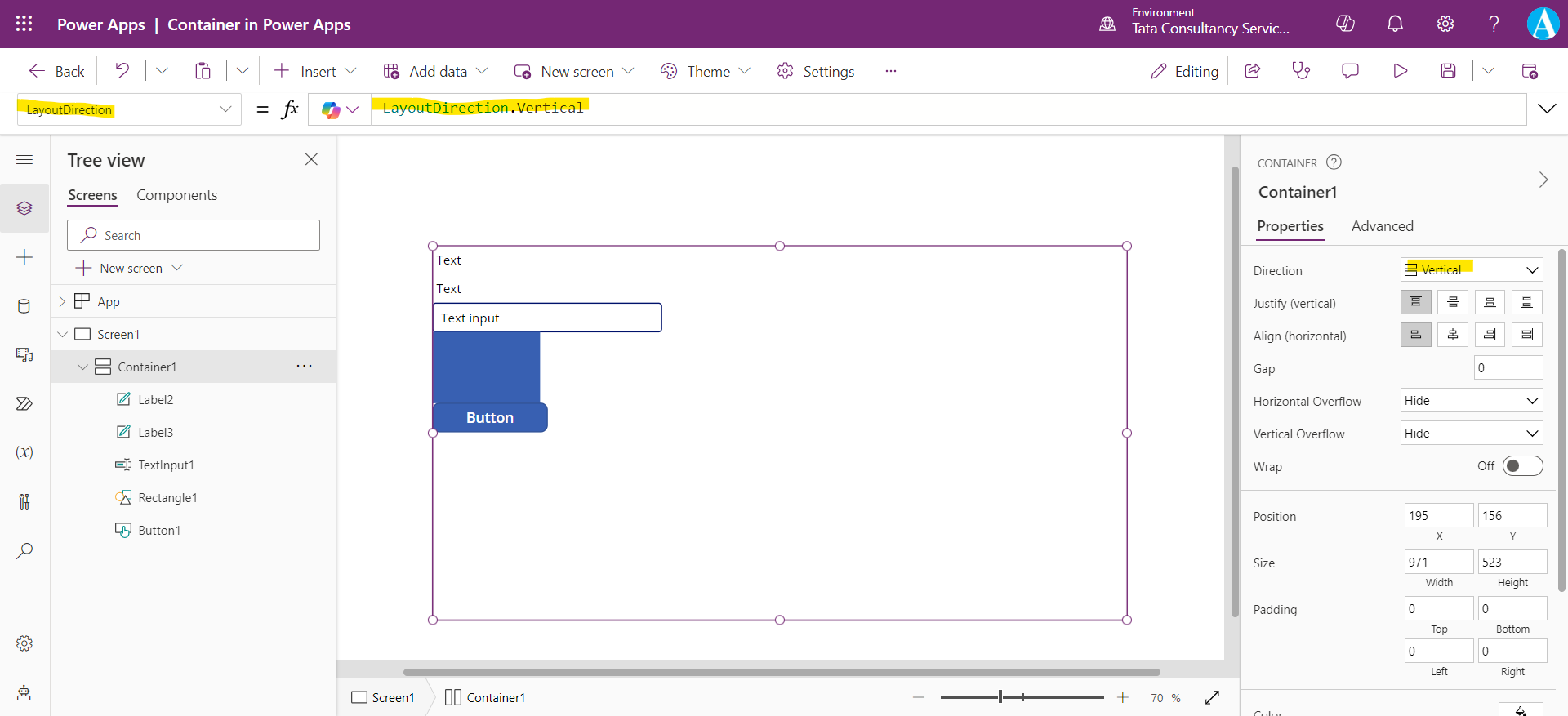
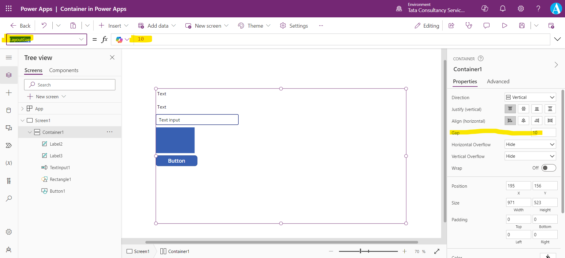
Let’s change the layout to Vertical. We can see its effect in the image below:
Step 3: The Gap property of the container defines the space between the child components of the container.
Step 4: The container has two properties to handle the overflow horizontally and vertically, Horizontal Overflow and Vertical Overflow simultaneously. These two properties have two possible values Scroll and Hide. Scroll is used to show the scrollbars when the content is too large to fit, and Hide is used to remove content when it is too large to fit.
Let’s change the layout to Horizontal and Set the Horizontal Overflow to Hide.
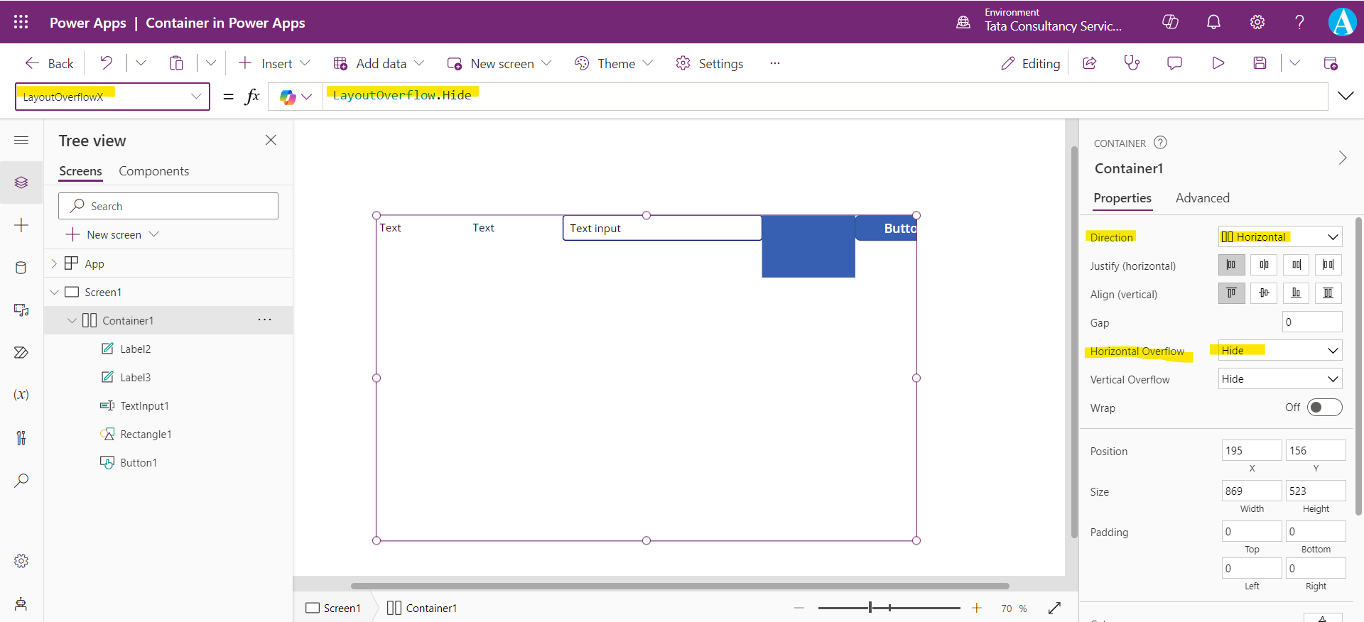
Step 5: In the above image we can see that the content is clipped. We can use the Scroll value for the overflow to add the scroll bar.
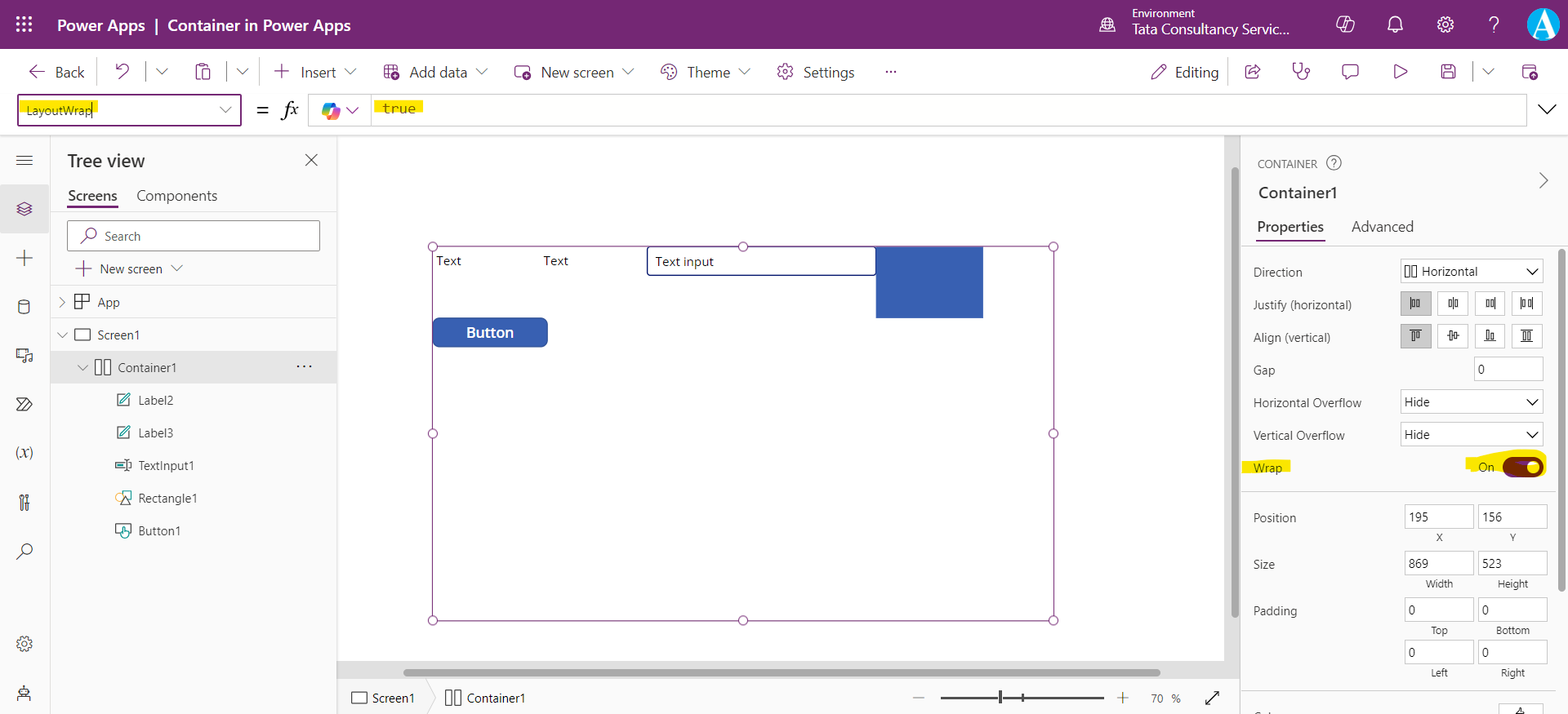
But what if we want that the content wraps to a new row or column when it cannot fit, we can use the LayoutWrap property of the container
Let’s set the LayoutWrap property value to true. We can see in the following image that the content is placed in the new row, when it overflows.
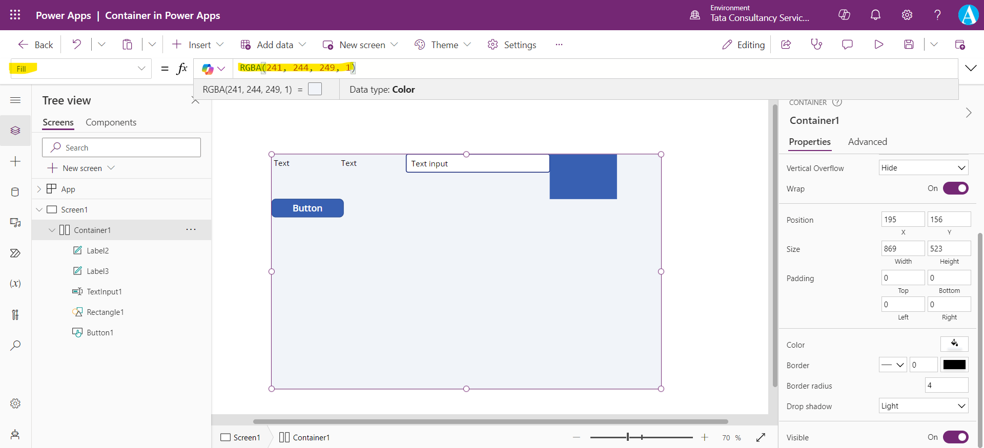
Step 6: We can set the background color to the container by specifying the Fill property of the container.
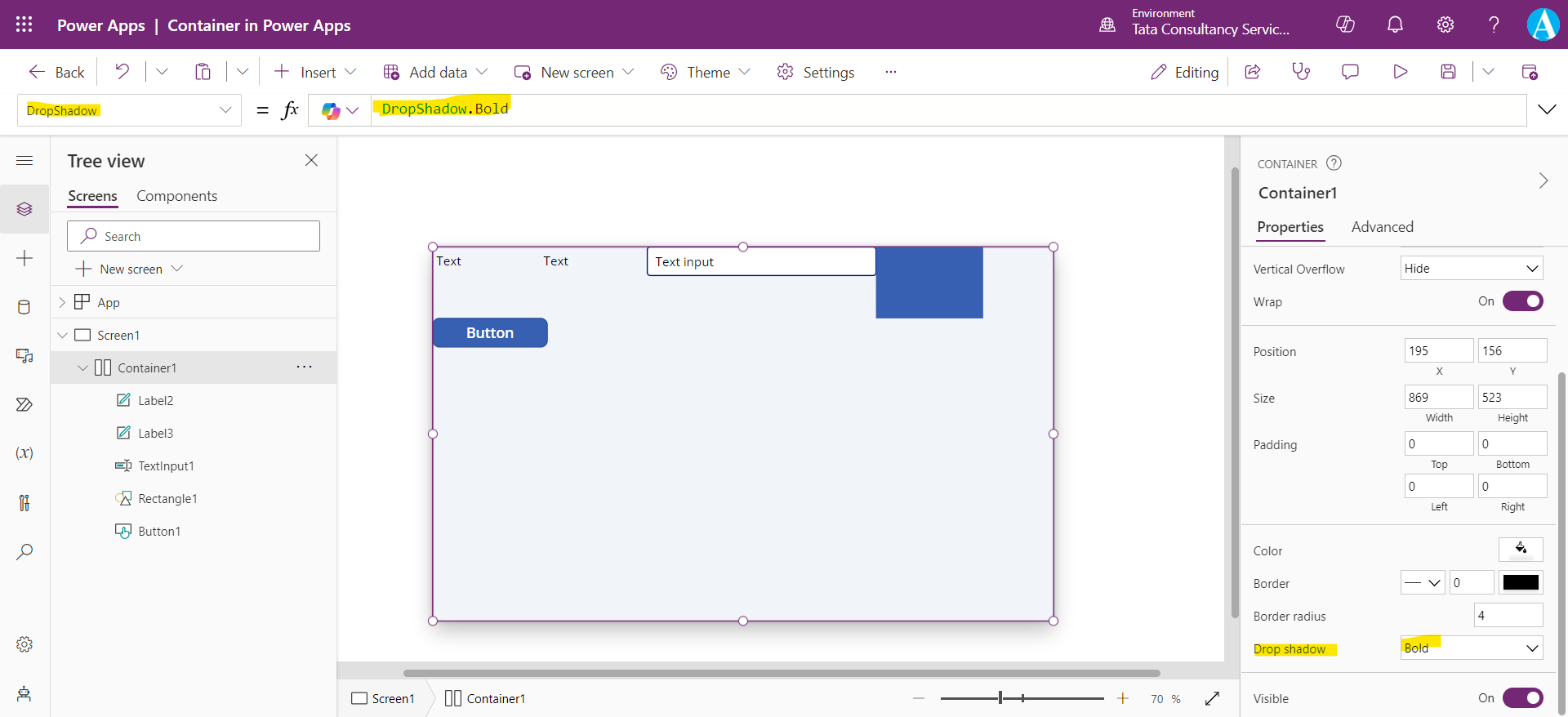
Step 7: We can add the shadow effects around the control, by using the DropShadow property of the container.
