Line chart control in Power Apps
The Line chart controls show data as graphs with x- and y-axes. Line chart is a grouped control. The group contains three controls: a Label for the title, the chart graphic, and a Legend.
The chart has the following properties: 1. Items The Items property specifies the source of data that appears in a line chart control. The value of Items property can be formula that can be dynamically changed. 2. NumberOfSeries The NumberOfSeries property specifies the how many columns of data are reflected in a line chart. 3. GridStyle The GridStyle property specifies whether a column or line chart shows its x-axis, its y-axis, both, or neither. The GridStyle of the control has four values All, None, XOnly, YOnly. 4. ItemColorSet The ItemColorSet property specifies the color of each data point in a chart. 5. Markers The Markers property specifies whether a line chart shows the marker circle at each data point. It takes the boolean value i.e., true, or false. 6. ShowValues The ShowValues property specifies that the value at each data point is shown or not. It takes the boolean value i.e., true, or false.
7. XLabelAngle
The XLabelAngle property specifies the angle of the labels below the x-axis of a column or line chart.
8. YLabelAngle
The YLabelAngle property specifies the angle of the labels next to the y-axis of a line or column chart.
9. YAxisMax
The YAxisMax property specifies the maximum value of the y-axis for a line chart.
10. YAxisMin
The YAxisMin property specifies the minimum value of the y-axis for a line chart.
11. X The X property specifies the distance between the left edge of a control and the left edge of its parent container (screen if no parent container).
12. Y
The Y property specifies the distance between the top edge of a control and the top edge of the parent container (screen if no parent container).
13. DisplayMode
The DisplayMode property specifies the display mode of a control, whether it will be Edit, view or Disabled.
1. Excel File as the Data Source
We can create a line chart in power apps using excel as the datasource. In the following example, we are implementing this scenario.
Example: The following excel file is used for this exercise Chart-controls.xlsx. Store this excel file in the OneDrive for Business. We will connect to this file from power apps through Add Data section.
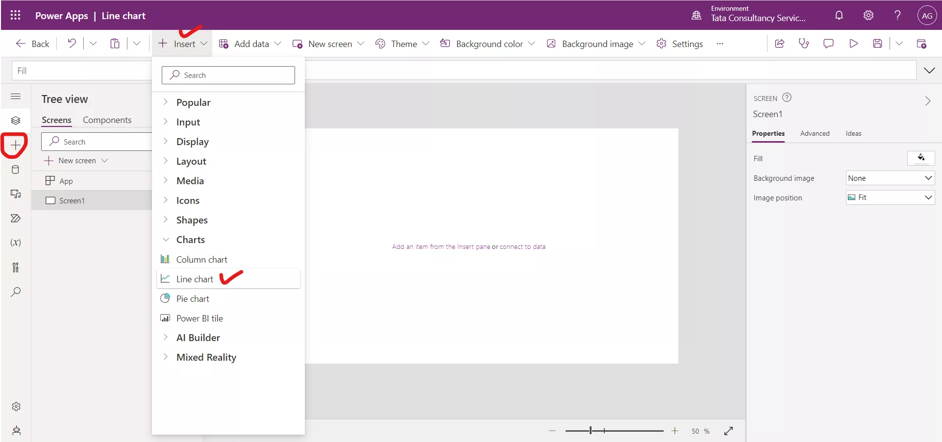
Step 1: Click on + Insert, and from the Charts section select a Line chart control.
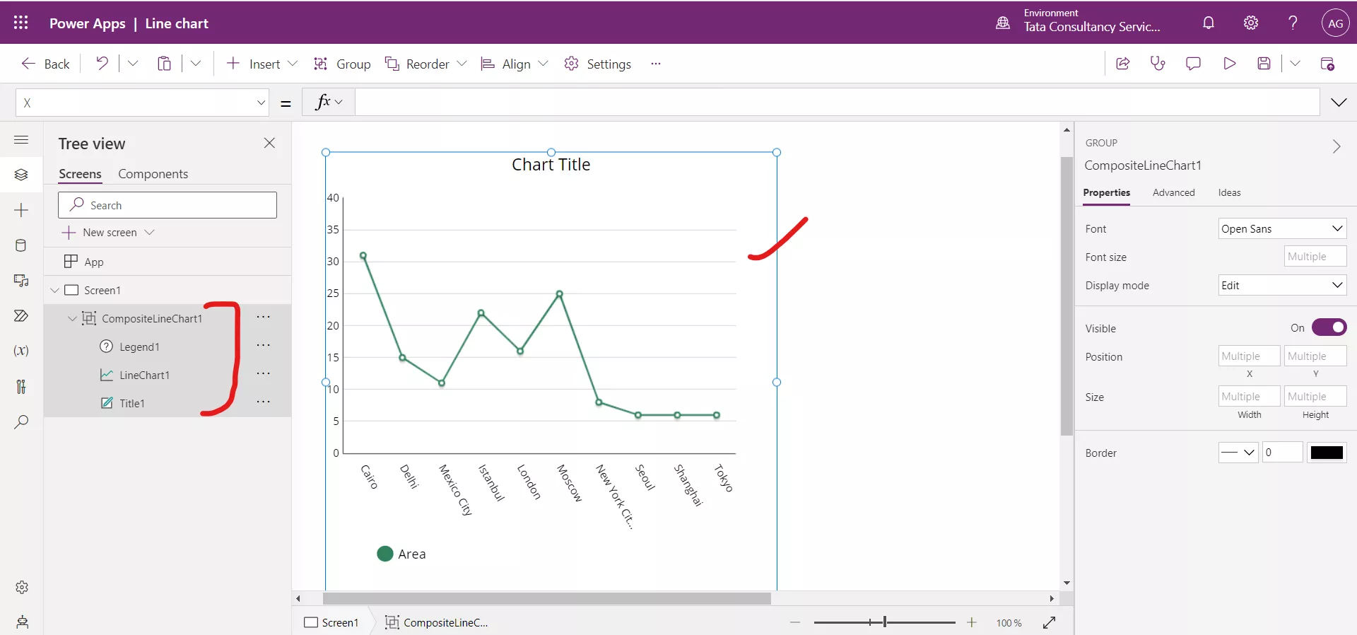
Step 2: The Line chart control is a group of three controls: Label, Chart graphic, and a Legend.
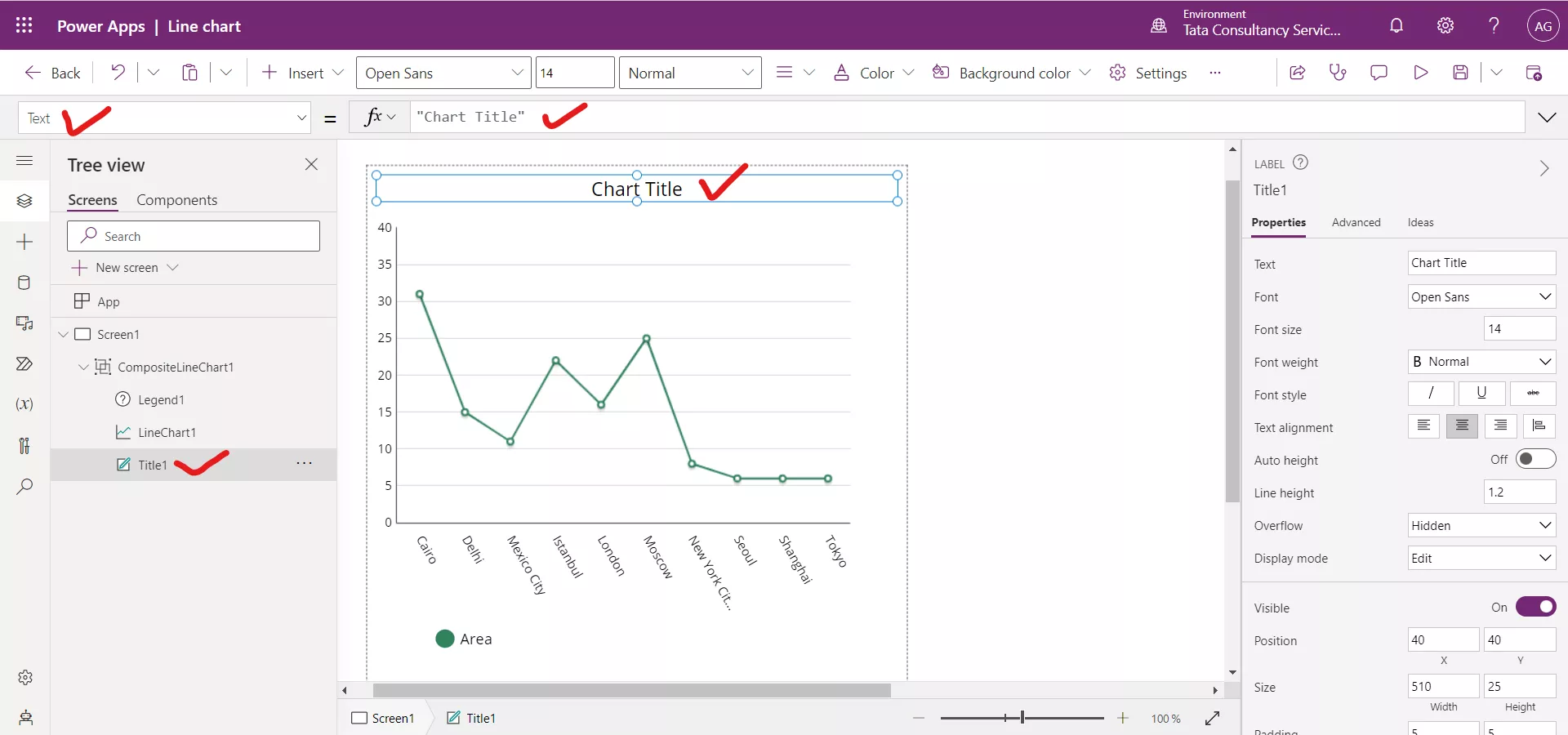
Step 3: There is a Text label control in the group, used to specify the title of the chart. By default, its name is ‘Chart Title’. We can modify it as per our requirement.
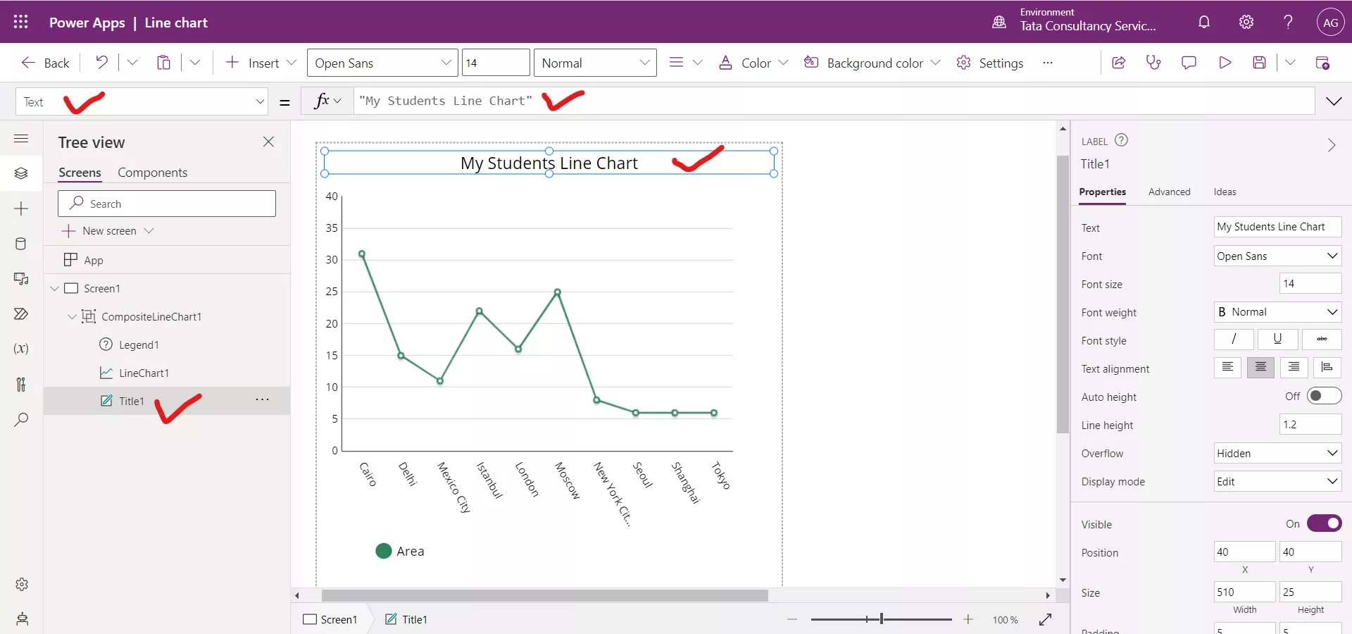
After updating the text of the Label control to “My Students Line Chart”. You can give a different name according to the need.
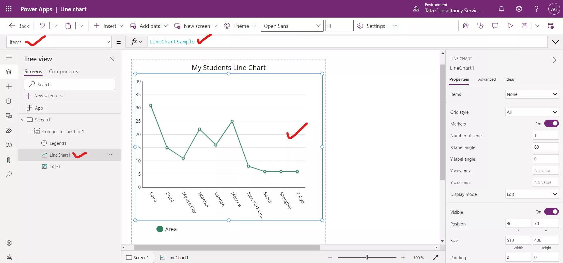
Step 4: Add the excel file from the Add Data section. Select the Line chart graphic control, by default its Items property is set to the LineChartSample.
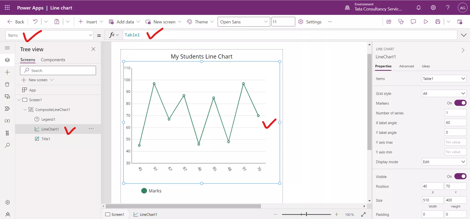
Set its Items property to our data source, i.e., Table1. After setting the Items property to the data source Table1, we get the following result.
Step 5: Select the Line chart and click on the Advanced, scroll down and change the Labels dropdown value to name to display the Name column value in the x-axis of the chart.
Note: Here the Labels dropdown specify the X-axis values and the Series1, Series2, Series3, Series4, upto Series9 are used to specify the Y-axis values. It means at the same time in the graph we can show 9 column values in the Line chart, corresponding to the X-axis i.e., Labels. The dropdown contains all the columns of our data source.
Here, we can see that the X-axis i.e., Labels it tagged to column Marks.
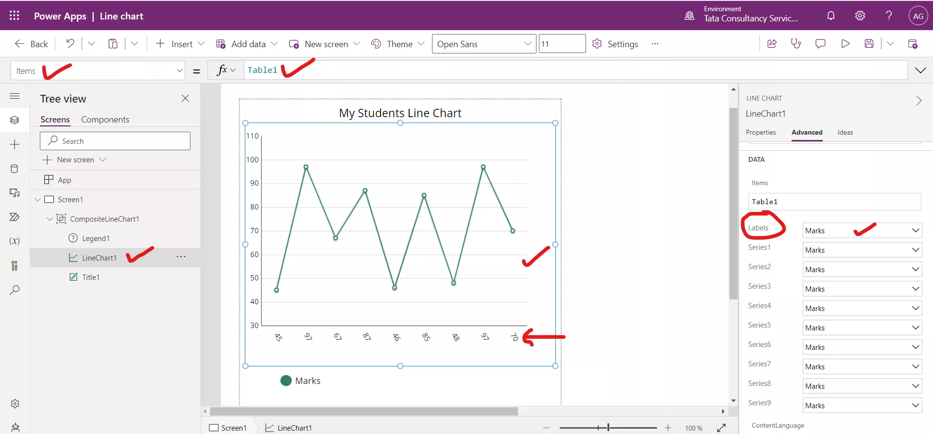
After changing the Labels dropdown to the column Name. We can see in the following image that now the X-axis shows the names of the students. We can also note one thing the Series1 is tagged to Marks column, that is why the in the Y-axis we have shown the Marks column values of the students.
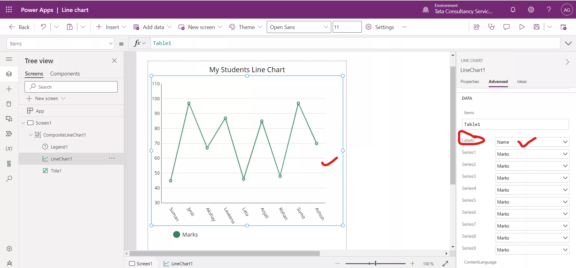
Select the Line chart graphic control and select the NumberOfSeries property from the dropdown we can see that its value is 1. It means we are showing only one y-axis value from Series1. Suppose we write here as 3. Then we can select the Series2 and Series3 column values from the dropdown and they are shown in the Line chart, corresponding to the Labels. But in this case, we have only one column to show at y-axis for now, so we are leaving this.

Step 6: Select the Markers property from the dropdown, we can see it is set to true. The Markers are the small circles shown at each data point.
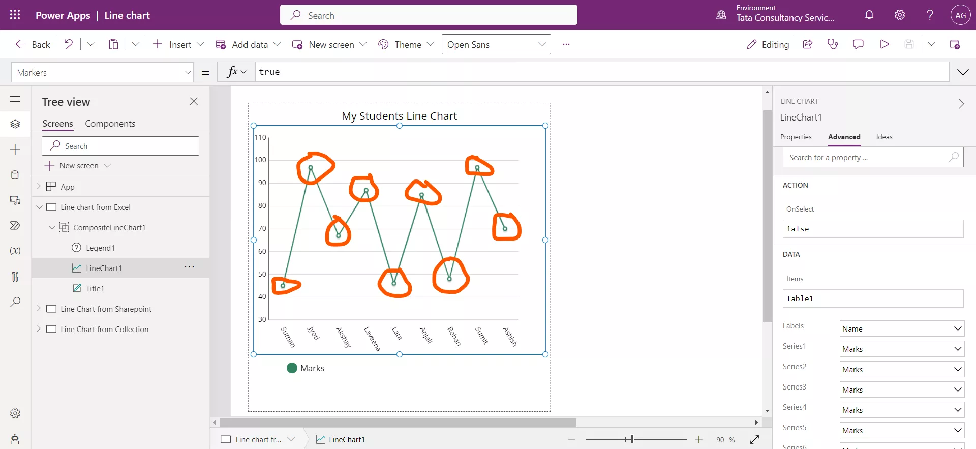
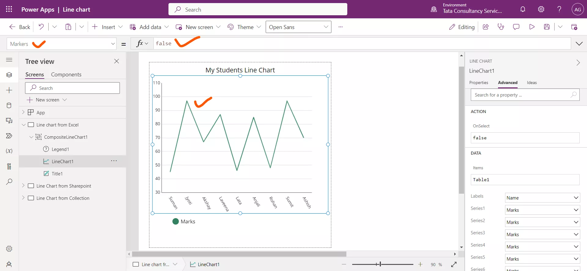
Let us set this property to false. We can see that the small circles are disappeared now in the following image.
Step 7: Select the ShowValues property from the dropdown it is seen that the property value is set to false.
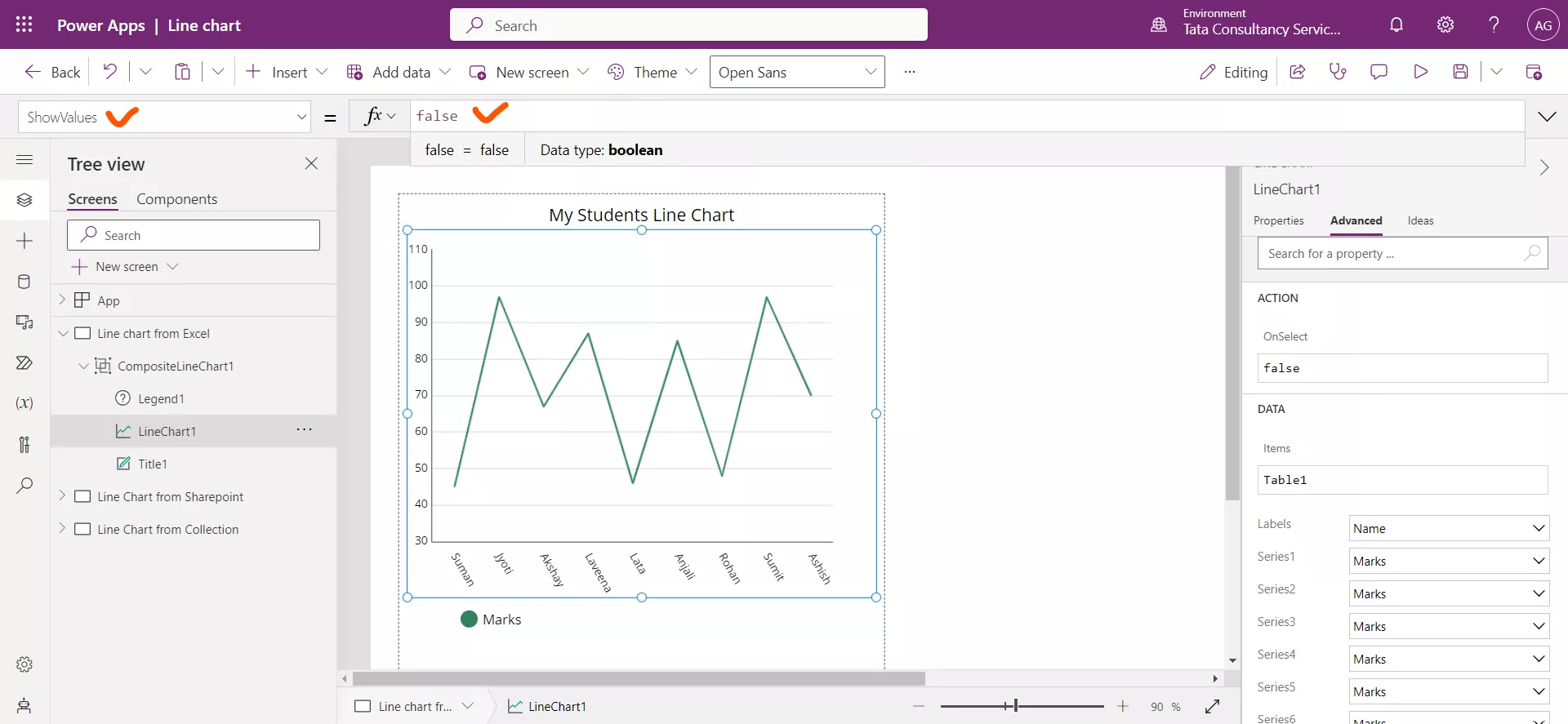
Let us set this property value to true.
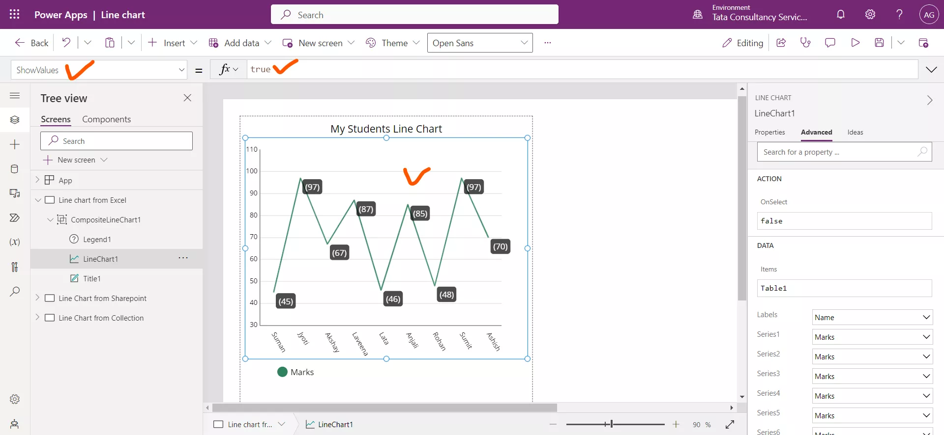
Step 8: Select the XLabelAngle property from the dropdown it is seen that the property value is set to 60. The Labels in the X-axis are tilted to 60 degrees.
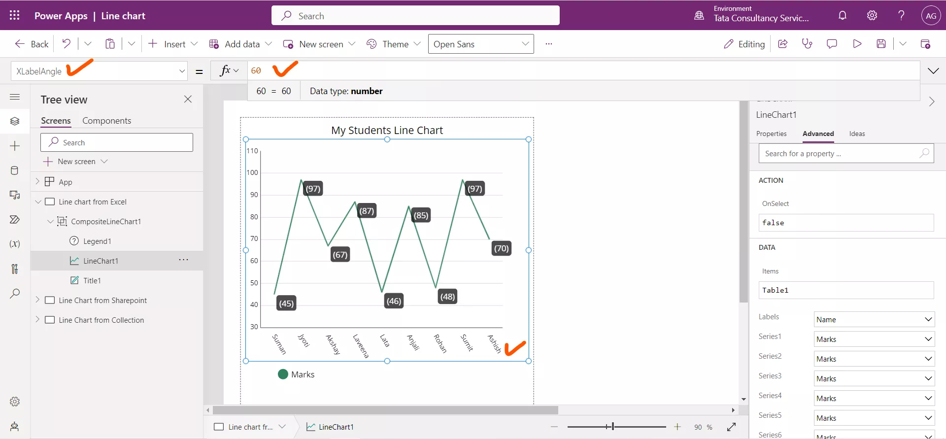
Let us set this property to 0, and see the change in the following image. Now the X-axis Labels are shown in 0 degrees.

Step 9: Select the YLabelAngle property from the dropdown it is seen that the property value is set to 0. We can change it according to our requirements.

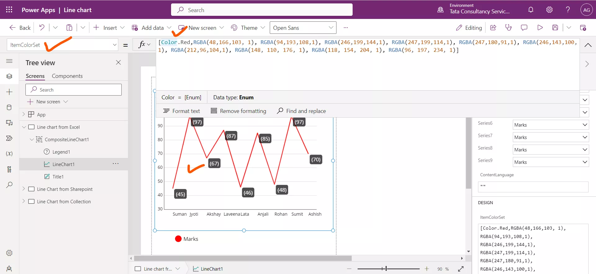
Step 10: The ItemColorSet specifies the color of each series in the Y-axis. We can specify the color using RGBA format or directly specifying the color name by Color.Colorname.
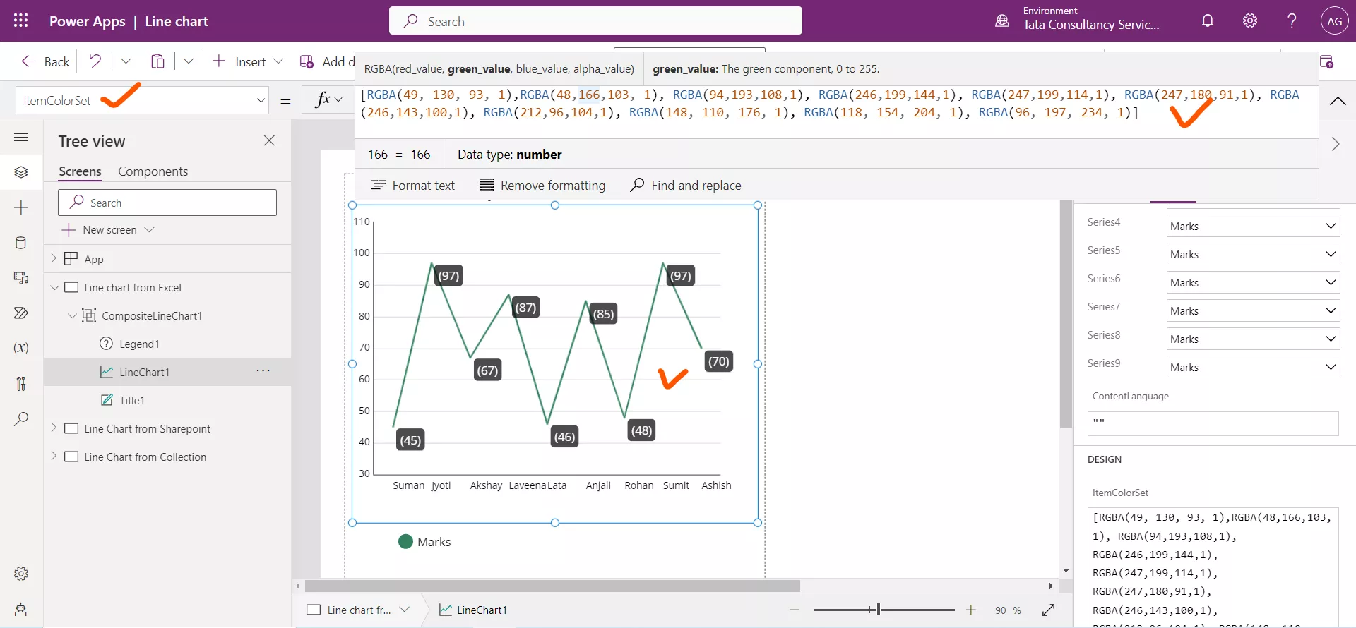
In the following image it is seen that we are specifying the red color by using Color.Red to the Series1.
2. Sharepoint as a Data Source In the following section we are using Sharepoint as the Data source.
| Teacher name | Teacher Qualification | Teacher Salary | Expenditure |
|---|---|---|---|
| Sushmita | B. Tech | 26,000 | 20,000 |
| Anjali Sharma | MBA | 28,000 | 22,000 |
| Lata Verma | BBA | 22,000 | 18,000 |
| Alia | M. Tech | 34,000 | 25,000 |
| Vicky | Engineer | 13,000 | 6,000 |
| Aakansha | LLB | 45,000 | 23,000 |
| Shilpa Shetty | Yoga guru | 60,000 | 15,000 |
The following shows our sharepoint list, named ‘Teachers Data’.
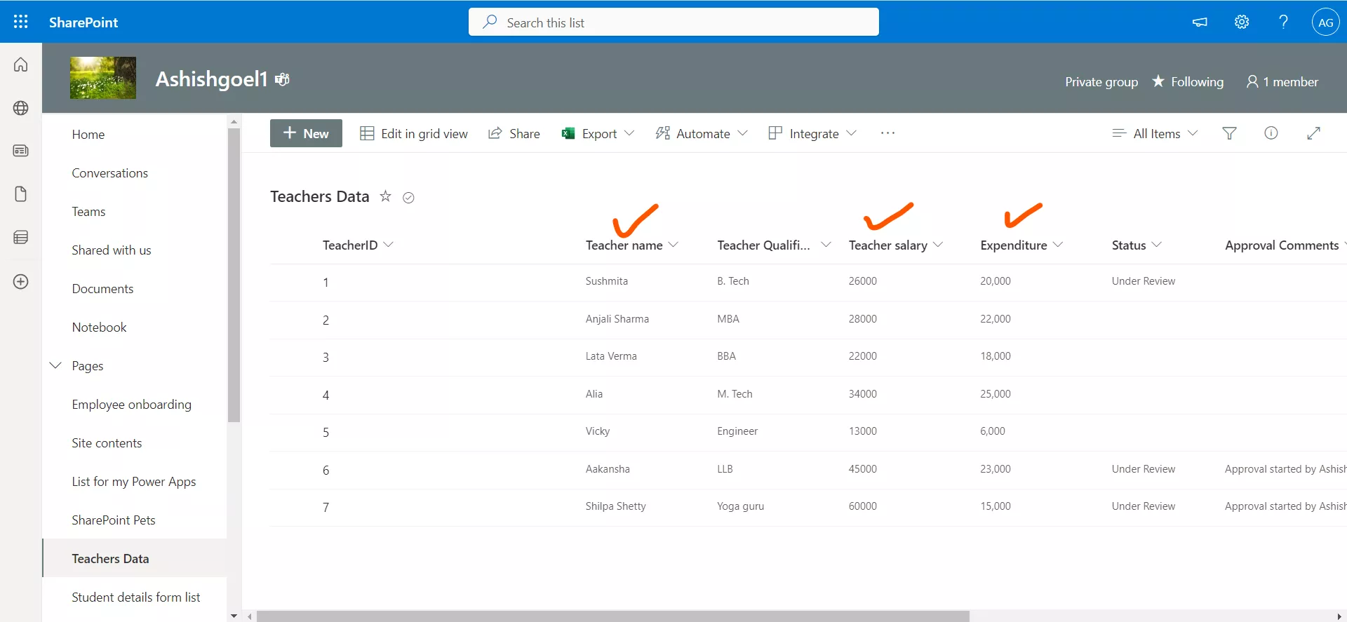
Add this list data source in the power app using the Add Data section. After this set this in the Items property of Line chart graphic control.

In the following image we have configure the following things in the Advanced tab.
| Heading | Internal column name |
|---|---|
| Labels | Teachername |
| Series1 | Teachersalary |
| Series2 | Expenditure |
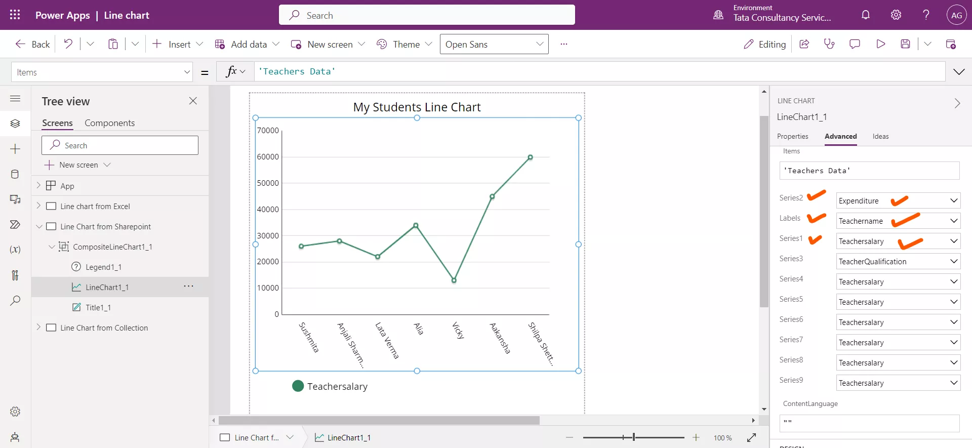
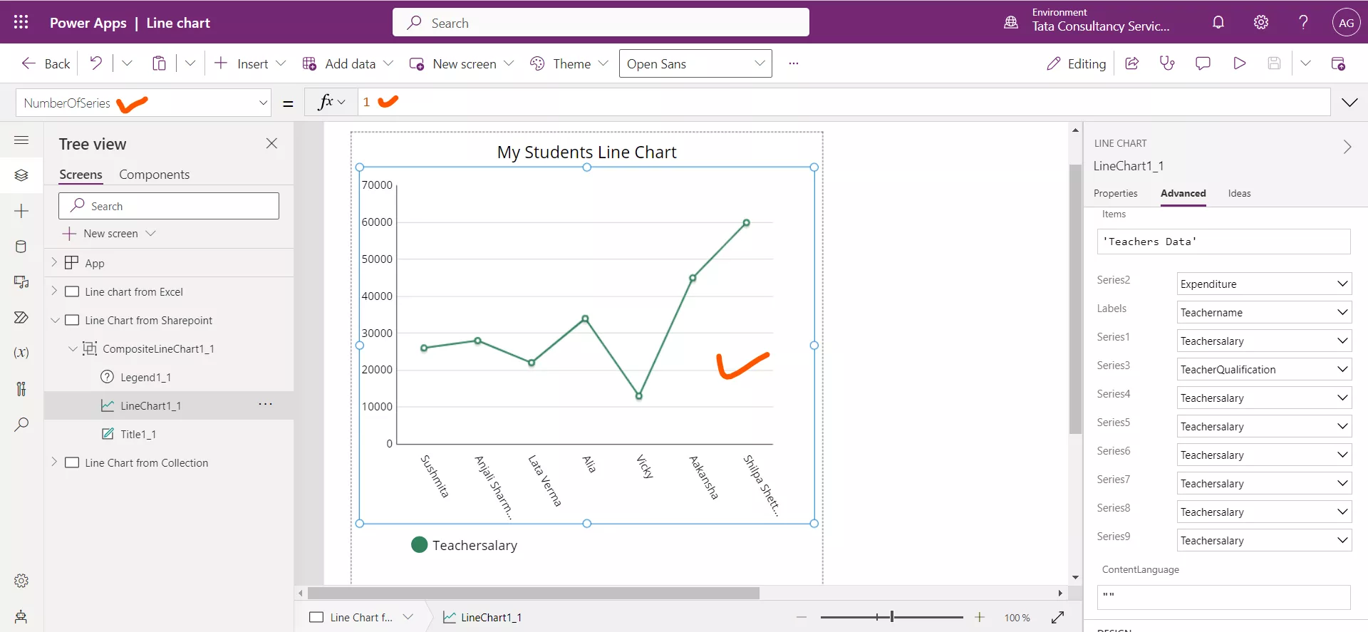
Now in the above image we can see only one line on the graph, and this is of Series1, if we need to show here our Series2 also, then we need to define another property of control called NumberOfSeries, which is by default set to 1.
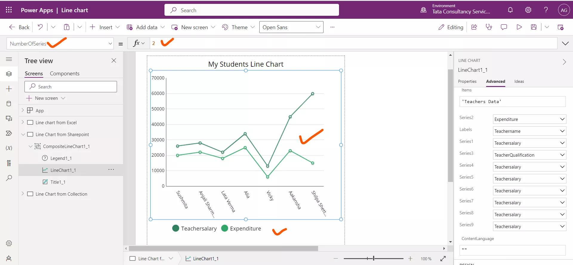
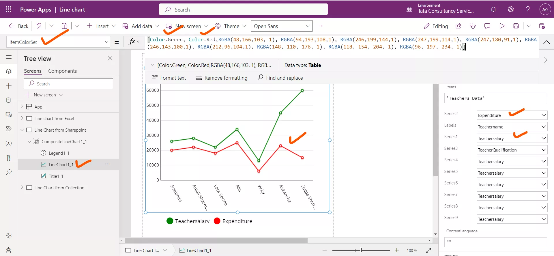
Now set its value to 2. Now in the following image we can see the both column values also legends are updated. We can change the color of the lines by using the ItemColorSet graphic control property.
We have updated the ItemColorSet values, the first value Color.Green applies on the Series1, and the second value Color.Red applies on the Series2.
We can dynamically change the Items property of the Line chart control.
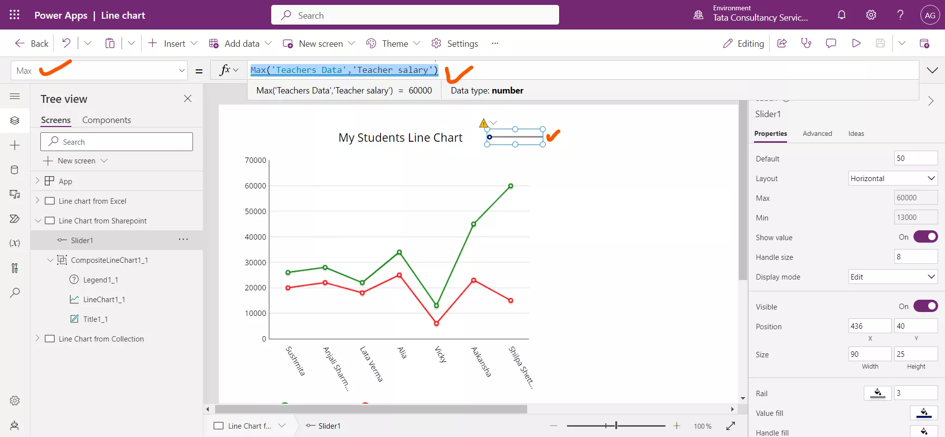
For that I am leveraging the Slider control and set its Max property to the following powerapps formula.
Power Apps Formula
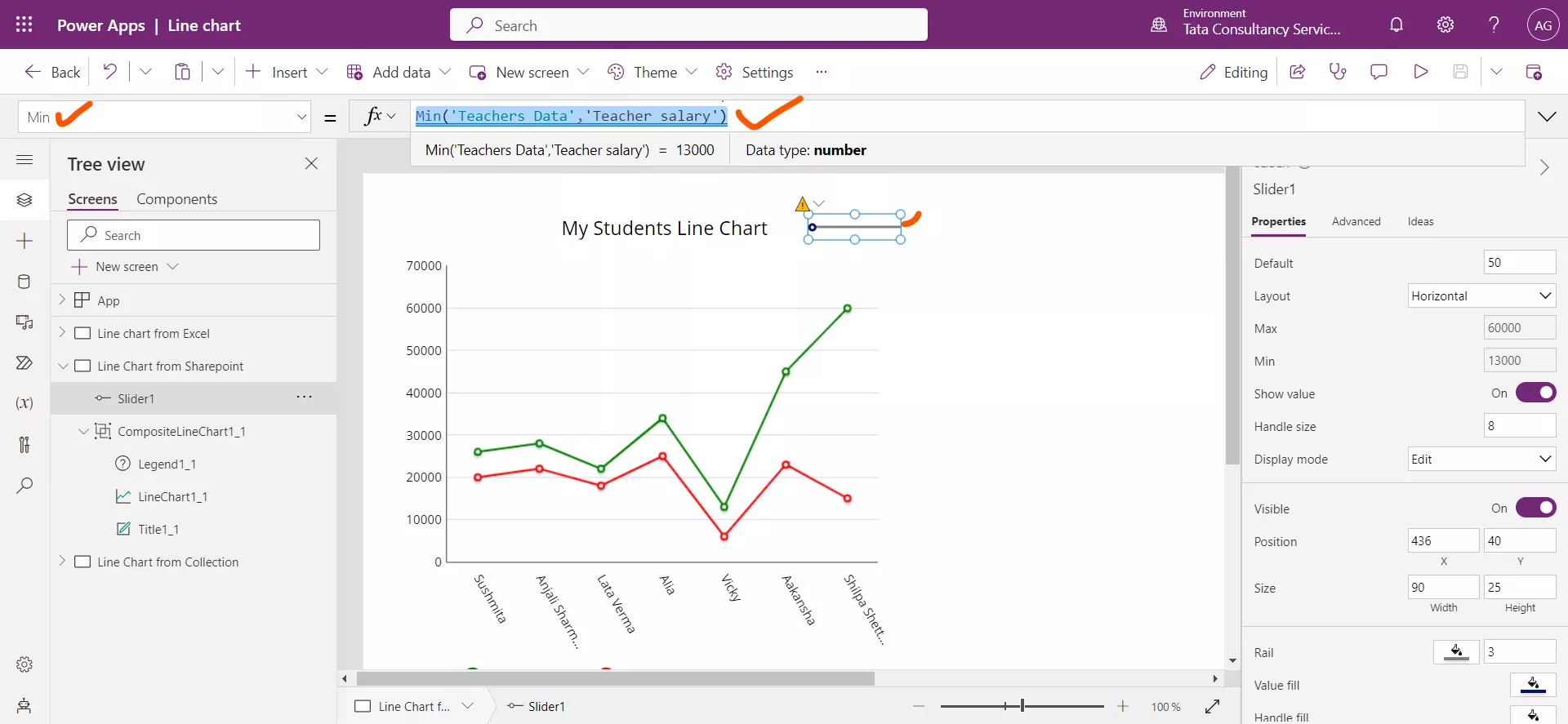
And set its Min property to the following powerapps formula.
Power Apps Formula
And now we change the Items property of the control to the following powerapps formula.
Power Apps Formula
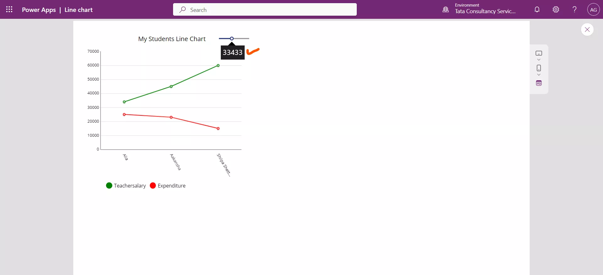
Here we are specifying that the Filter function return only the rows that have ‘Teacher salary’ column value is greater than the Slider1 value.
Put the app in preview mode and let us try the functionality, we can see in the following image that only three persons are there in the list whose salary is more than 33433. We can verify this by the data I have used.
3. Collection as the DataSource
We can use collection as a source of data for the Line chart control.
Add a Button control and set the OnSelect property to the following powerapps formula.
Power Apps Formula
Collect(
    MyFirstCollection,
    { FirstName: "Ashish",   LastName: "Goel",    Marks: 52 },
    { FirstName: "Abhishek", LastName: "Bachhan", Marks: 58 },
    { FirstName: "Ayesha",   LastName: "Sharma",  Marks: 48 },
    { FirstName: "Priya",    LastName: "Verma",   Marks: 67 }
) 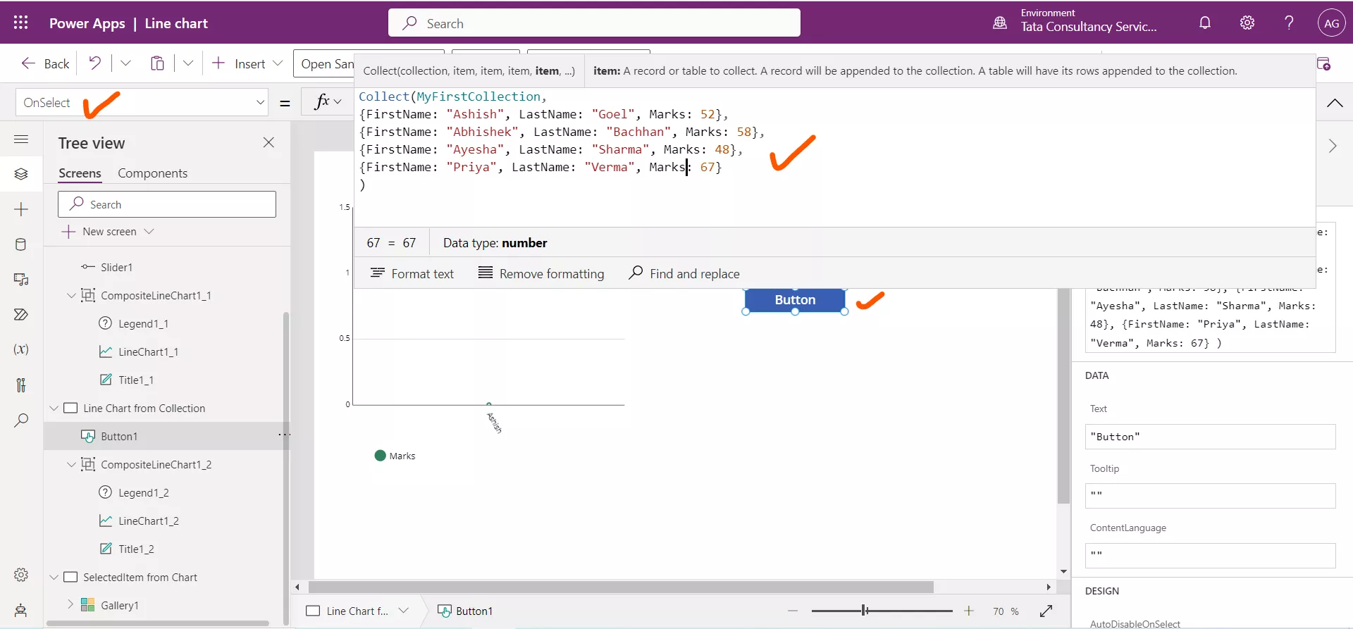
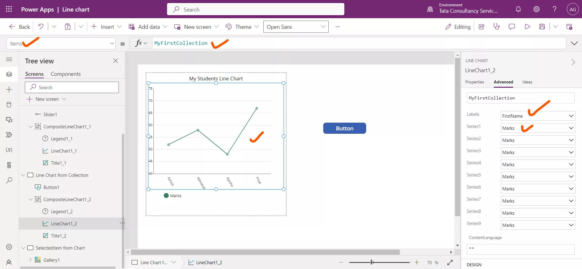
Set the line chart Items property to the name of the collection variable i.e., MyFirstCollection. Similarly set its Series1 to Marks and Labels to First Name.
