Column chart controls in Power Apps
The Column chart controls show data as graphs with x- and y-axes. Column chart is a grouped control. The group contains three controls: a Label for the title, the chart graphic, and a Legend. The Column Chart control is a great way to visualize data in a simple and easy-to-understand format. You can use it to display data trends, comparisons, and distributions in your app.
The column chart has the following properties: 1. Items The Items property specifies the source of data that appears in a control such as a gallery, a list, or a chart. 2. NumberOfSeries The NumberOfSeries specifies how many columns of data are reflected in a column chart. 3. ItemsGap The ItemsGap specifies the distance between columns in a column chart. 4. Markers The Markers property specifies whether the data points are visible on each data point. By default, its value is true. 5. MarkerSuffix The MarkerSuffix property specifies the text that appears after each value in a column chart for which the Markers property is set to true. 6. GridStyle The GridStyle property specifies whether a column chart shows its x-axis, its y-axis, both, or neither.
Example: The following excel file is used for this exercise Chart-controls.xlsx.
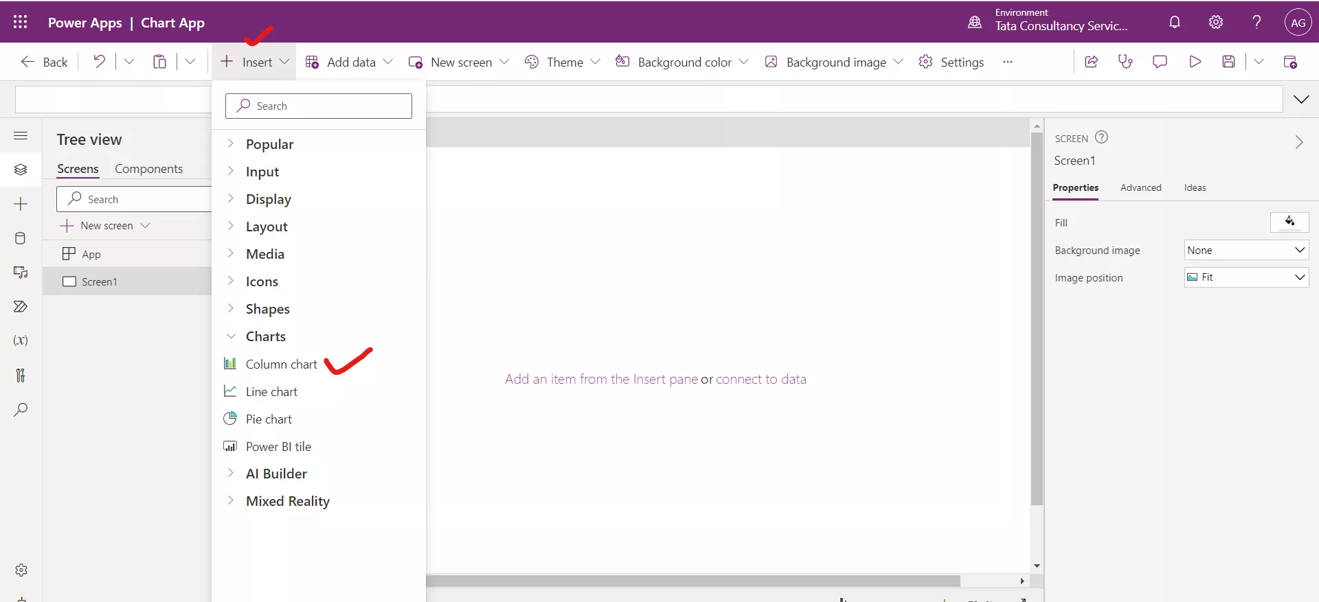
Step 1: Insert a Column chart control.
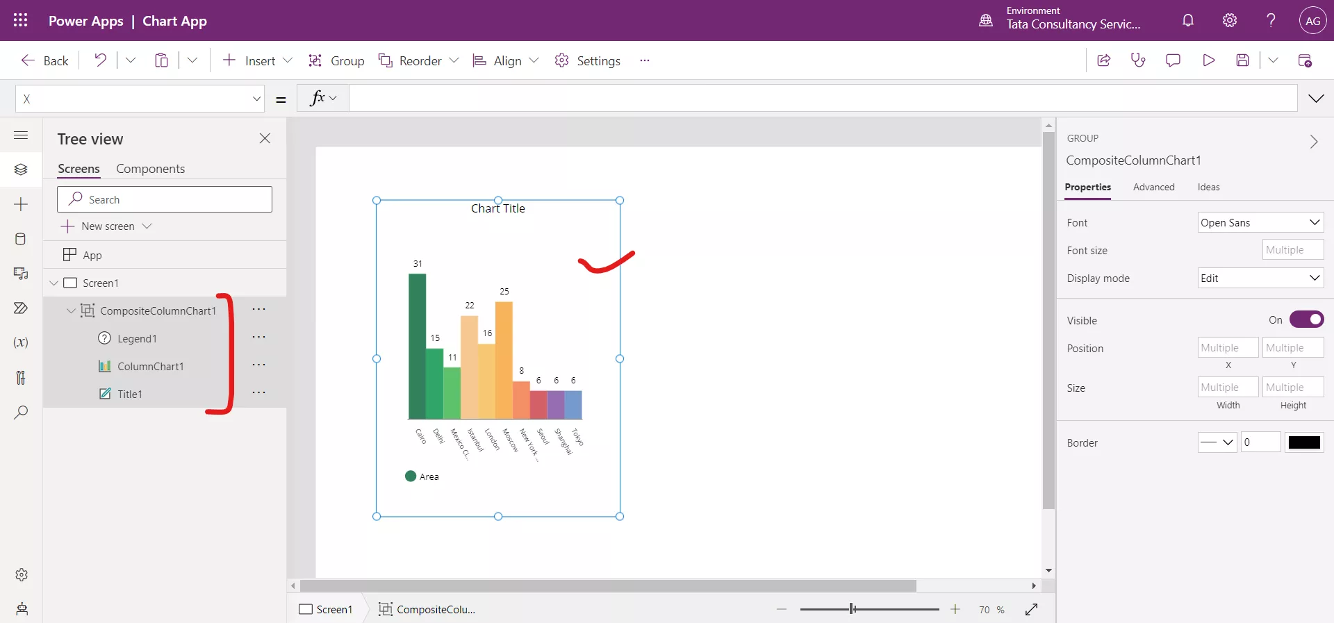
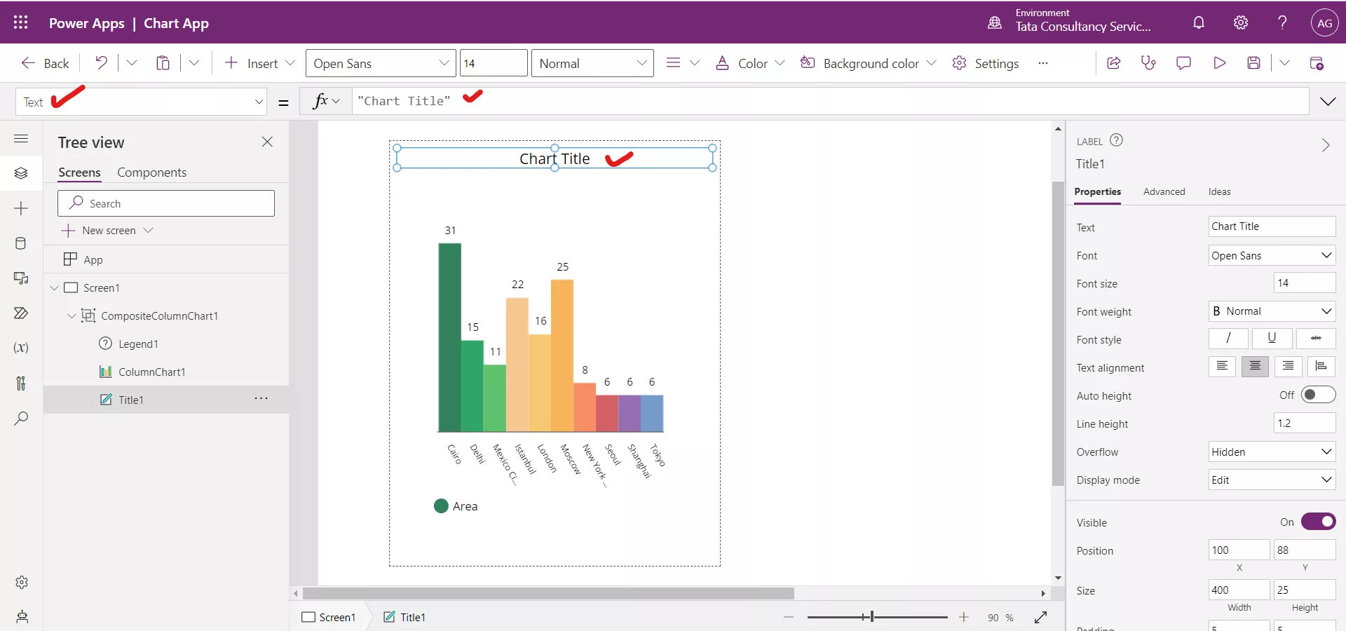
Step 2: There is a Text label control in the group, used to specify the title of the chart. By default, its name is ‘Chart Title’. We can modify it as per our requirement.
After updating the text of the Label control.
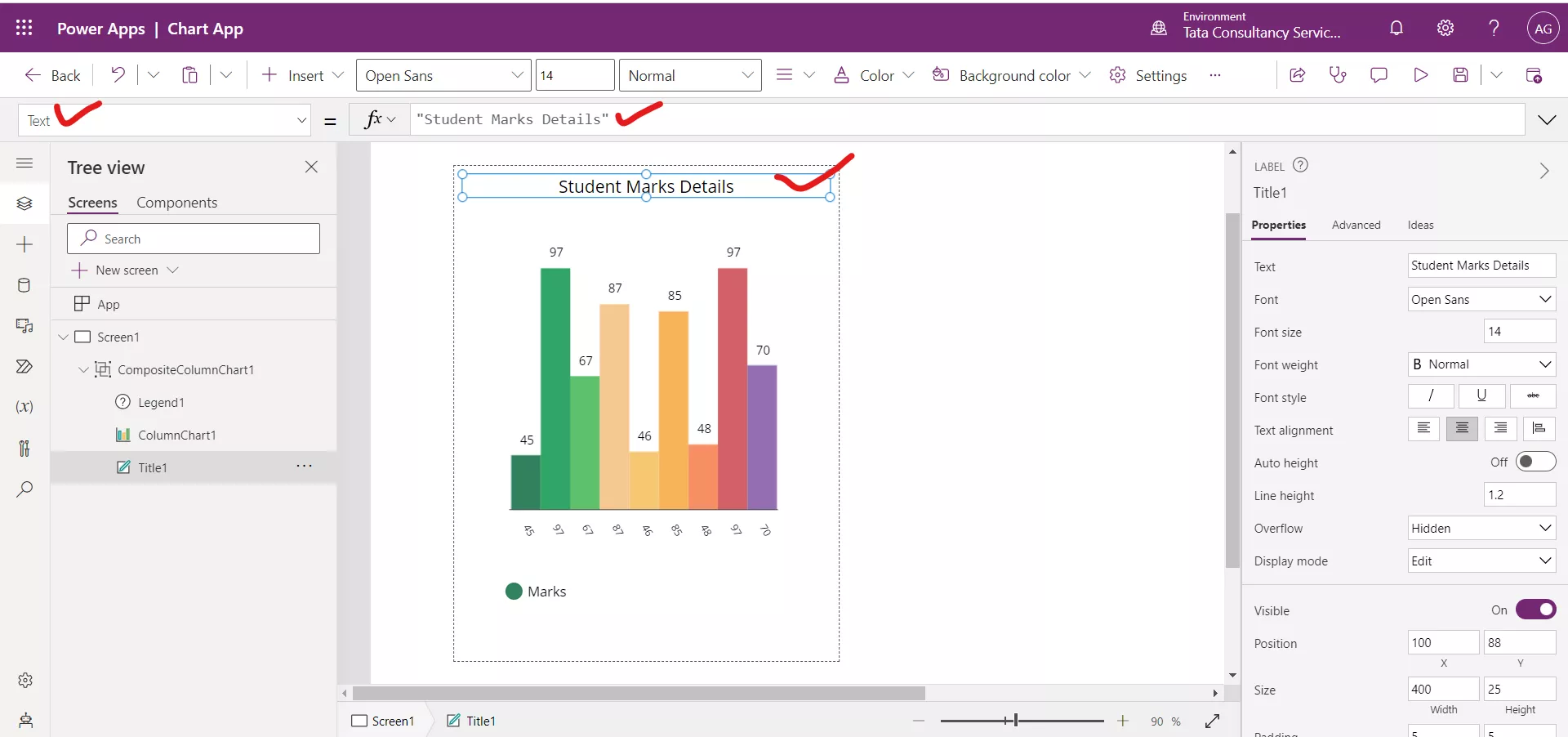
Step 3: Select the Column chart control and set its Items property to the data source.
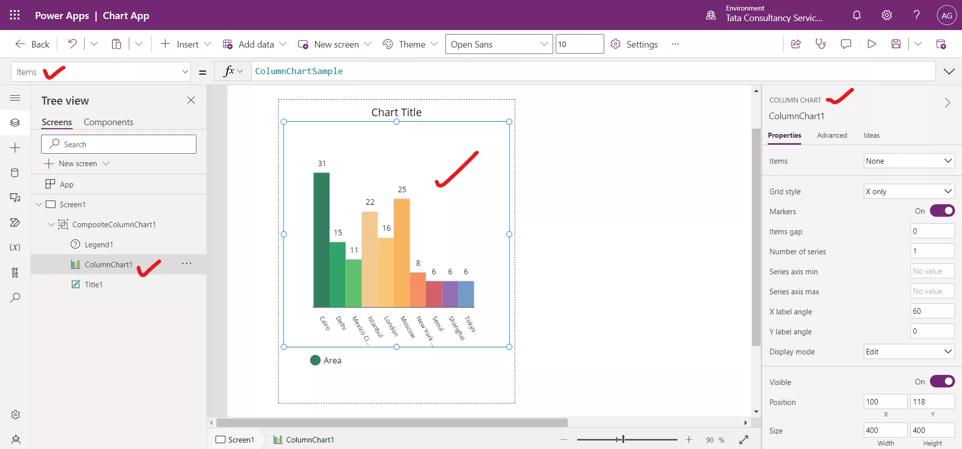
After updating the Items property of column chart.
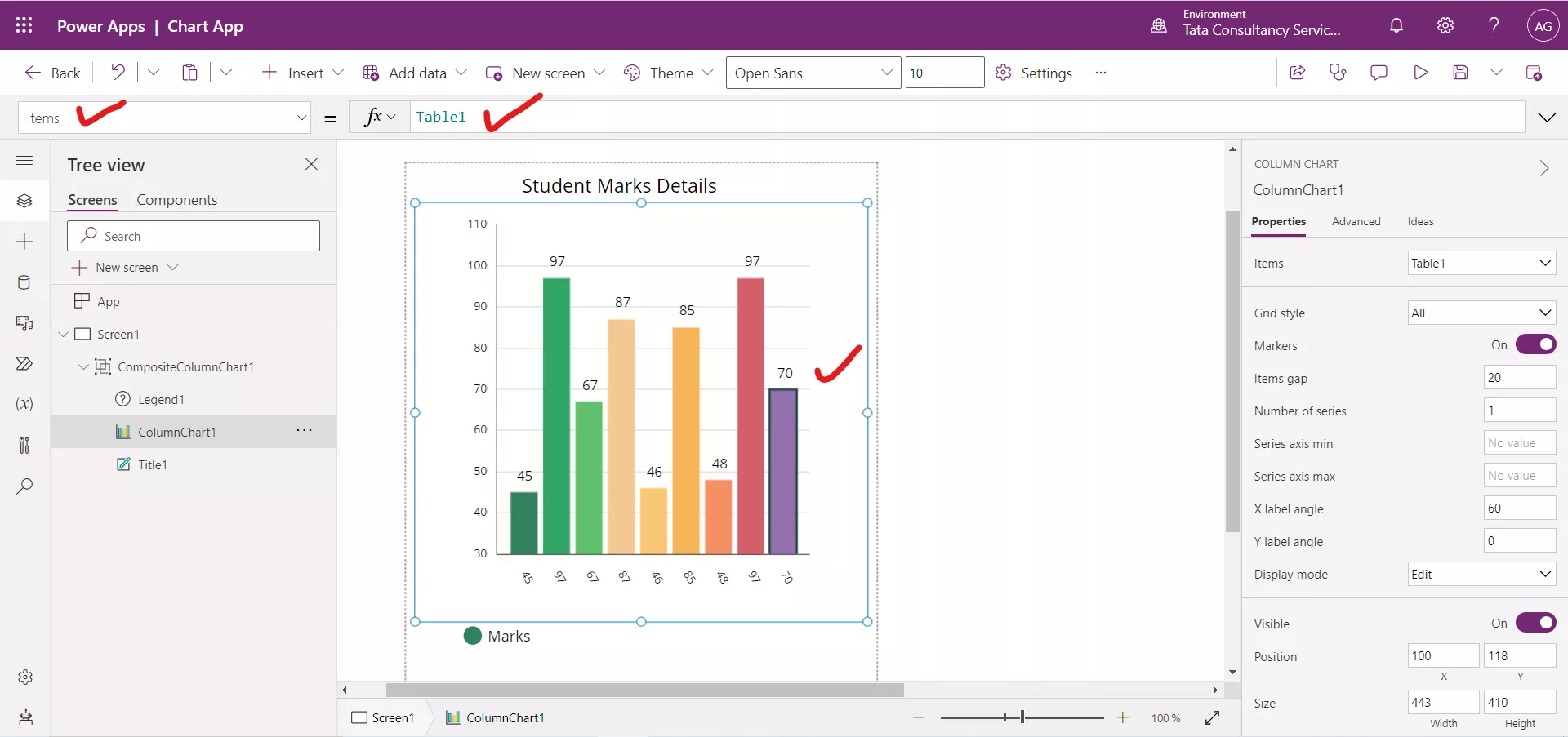
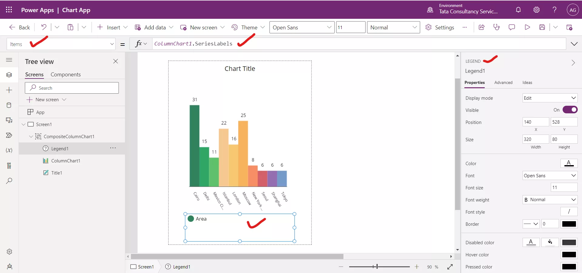
Step 4: There is a Legend control in the group.
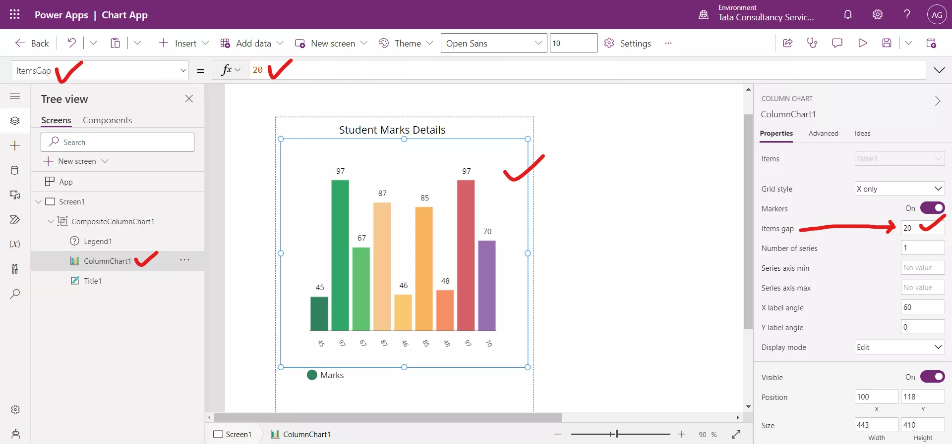
Step 5: Select the column chart. Set the ItemsGap property to value 20. By default, its value is 0.
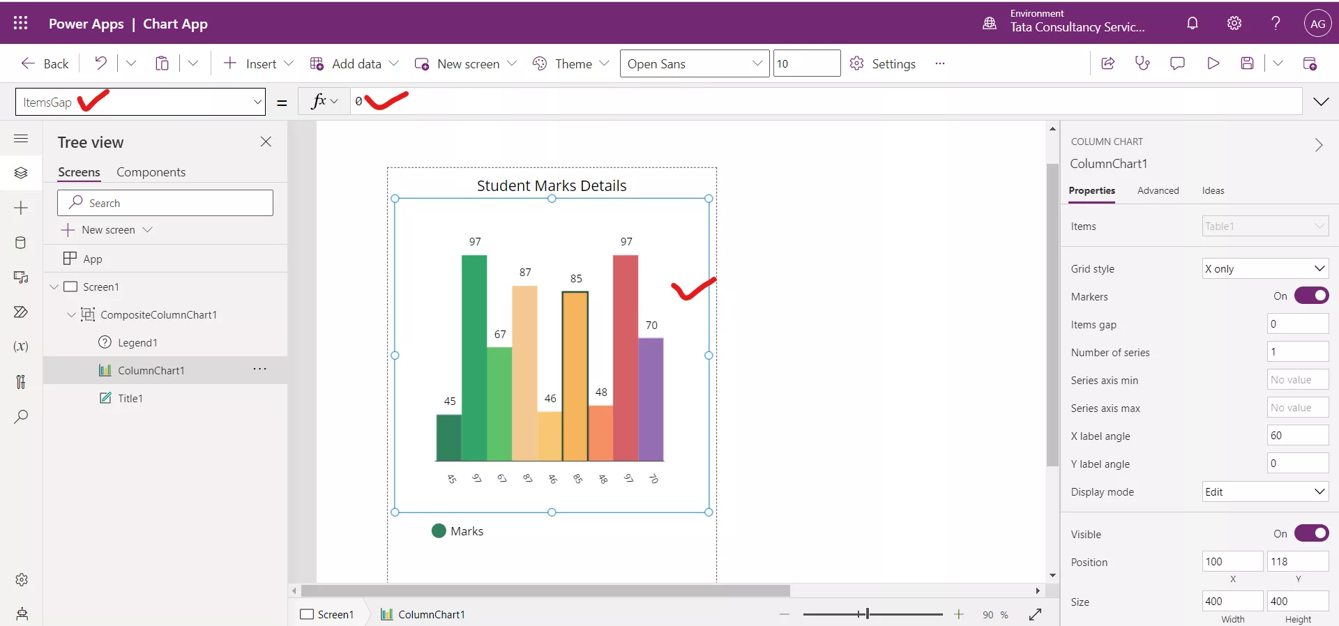
We can see that the columns have gap in between them after setting the value ItemsGap to 20.
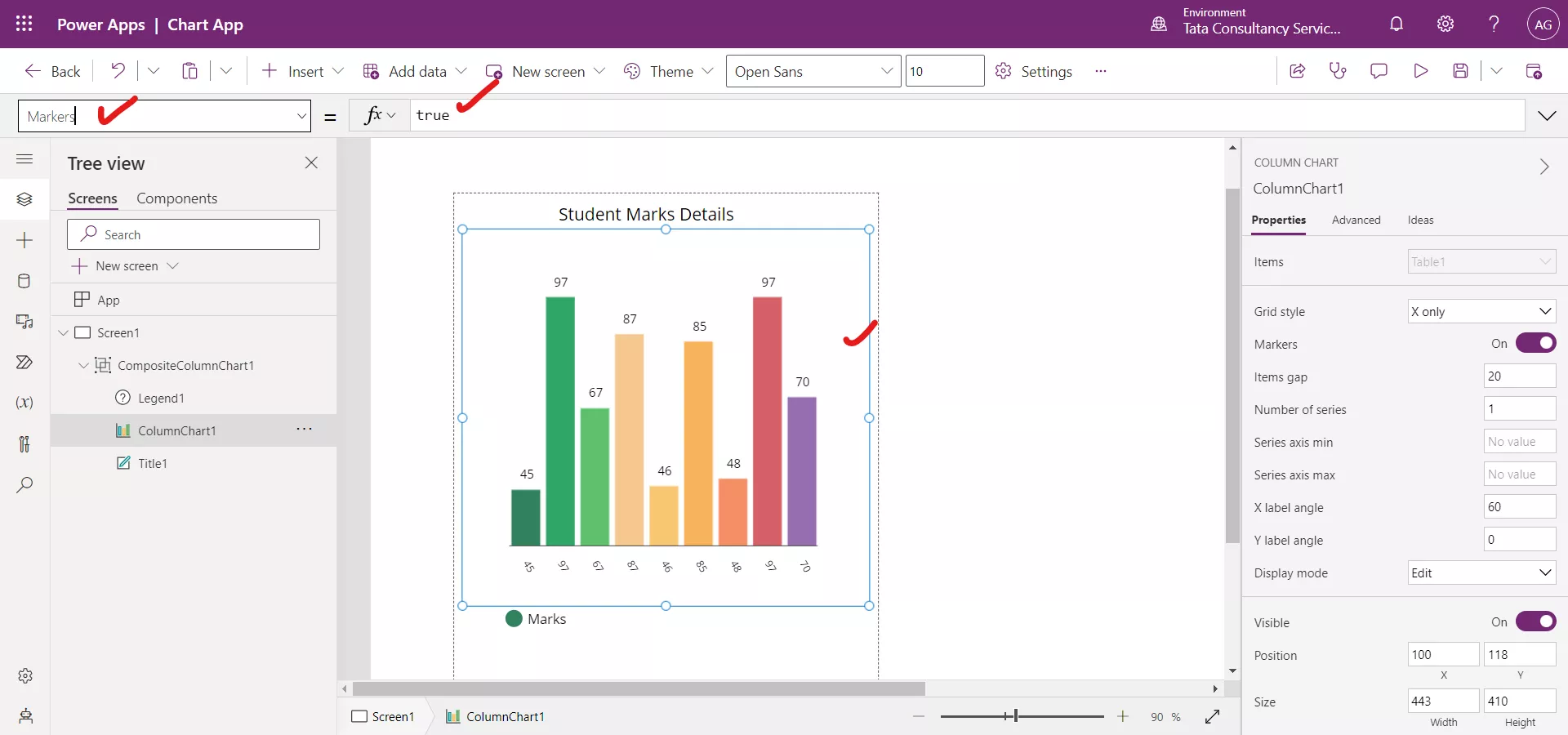
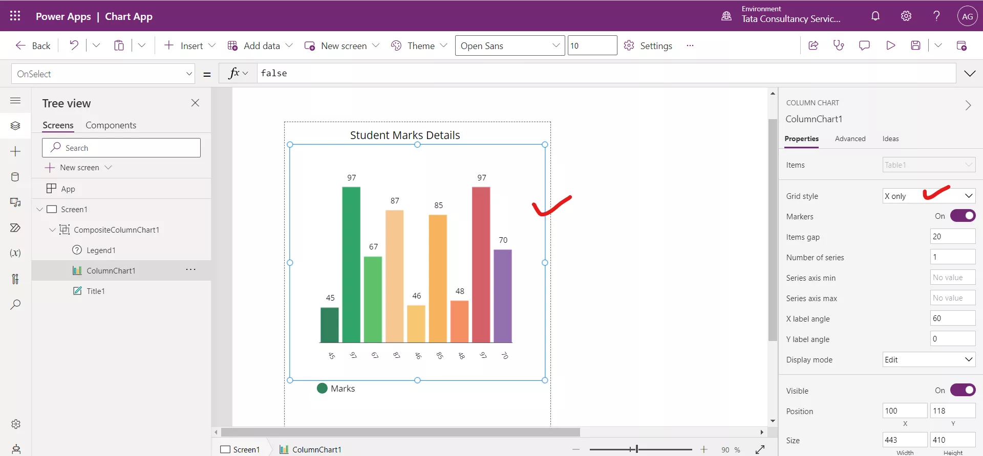
Step 6: The Markers property specifies whether the data points are visible on each data point. By default, its value is true.
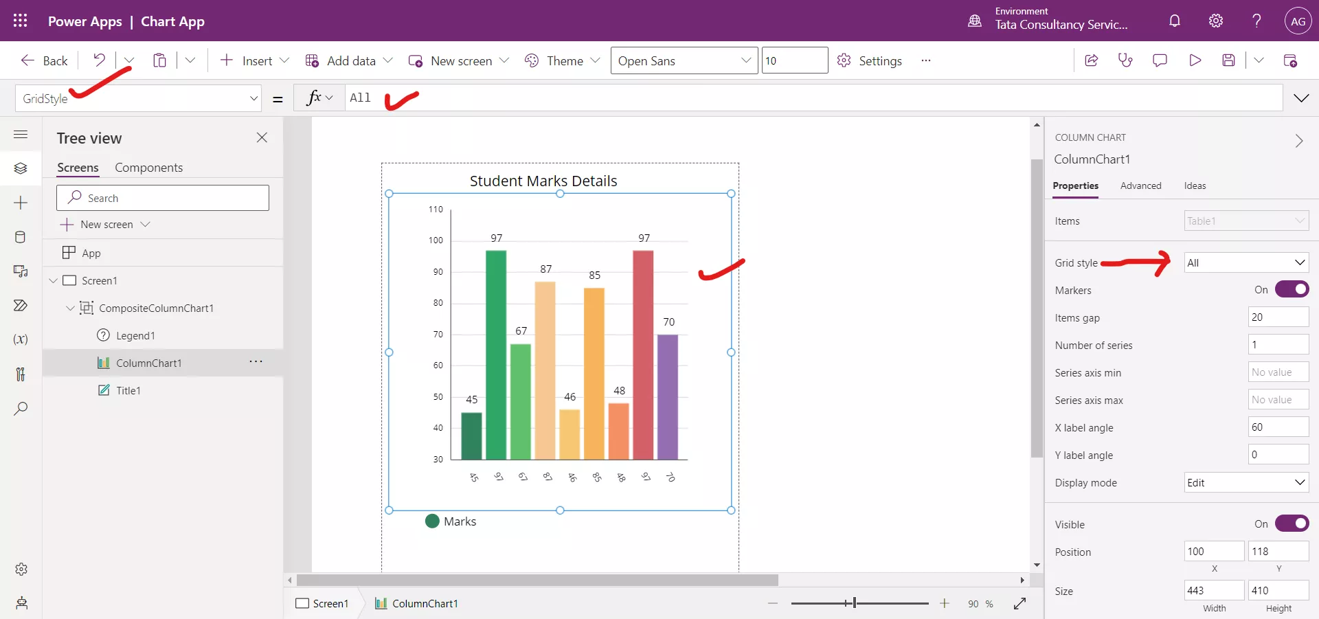
Step 7: Select the column chart and set the GridStyle property value to All.
After changing its value to All.
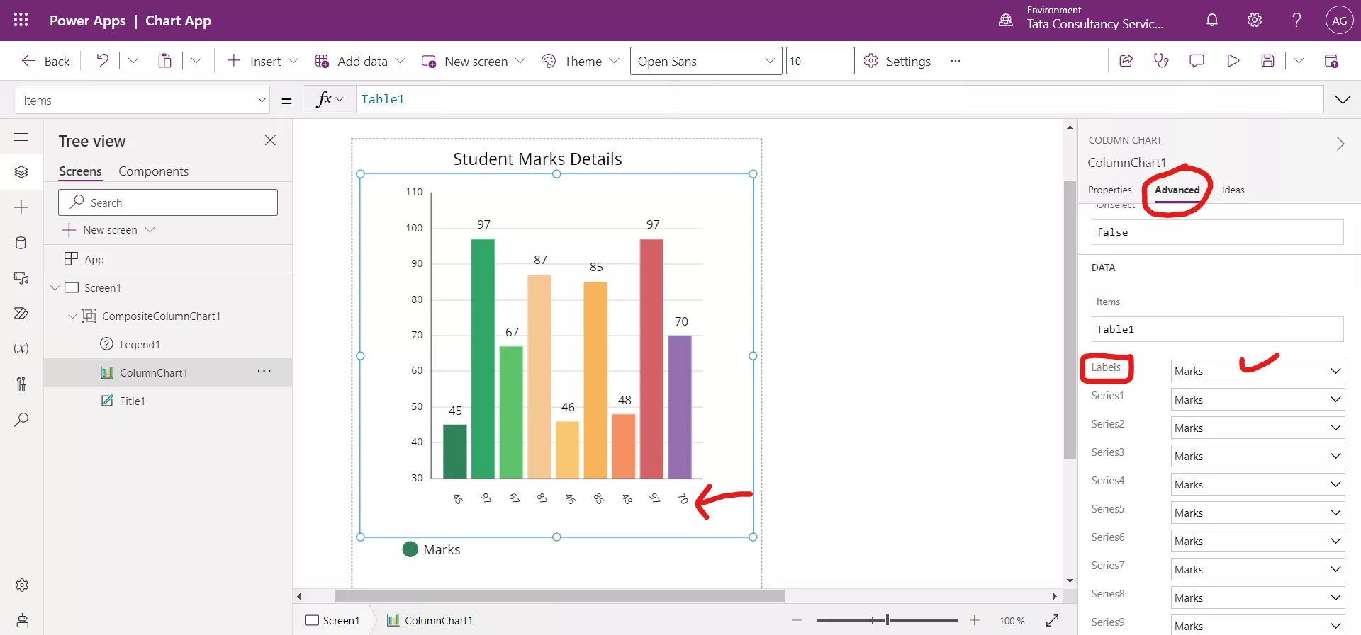
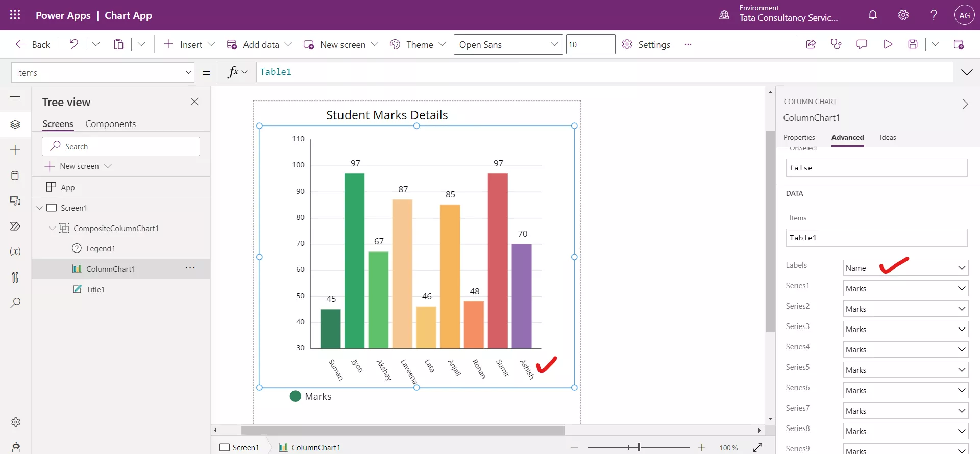
Step 8: Select the column chart and click on the Advanced, scroll down and change the Labels dropdown value to name to display the Name column value below the chart.
After changing the Labels choice value.
Step 9: We can drag the Legend control and place it in the group, where we like.
