Combo box control in Power Apps
The combo box control allows users to make selections from provided choices. The Combo box Control allows us to search for items as well as select multiple items, by default the dropdown control does not support this functionality, with a dropdown control we can only select a single item. The search is performed server-side on the SearchField property so performance is not affected by large data sources.
Note: The dropdown control shows a maximum of 500 items, this limit does not apply to the Combo box.
Note If you want to search for items with numbers, convert numbers to text with Text() function. For example, Text(12345).
People picker
To use Combo box as a people picker, choose the Person template from the Layout settings in the Data pane and configure the related data properties to be shown for the person below. There are the following properties of a combo box control: 1. Items The Items property specifies the source of data from which selections can be made.
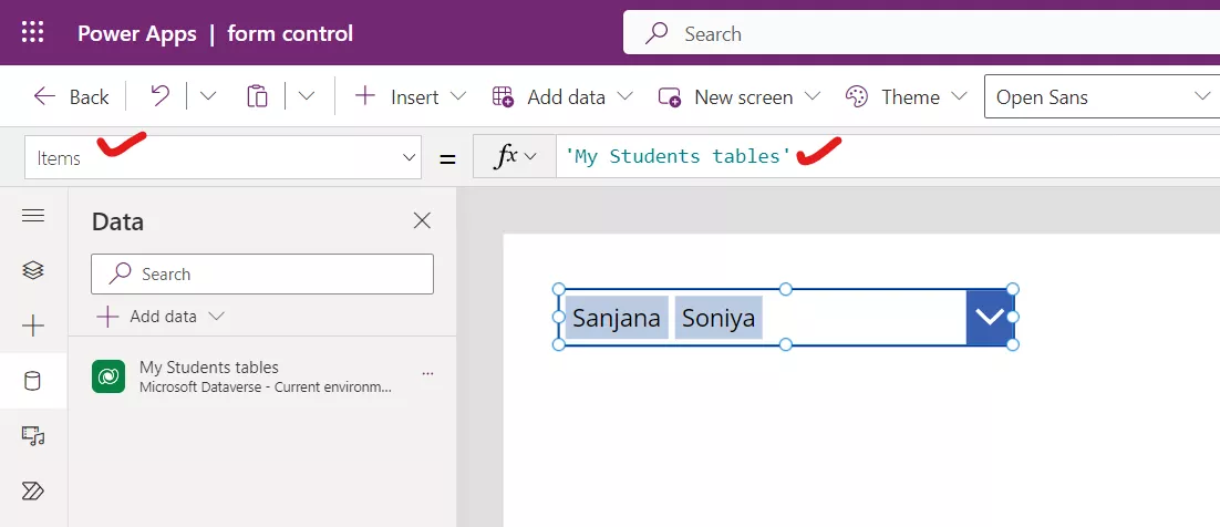
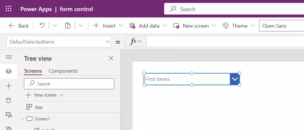
2. DefaultSelectedItems The DefaultSelectedItems property specifies the initial selected item(s) before the user interacts with the control.
Note: Default property is deprecated, use DefaultSelectedItems instead.
Power Apps Formula
3. SelectedItems The SelectedItems property specifies the list of selected items resulting from user interaction.
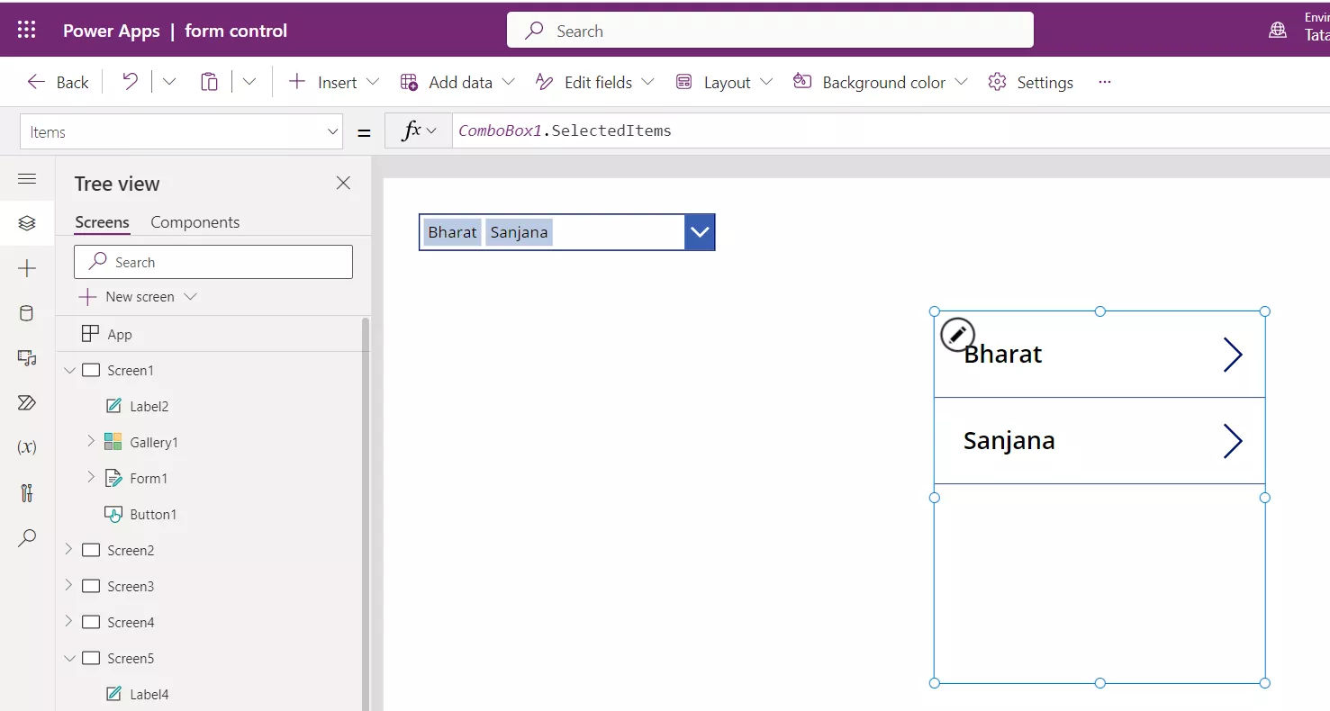
4. SelectMultiple The SelectMultiple property specifies whether the user can select a single item or multiple items is configured via the SelectMultiple property.
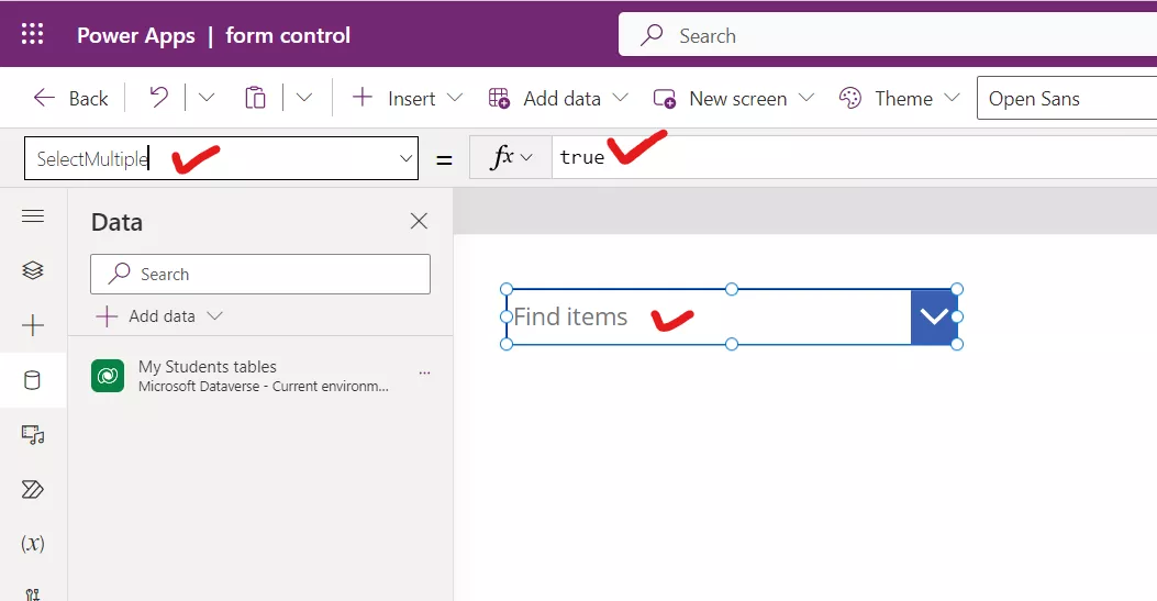
5. IsSearchable The IsSearchable property specifies whether the user can search for items before selecting. After setting it to true, we notice that “Find items” is shown in the combo box.
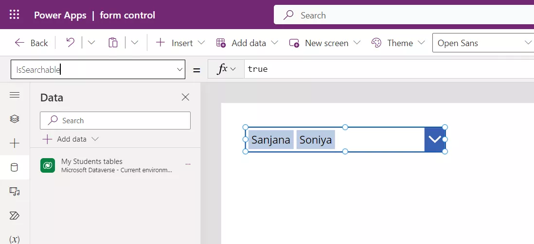
6. SearchFields The SearchFields property specifies the data fields of the data source searched when user is entering text.
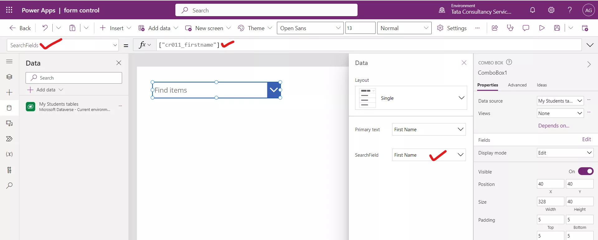
Note: To search on multiple fields, set SearchFields property in this format: ["MyFirstColumn", "MySecondColumn"]. Only text fields are supported.
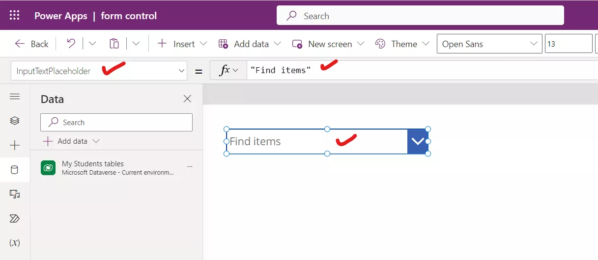
7. InputTextPlaceholder The InputTextPlaceholder property specifies the instructional text shown to end users when no items are selected.
8. X The X property specifies the distance between the left edge of a control and the left edge of its parent container. If there is no parent of the control then the screen itself acts as a parent container. 9. Y The Y property specifies the distance between the top edge of a control and the top edge of the parent container. If there is no parent of the control then the screen itself acts as a parent container. 10. SelectionFill The SelectionFill property specifies the background colour of the selected item in the dropdown choices. 11. SelectionColor The SelectionColor property specifies the text colour of the selected item in the dropdown choices. 12. SelectionTagFill The SelectionTagFill property specifies the background colour of the selected item from the dropdown and appears in the combo box. By default, its value is Self.HoverFill. 13. SelectionTagColor The SelectionTagColor property specifies the text colour of the selected item from the dropdown and appears in the combo box. By default, its value is Self.HoverColor.
Example: Demonstrate the use of Combo box and its various properties. Follow the following steps in the power apps studio to understand about the combo box control.
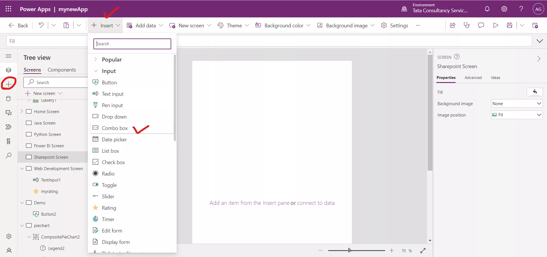
Step 1: Click on the + Insert. Select Combo box, from the Input section and name it "Combobox1".
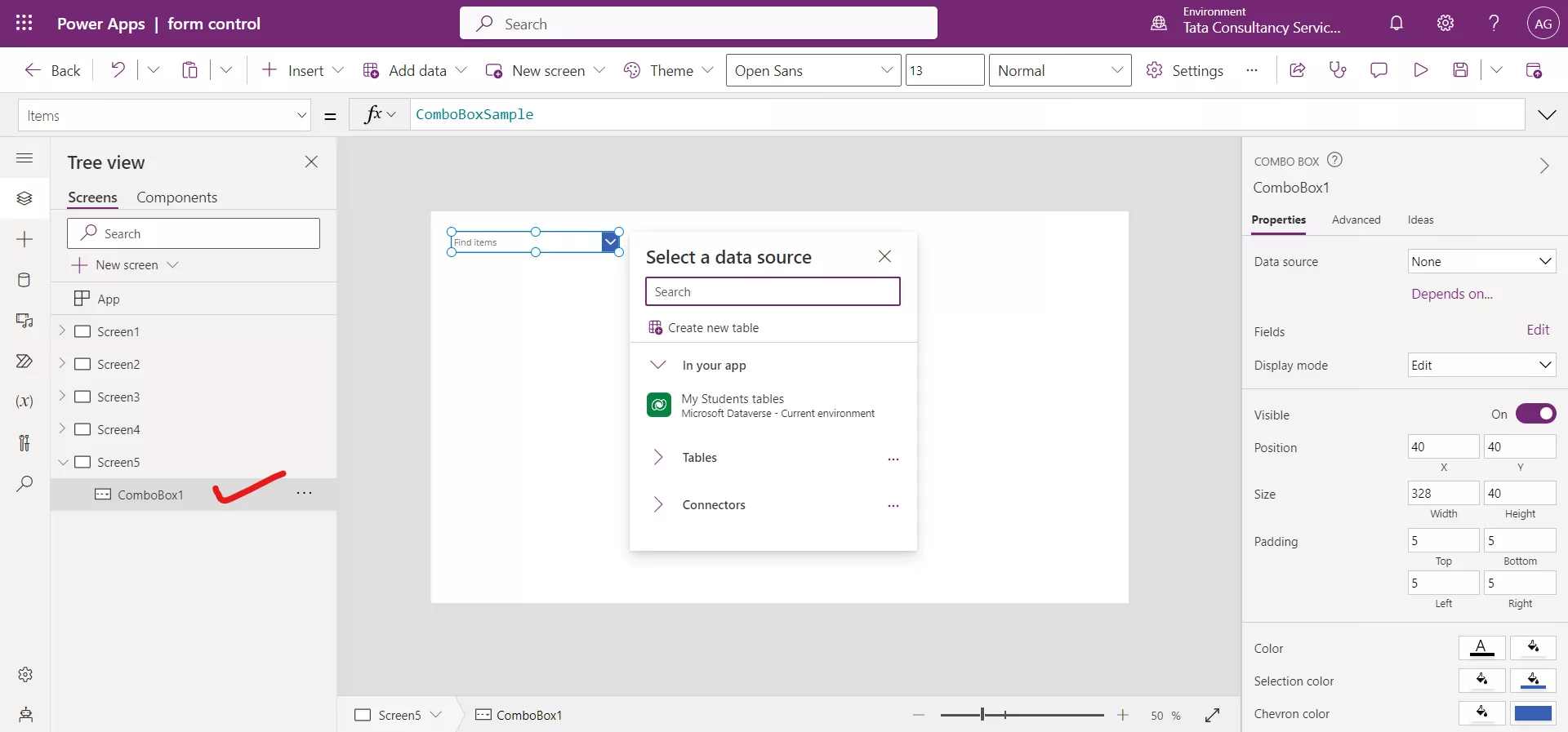
Step 2: On the Properties pane on the right-side of the screen, open the Data source list, and then add or select a data source.
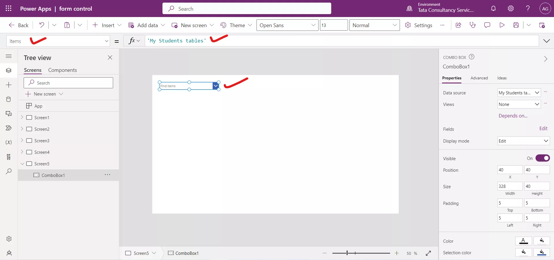
Step 3: On the same pane, select Edit (next to Fields).

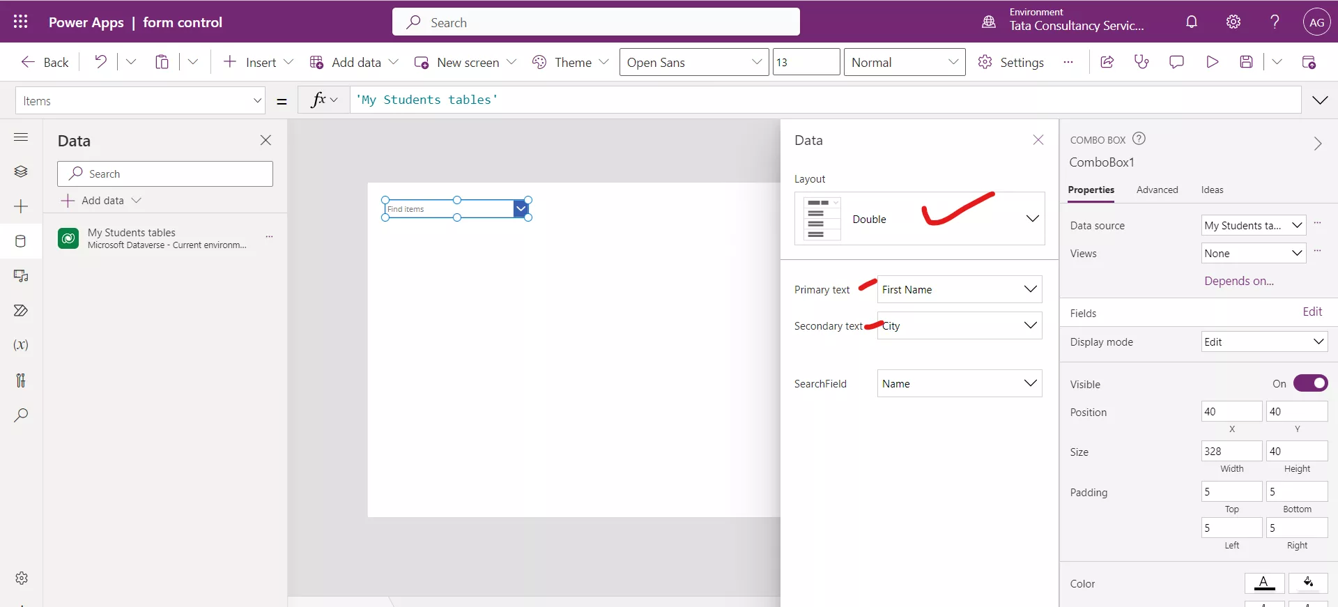
Step 4: In the Data pane, open the Primary text list, and then select the First Name column, or any column that will show in the Combo box control.
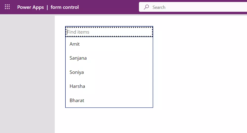
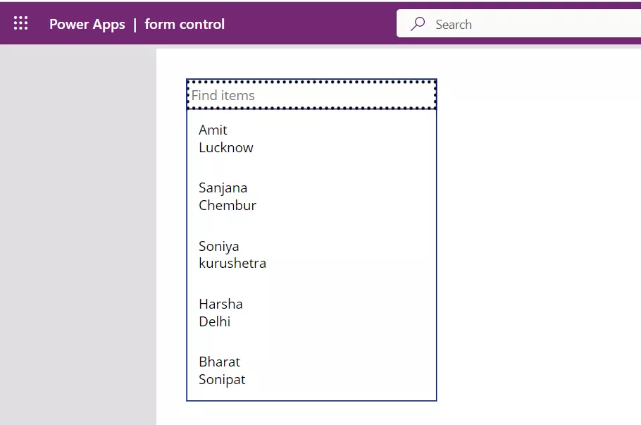
Step 5: While holding down the Alt key, select the down arrow to open the Combo box control. The control shows the data from the First Name that we specified in the data source that we specified.
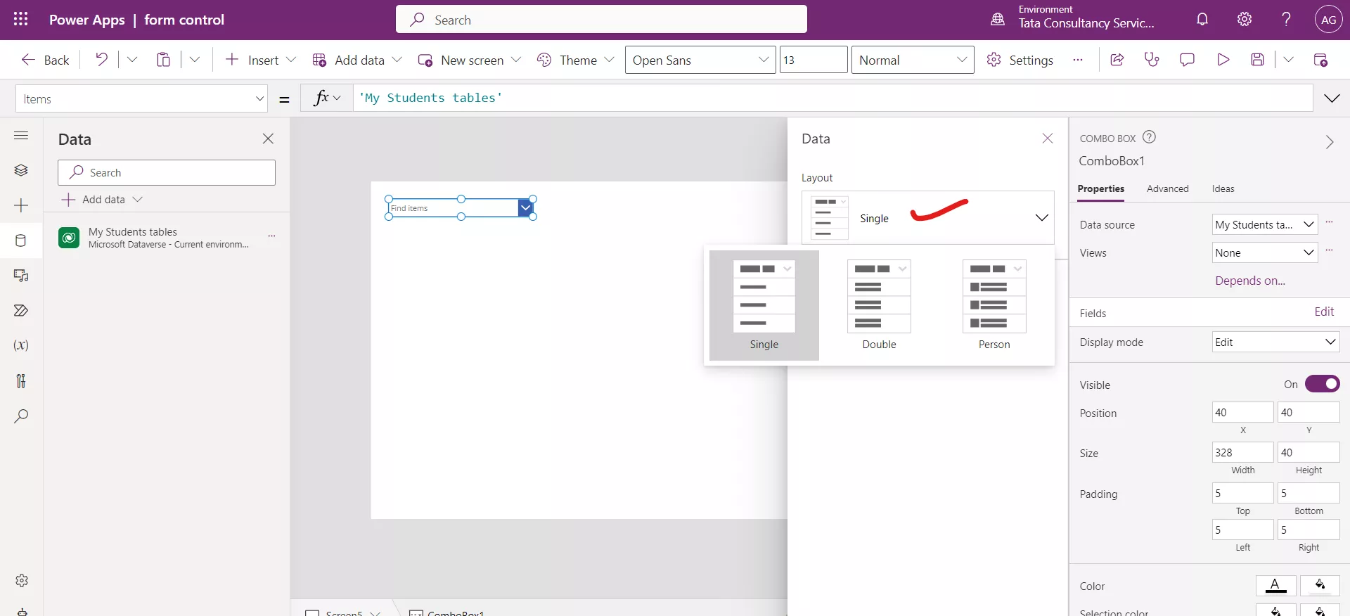
Step 6: For each item we can choose to show a single data value, two values, or a picture and two values (Person) by modifying the Layout settings in the Data pane.
a) Single
For single layout we need to give one column in Primary text.
b) Double For double layout we need to give two columns in values.
The OnSelect Vs OnChange Property of Combo box
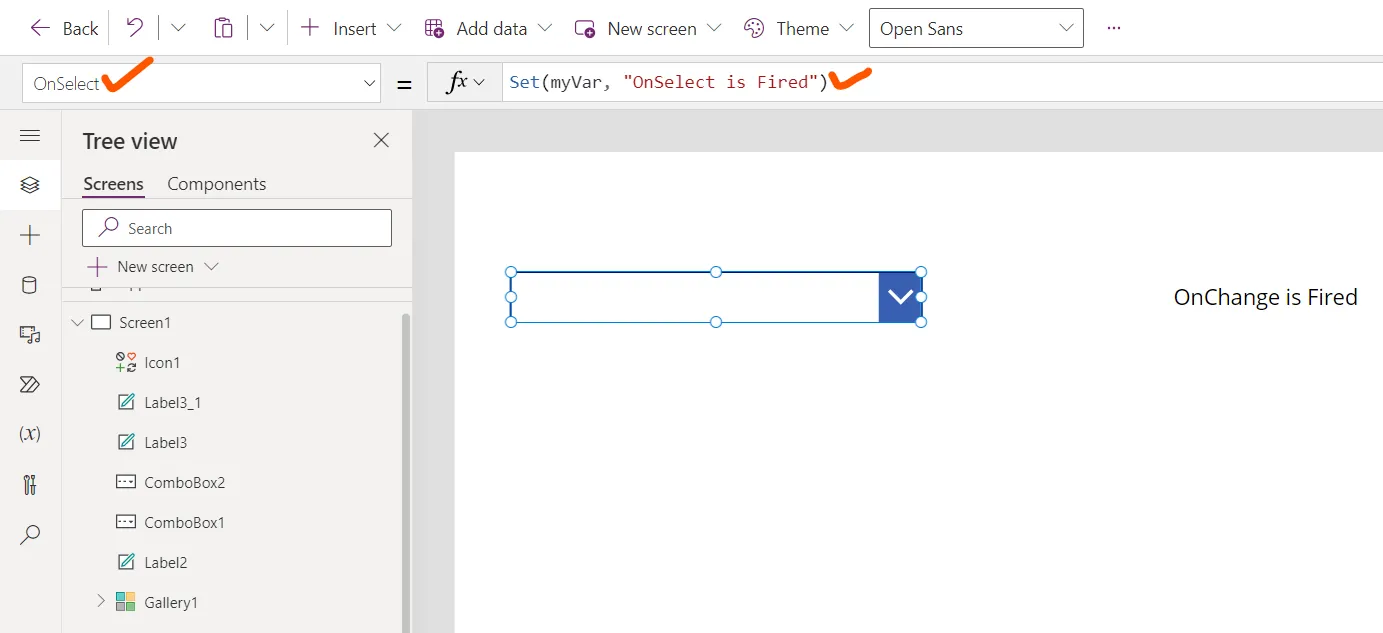
The OnSelect property specifies the actions to perform when the user taps or selects a control itself. By default, its value is false.
Set the OnSelect property of the control with the following power apps formula.
Power Apps Formula
The OnChange action will fire each time when we select or deselect an item in the Combo box. Set the OnChange property of the control with following power apps formula.
Power Apps Formula
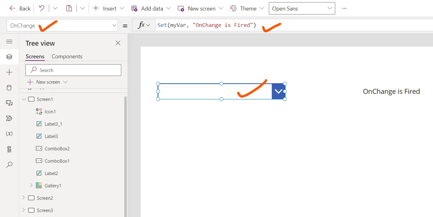
Add a Text label control and set its Text property to the variable myVar.
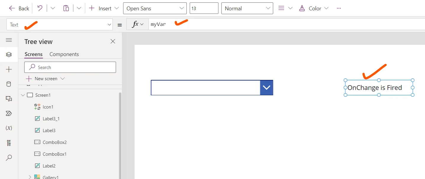
In practice, we might use these events in various ways depending on our app's requirements. For instance, if we have a combo box that allows users to filter data, we might use the "OnChange" event to apply the selected filter to a data source. On the other hand, if clicking the combo box opens a help menu or navigates to a different screen, we would likely use the "OnSelect" event to handle those interactions.