List Box control in Power Apps
A list in which the user can select one or multiple items. A List Box control always shows all available choices (unlike a Dropdown control) and in which the user can choose more than one item at a time (unlike a Radio control).
The List Box has the following properties: 1. Size The Size property specifies the font size of the text that appears on a control.
2. Tooltip The Tooltip property specifies the explanatory text that appears when the user hovers over a control.
3. Visible The Visible property specifies whether a control appears or is hidden.
4. X The X property specifies the distance between the left edge of a control and the left edge of its parent container. If there is no parent container of the control and screen itself acts as a parent container.
5. Y The Y property specifies the distance between the top edge of a control and the top edge of the parent container. If there is no parent container of the control and screen itself acts as a parent container.
Example: Demonstrate the use of List box control and its various properties.Step 1: Add a List box control to the Power apps canvas.
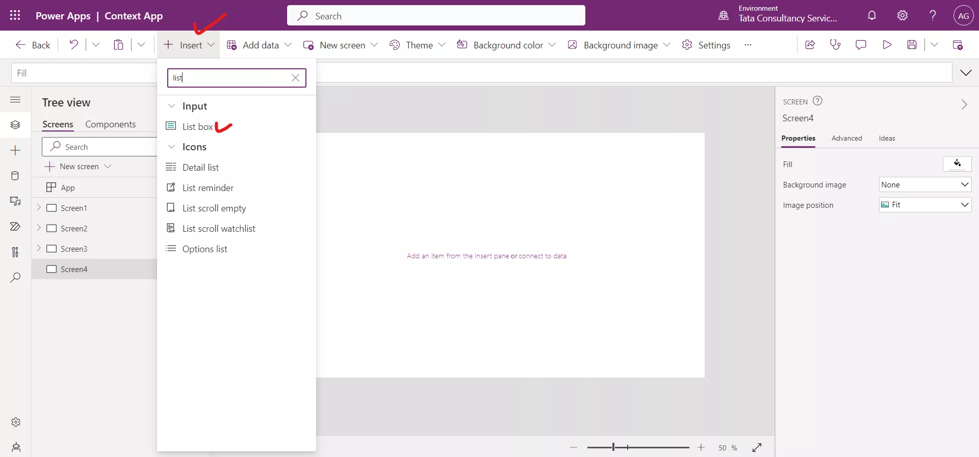
We can see a List box control with some predefined data loaded in the control.
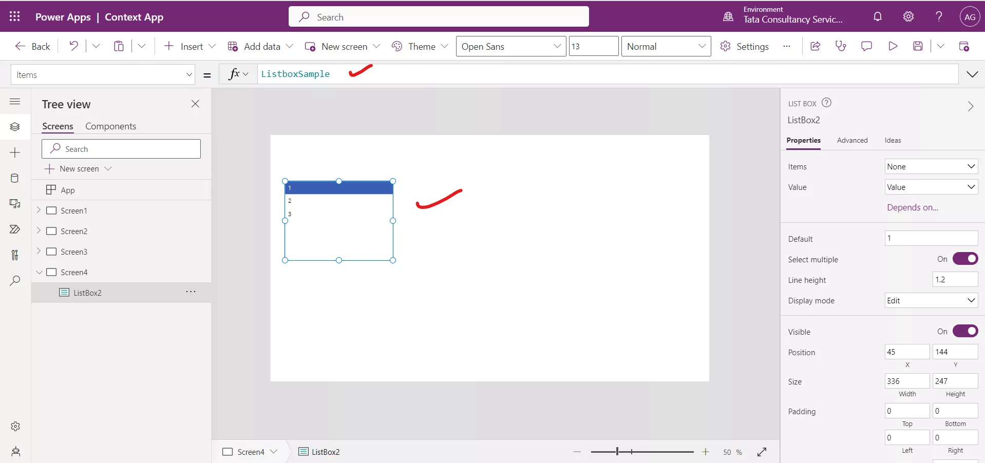
Step 2: Let us write the following powerapps formula in the Items property of the control in power apps.
Power Apps Formula
The Items property specifies the source of data that appears in a List box control.
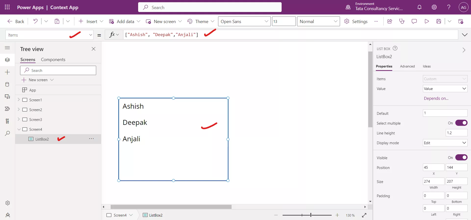
Step 3: The SelectMultiple property takes the boolean value true or false and specifies whether a user can select more than one item in a listbox.
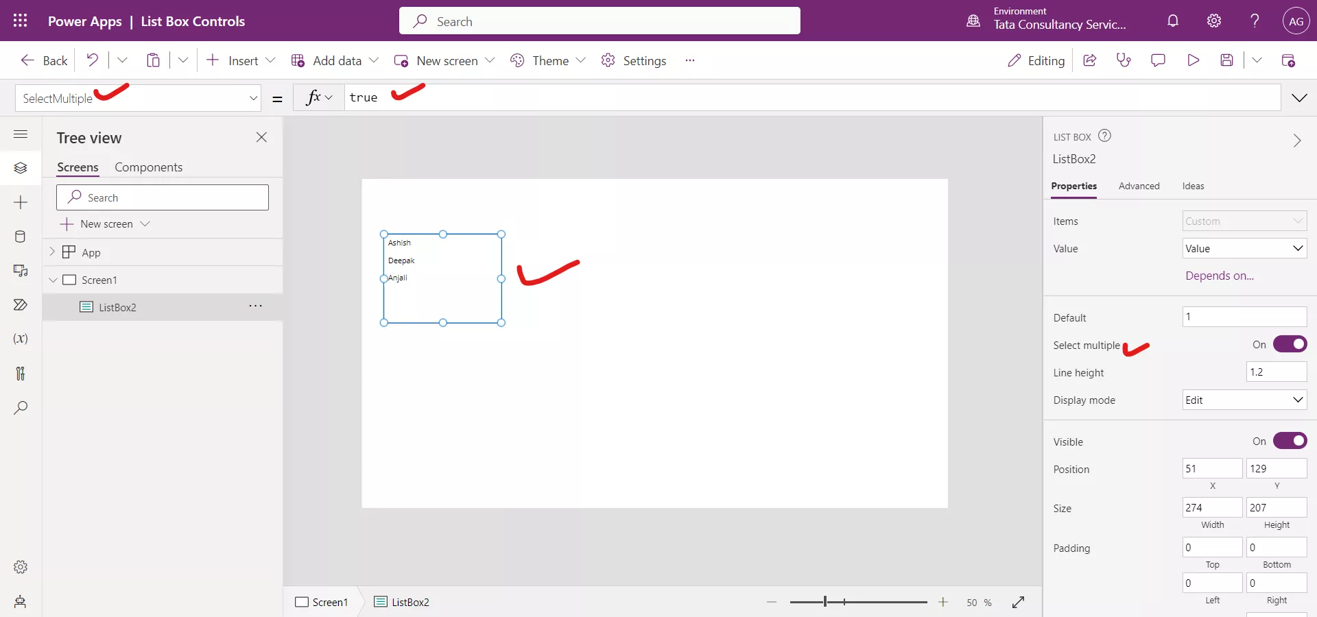
If the value is true, we can select we can select two or more than two items in the List box control.
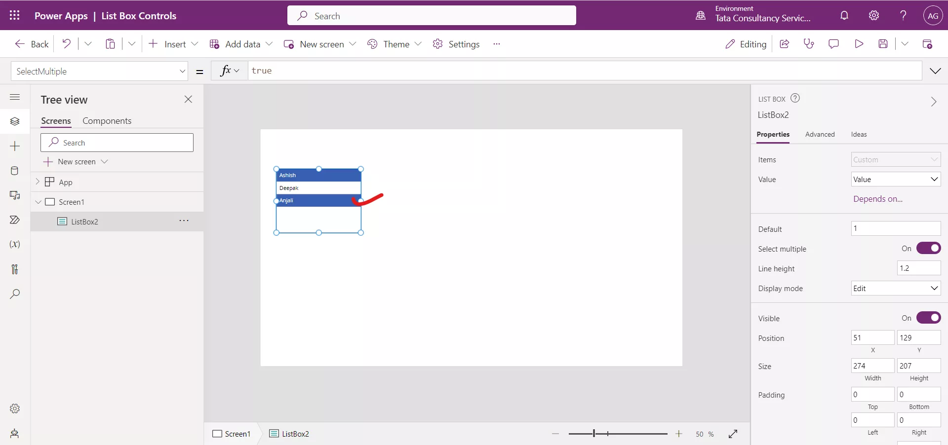
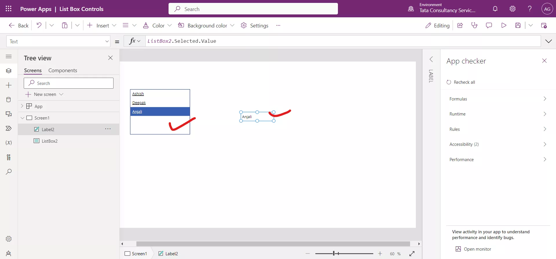
Step 4: With list box control we can leverage the Selected property of the controls.
Power Apps Formula
Here, ListBox2 is the name of our listbox control.
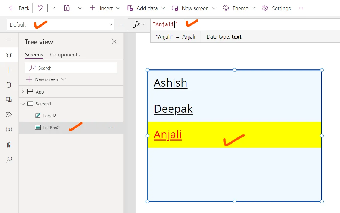
Step 5: Set the Underline property to true.
The Underline property specifies whether a line appears under the text that appears on a control.
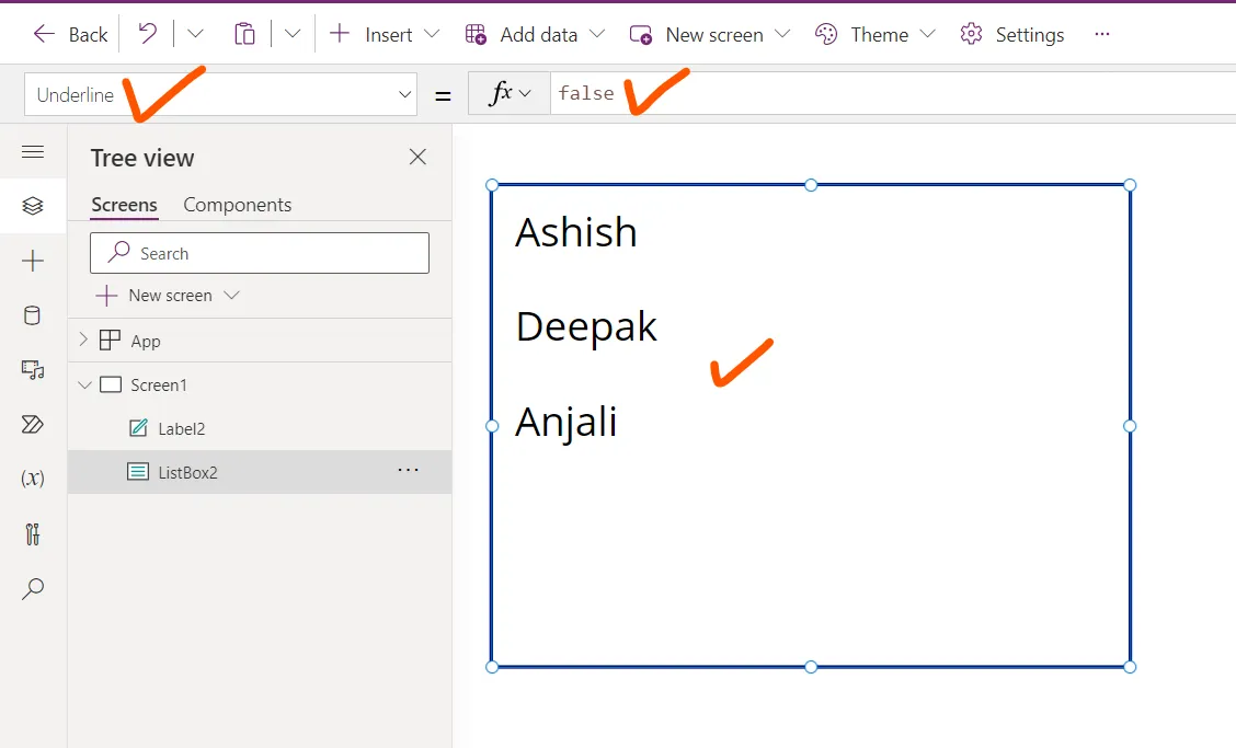
We can see the change in the following image.
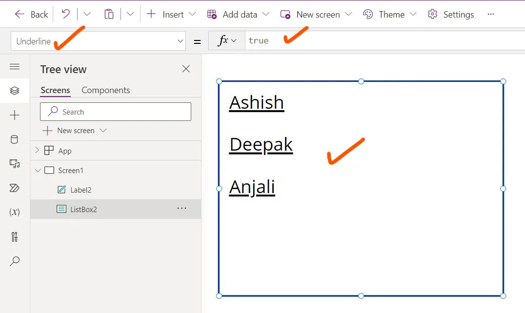
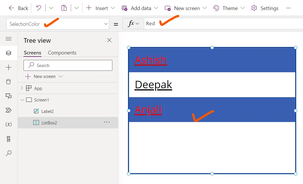
Step 6: Set the SelectionColor property to the value Color.Red. This property specifies the text color of a selected item or items in a list.
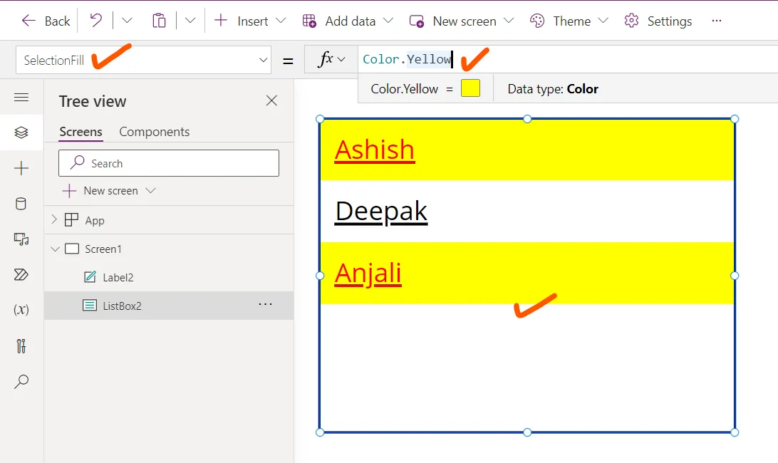
Step 7: The SelectionFill property specifies the background color of a selected item or items in a list.
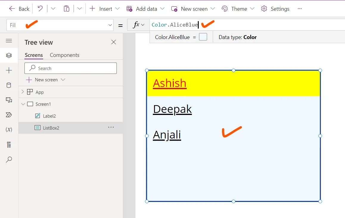
Step 8: The Fill property specifies the background color of a List box control.
Step 9: The Default property specifies the initial value of a control before it is changed by the user. Note: We can only have one default selected item. If you need multiple selected items, please use the Combo Box control.
