The display mode of a control
In Power Apps, the DisplayMode property of a control allows us to modify how controls and information look and function when using the app. For example, if we have a button on the screen but it should only be selected when needed. Otherwise, the button is disabled, and users cannot select it. This is a common example and can be done by properly configuring the DisplayMode.
There are three DisplayModes on every control, except a screen:
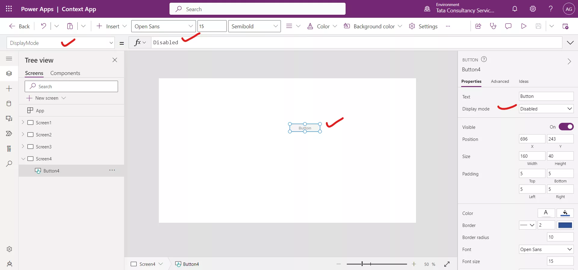
- DisplayMode.Disabled
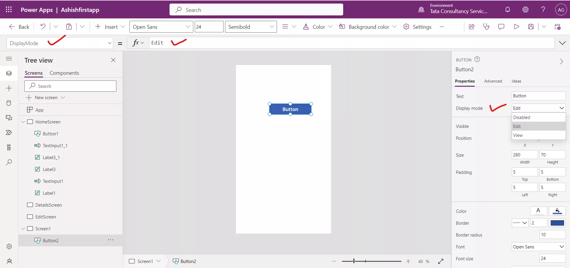
- DisplayMode.Edit
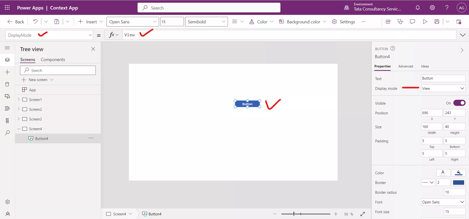
- DisplayMode.View
1. DisplayMode.Edit Let us take the Button control as an example, when the DisplayMode property is set to DisplayMode.Edit, the button functions as we would expect. This means that users can interact with the button, by selecting it. This also means that other properties for the control, such as OnSelect, are available to trigger actions when the button is selected.
When we add a control to our app, by default the DisplayMode is set to DisplayMode.Edit.

2. DisplayMode.Disabled Let us take again the Button control as an example, when the DisplayMode property is set to DisplayMode.Disabled, the button appears greyed out and can't be selected. The reason the control looks greyed out is because of the disabled properties. Each control has slightly different disabled properties, which determine how the control looks in this mode. We can change these by using the following properties:
- DisabledBorderColor - The color of a control's border.
- DisabledColor - The color of the text in a control.
- DisabledFill - The background color of a control.

3. DisplayMode.View Again, take Button control as an example, when the DisplayMode property is set to DisplayMode.View, the button looks exactly like when it is in DisplayMode.Edit, but it is not selectable. It can be confusing for end users.

If we plan to have a button or buttons configured in your app that can only be selected at certain times, set the DisplayMode property to DisplayMode.Disabled instead of DisplayMode.View. While both modes do not allow the user to select the button, the disabled mode also gives a visual indication that it is not selectable.
Each Control functions slightly differently, so DisplayMode for one control may not affect another control the same way.