Configure charts and dashboards in model-driven apps
In this exercise, we will learn how to configure charts and dashboards in the model-driven applications.
Charts provide an interactive view of data. To create or configure a chart for our table by using Power Apps, we can use the following steps:
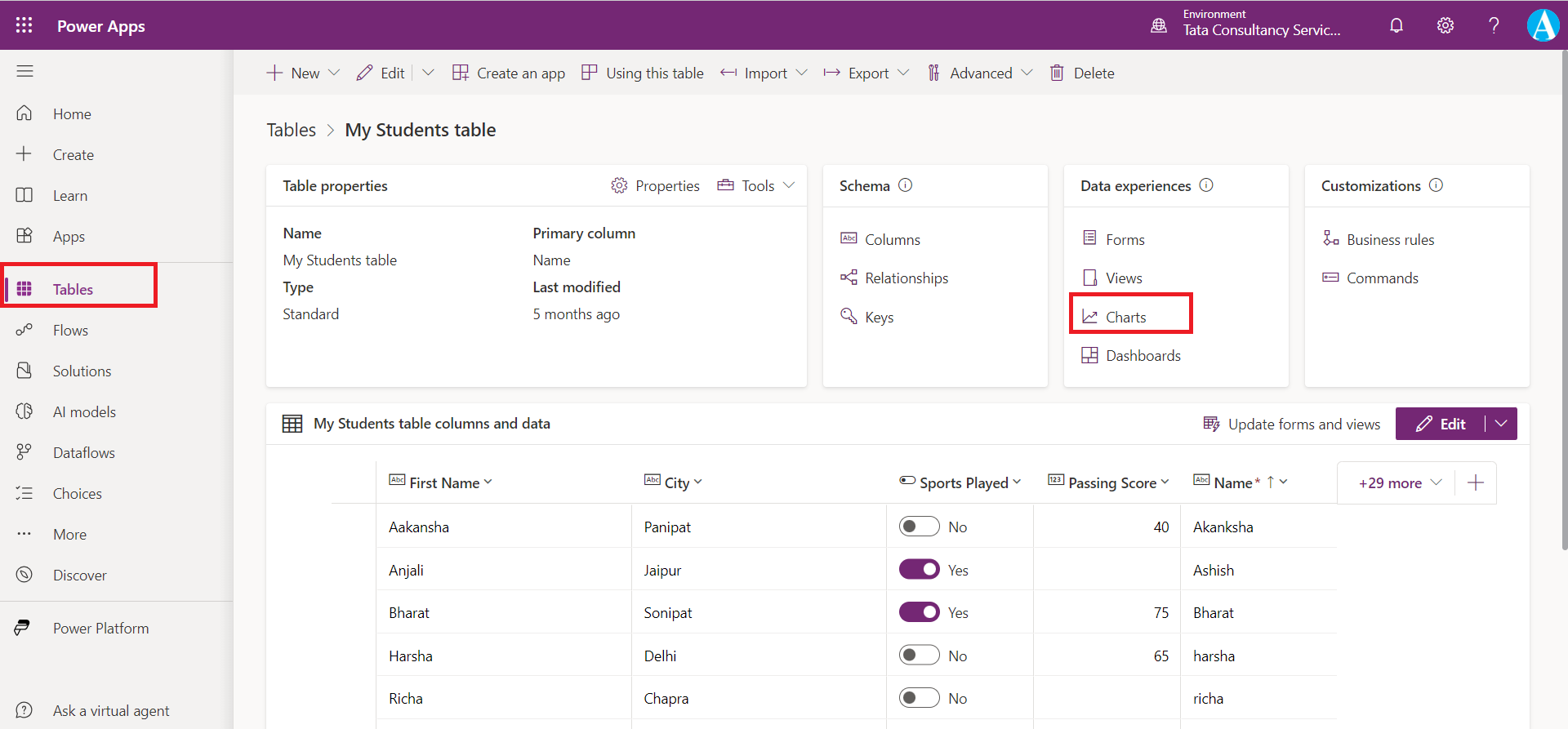
Step 1: Sign in to the Power Apps, select Tables from the left navigation.
Step 2: Select the table where we wish to create the view. Ideally we want to pick a table that already has data in it.
Step 3: From the Tables dashboard for our selected table, look in the Data experiences pane and select Charts.
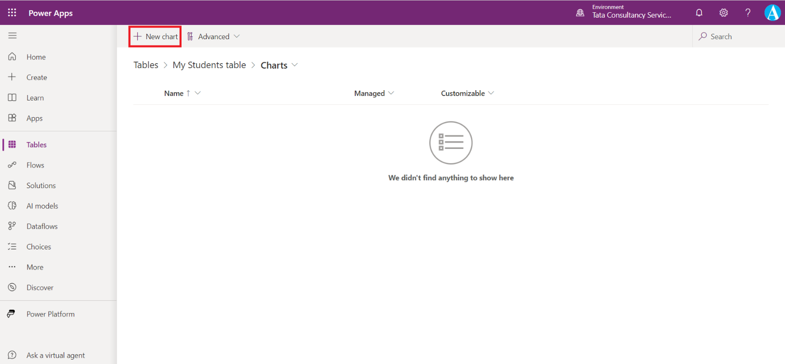
Step 4: From the list of charts, we can select any existing chart (that we have access to) or choose + New chart from the command bar.
Step 5: Either option opens a chart editor in a separate browser tab. (Refer to the next image for the following steps.)
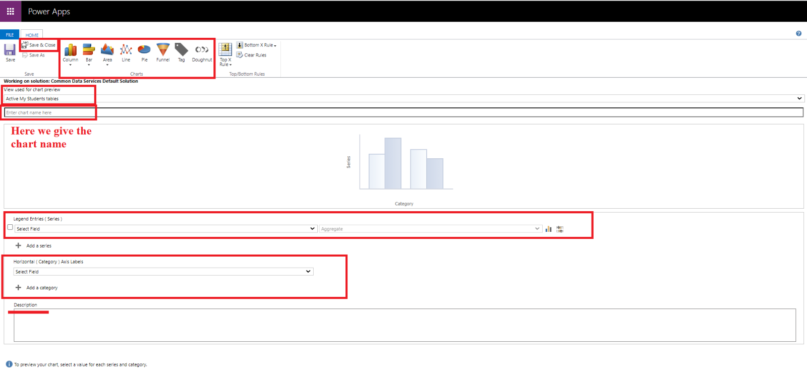
Step 6: We can select the public view from the dropdown which can be sued to see the preview for our chart. We can name the chart and pick the type of chart to display.
Step 7: Under Legend Entries (series) we can select the data we wish to graph along with how we wish to aggregate that data: Average, Count:All, Count:Non-empty, Max, Min or Sum. Basically, this data is shown on Y-axis.
Step 8: Under Horizontal (Category) Axis Labels we can select a field which shows our data on the X-axis.
If we have data in our table, as we select our Legend Entries and Horizontal Axis Labels, we can see a preview of our table in the viewer under our name of the chart.
Step 9: We can also (optionally) add a description for our chart.
Step 10: Once done all the configurations with our chart, select Save & Close to close the chart editor and return to our charts list.
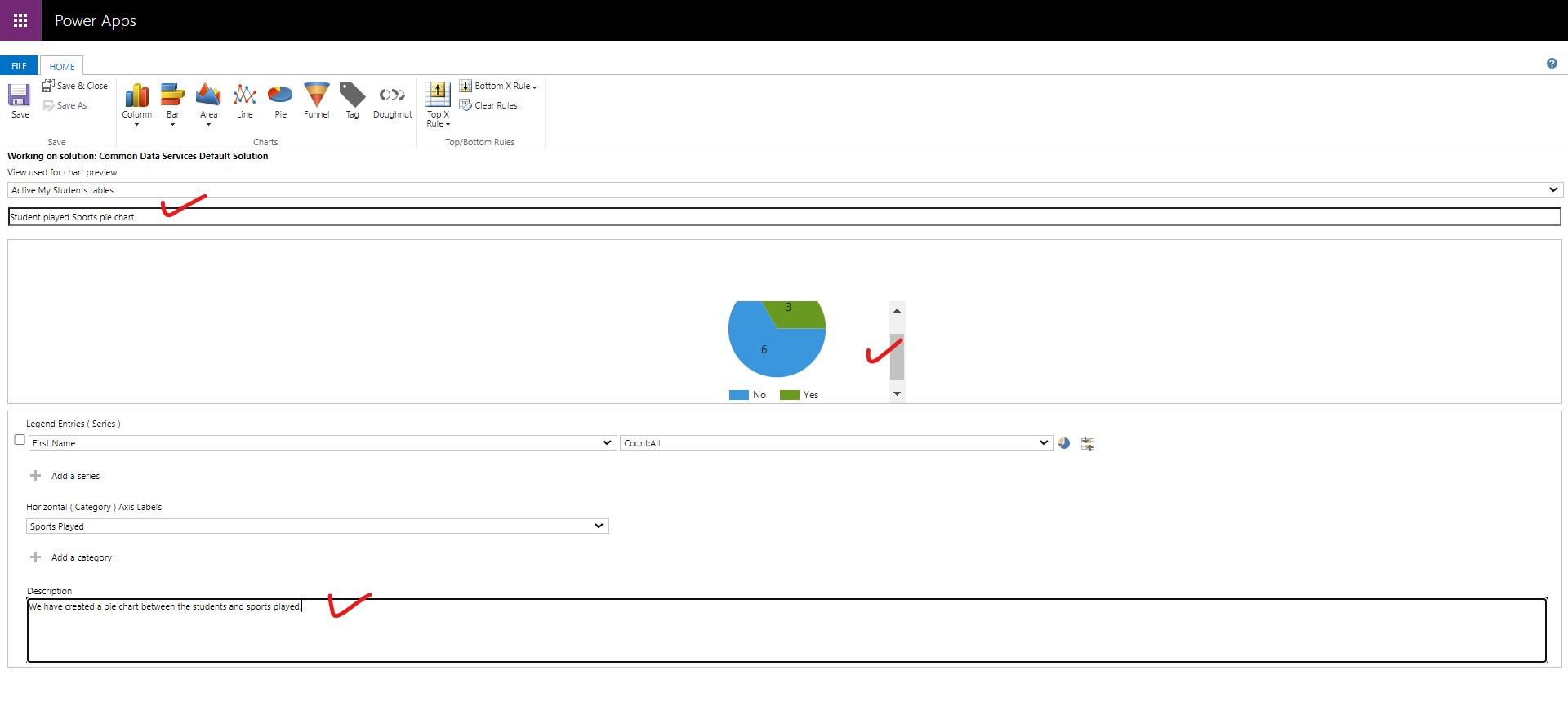
Using this technique, we can create charts that we can display in our model-driven app.
Open the model-driven app, and click on Show Chart.
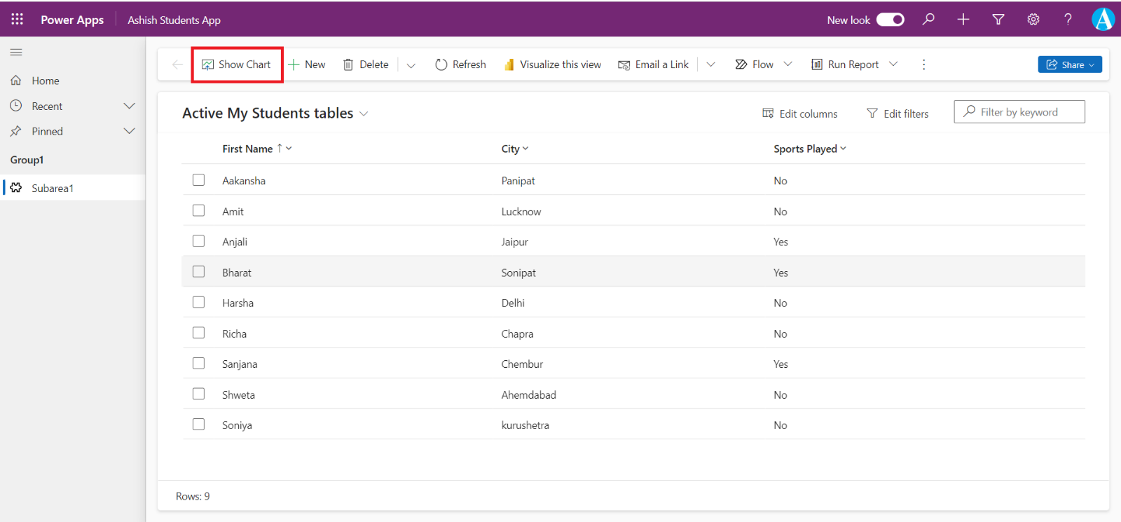
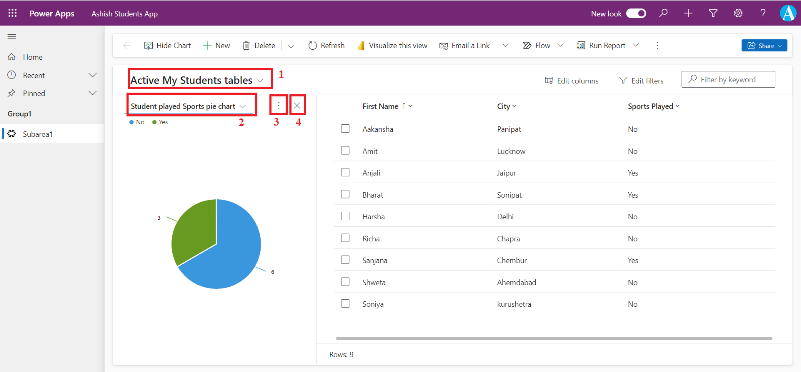
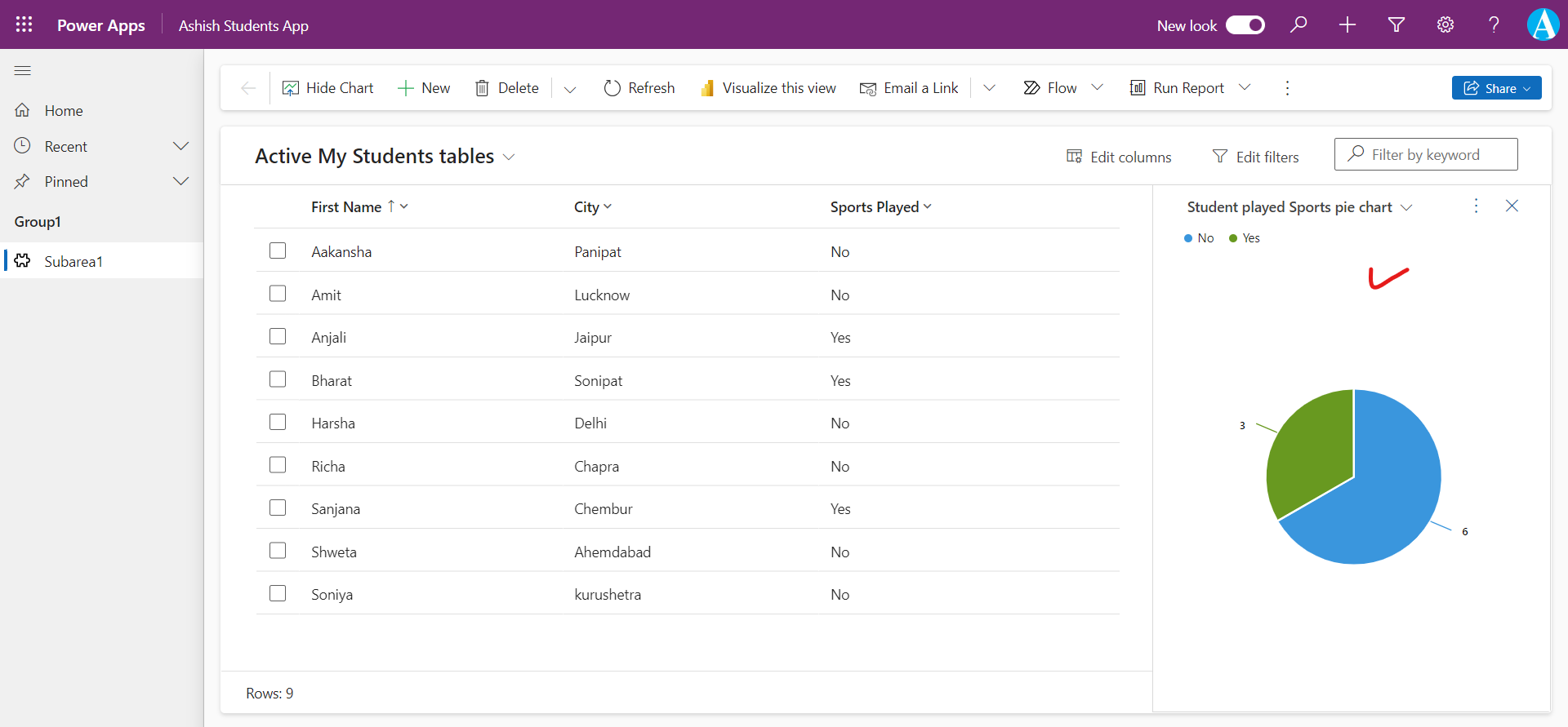
We can see our chart directly on this window as shown in the image.
From the (1) dropdown we can see change our views and from the (2) dropdown we can choose different chart that we have for this table.
From (3) when we click on three dots we can see a lot of options, as shown in the image below:
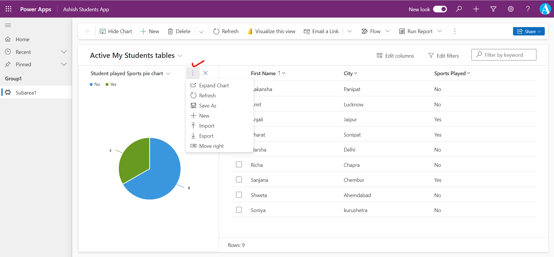
• Move right: By clicking on move right the chart right now is shown on the left side of the screen it is just shifted towards the right side of the screen.
• + New: When we click on the new option the chart editor is opened in a new window.
• Import, Export: We can import and export the xml file of the visual.
• Refresh: To refresh the visual.
• Save as: By using this option we can create a same chart but with a different name and description.
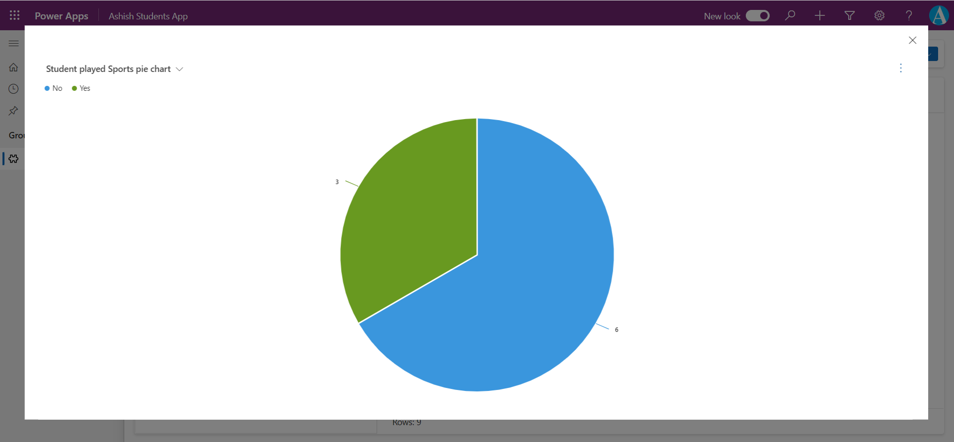
• Expand Chart: When we click on this option it just focuses the chart in the current window, as shown in the image below.
As we create charts, we can then add them to a dashboard.
Dashboards overview Dashboards are used to show several areas of an application in a single display.
Step 1: Click on the Tables from the left navigation, and select the table.
Step 2: Click on the Dashboards from the Data experiences section.
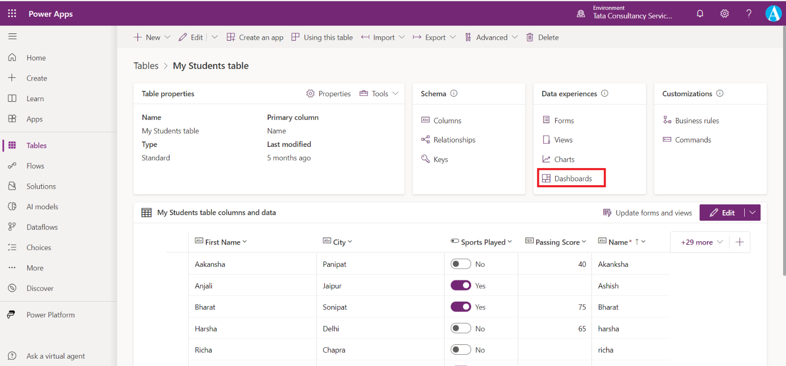
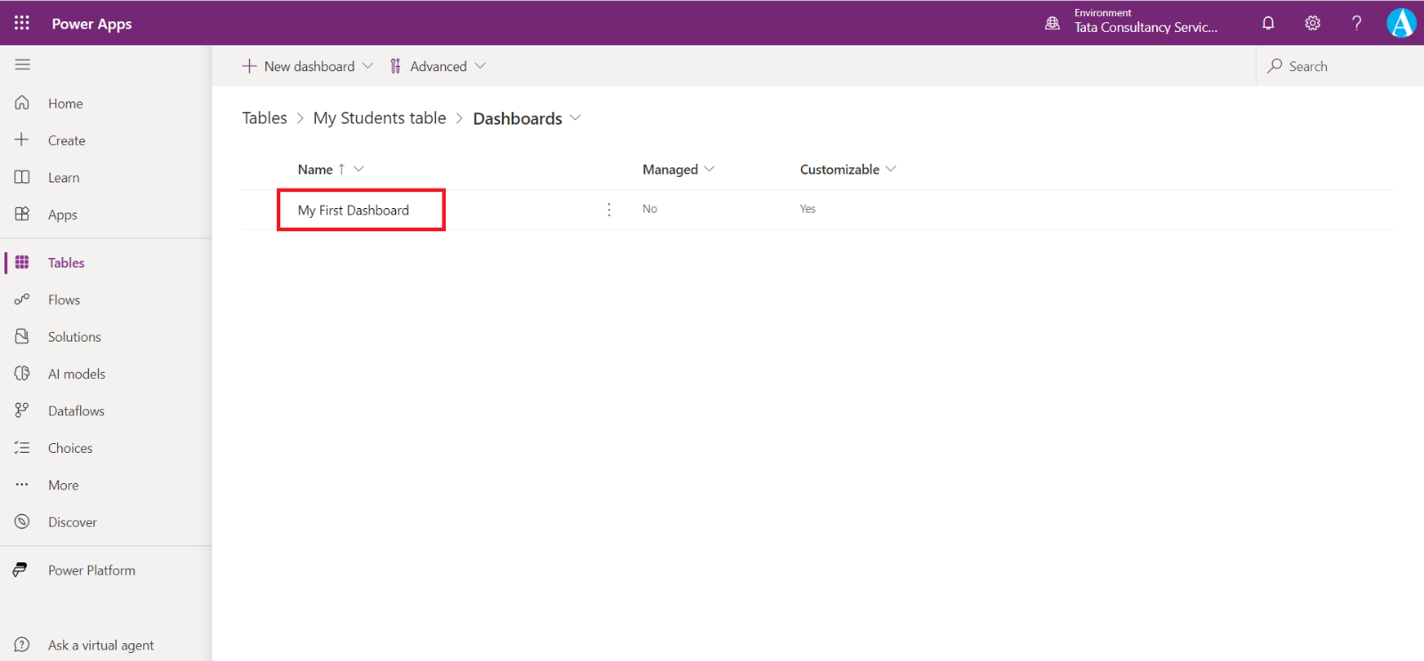
We reach to the following screen, where we can see our Dashboards and we can create a new one.
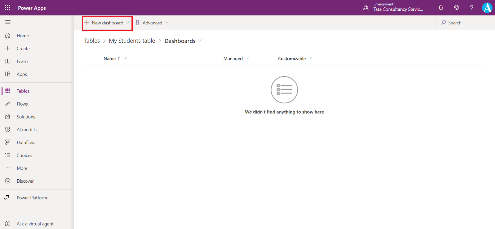
By clicking on the + New dashboard we can see a lot of options.
- + 4-Column overview
- + 3-Column overview (varied width)
- 3-Column overview
- 2-Column overview
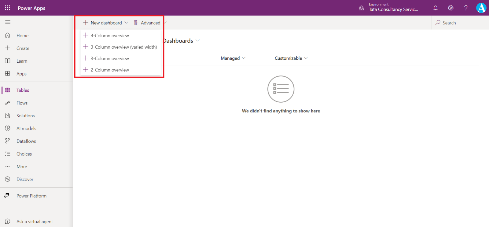
Let’s suppose I select + 4-Column overview then I reach the following screen.
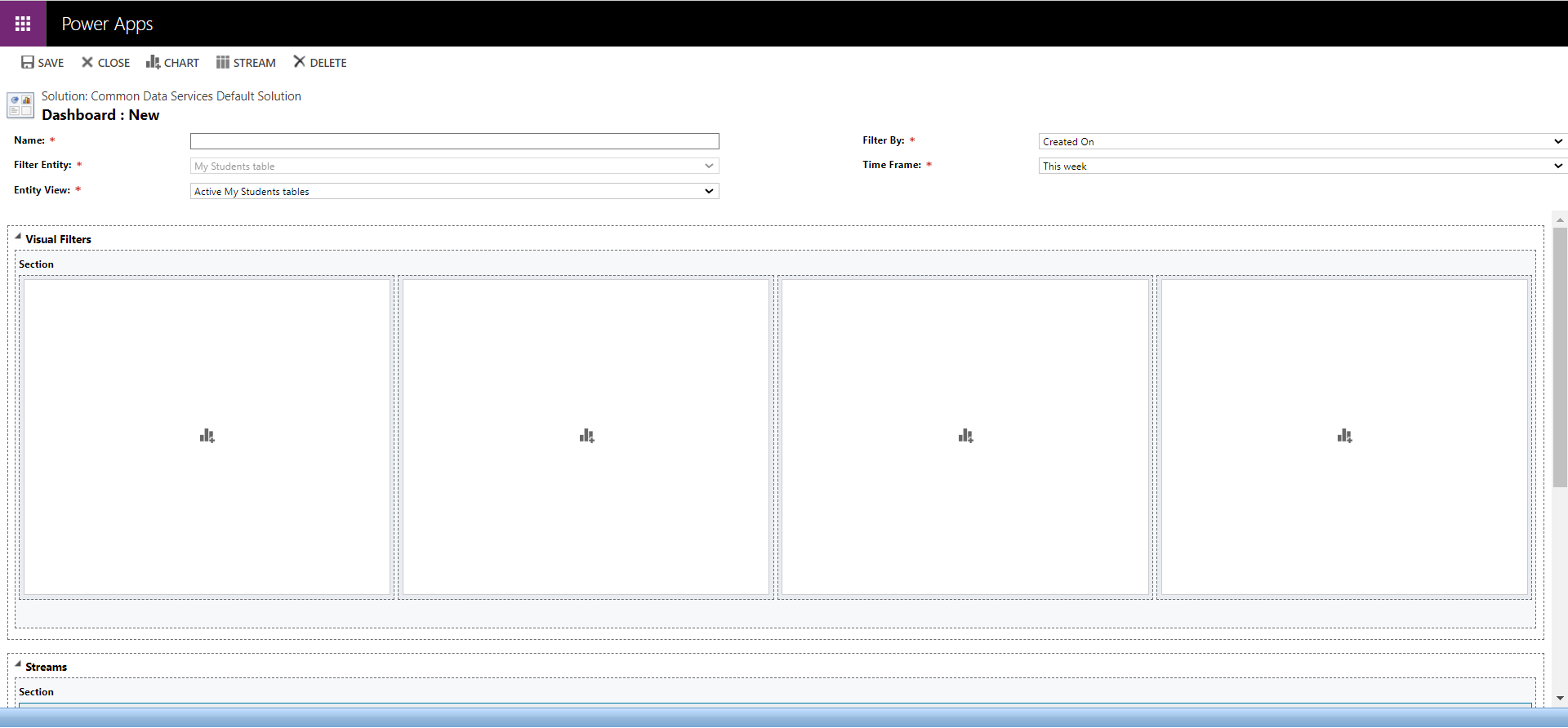
Here, we name our dashboard and select the view from the public views.
• Filter Entity: The visual filters and global filter attributes are based on this table.
• Entity View: The visual filters are based on this view.
• Filter By: The column that the time frame filter applies to.
• Time Frame: The default time frame filter value for the Filter By column.
After adding the above details. Click on chart icon in the section.
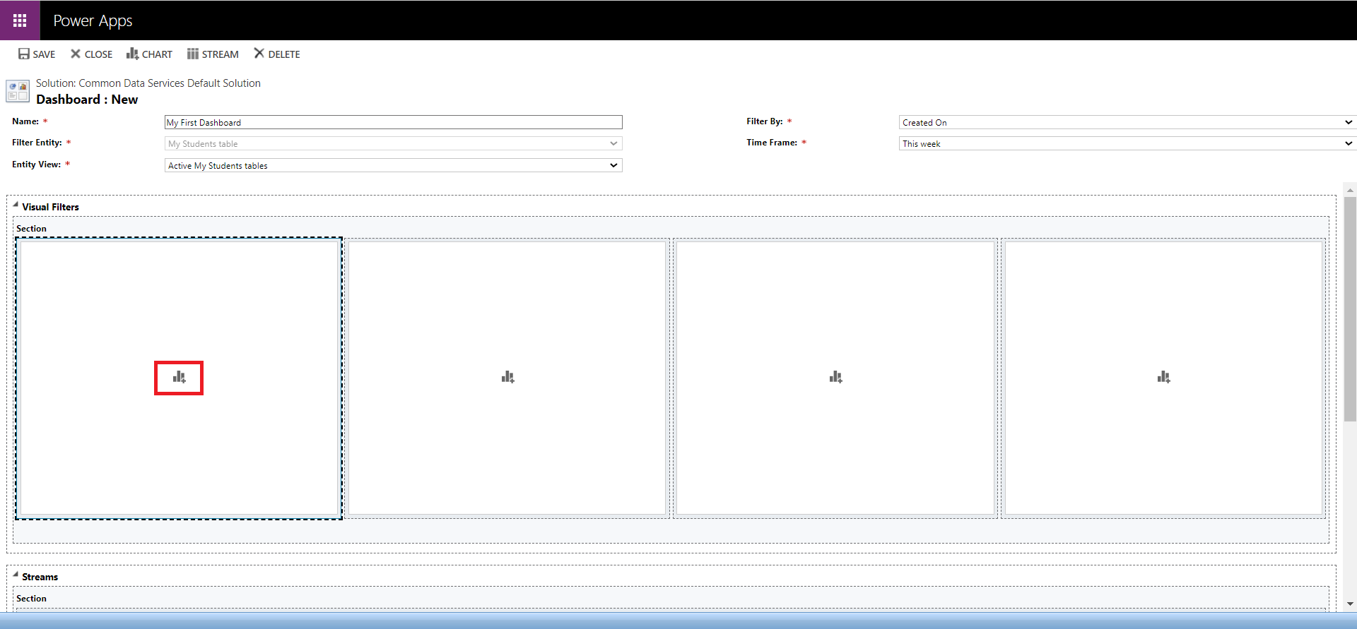
The chart is added to the dashboard.
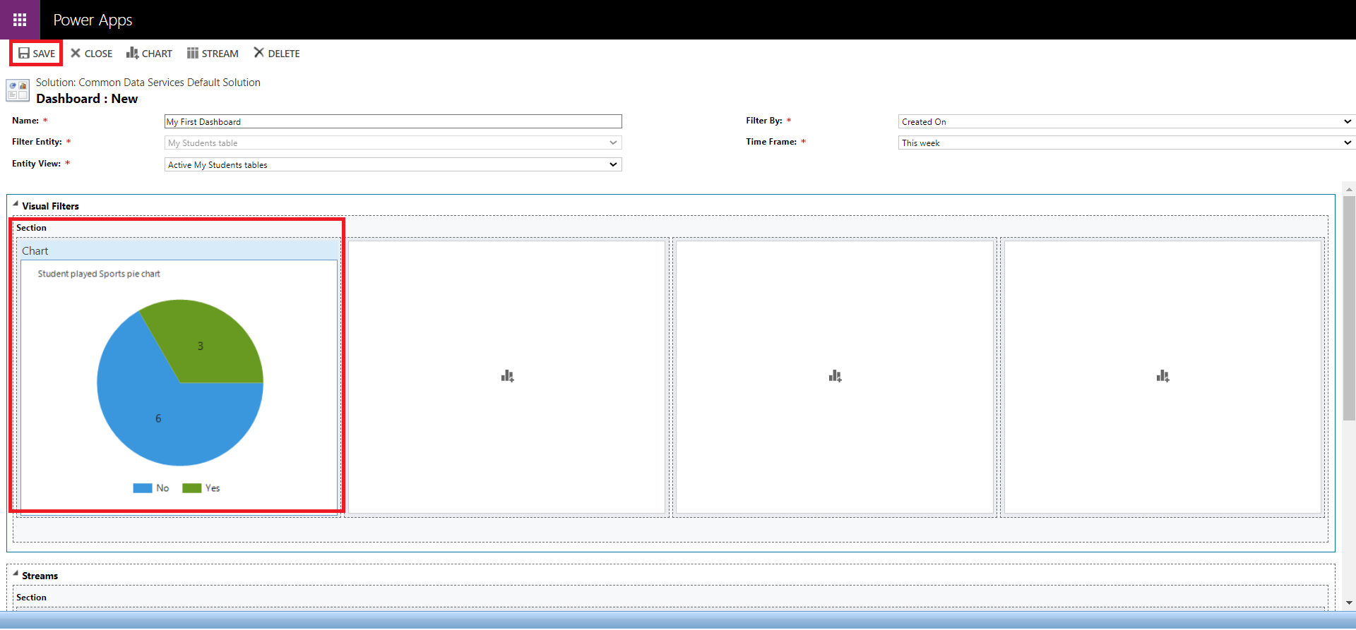
But before that click on icon on the stream section to add the stream.
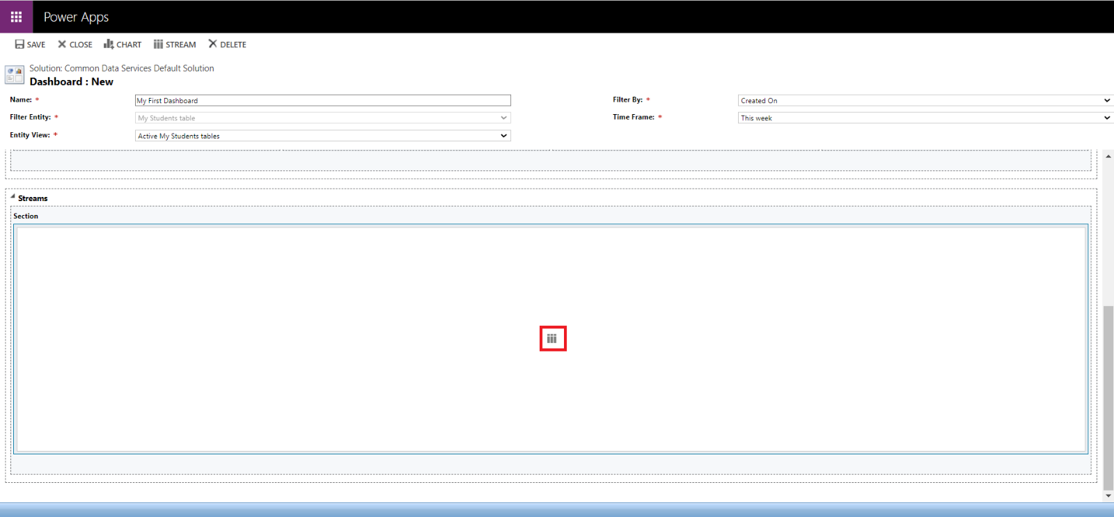
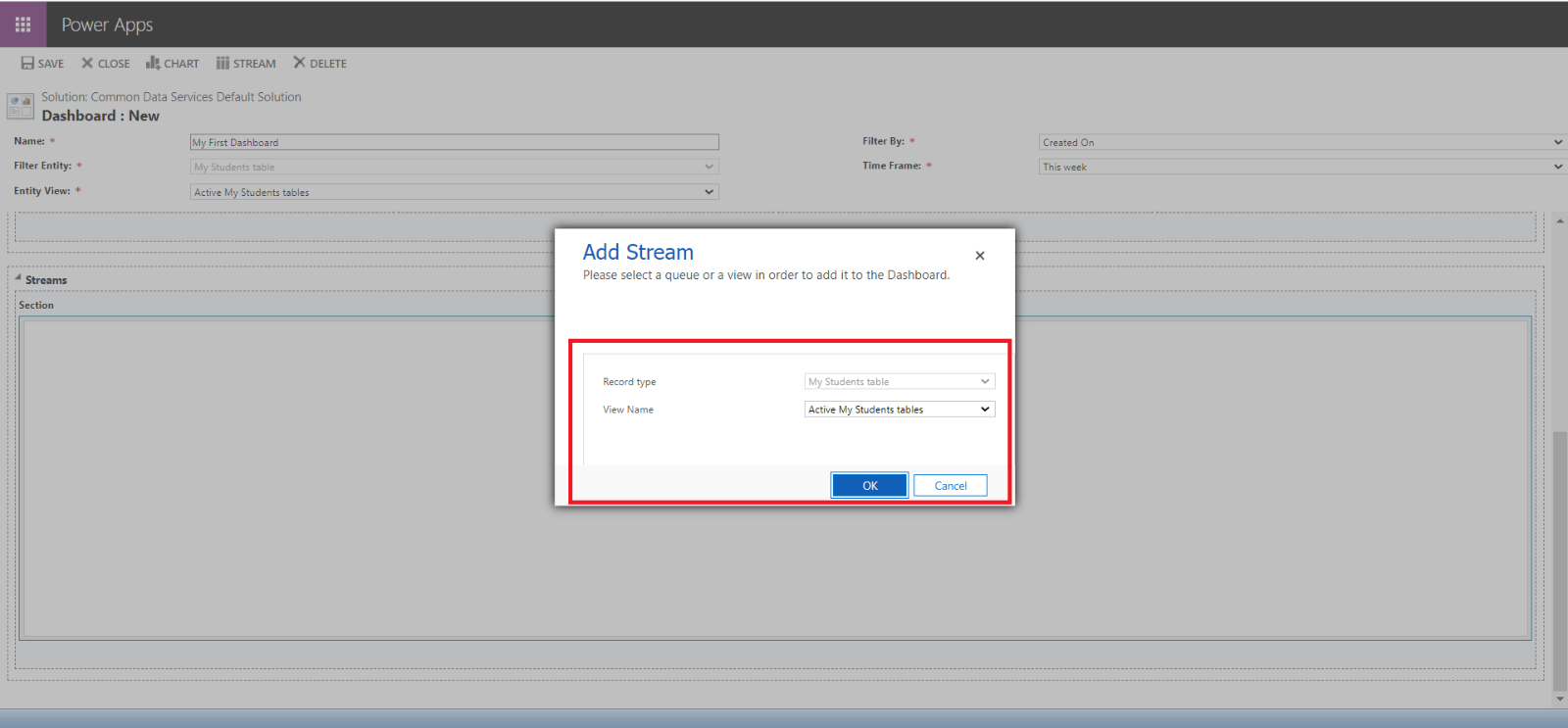
We can select dropdown and choose the View Name from our public views. And click on OK.
The Stream is added to the dashboard.
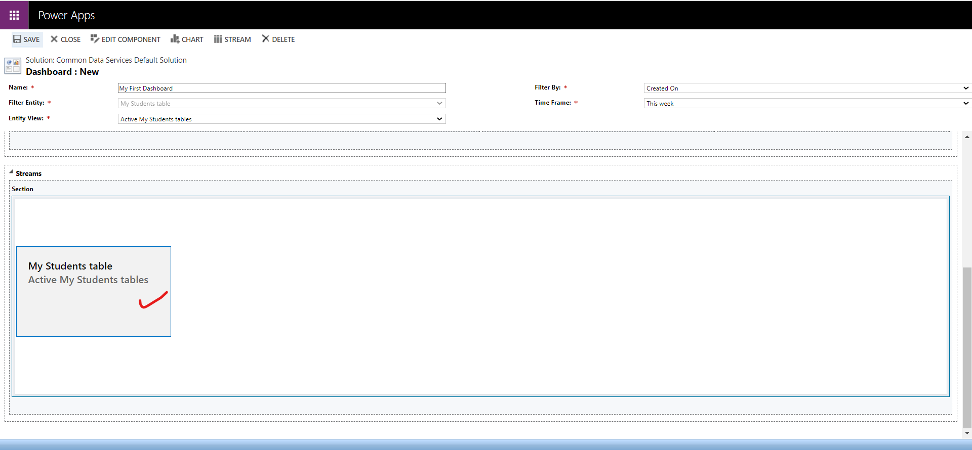
Click on SAVE to save the changes and then CLOSE.
Add the Dashboard to a model-driven app We can add the dashboard to the model-driven app.
Step 1: Open the Model-driven app in Edit mode.
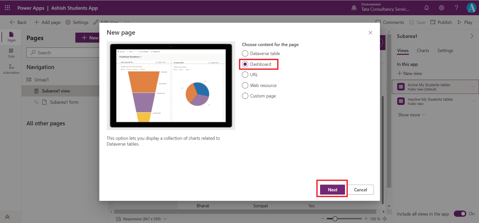
Step 2: Click on the + New or +Add page
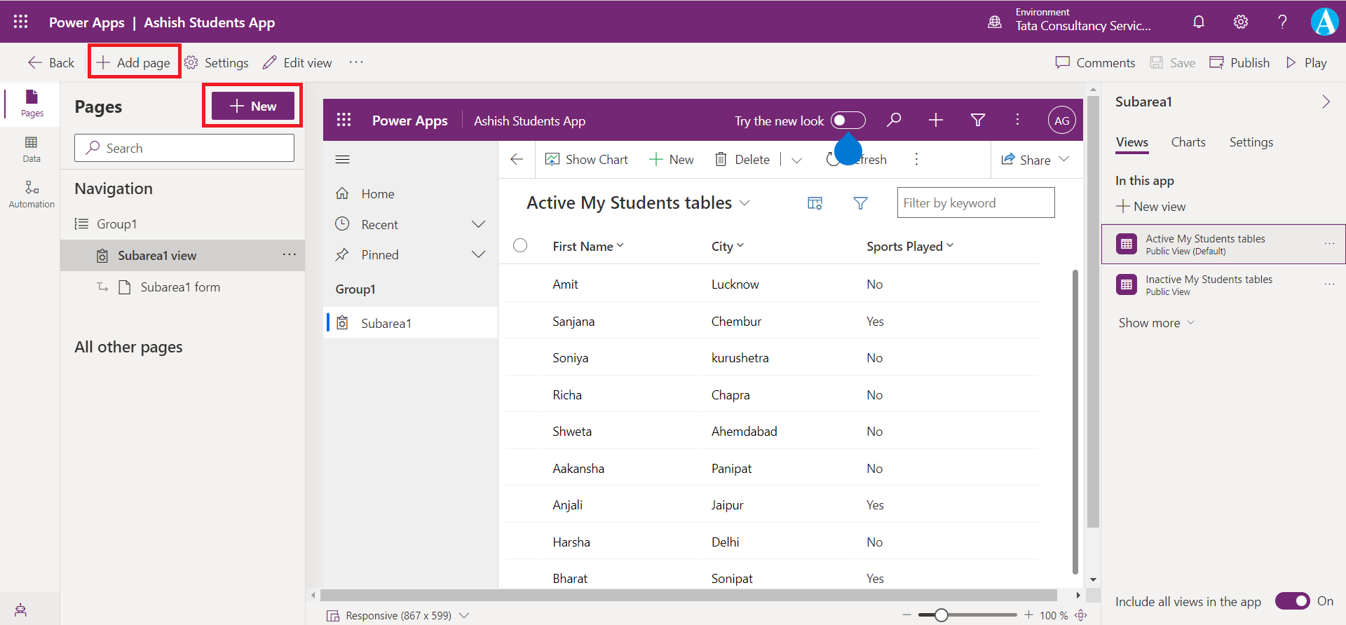
Step 3: Select Dashboard from the options and then select Next.
