Waterfall visual in Power BI
A Waterfall Visual, also known as a waterfall chart or bridge chart, is a type of bar chart that illustrates how an initial value is affected by a series of intermediate positive (increases) or negative (decreases) contributions, resulting in a final value. Each bar in the chart represents a category or step, and the height of the bar indicates the magnitude of change (increase or decrease). The chart visually "bridges" the gap between the starting and ending values, making it easy to understand the contributions of each step.
Key Characteristics:
- Sequential Analysis: Shows changes in a sequential order, typically from left to right.
- Cumulative Effect: Each bar builds on the previous total, showing how the starting value evolves into the final value.
- Positive and Negative Contributions: Uses distinct colors to differentiate increases (e.g., green) from decreases (e.g., red).
When to Use a Waterfall Visual The Waterfall Visual is ideal for scenarios where we need to explain how a starting value transforms into a final value through a series of changes. It can be used to know the running sum of the Revenue.
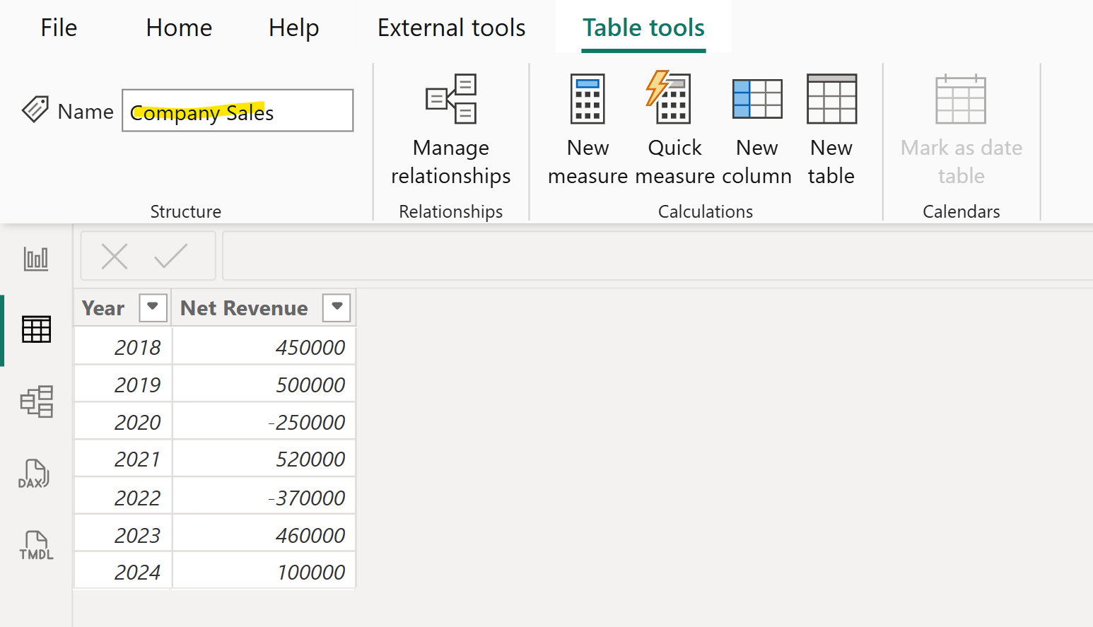
Step 1: Let’s have a table named “Company Sales”.

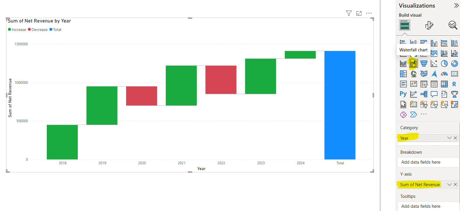
Step 2: Let’s add a waterfall chart visual from the Visualisations pane. And add the field Year in the Category and add the Net Revenue field to the Y-axis.

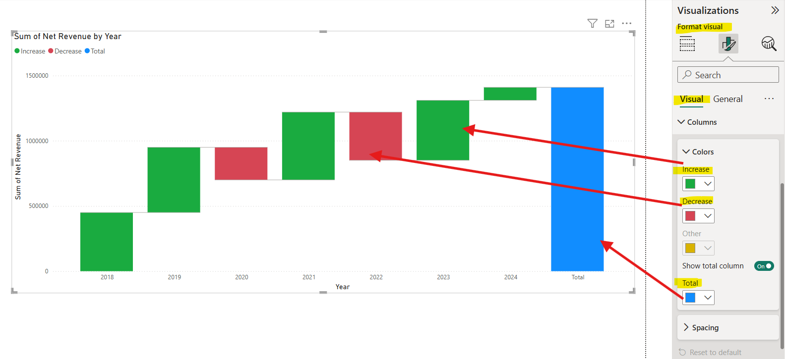
Step 3: We can format the visual and specify the different colour for bars for Increase, Decrease, and Total from the Columns section in the Format visual, as shown in the image below.

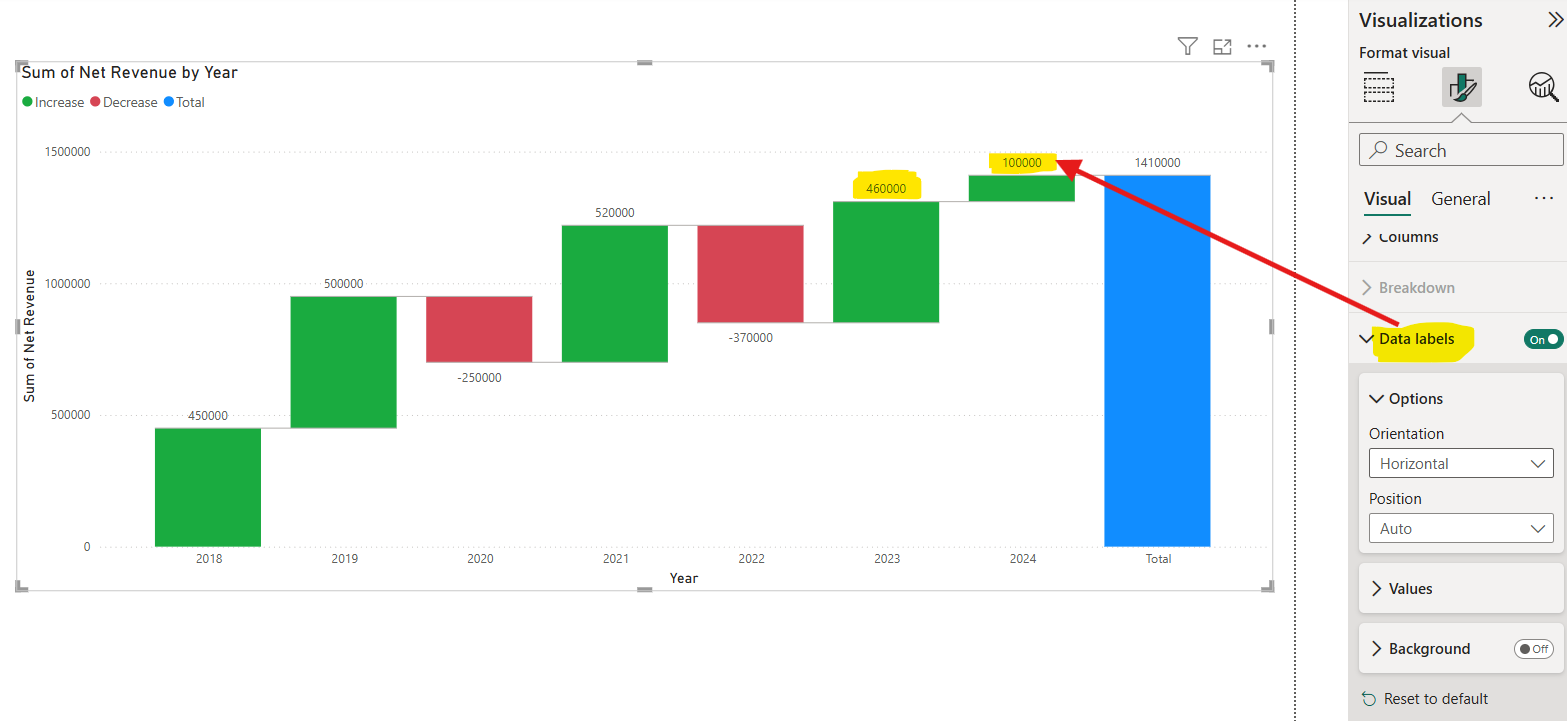
Step 4: We can add the Data labels on the top of bar to see the actual value.
