Matrix visual in Power BI
In this exercise, we will use a matrix visual in Power BI.
Step 1: Let’s click on the Matrix visual by clicking from the Visualization pane, as shown in the image below:
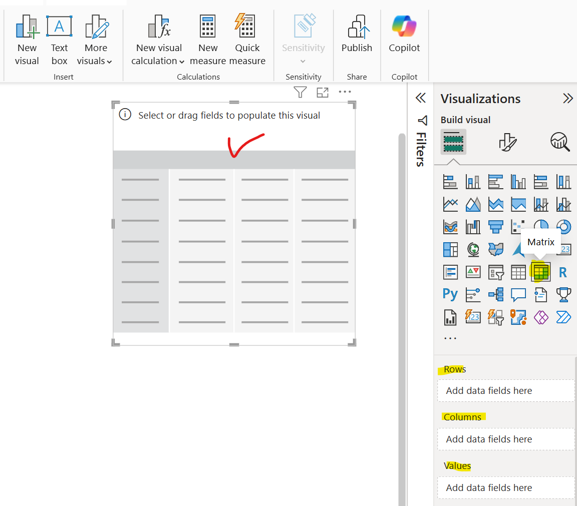
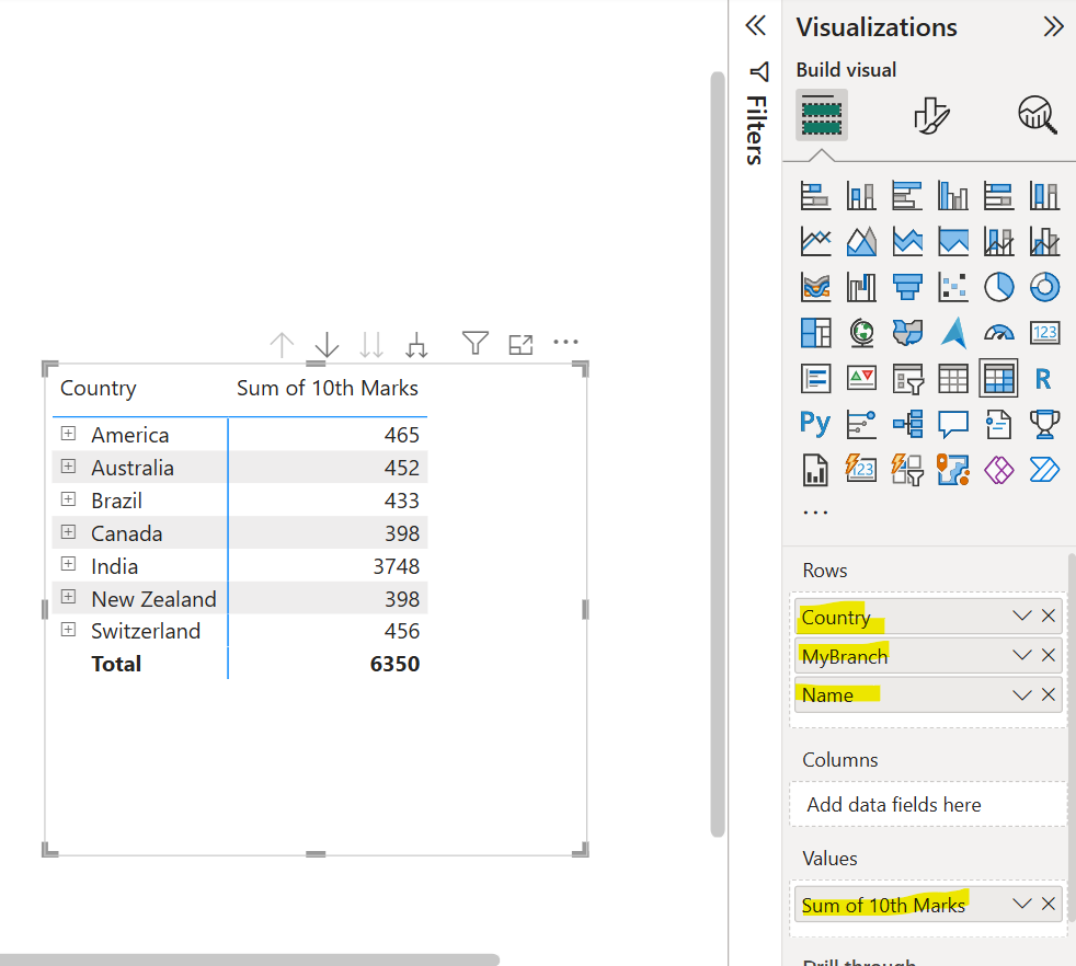
Drag and drop some field from the table to the matrix Rows section and in the Values section add the 10th Marks field.
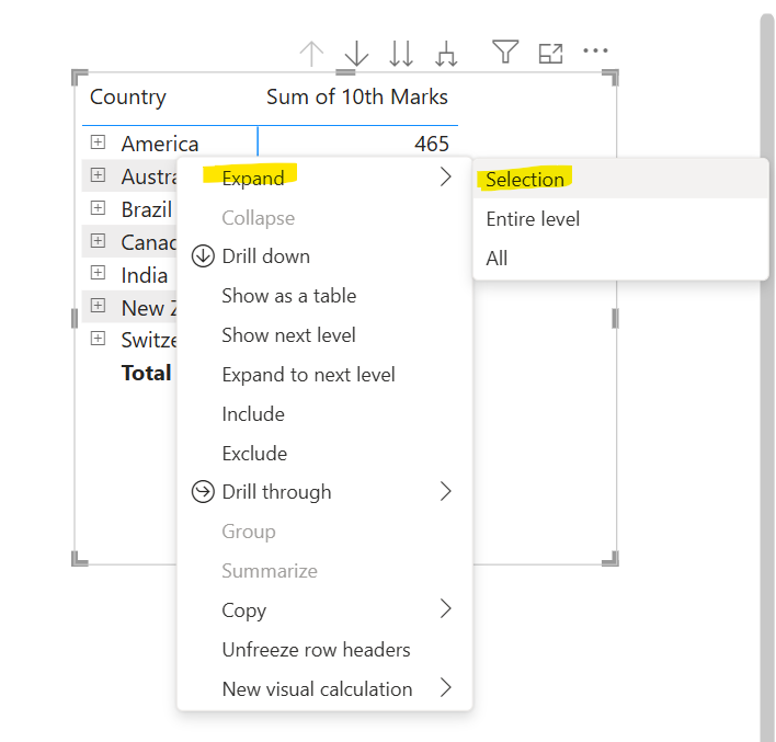
Expanding and collapsing row headers There are two ways we can expand row headers. The first is through the right-click menu. We’ll see options to expand the specific row header we selected, the entire level, or everything down to the very last level of the hierarchy. We have similar options for collapsing row headers as well.
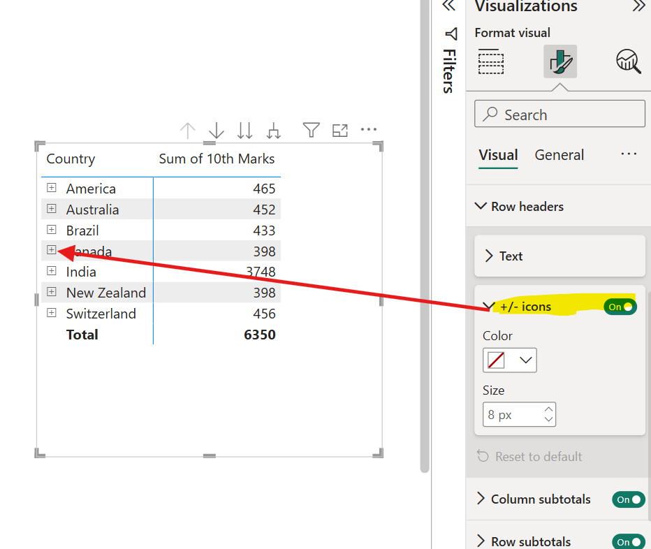
We can also expand/collapse by clicking on +/- icons to the row headers. We can also show or hide these icons using the formatting of the visual under the Row headers card. By default, the icons will match the formatting of the row header, but we can customize the icons’ colors and sizes separately if we want.
Row Subtotals and Column Subtotals We can turn on or turn off subtotals for the matrix rows and columns. In the Format visual pane, set the Row subtotals slider and the Column subtotals slider to Off.
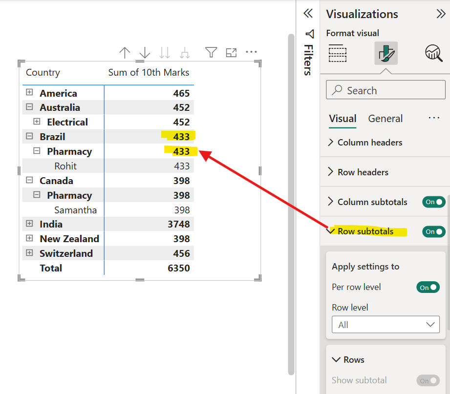
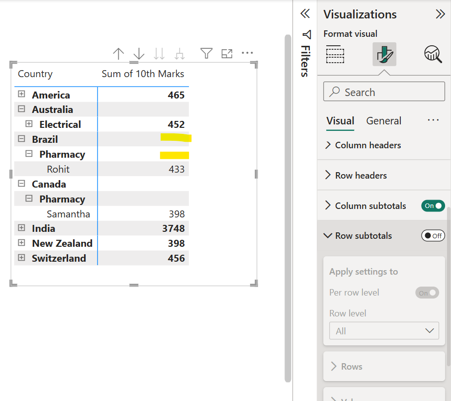
Let’s turn off the Row subtotals.
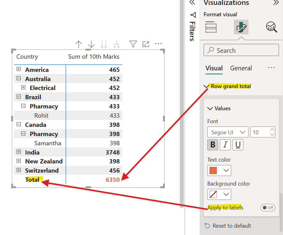
We can also format the Row grand total. We can change its font, colour, background colour. We have the option to apply the same format on the label also.
