Tooltips in Power BI
Tooltips in Power BI provide additional contextual information when a user hovers over a visual element, such as a bar in a chart or a data point in a scatter plot. They enhance interactivity and help users understand the underlying data without cluttering the main report.
Types of Tooltips in Power BI 1. Default Tooltips – Automatically generated by Power BI for visual elements.
2. Report Page Tooltips – Custom tooltips designed using separate report pages.
3. Dynamic Tooltips – Tooltips that display dynamic content based on measures.
4. Modern Visual Tooltips – Available in some visuals for advanced formatting.
1. Default Tooltips Power BI automatically creates tooltips displaying data for the hovered visual element. These include values from the visual’s fields, like axis categories, values, and legends.
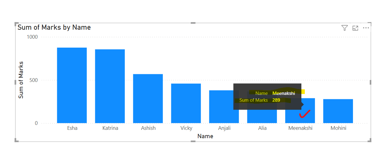
How to Customize Default Tooltips Step 1: Select the visual.
Step 2: Go to the Format pane and expand the Tooltip section.
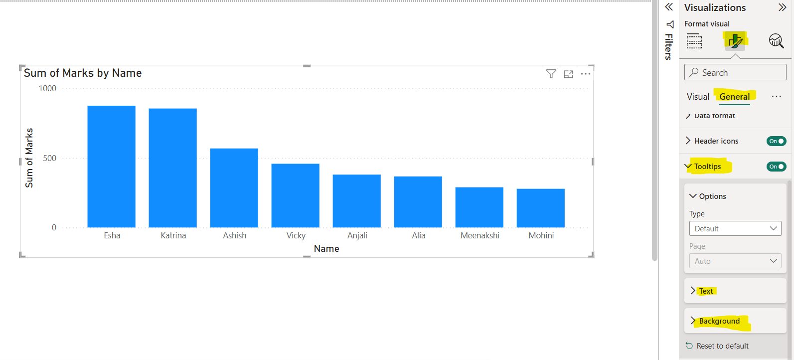
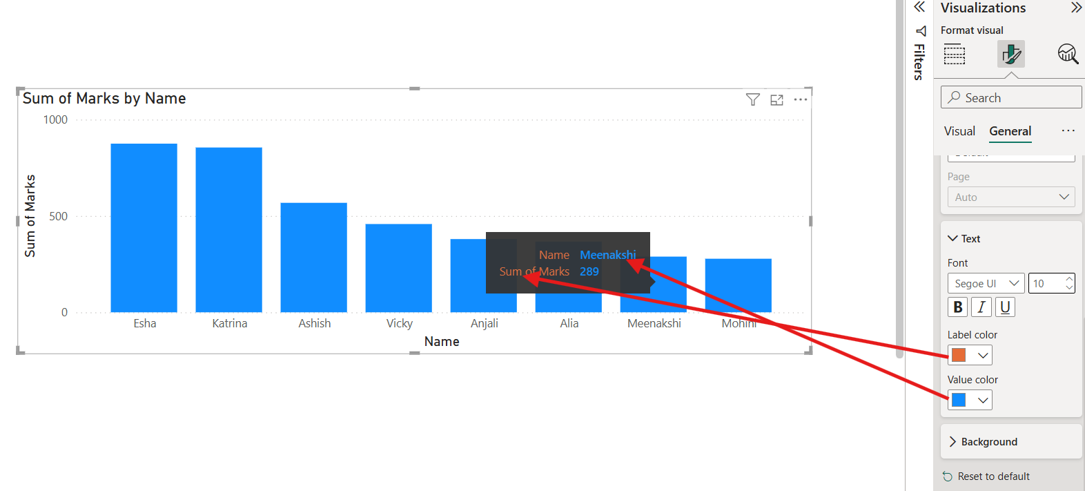
We can modify the text and background colour and its formatting.
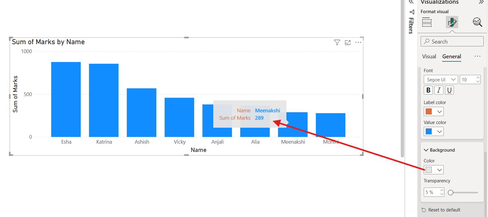
After changing the background colour, see its effect on the tooltip by hovering it on the data point.
Step 3: The default tooltip can be customized by adding fields to the Tooltips field well. We can add multiple fields in the Tooltips section. Here we can add measures also. Please note the field or measure added respects the filter context, unless explicitly removed.
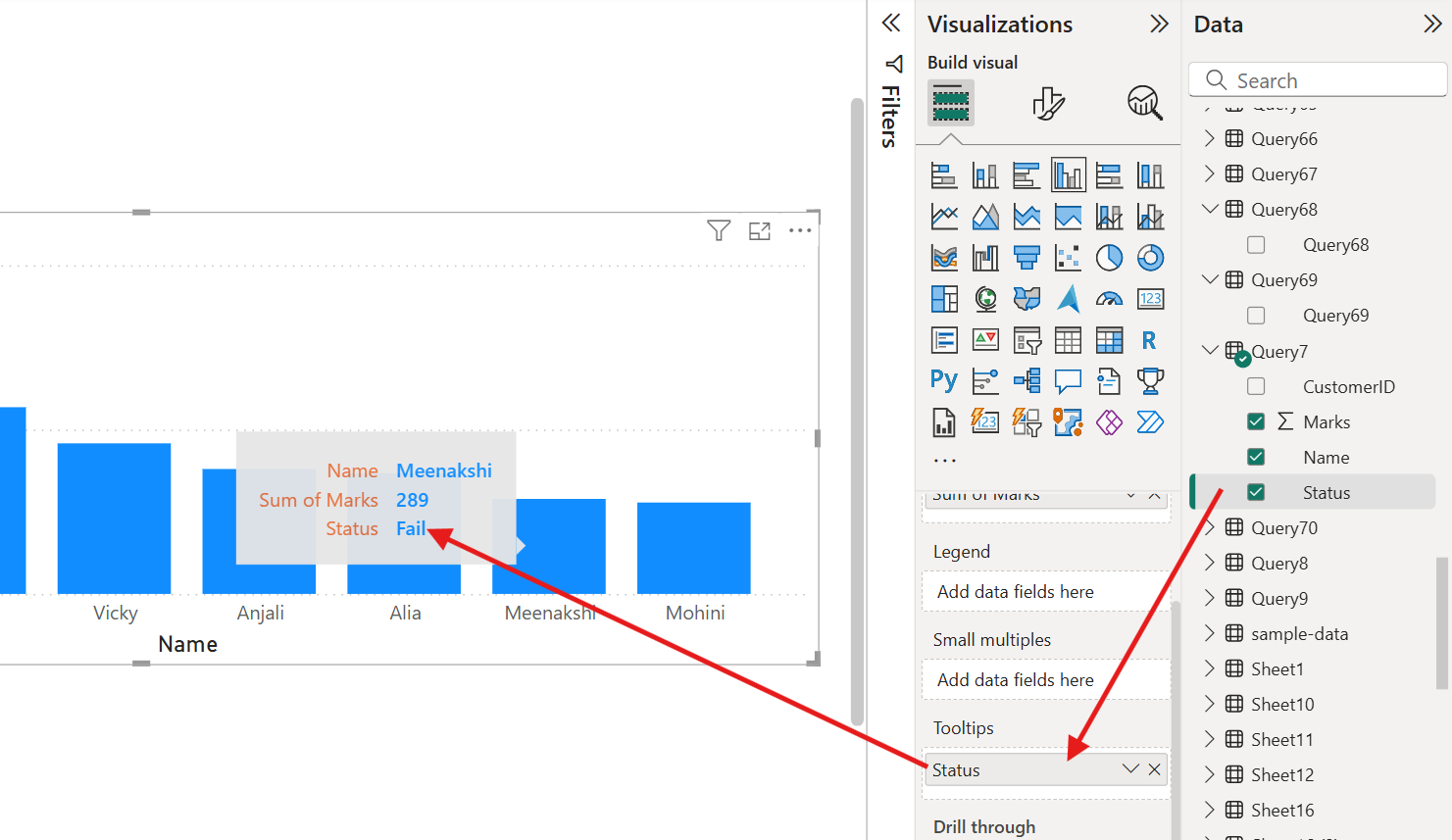
Here the Status shown is Fail which is the status of student Meenakshi.
2. Report Page Tooltips (Custom Tooltips) We can create a separate report page and use it as a tooltip. Allows for more detailed and customized information.
How to Create a Report Page Tooltip 1. Create a New Page: o Click the "+" to add a new page. Let’s have named the page “Tooltip Page 1”.
o Go to the Format pane and then under Page Information, toggle Tooltip to "On".
o Set the Page Size to Tooltip (under Canvas settings).
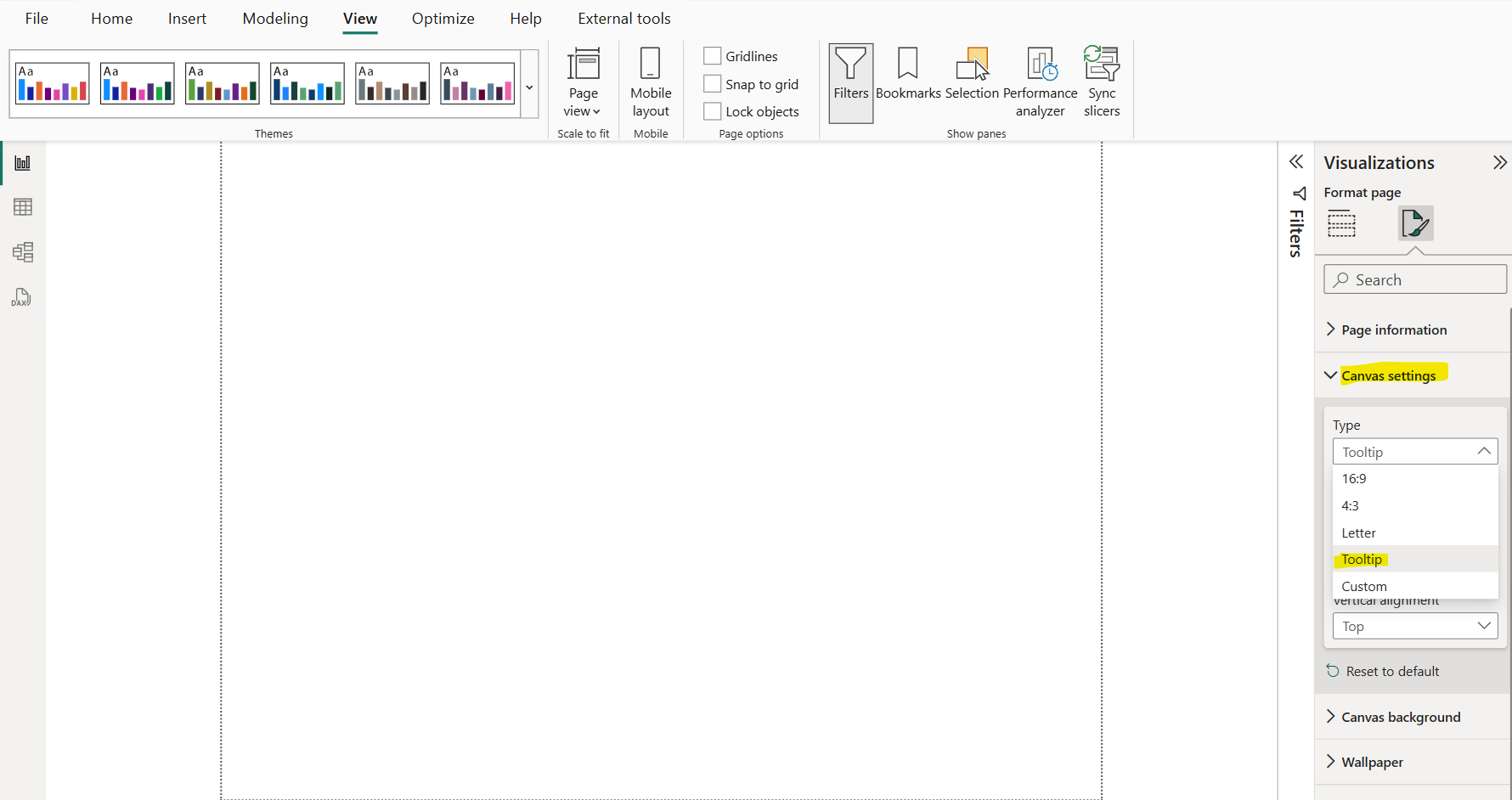
2. Design the Tooltip: o Add visuals like tables, charts, or KPIs.
o Ensure the page background is transparent for a better experience.
Let’s add the two card visuals, and add the fields as shown below:
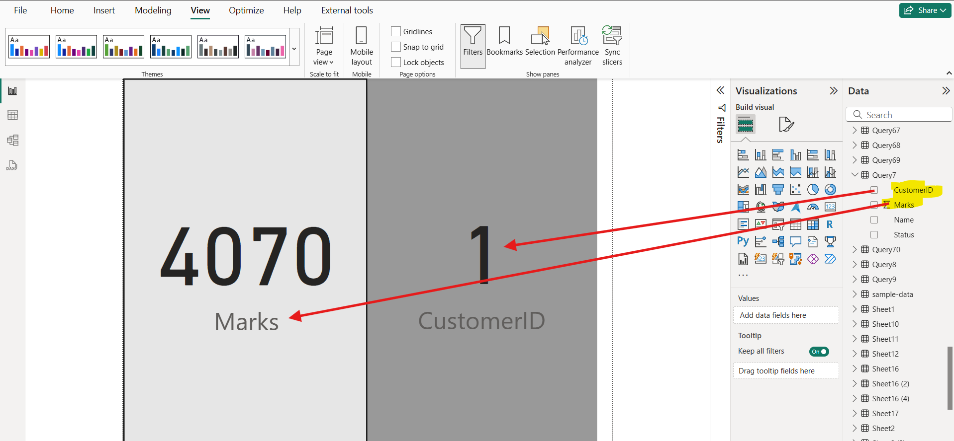
Here, the Marks field shows the total sum of marks and the CustomerID shows the First CustomerID.
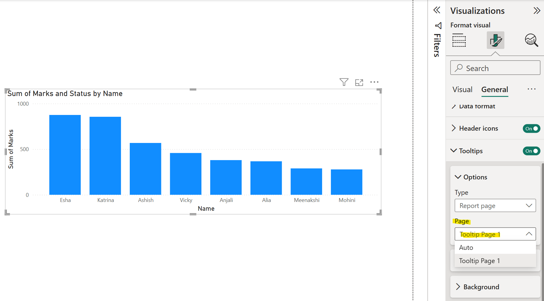
3. Apply the Tooltip to a Visual: o Select the target visual.
o Go to the Format pane and then select Report Page option from the Tooltip type dropdown.
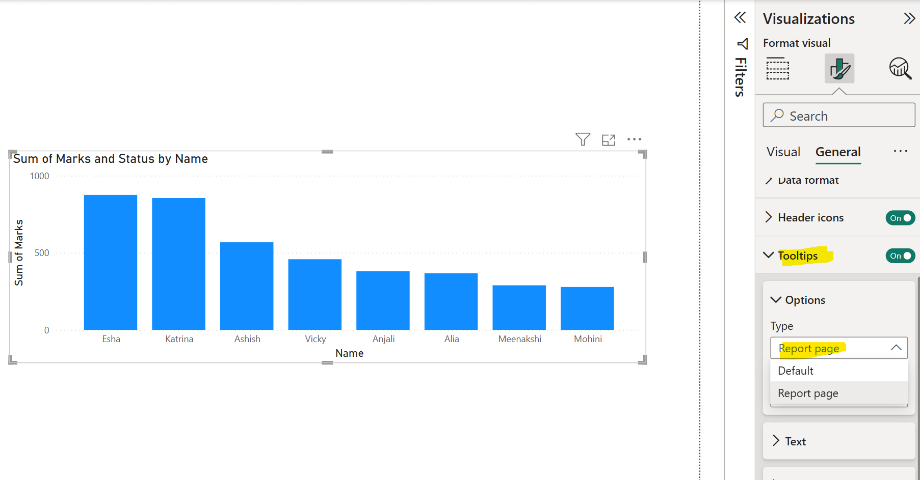
o Choose our custom tooltip page.
Let’s hover on the data points on the visual as shown in the image below:
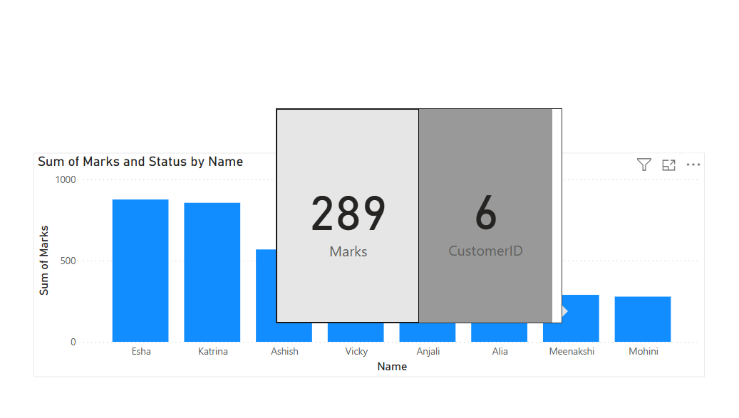
Here, 6 is the customerID of Meenakshi and 289 is her Marks.