New Card visualization in Power BI
We can create a new card visual in Power BI.
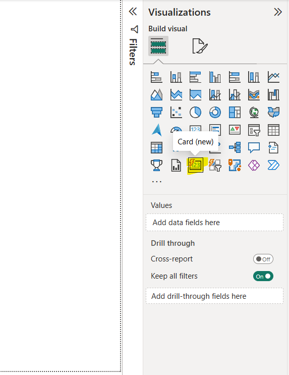
Step 1: To add a new card visual to the Power BI, select the new card visuals from the visualization pane.
Step 2: The new card visual is added on the page. Let’s drag the 10th Marks, Graduation marks and Total column from the table to the Data tab.
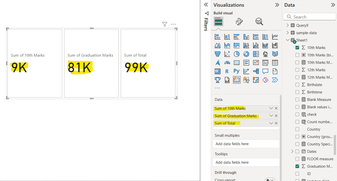
Note: In the new card visual we can add multiple fields in the Data tab and correspondingly for each field a card is created.
Format a card visual Click on the visual, then click on Format your visual.
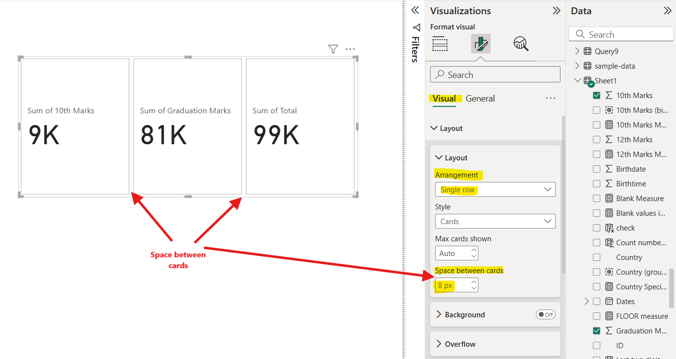
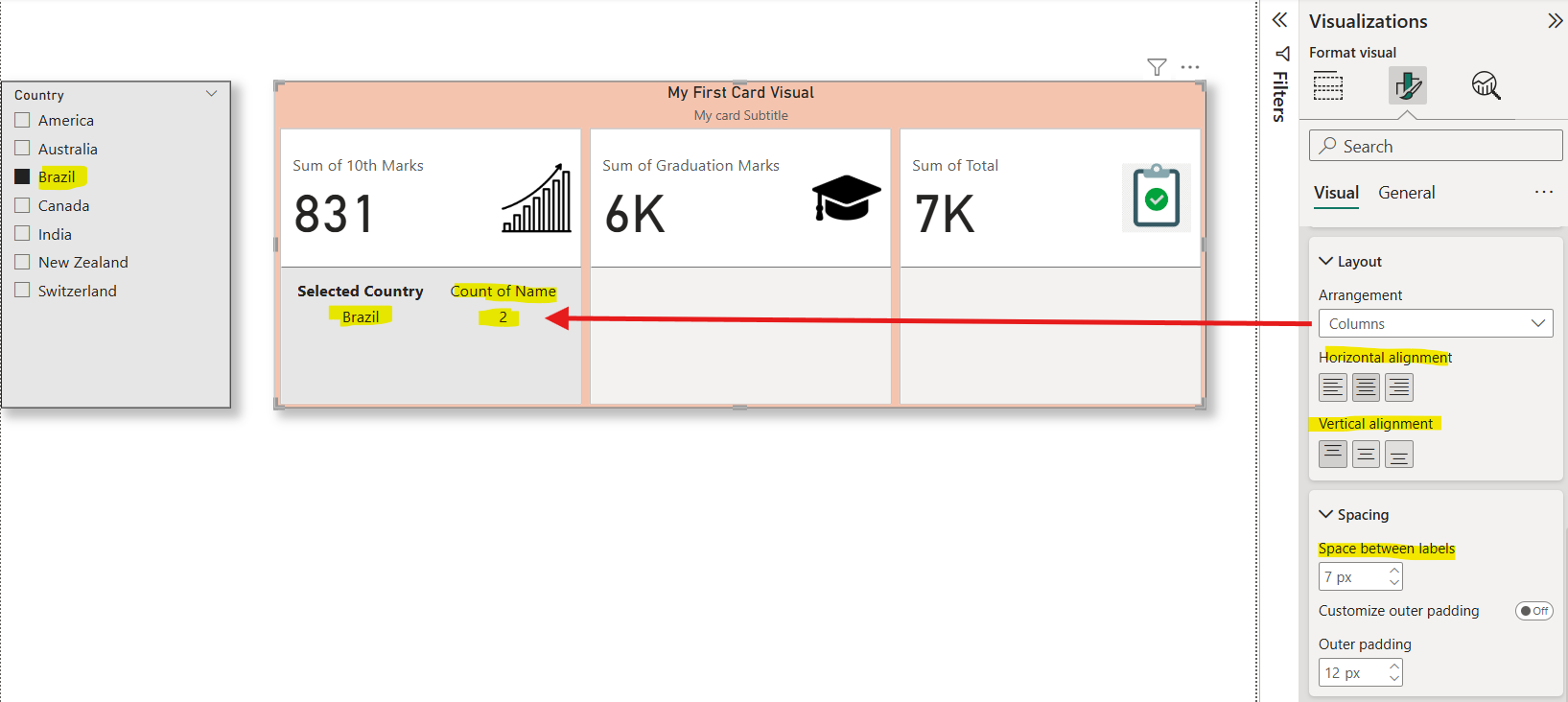
From the Layout we have the option Arrangement, which can be used to arrange the cards. We can also specify the space between cards.
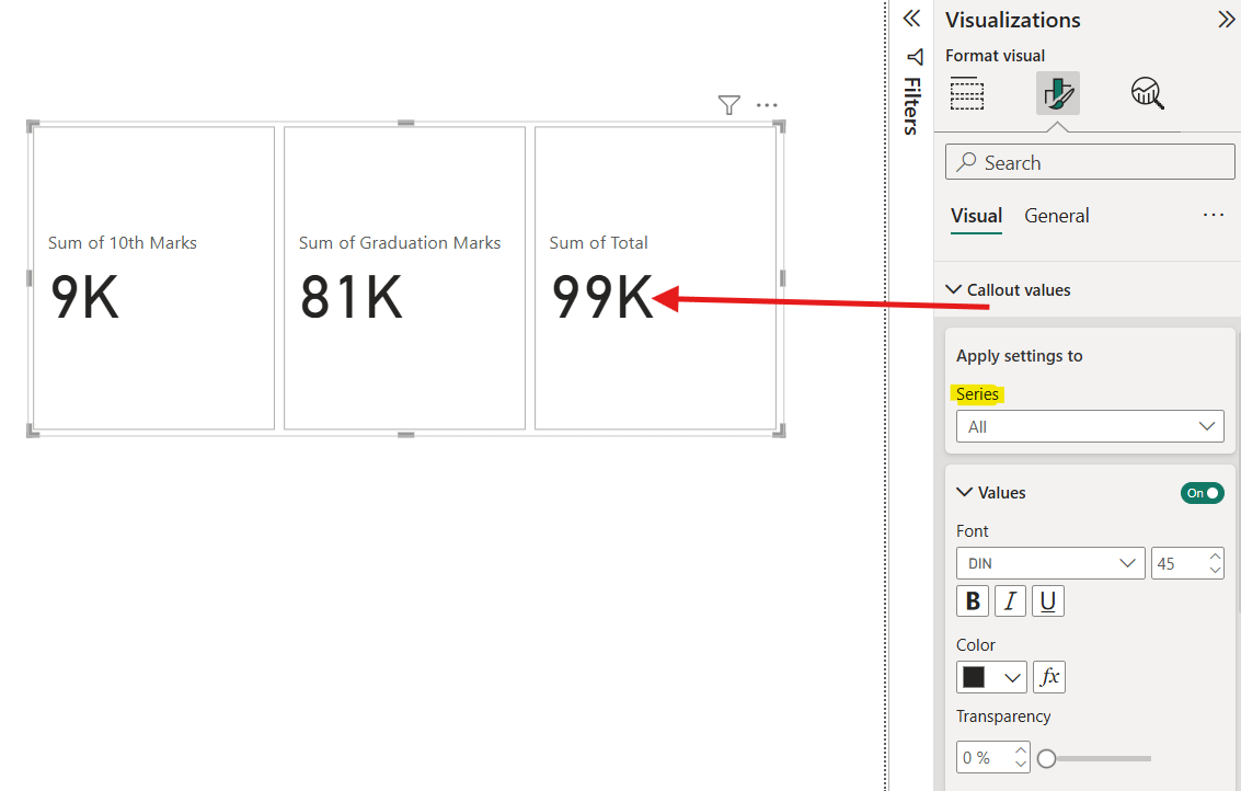
And then click on the Callout values. We have a lot of options for font, display unit, decimal places, and color. We can apply the different formatting to different data by selecting the field from the series dropdown.
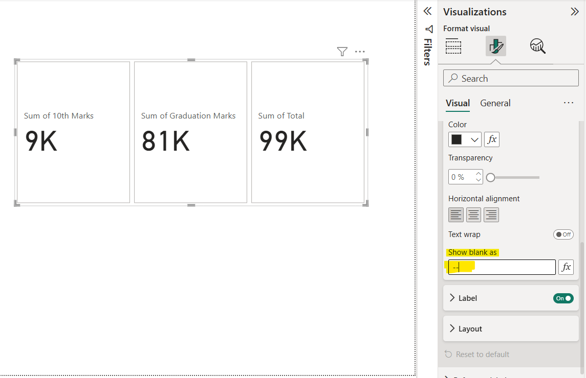
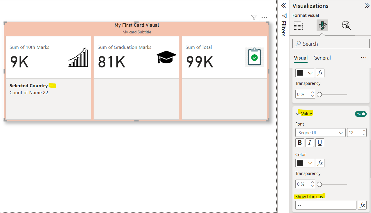
If the value is blank, we can specify the alternate value for that in the “Show blank as” option.
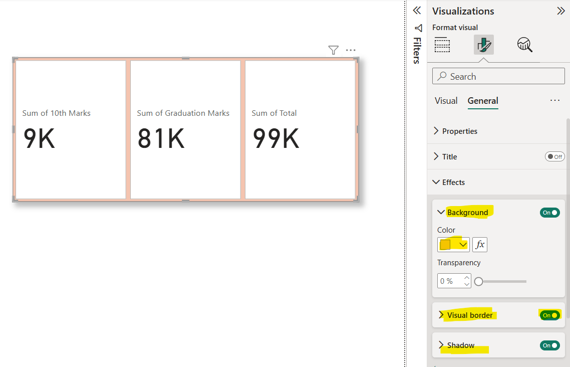
From the Effects section from the General tab, we can set the background color, transparency, visual border, and shadow.
Just go to the General option to see more formatting options. Expand the Title option. Click on the toggle button next to Title to show or hide title. Let’s turn it on and specify the Title as “My First Card Visual”.
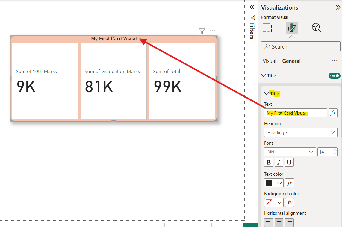
Write the text in the Text column. We can see the various options for title like font, text color, size, horizontal alignment, and background color.
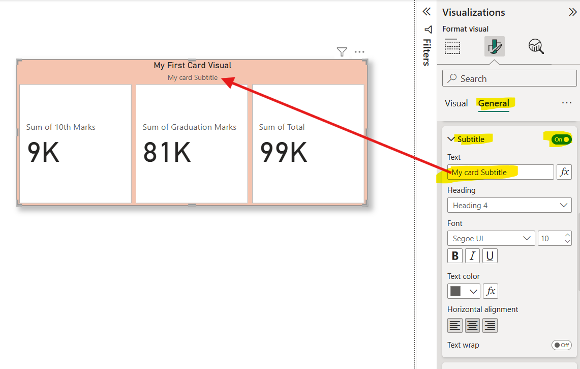
Click on toggle button next to Subtitle to show and hide the subtitle label. Expand the Subtitle, we can specify the subtitle text, and format it.
We can also add the image with the callout value. From the Series dropdown, select the field and then browse the image. We can specify the Position of the image, and its vertical alignment.
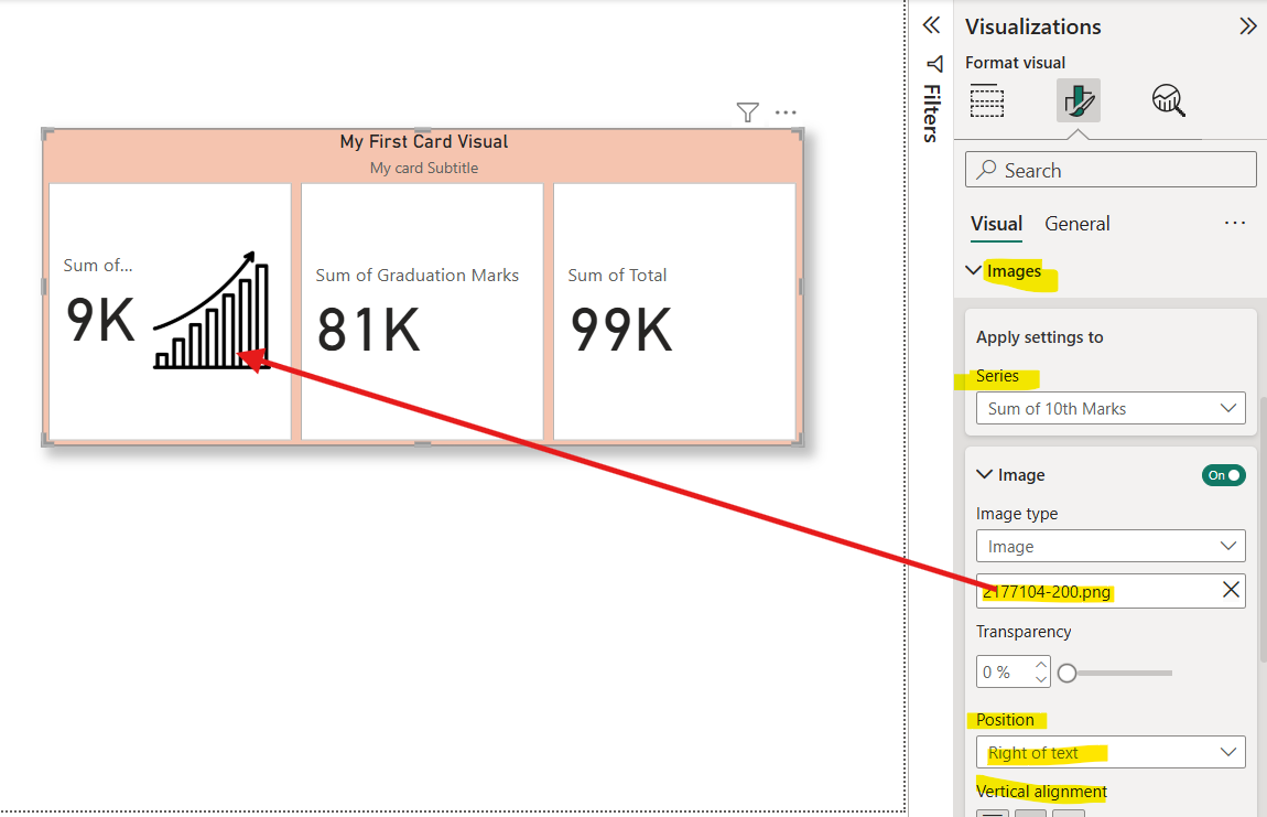
With the “Image type” option we can choose to insert and image from our local files, or from an image URL, to accompany the data in our visual.
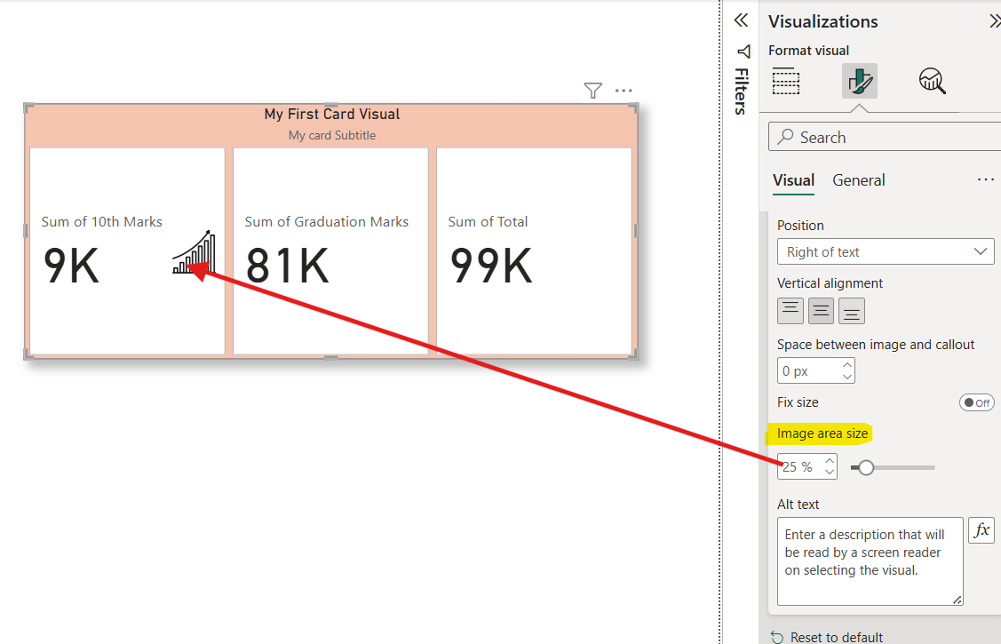
We can specify the Image area size.
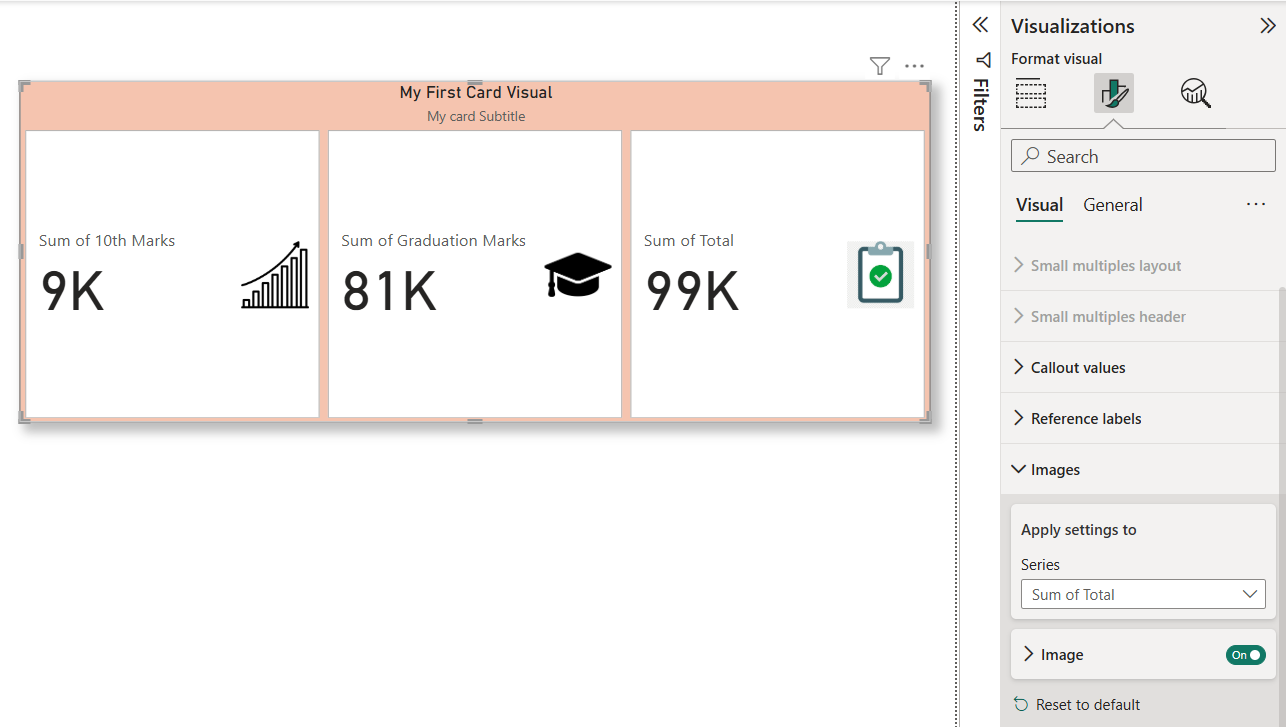
Similarly add images for other cards also.
Adding and formatting reference labels We can add Reference label to the cards to make them more informative. Go to the Reference labels section and in the ‘Select series’ dropdown, choose a card, then in the ‘Add label’ field, select a data field or measure to add reference labels, keeping in mind that we can include multiple data fields.
Let me add a measure and a field from the table.
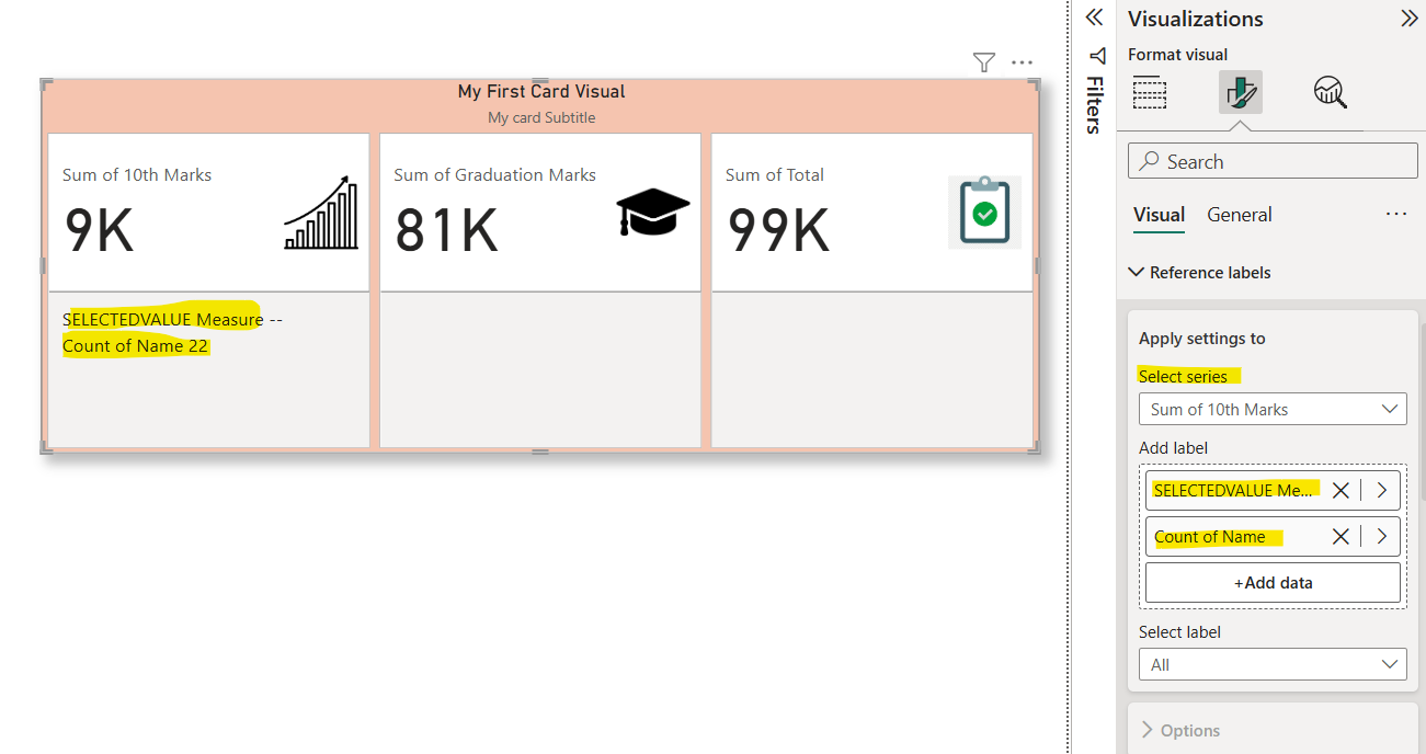
The reference labels are composed of three key elements: Title, Value, and Detail.
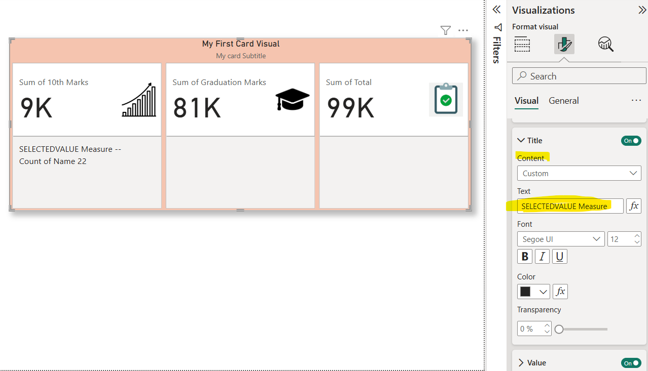
The Title displays the data field name, but you can spice things up by selecting Custom content and using a different data field or measure.
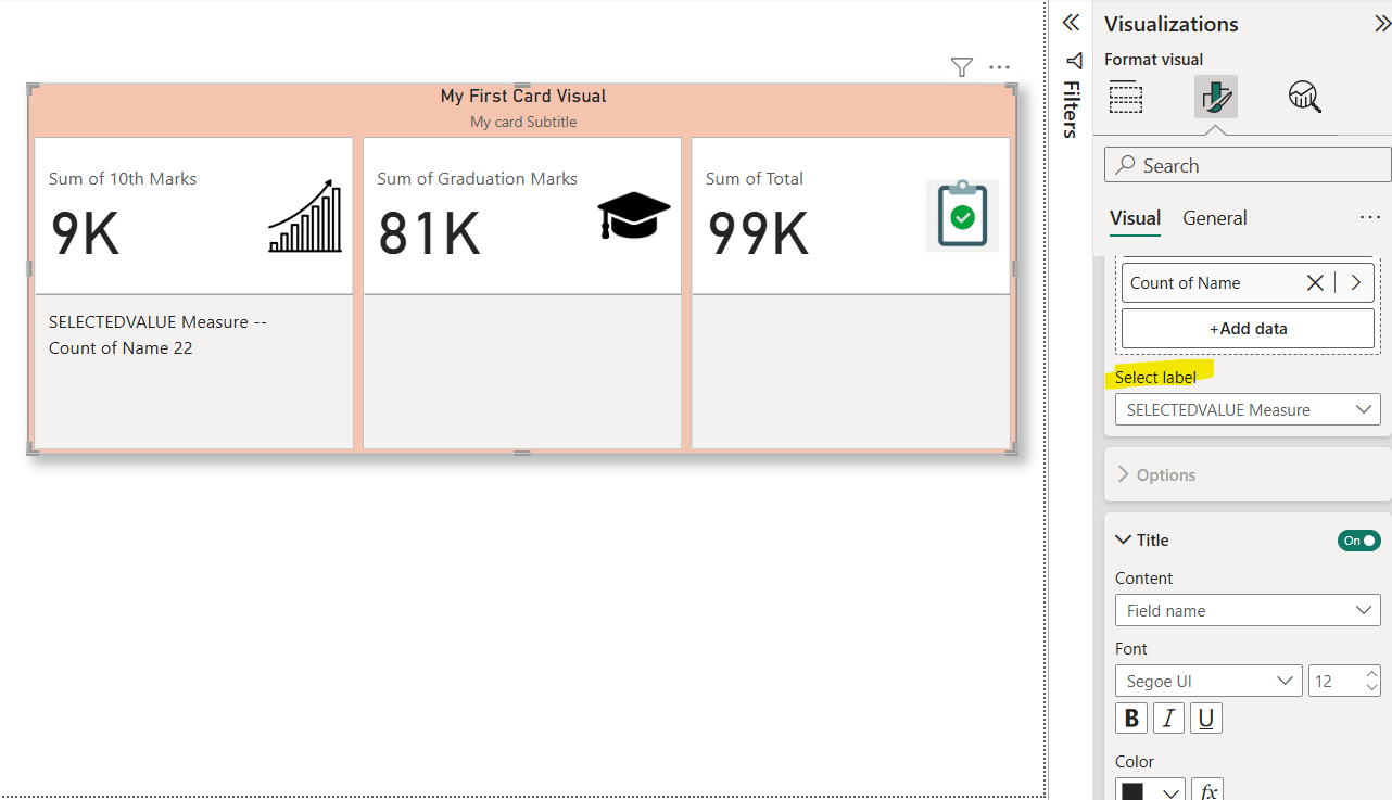
We can customize the text.
The Value showcases the assigned data field value, we can format this value and also we can use “Show blank as” when the value is blank.
We can add the “Detail” also, which gives more context to our reference values.
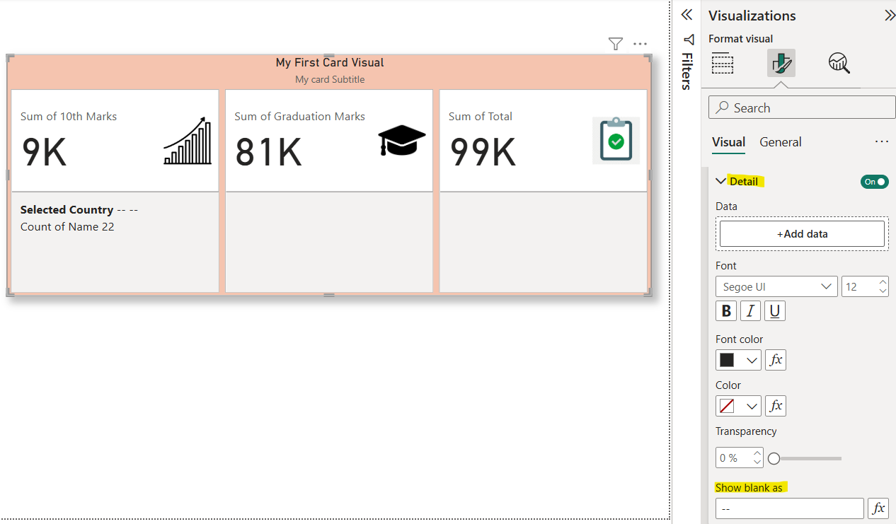
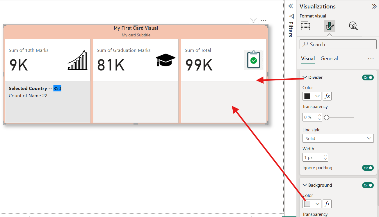
The Divider toggle, when enabled, displays a customizable visual division between the Callout values and the Reference label, and makes the Background toggle available for more customization options.
From the Layout section of the Reference labels, we can show them Columns arrangement. Please note the Name field which is added respects the filter context from the slicer.
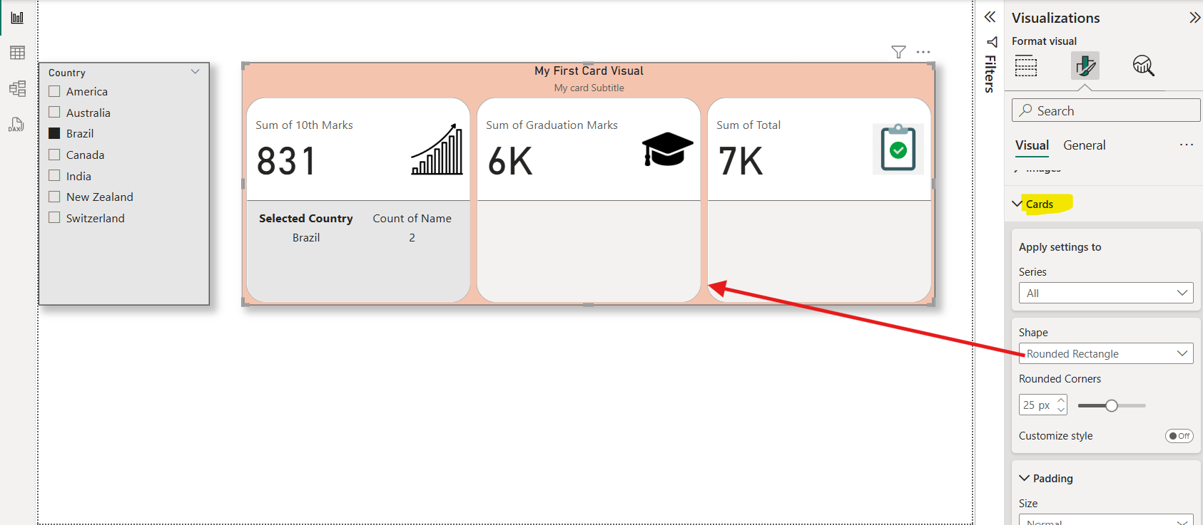
From the Cards section we can format the Cards. Here we changed the shape of the cards to Rounded Rectangle as shown in the image below:
