Gauge chart in Power BI
In this exercise, we will create a create a gauge chart in Power BI. A gauge chart has a circular arc and displays a single value that measures progress toward a target.
Step 1: To create a gauge, choose its icon from the Visualizations pane.
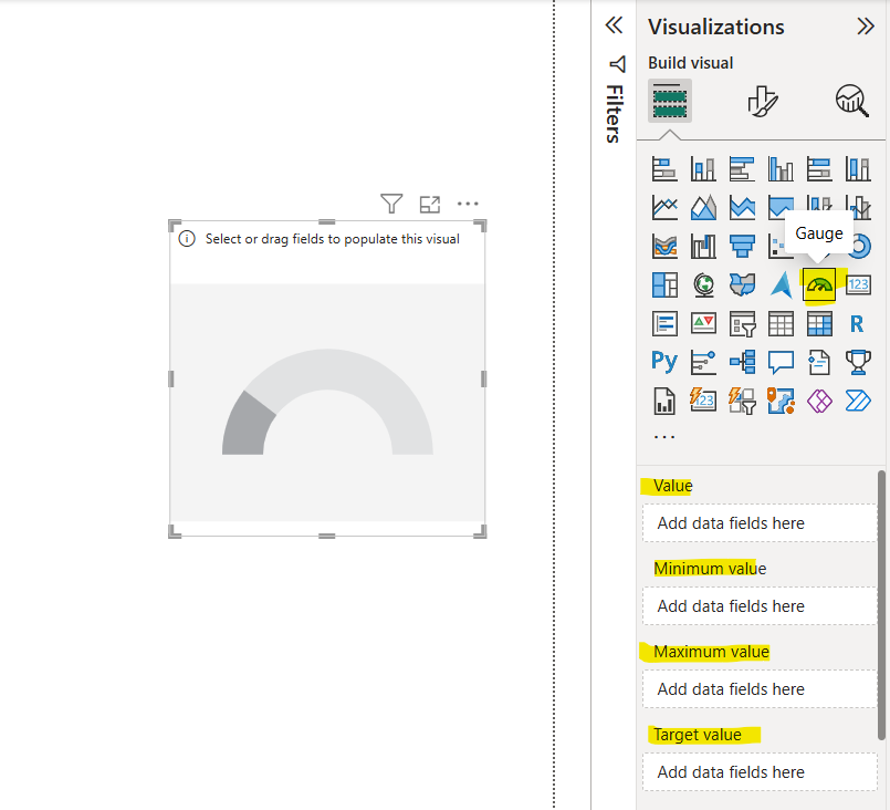
Step 2: Let’s add the 10th Marks column to the Value field. The value at the end of the arc represents the defaulted maximum value, which will always be double the actual value.
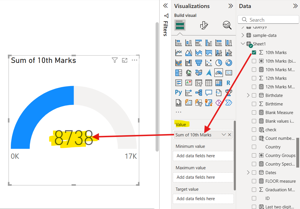
We can also add the fields from the table to the Minimum value, Maximum value, and Target Value.
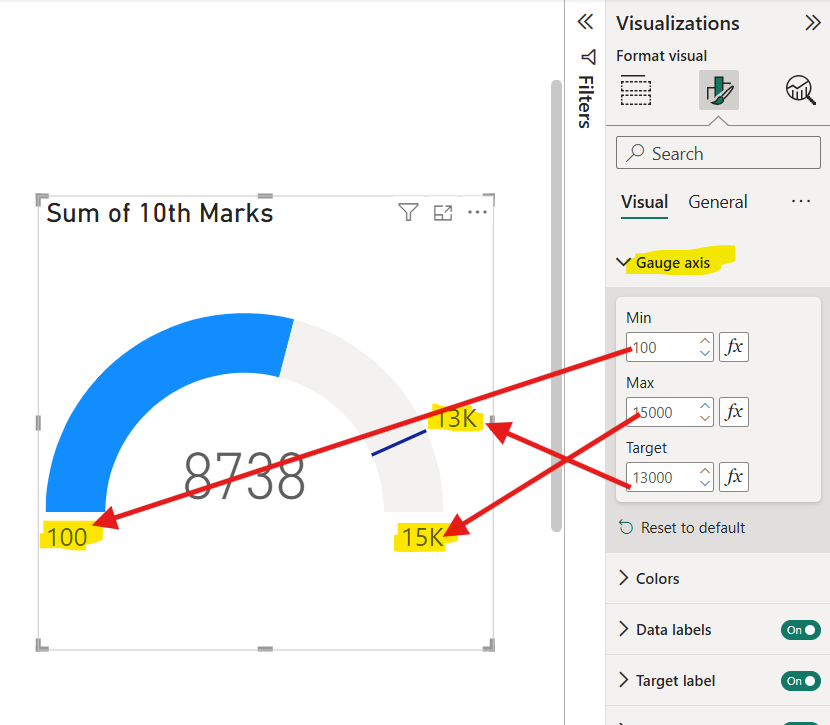
Step 3: Alternatively, we also have the option to manually add the Min, Max and Target values in the Gauge axis in the Format visual pane.
Step 4: We can format the Callout value as shown in the image below.
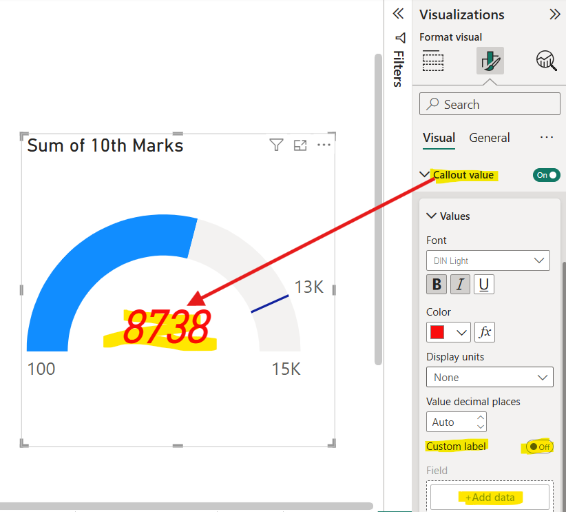
Step 5: We also have the option to add the Custom label.
Let’s create a measure “SELECTEDVALUE Measure”.
DAX
Step 6: Add a slicer and add the Country field from the Sheet1 table.
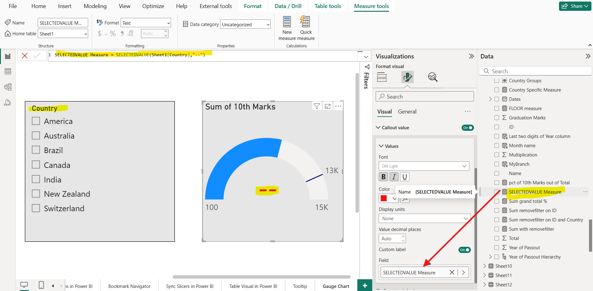
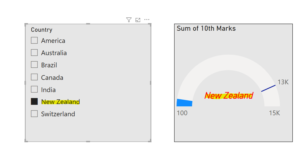
Step 7: Now if all countries are selected then the value in the callout label is shown as --, otherwise we can see the selected country from the slicer.
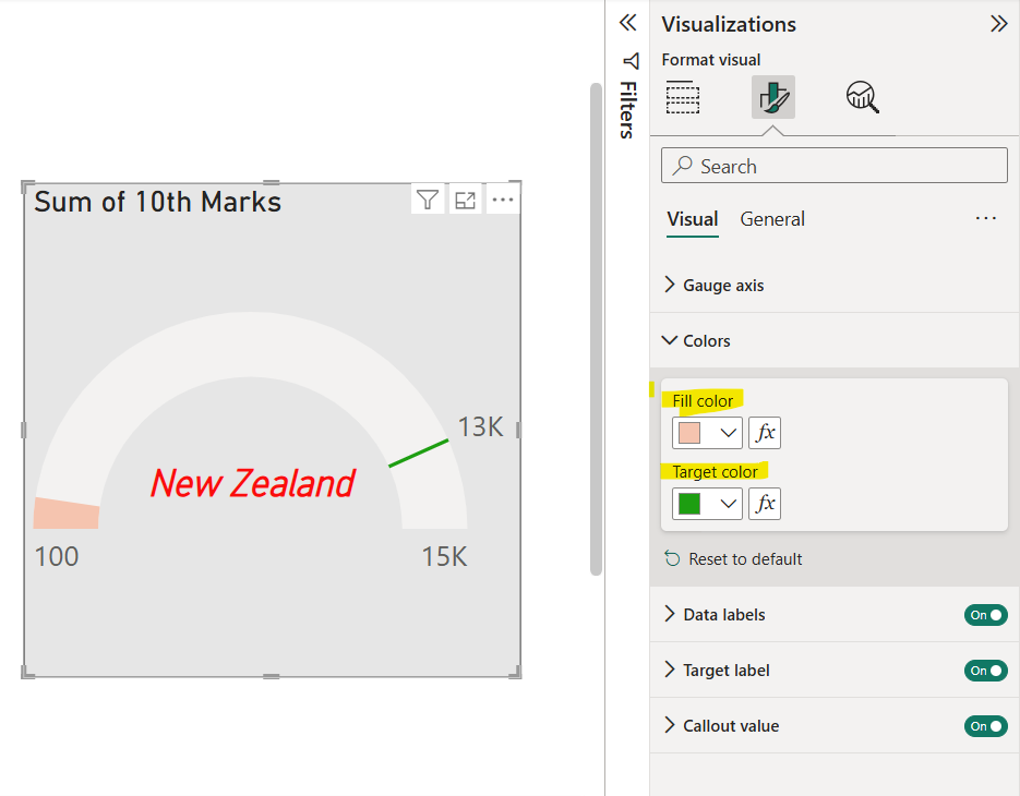
Step 8: We have the option to specify the Fill color for the value and Target color of the needle.
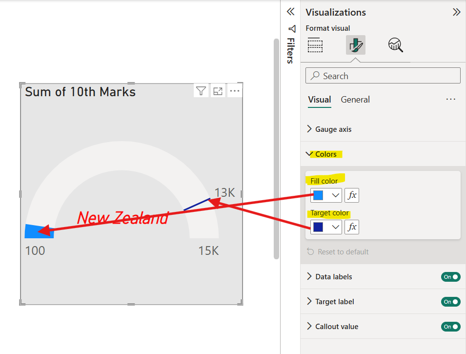
We have formatted the color as shown in the image below:
