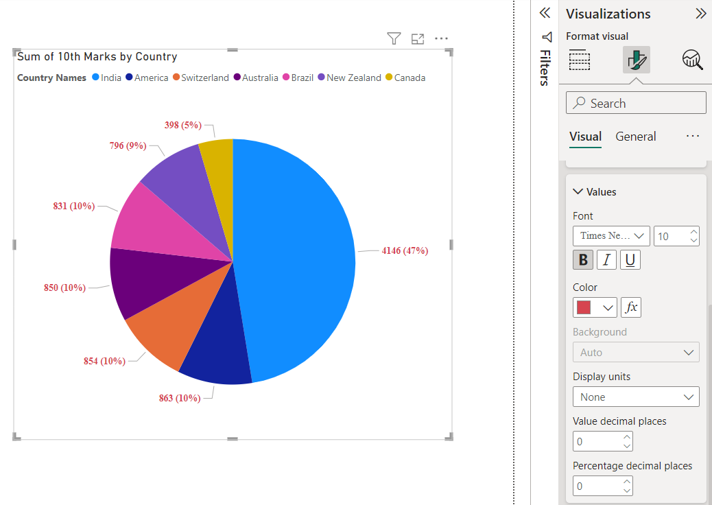
Pie chart visual in Power BI
In this exercise, we will learn how to create a pie chart in the Power BI report. Pie charts show the relationship of parts to a whole.
Step 1: Go to the Report View in Power BI desktop and from the Visualizations pane click on the Pie chart visual icon.
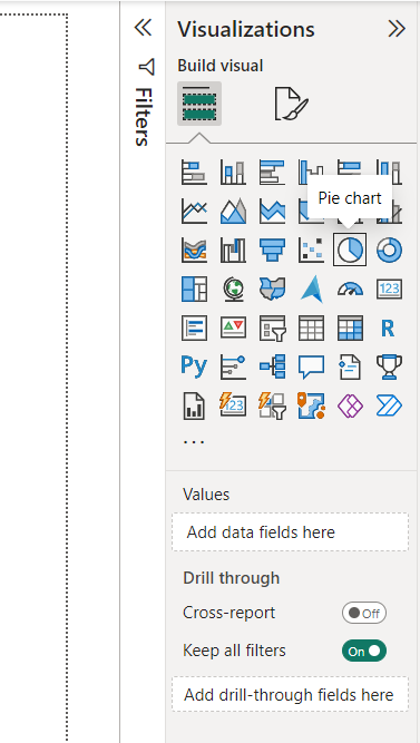
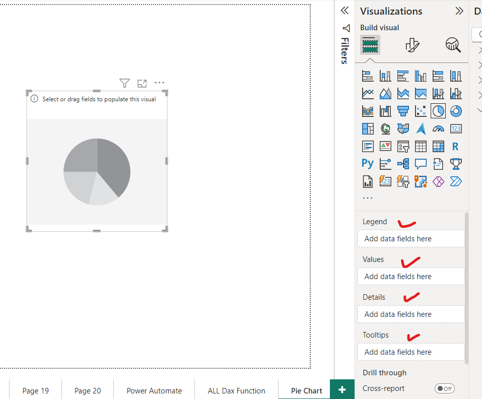
Step 2: When we select the Pie Chart visual on the canvas several option we can see below the Visualizations pane.
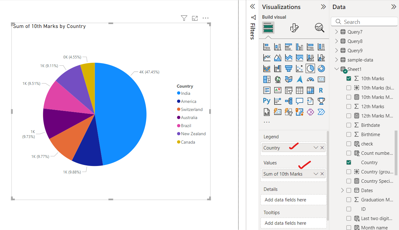
Step 3: Now we add the categorical field and the value field to show in the pie chart.
Step 4: We can also format the visual.
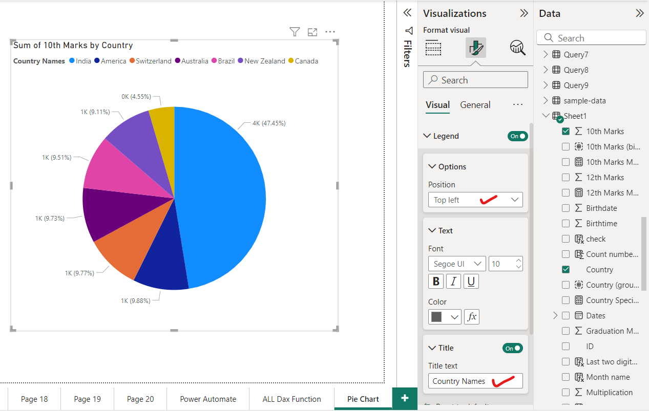
We can change the legend text, size, color, and its position.
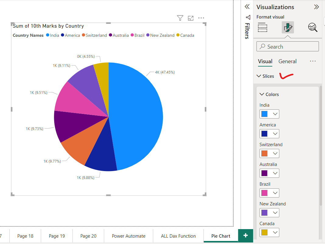
We can also specify which category specified by which colour.
We can also specify the label position, and label content i.e. (Category/Data value/ Percentage of Total or any combination of these).
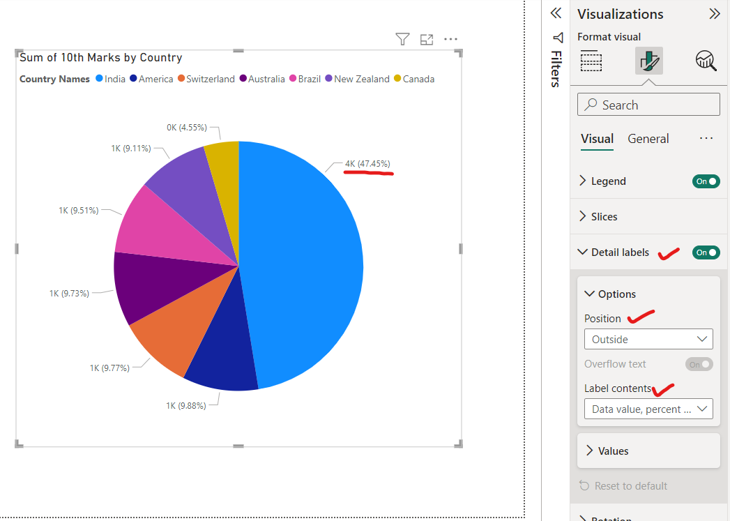
We can also format the Label content like its colour, size, display units, etc.
