Slicer visual in Power BI
In this exercise, we will learn about the slicer visual in Power BI. We can add a Slicer visual in Power BI following the following steps:
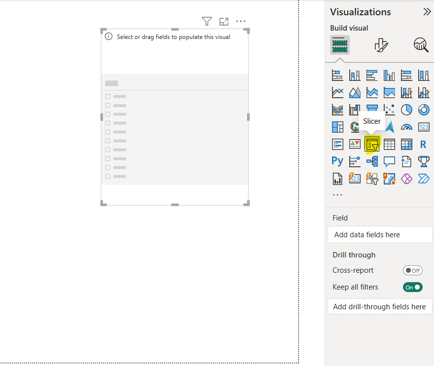
Step 1: To add a slicer on the page, first click on the empty area of the report page, and then from the Visualizations pane, select the Slicer visual.
Step 2: Drag the fields that we want to include in the slicer Field pane.
The visualization then changes to a list of items (filters) with check boxes that we can use to segment the data. When we select an item's check box, Power BI will filter all the other visualizations (including other slicers) on the same report page.
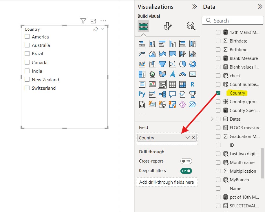
The below is a Vertical list format of slicer.
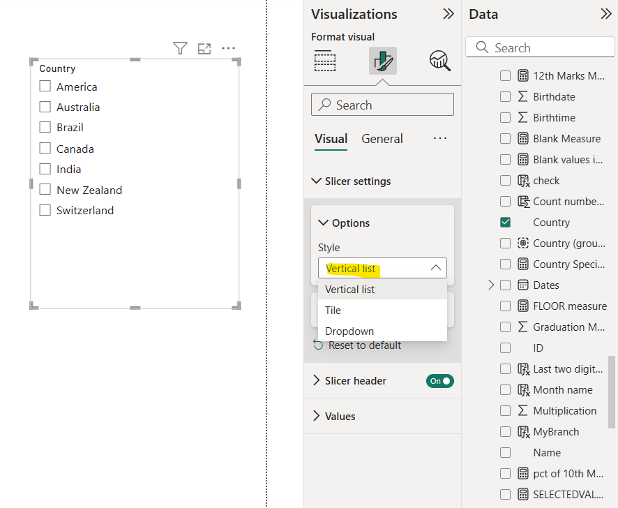
We can make that list appear in a drop-down format if we want to save space for more important data on our report page.
We can use the following slicer style:
• Vertical list,
• Tile, or
• Dropdown
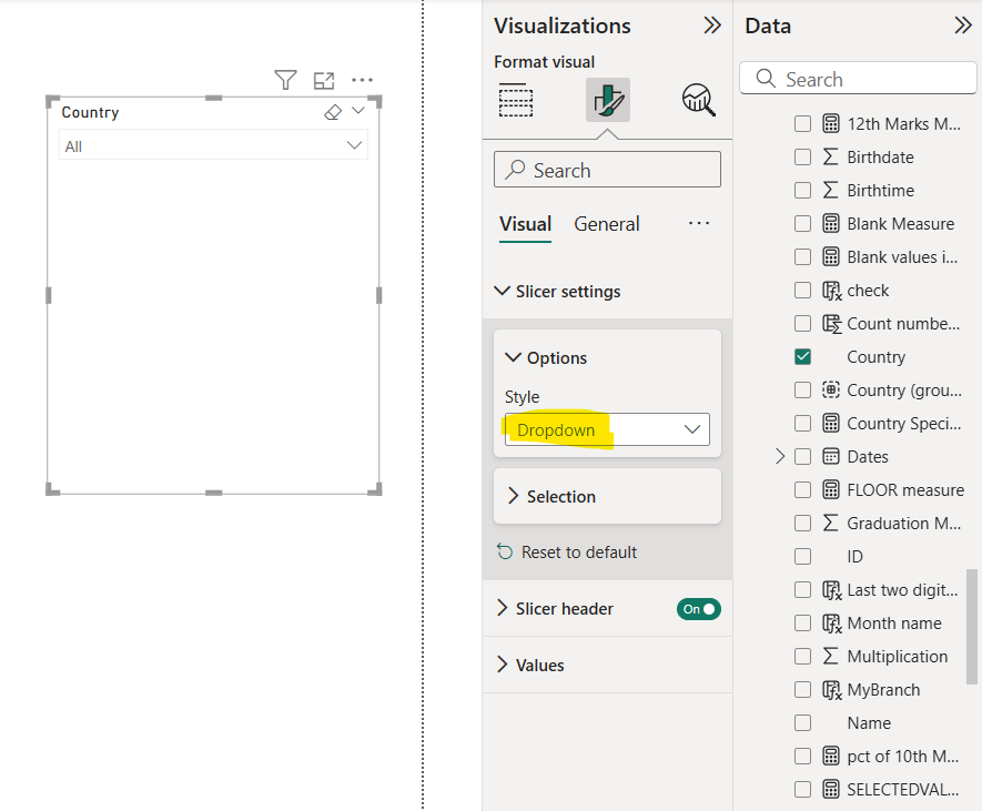
In the image below we can see the Dropdown slicer style. By clicking on the All option, we get the list of all options.
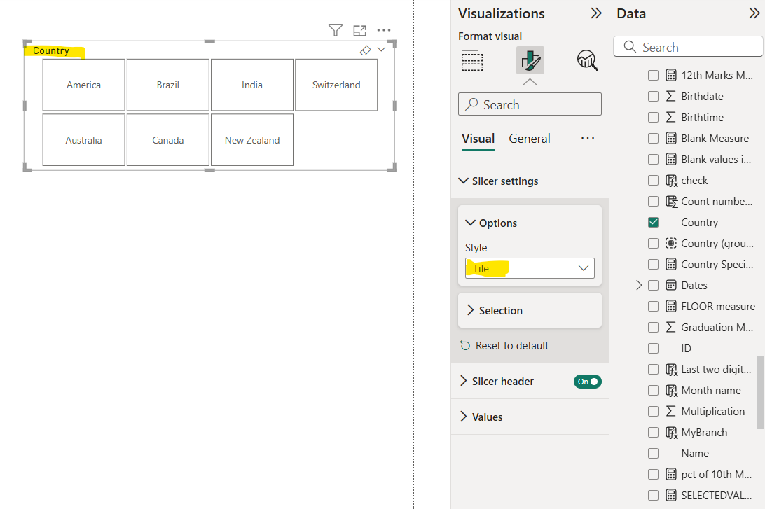
We can turn our slicer into buttons, by selecting the Tile slicer style, to make it easier for users to filter data.
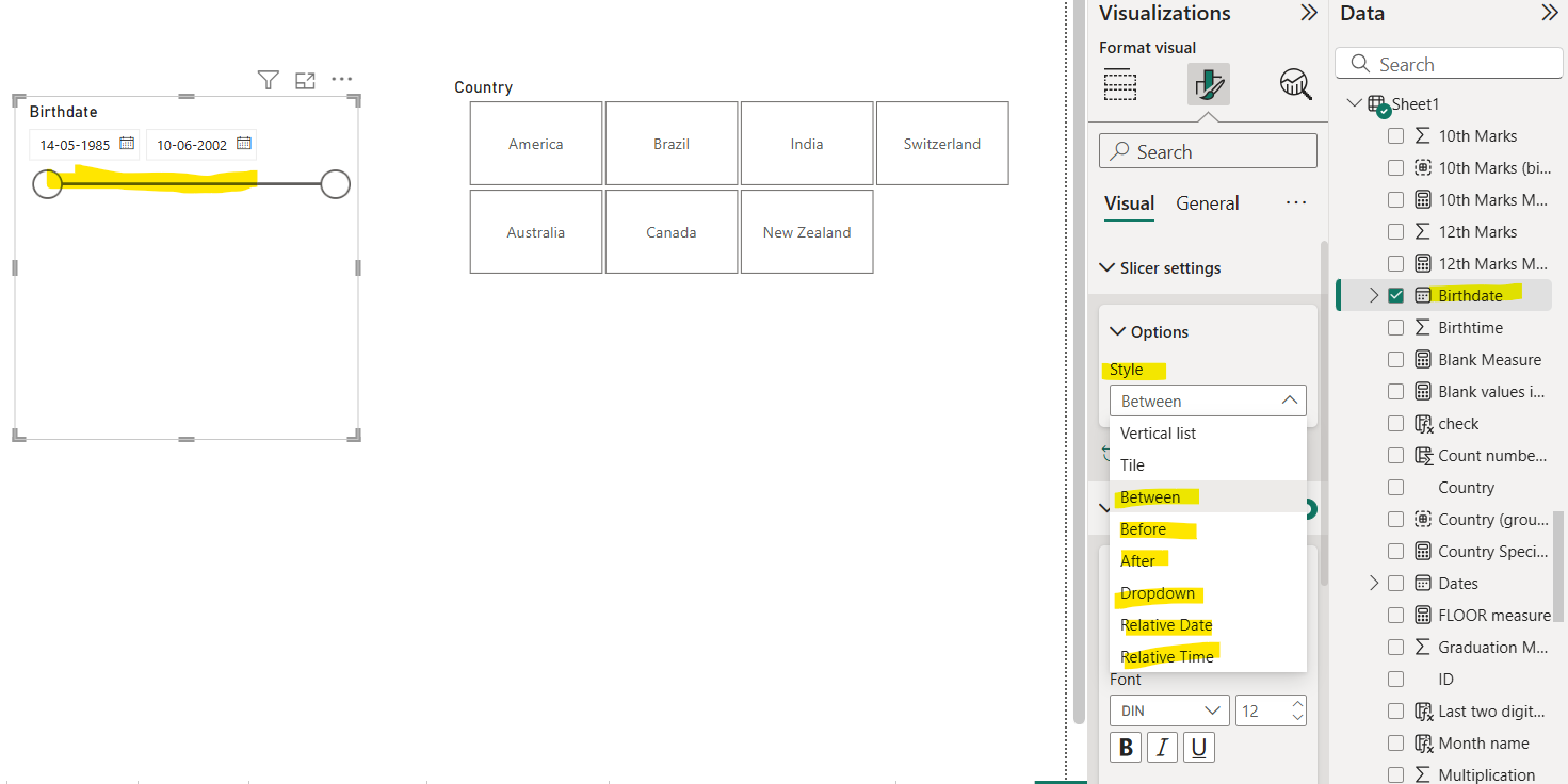
Also, we can use our slicer with date datatype columns, so we can select a different date range by using the slider. We have other styles also like Between as shown in the image below.
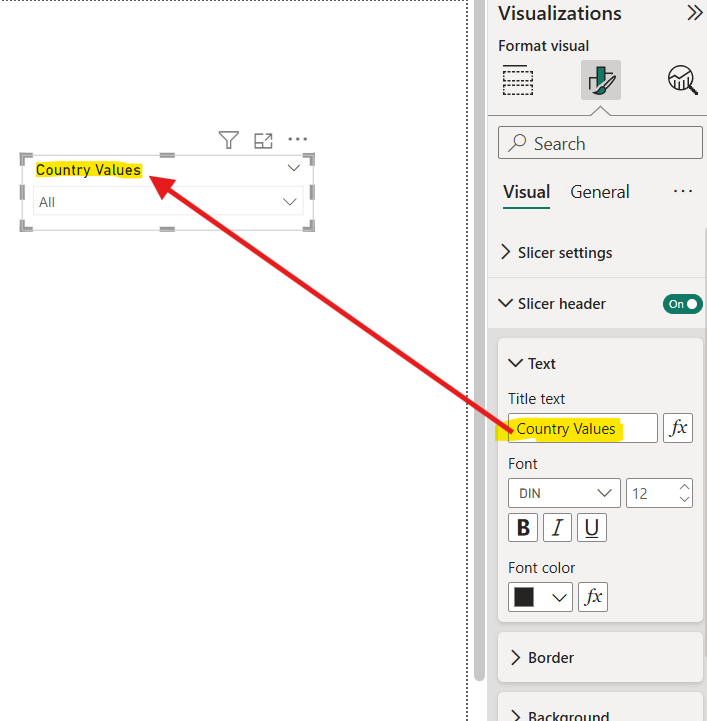
We can also add Title to the slicer and format it.
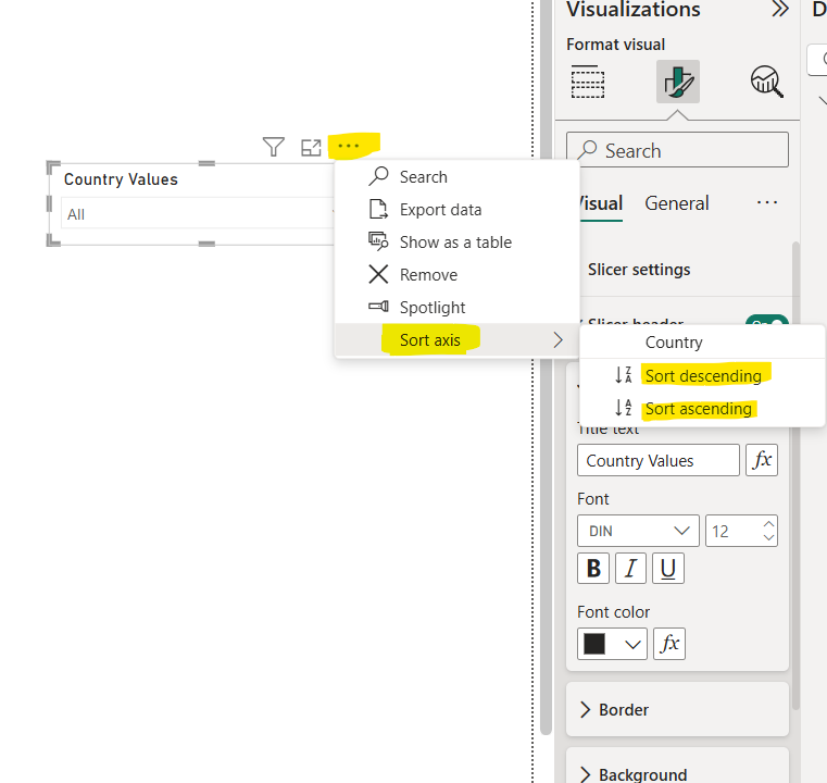
Tip Slicer list items are sorted in ascending order, by default. To reverse the sort order to descending, select the ellipsis (...) in the top right corner of the slicer and choose Sort descending.
