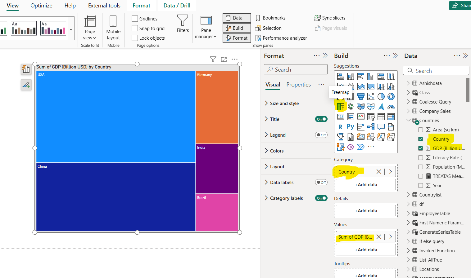
Treemap visual in Power BI
A Treemap visual in Power BI is a hierarchical visualization that displays data as a set of nested rectangles. Each branch of the hierarchy is represented by a rectangle, with smaller rectangles inside representing subcategories. The size and color of the rectangles represent different values or categories.
Key Features of a Treemap in Power BI
- Area (Size): Represents a quantitative value (e.g., total sales).
- Color: Represents a category or measure (optional).
- Hierarchy: Supports drill-down if you add multiple fields.
When to Use a Treemap
- When we want to show proportions within a category.
- When we have a limited number of categories (not ideal for too many small segments).
- When comparing contribution of parts to the whole.
How to Create a Treemap in Power BI
Step 1: Go to Visualizations pane and then click on the Treemap icon (it looks like stacked rectangles).
Step 2: Add the fields in the Category and Values section.

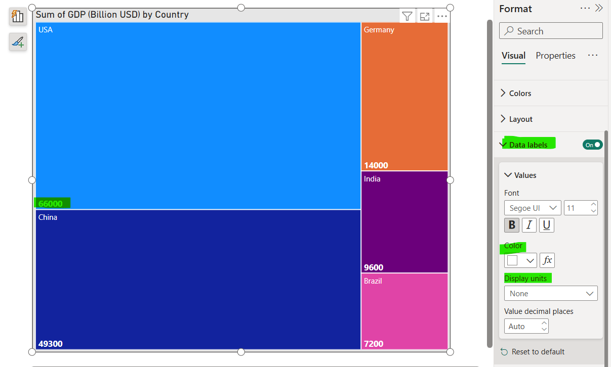
Step 3: We can apply several formatting options; we can add the Data labels in the chart. We can specify its color, size and display units.
