Key performance indicators (KPI) visual in Power BI
The KPI visual in Power BI is a tool that helps you track how well you're doing against specific goals. It shows the current value of a key metric, like total sales, and compares it to a target, such as our sales goal. It also uses colors (like green for good, red for bad) or icons to quickly show if we're on track and includes a trend line to see how the metric has changed over time.
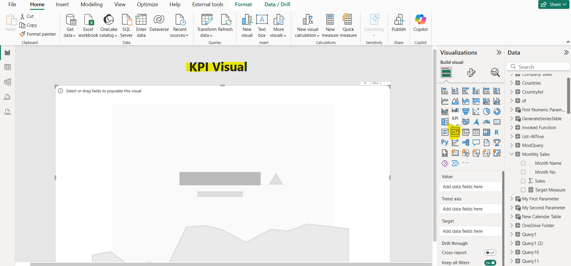
Step 1: Insert the KPI visual by clicking on the KPI visual icon from the Visualizations pane as shown in the image below:
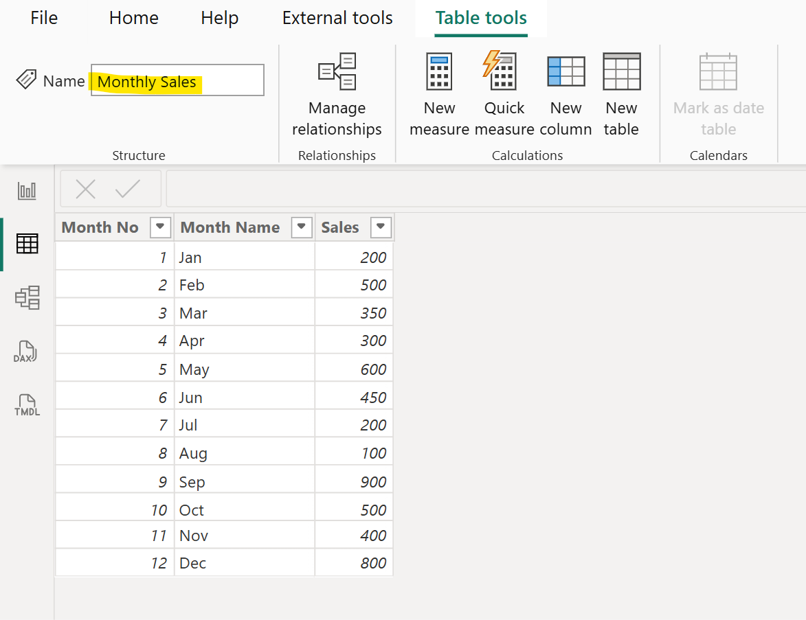
Step 2: Let’s have following “Monthly Sales” table in the Power BI.
Step 3: We have created a “Target Measure” with the following dax code:
DAX
Step 4: Let’s add the Sales column in the Value field and “Month Name” column to the Trend axis field and “Target Measure” in the Target field of the visual.
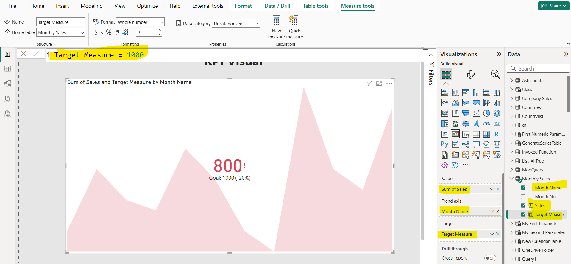
In the visual the 800 value comes from the recent month i.e. Dec month as we are sorting “Month Name” column with “Month No”. It is compared with the Target value which is 1000 . Here we get that the latest value is 20% less than the specified Target.
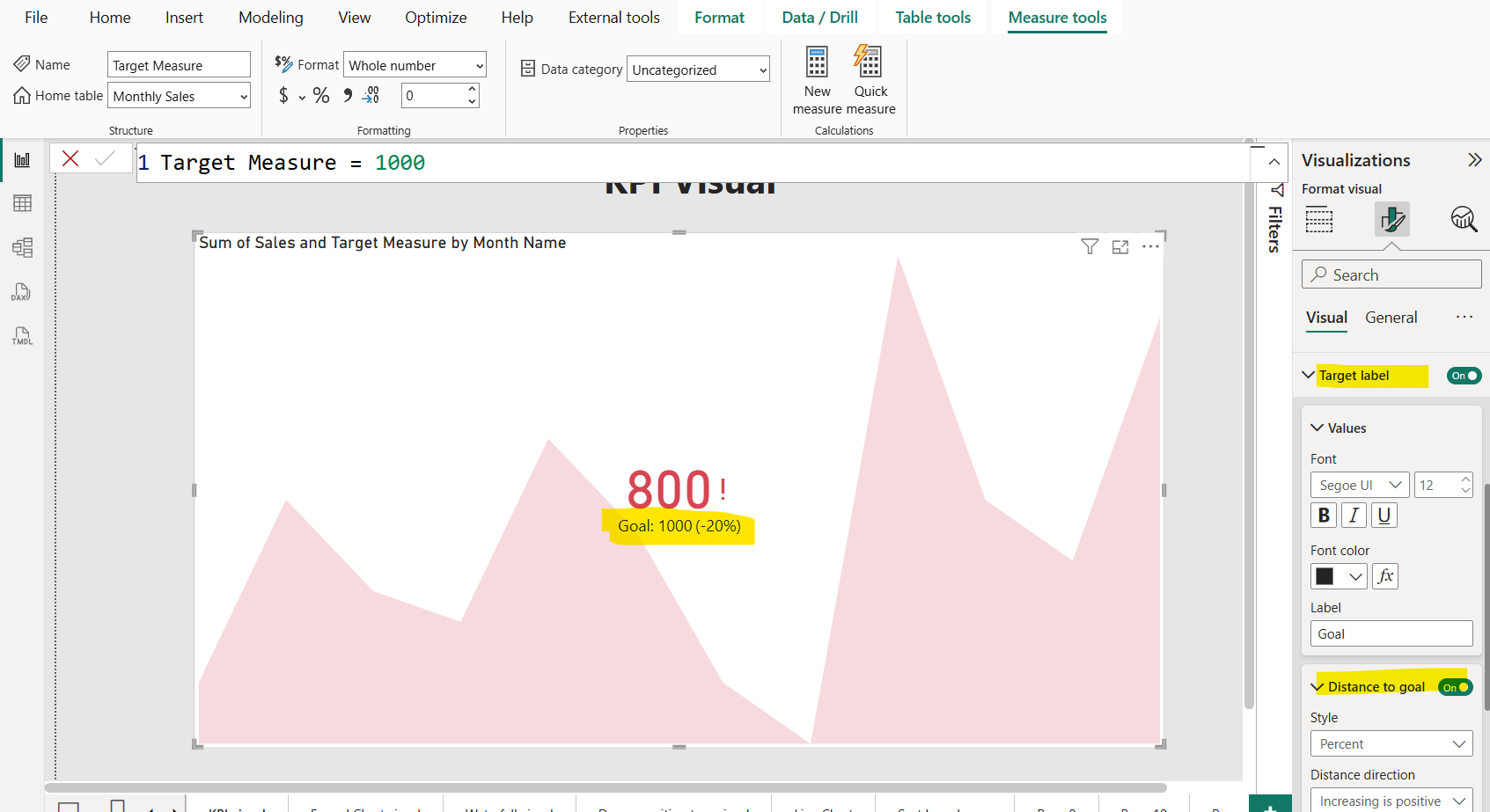
Step 5: Format visualization Let’s format the visual. We can specify the Icons property. When it is set to On, the visual shows small icons next to the value, a green checkmark for an increasing value, and a red exclamation point for a decreasing value.
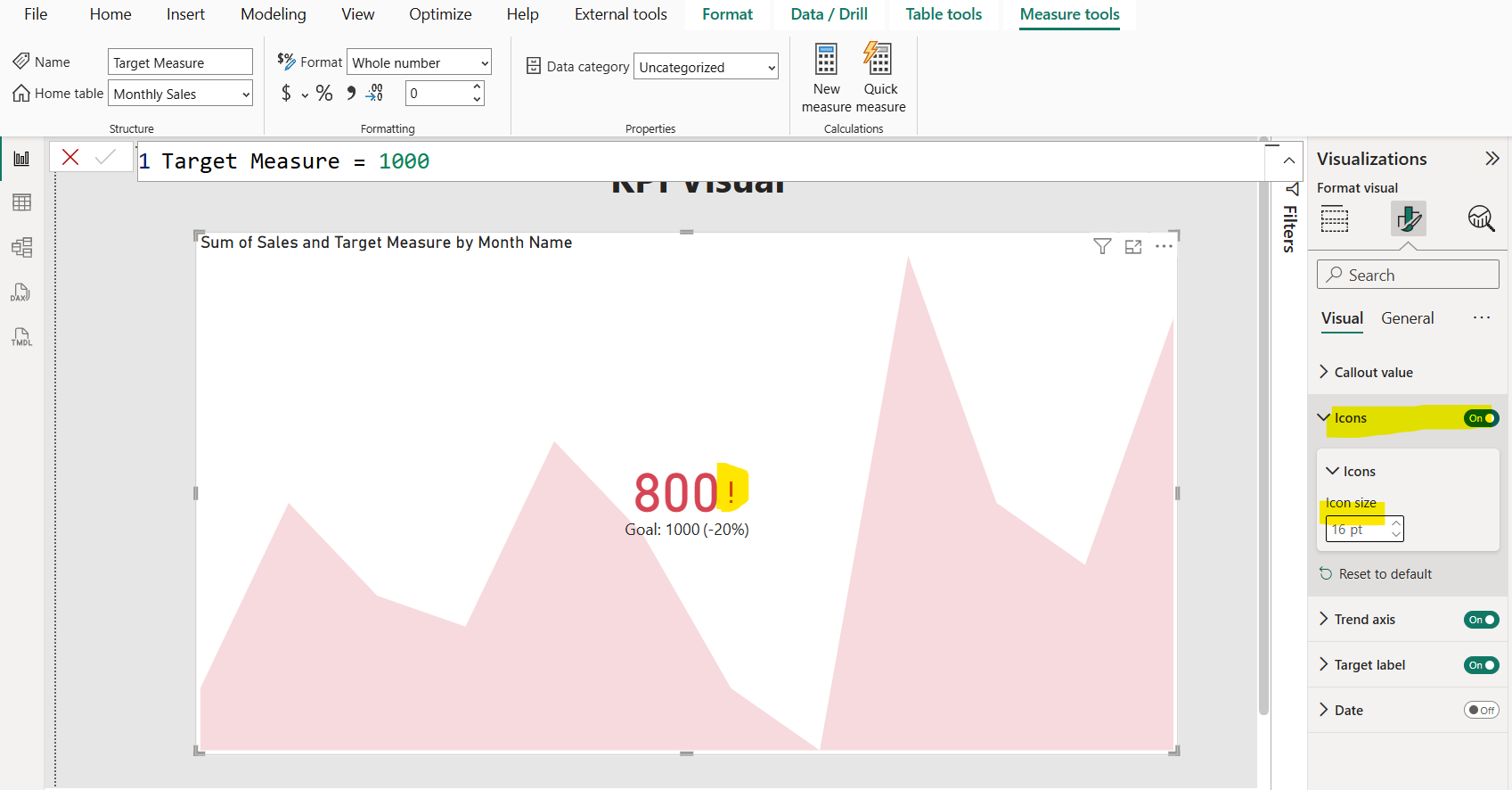
We can also format the Target label and Distance to goal. Here, Target label specify the Target value which is 1000 and the Distance to Goal specify the difference between the Target and the current value, which in our case is 200. But we are specifying that difference in the percentage format.
