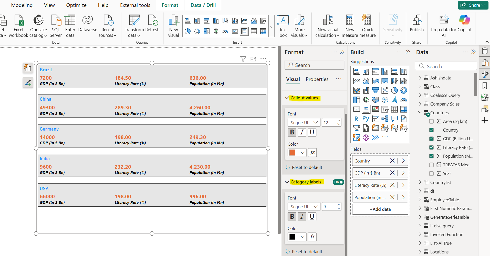
Multi-row Card visual in Power BI
We can add Multi-row Card visual to the report page in Power BI.
Step 1: Click on the Multi-row Card visual icon from the Build pane.
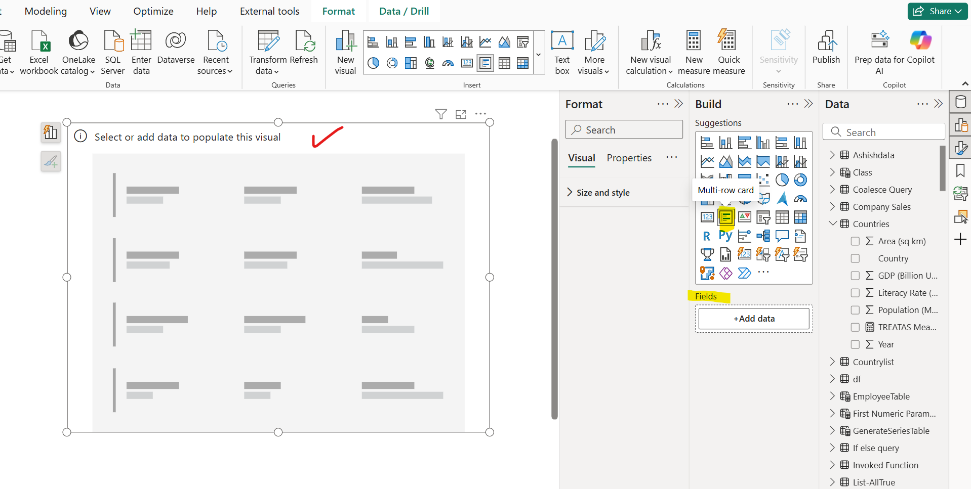
Step 2: Let’s add some aggregated fields or measure in the pane.
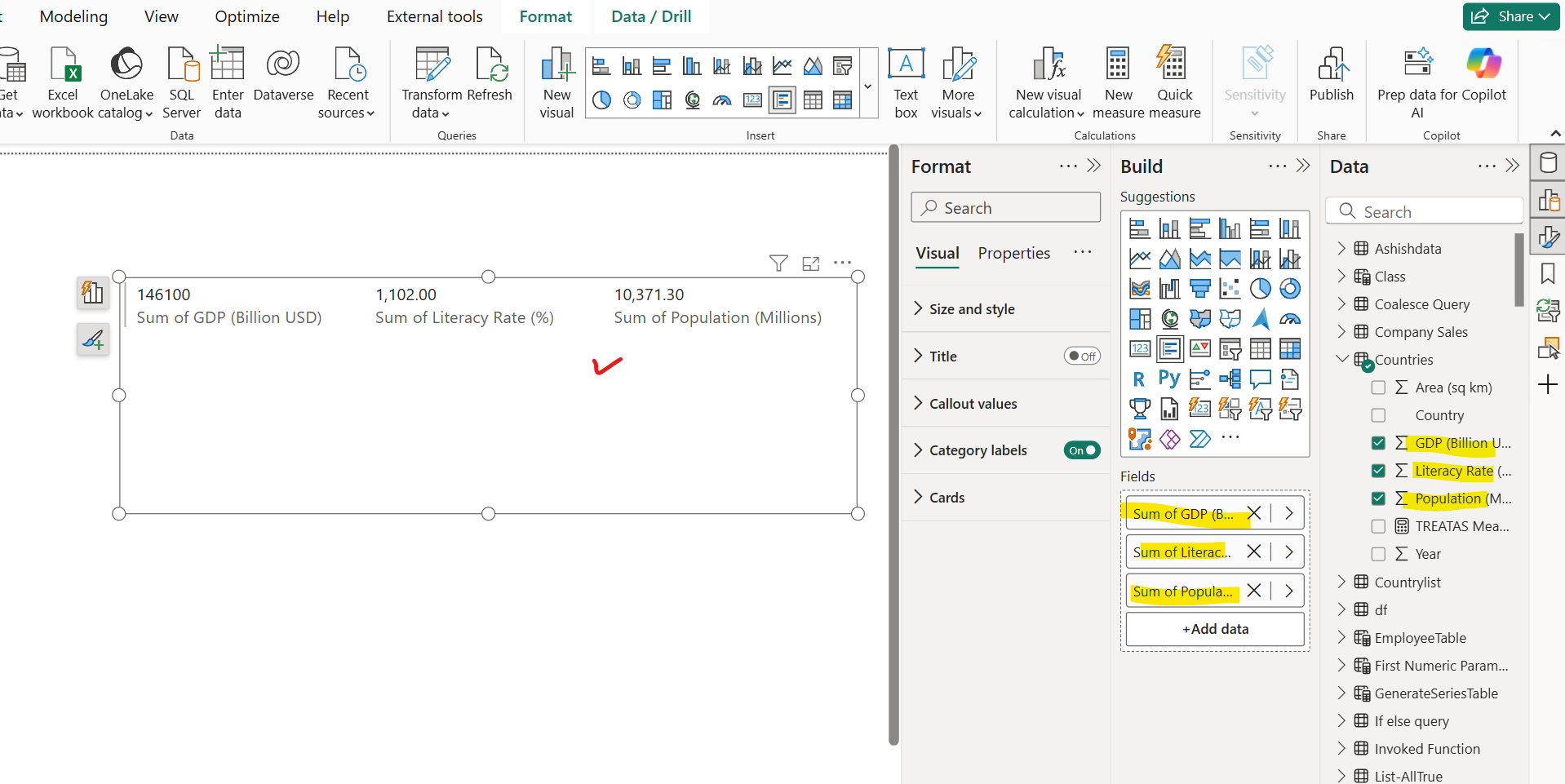
In the above image we can see that all the aggregated fields are shown in the visual.
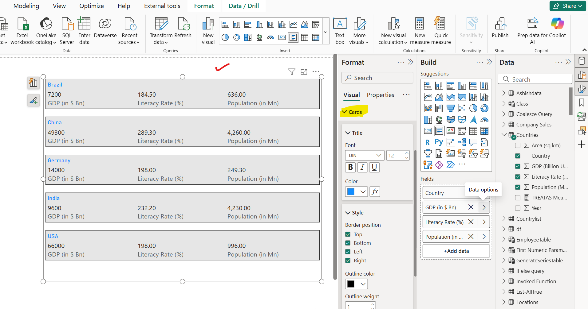
Step 3: We can also add the categorical field in the visual. Let’s add the Country field from the table.
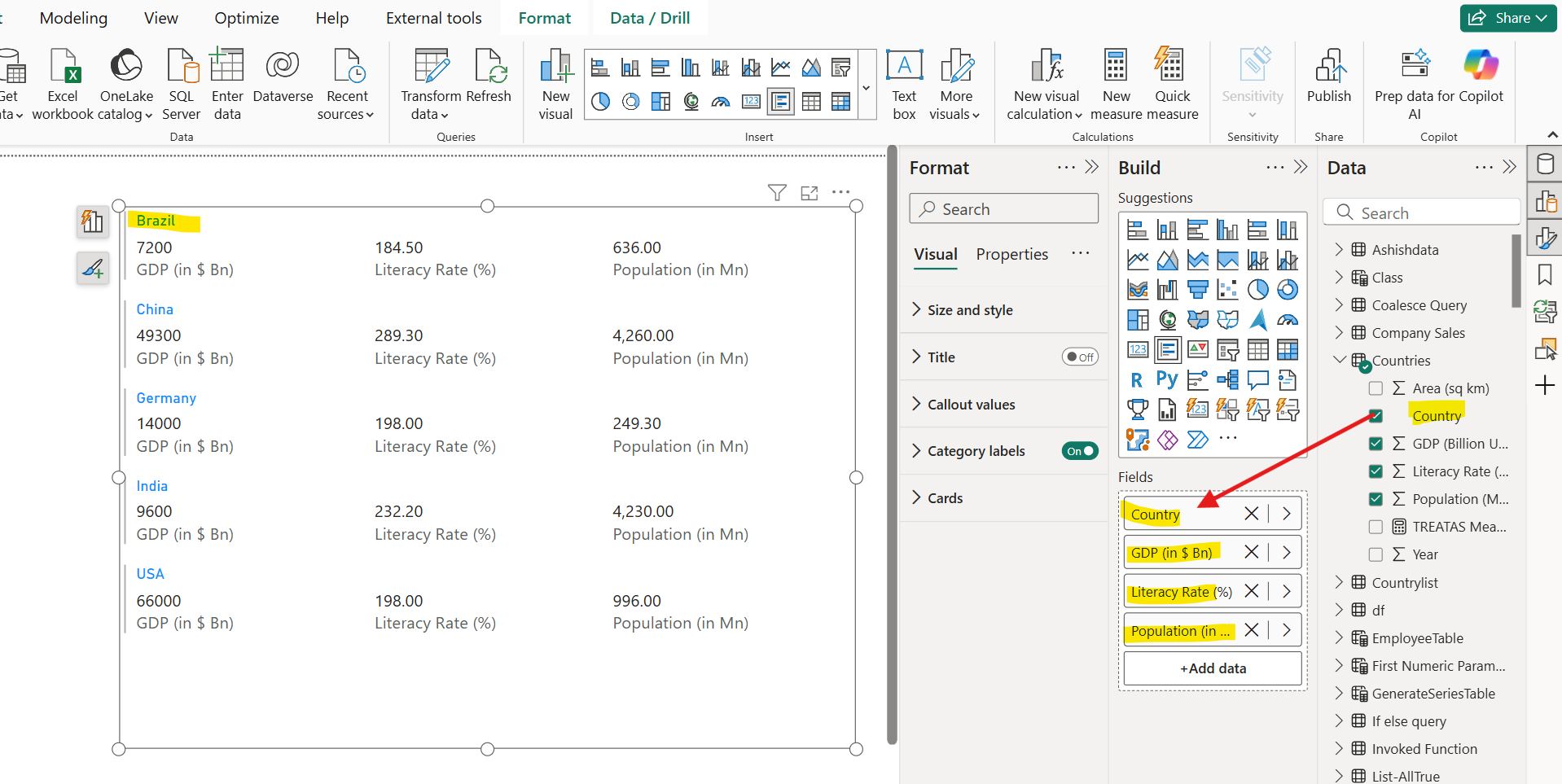
In the above image once we add the categorical field the aggregated field or measure is automatically provides us the values in the filter context of that categorical field.
Step 4: We can format the Multi card visual. We can specify the card’s background colour, border color, outline width, its title colour, etc.
Step 5: We can format the Callout values and the Category labels, as shown in the image below:
