Reference Lines in Power BI Desktop
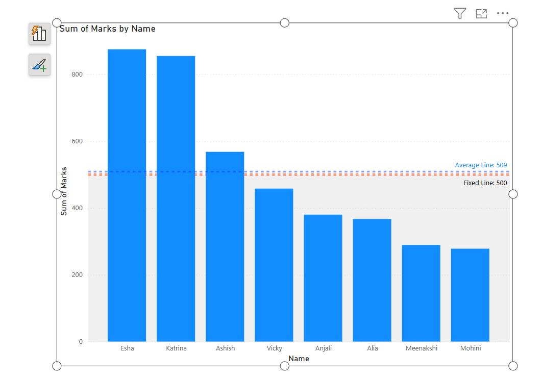
In Power BI, Reference Lines are horizontal or vertical lines that we can add to charts (especially line charts, bar charts, scatter plots, etc.) to highlight a specific value, average, constant, or statistical boundary. They're useful for data analysis and storytelling by giving context to your visual data.
Step 1: Lets’ we have added a column chart on the report page. On the X-axis we have added the Name column, and, on the Y-axis, we have added the Marks column.
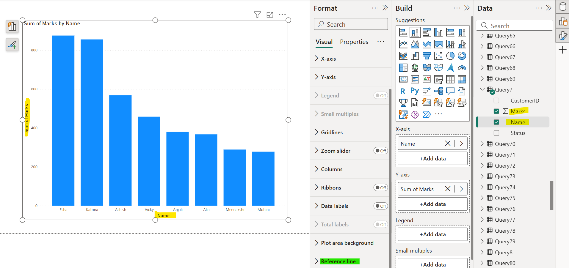
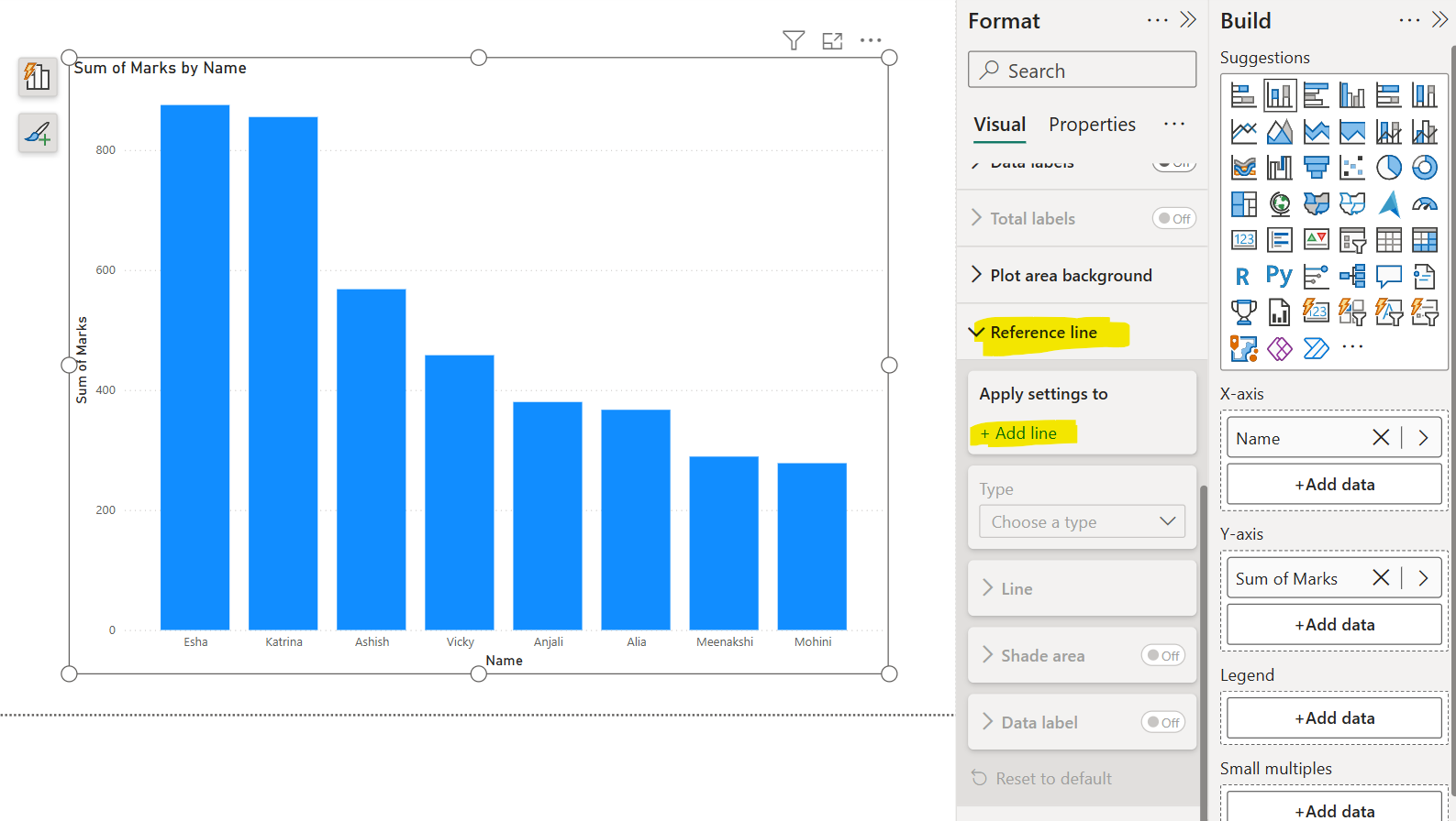
Step 2: From the Reference line section in the Format pane. Click on the + Add line.
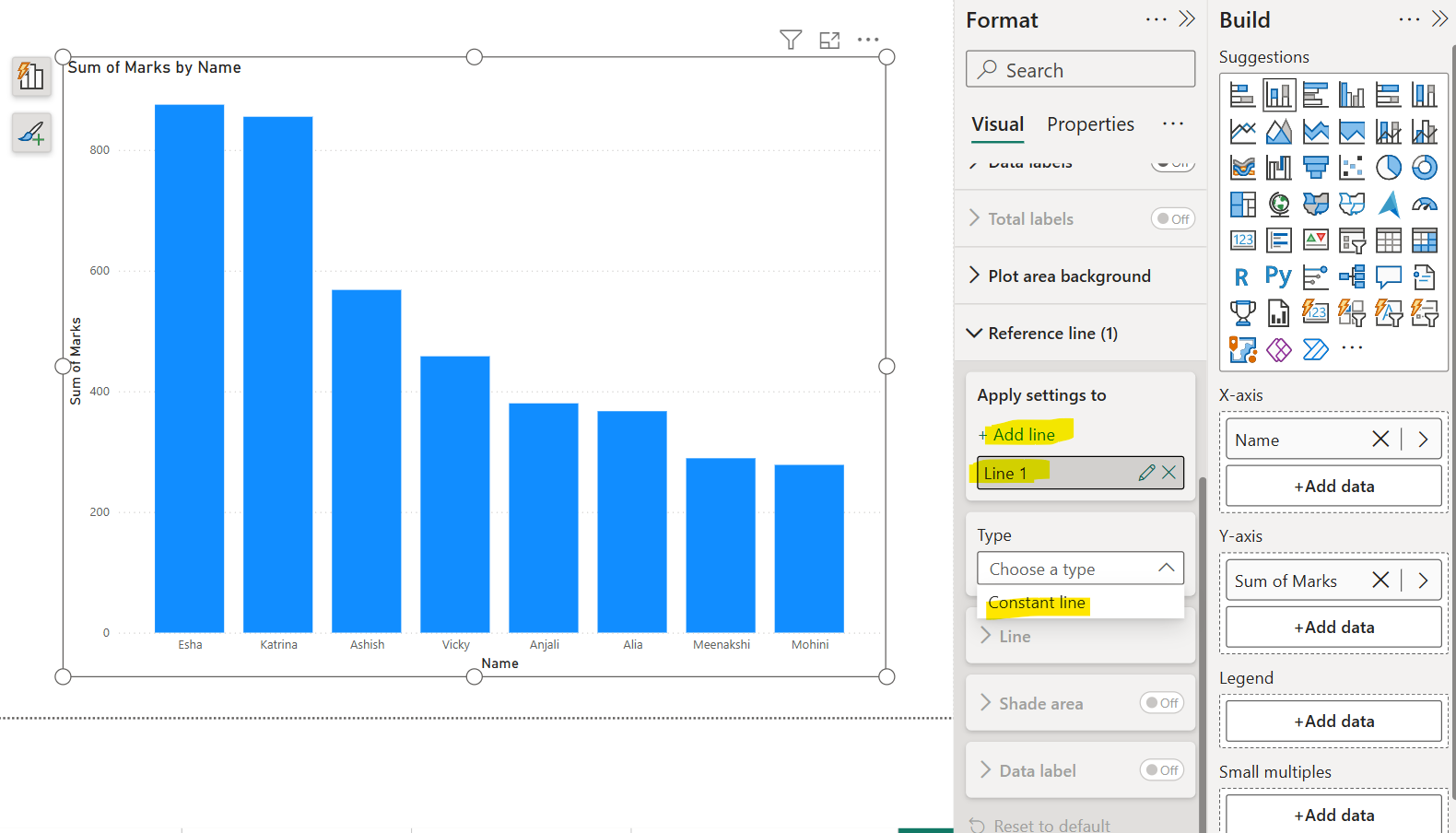
Give a name to the line and from the type choose Constant line.
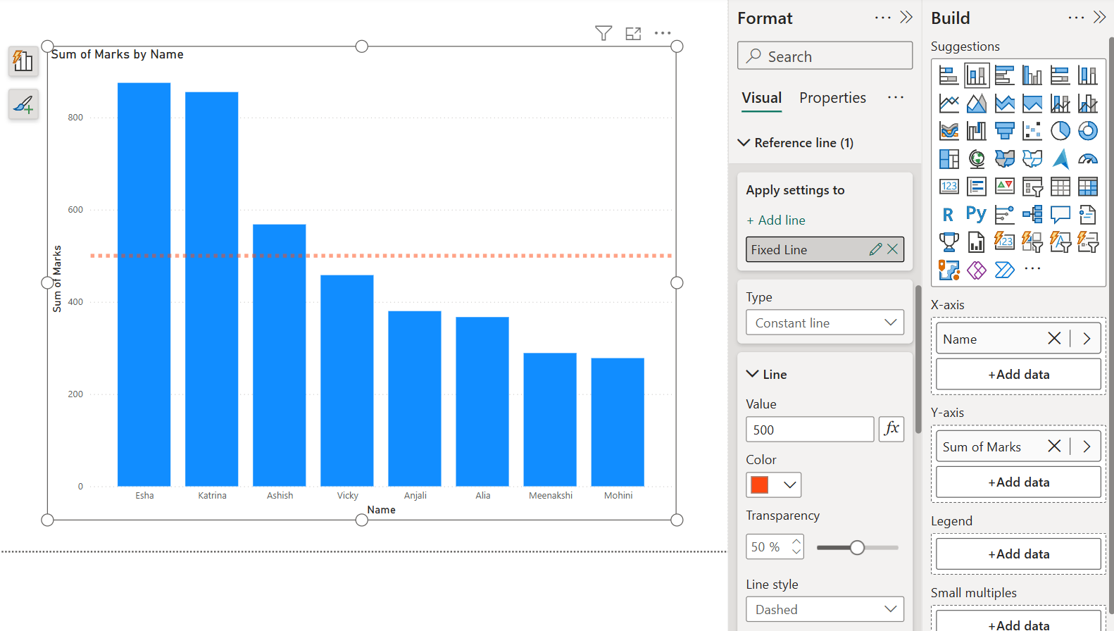
I have given the name Fixed Line and given the constant value 500. Here we specify a fixed value across the chart (e.g., sales target).
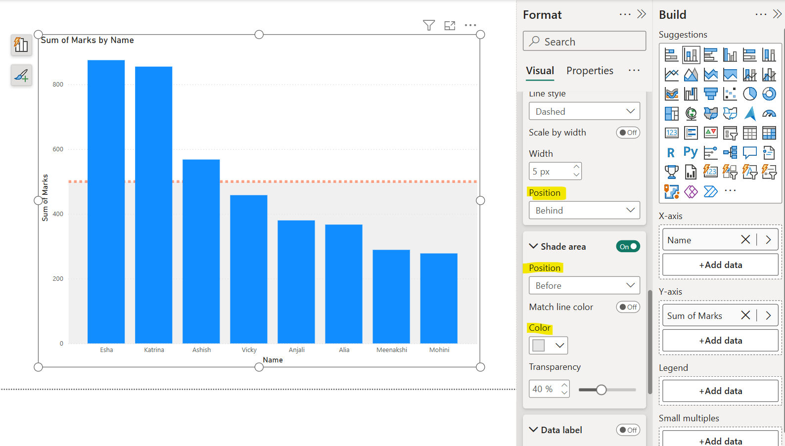
We can specify the line color, style, and its position. The position front means the line displays on the front of the chart and behind it displays on the behind of the chart.
We can also add shade areas for all reference line types. We can specify its position that is before or after the reference line. We can also specify its color.
We can add Data label on the chart for the reference lines. Here, we can specify the Horizontal and vertical positions of the Data label. And its style i.e, we want to show only Name, Value or Both on the reference line. We can specify the label color, and units and decimal places for the value.

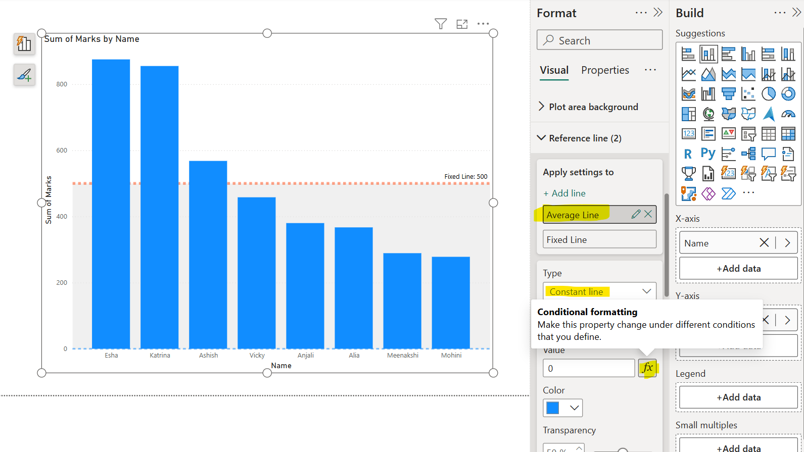
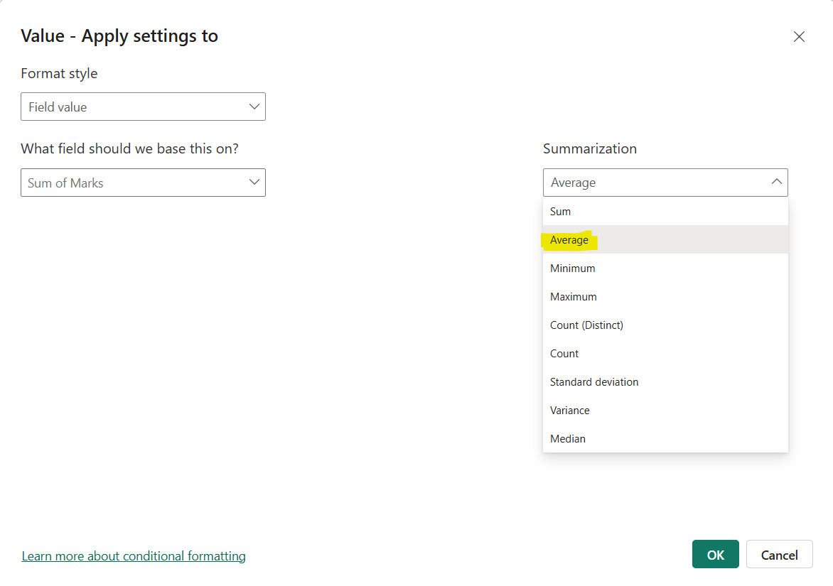
We can add multiple reference lines on the chart let’s jump back again on the reference line section in the start and click on + Add line again. Give it a name Average line, and from the type select Constant line. And click on function icon in the value section.
Select the field on which we want Summarization should apply. Here, we can select the measures also.
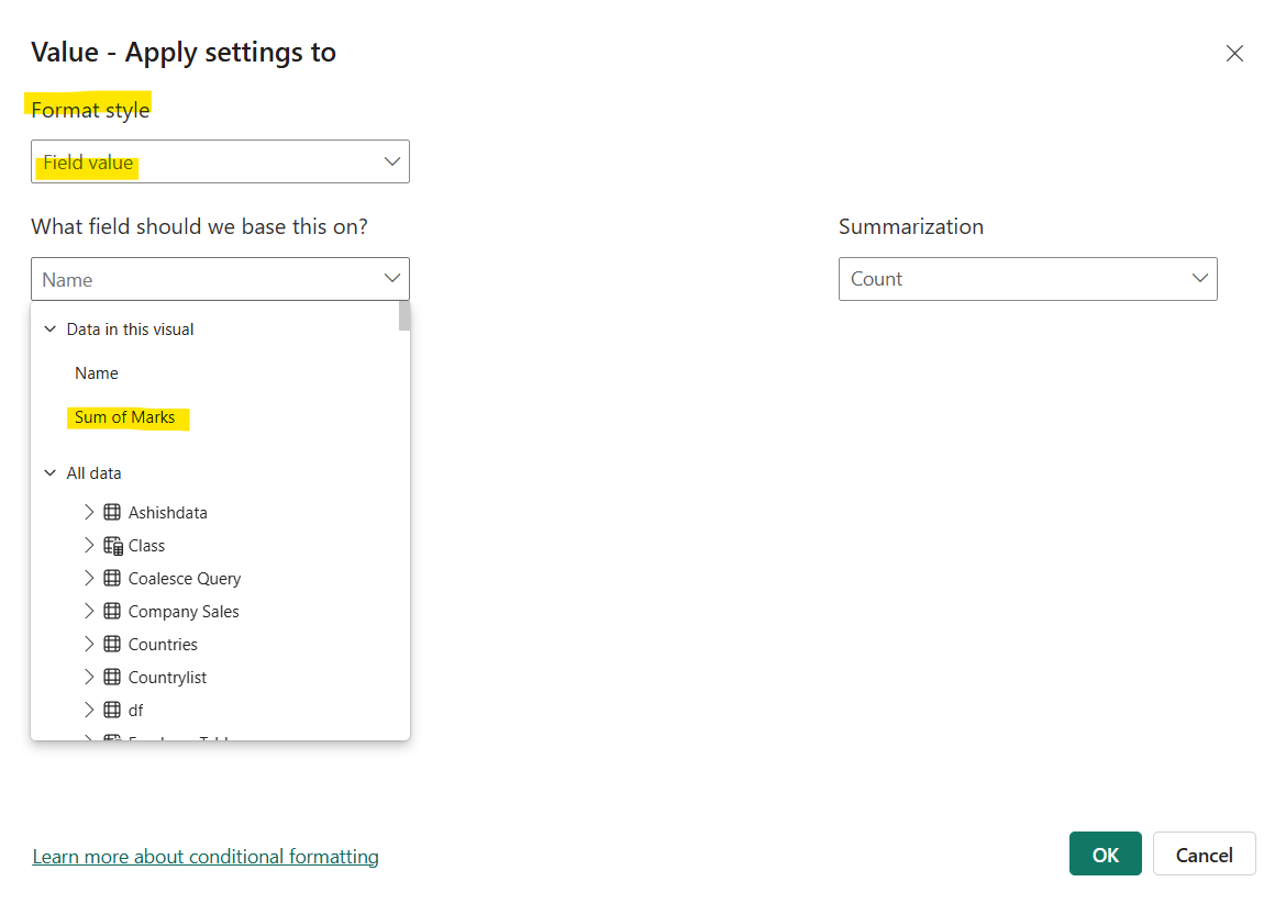
From the Summarization we have selected the Average. Now this line automatically calculates and shows the average of the plotted values. Click on Ok and apply the changes.
Similarly, we can specify other formatting to this reference line also.
