Error bars in Power BI
In Power BI, Error Bars are used in visuals (like line or bar charts) to represent uncertainty or variability in our data — such as confidence intervals, standard deviation, standard error, or custom upper/lower bounds.
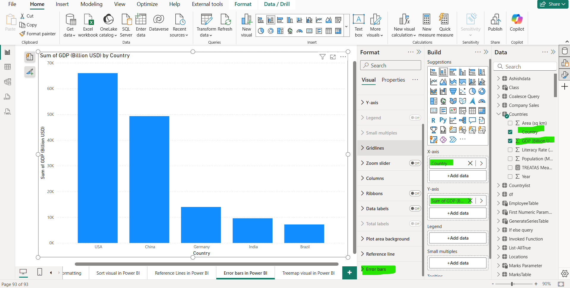
Step 1: Lets’ we have added a column chart on the report page. On the X-axis we have added the Country column, and, on the Y-axis, we have added the GDP (Billion USD) column.

Step 2: From the Error bars section in the Format pane.

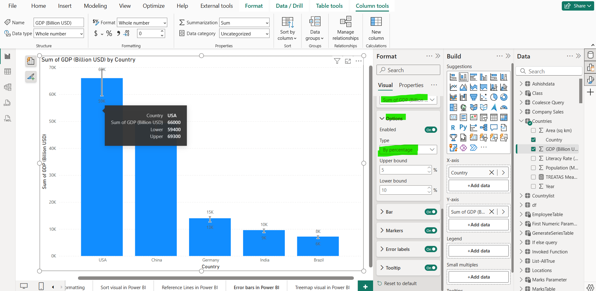
Here, we choose the error bars type “By percentage”, by which we can set the upper and lower bound percentage values of its actual data value. We also have the option to choose “By field” and other options also we have.
We can format these error bars by specifying the marker style, error labels and also have the option whether to include the error bars value in the tooltip.
Note: Absolute means that the fields contain the exact value of the upper or lower bound, while Relative means that the fields contain the difference between the upper or lower bound and the measure. For example, if at one point my measure has a value of 60, an upper bound of 90, and a lower bound of 45, my upper bound field in absolute terms would be 90 and my lower bound 45, while my upper bound in relative terms would be 30 while my lower bound would be -15. We can choose the option which suits the format of our upper and lower bound fields.