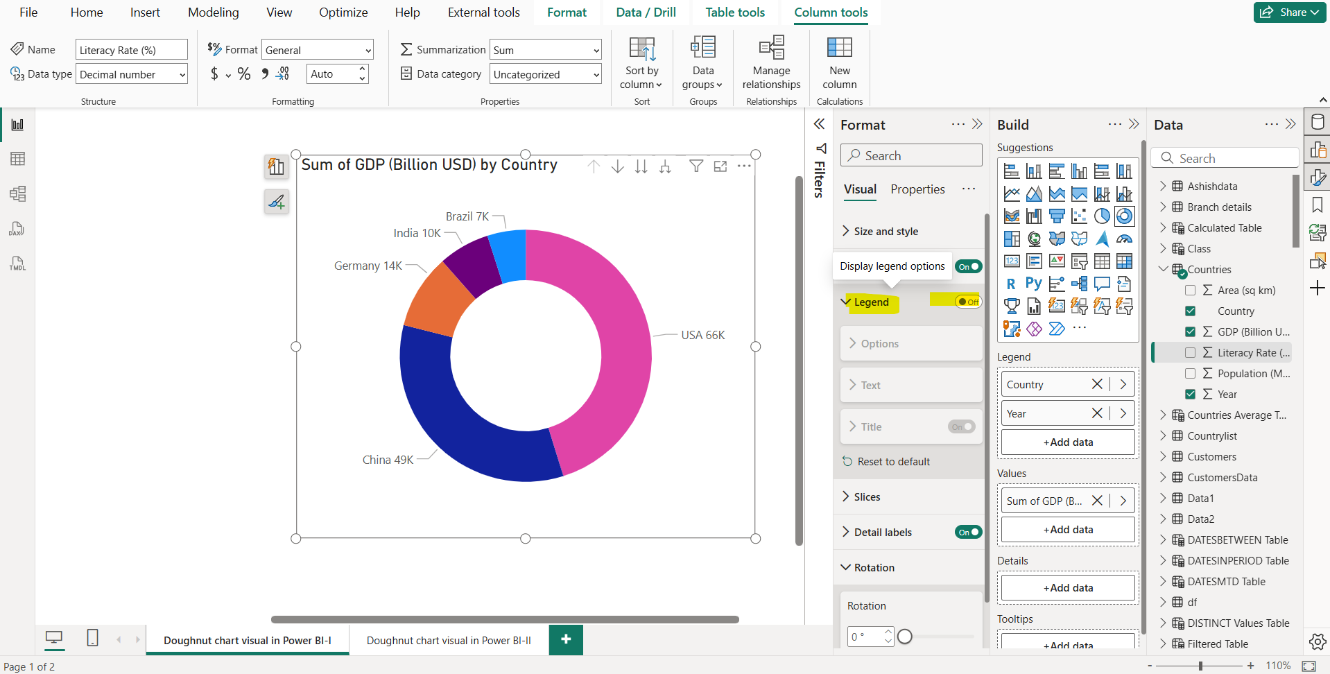
Donut Chart in Power BI
In this exercise, we will create a Donut chart in Power BI.
A donut chart is like a pie chart in that it shows the relationship of parts to a whole. The only difference is that the center is blank and allows space for a label or icon.
Donut charts work best when we use them to compare a particular section to the whole, rather than comparing individual sections with each other.
Let’s create and format a donut chart in Power BI desktop:
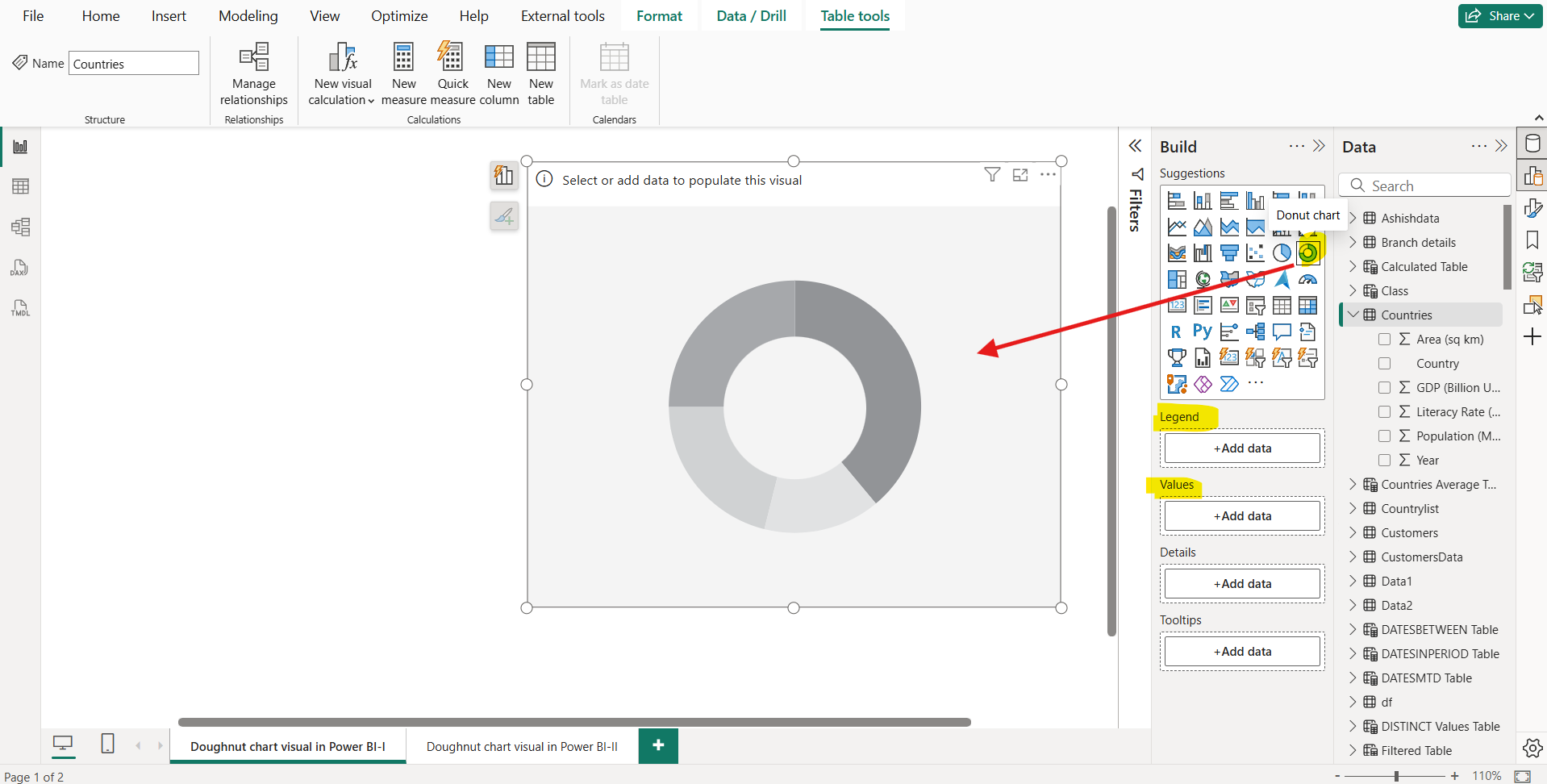
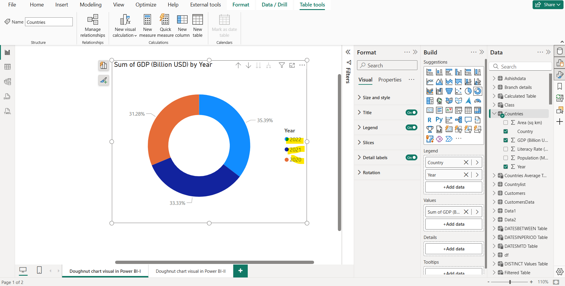
Step 1: From the Build pane, select the icon for donut chart. This will add the donut chart visual on the report page as shown in the image below.
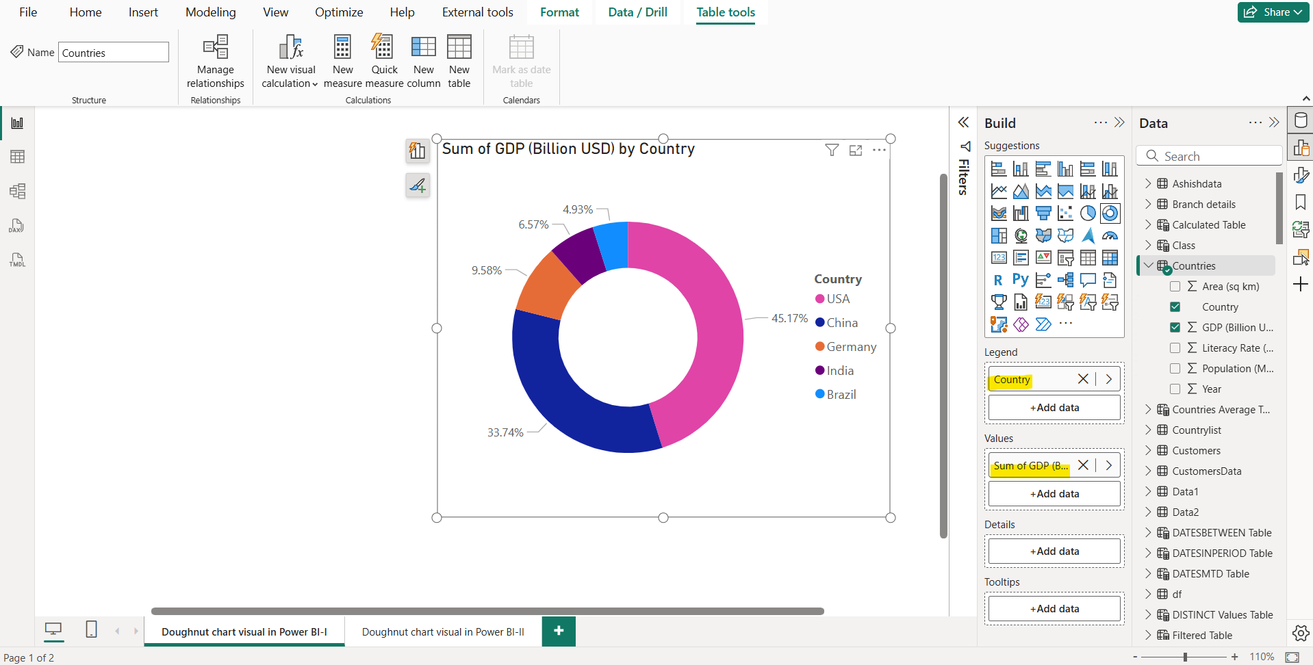
Step 2: Add the GDP column to the Values section. And for the Legend select the Country field, from the Countries table.
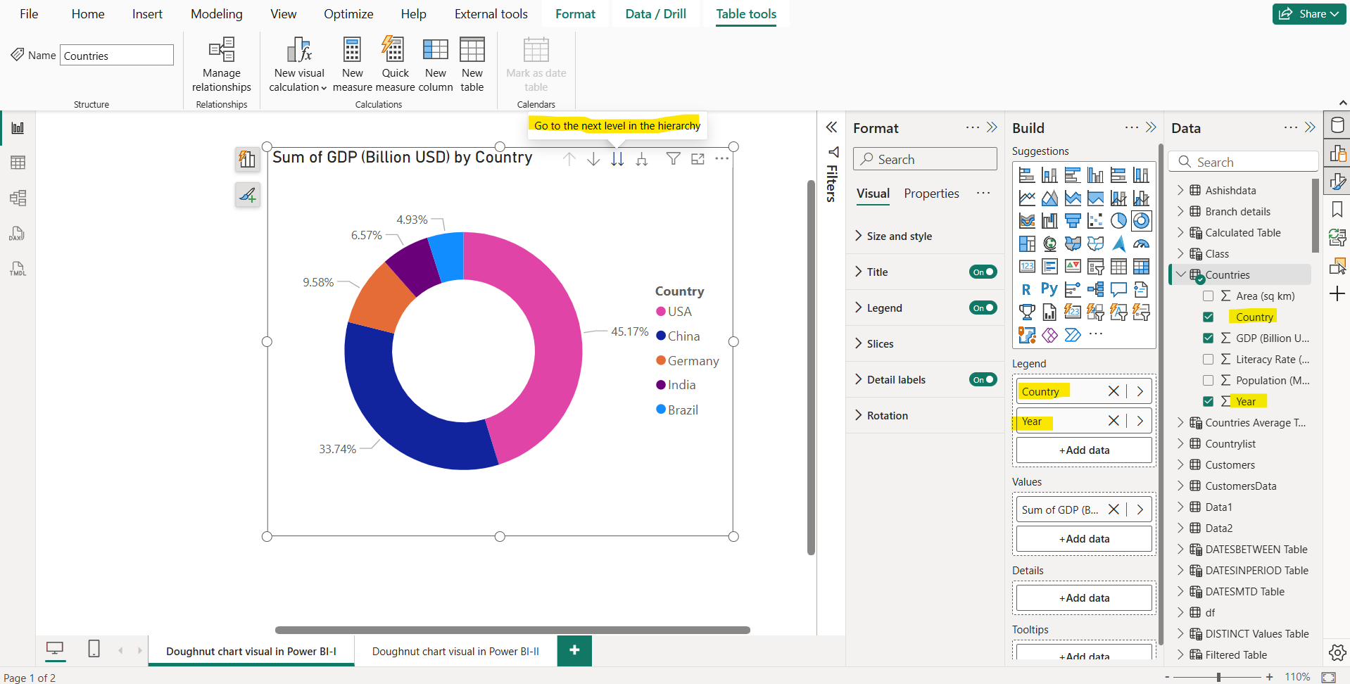
Here we can add multiple fields in the Legend bucket. When multiple fields are added, it gives us a drill up and drill down functionality in this visual.
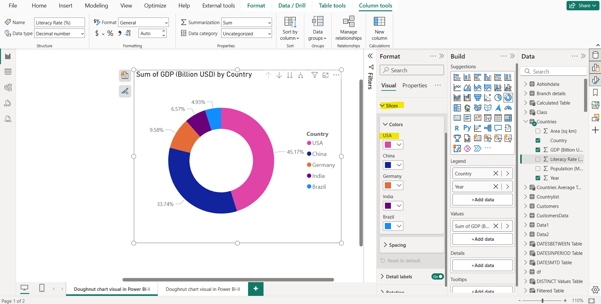
Step 3: Let’s format the visual. We can also choose the different colours for the slices according to the requirement.
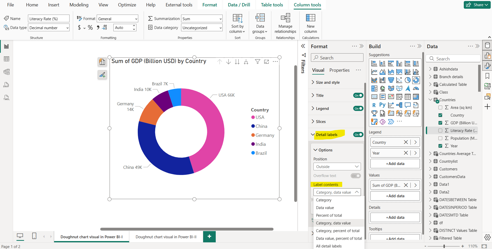
We can choose the Label contents format also from the given options.
We have the option to hide the legend as it is required to create the visual, but we have the choice to hide it from the visual
