Bar chart visual in Power BI
A Bar Chart in Power BI is a common and powerful visual used to display and compare categorical data using rectangular bars. In Power BI, bar charts come in horizontal orientation, unlike column charts, which are vertical.
Types of Bar Charts in Power BI
1. Clustered Bar Chart
- Displays multiple values side by side for each category.
- Ideal for comparing multiple series.
2. Stacked Bar Chart
- Stacks data segments horizontally in a single bar per category.
- Shows part-to-whole relationships.
3. 100% Stacked Bar Chart
- Similar to stacked bar but normalizes values to a percentage (total = 100%).
- Best for comparing proportions across categories.
Let’s create a Bar chart in Power BI:
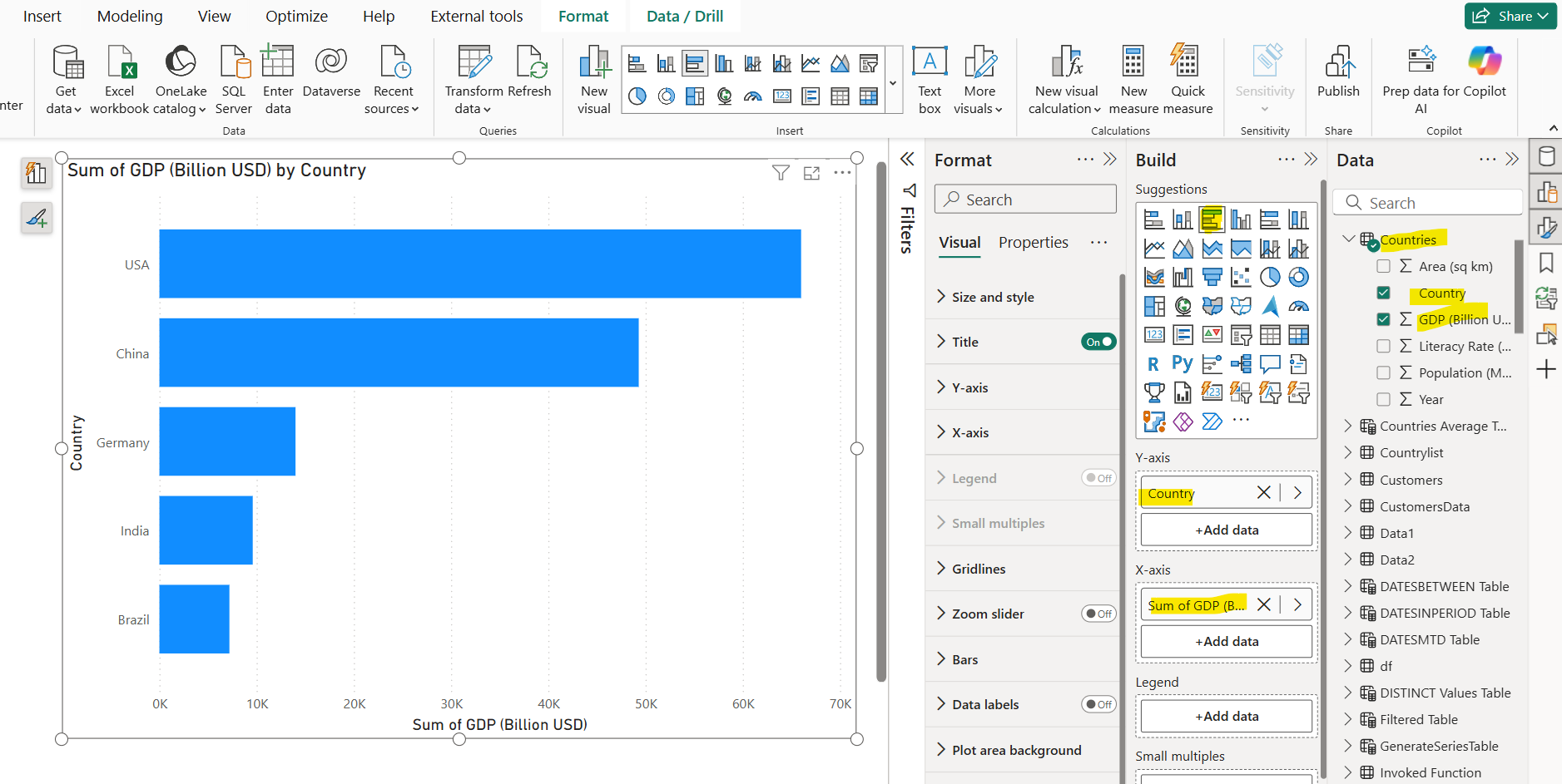
Step 1: Let’s add the Clustered bar chart in Power BI from the Build pane. Also add the Country and GDP column from the Countries table to the Y-axis and X-axis respectively.
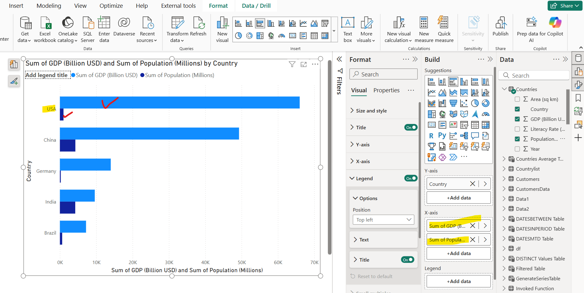
Let’s add another field or measure on the X-axis. Now in the chart we can see two bars for each category as shown in the image below:
Now let’s change the chart type from clustered bar chart to the Stacked bar chart and see the difference. To change the chart type, select the visual and then click on clustered bar chart from the Build pane.
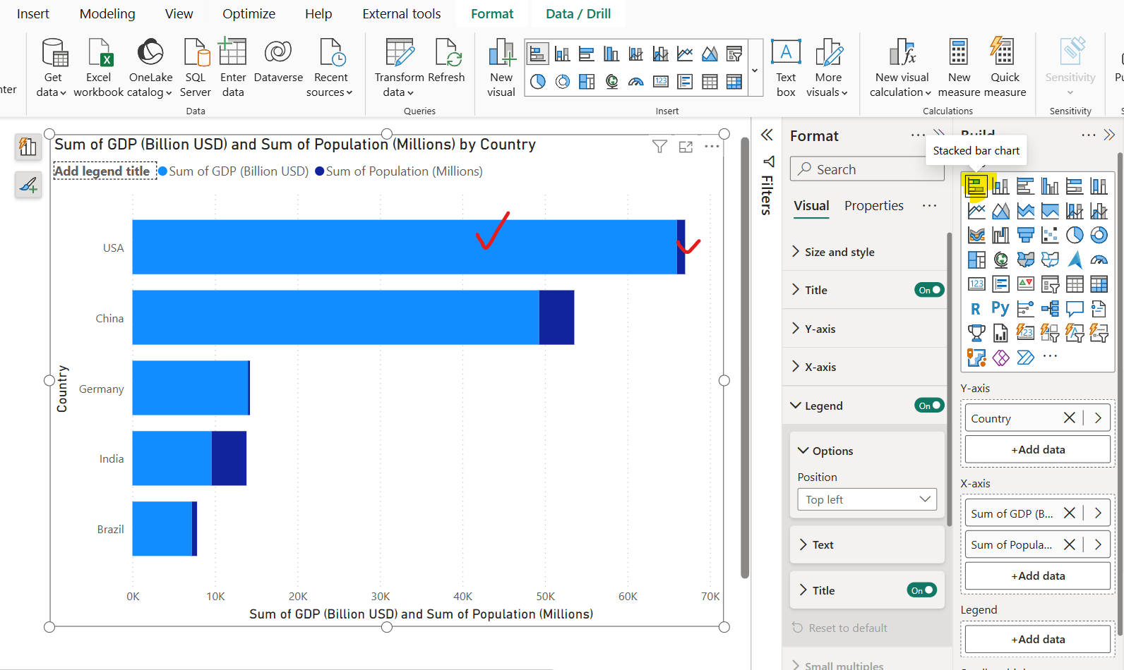
Now we can see that the bars are stacked on top of each other for each category.
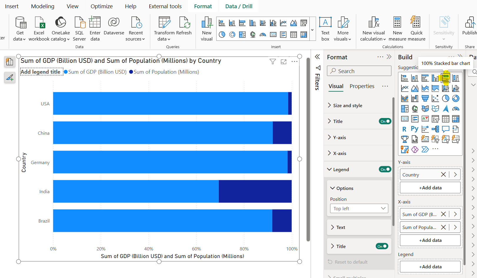
Now let’s change the chart type to 100% Stacked bar chart and see the difference. Now we can see it is similar to stacked bar chart, but its bar values represent percentage to a bar height.
Step 2: We can add multiple fields in the Y-axis section. When we add multiple fields, we can drill up and drilldown with that fields in the visual.
Let’s add the Year field in the Y-axis. Once I add another field in the Y-axis, the drill up and drill down icons are going are available in the visual as shown in the image below:
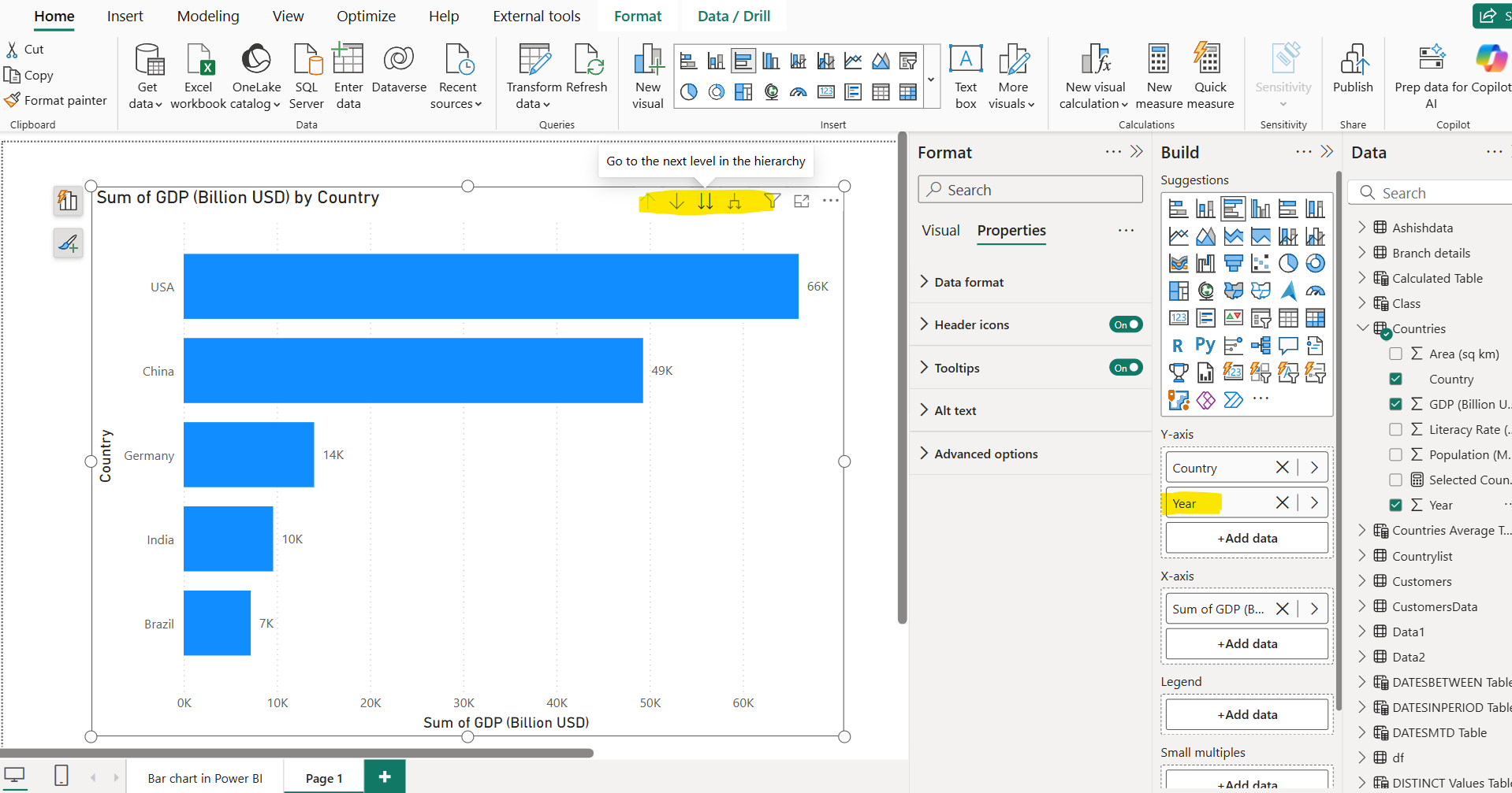
Right now, it is at Country level and let’s drill down to the Year click, by clicking on the “Go to the next level in the hierarchy”.
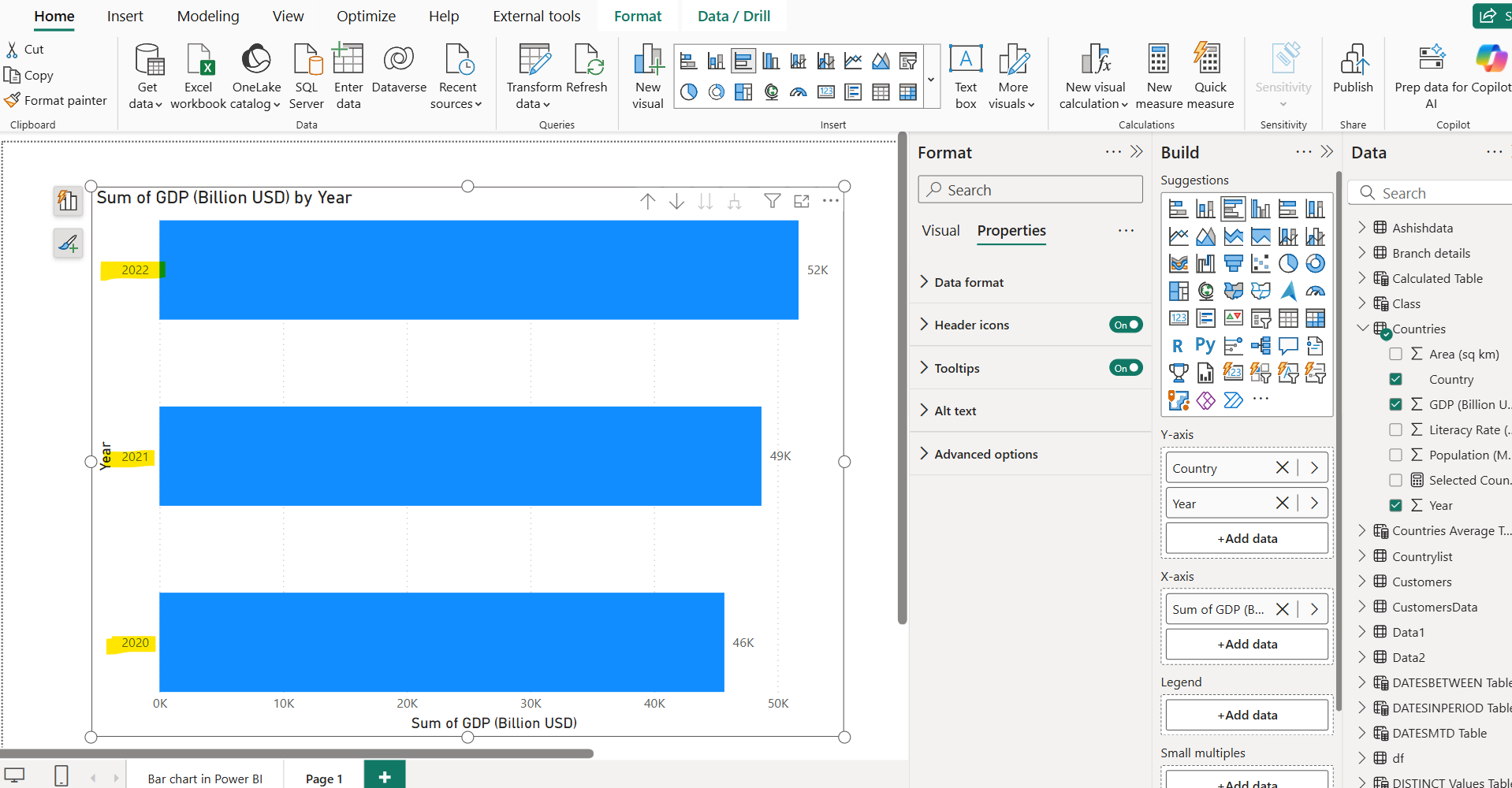
Now we can see the values at the Year level.
Step 3: We have a lot of formatting options to format the visual. We can add Data labels in the visual to enhance the quick way to see the actual value of bar. We can decide its position, Title and format the value color, font size, underline, etc.

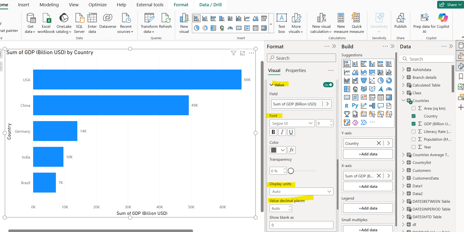
We can decide the Display units of the values like in None, Thousands, Millions, Custom etc. If we choose Custom option, then we can specify the custom format string for the values. We can specify the decimal places and if blank value is there then how it shows in the visual.
We can include the fields in the Details option to add more details to our data label. The value of this details field is calculated in the filter context.
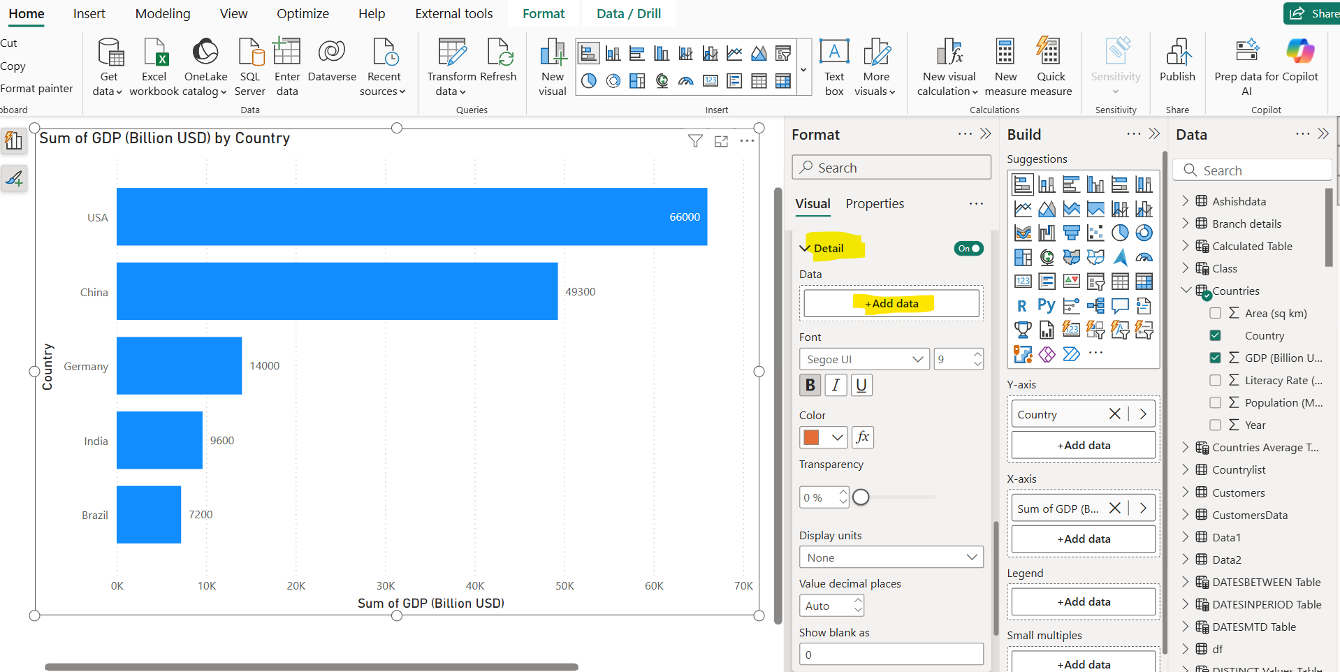
Let’s have added the Population and specify its formatting, like other fields.
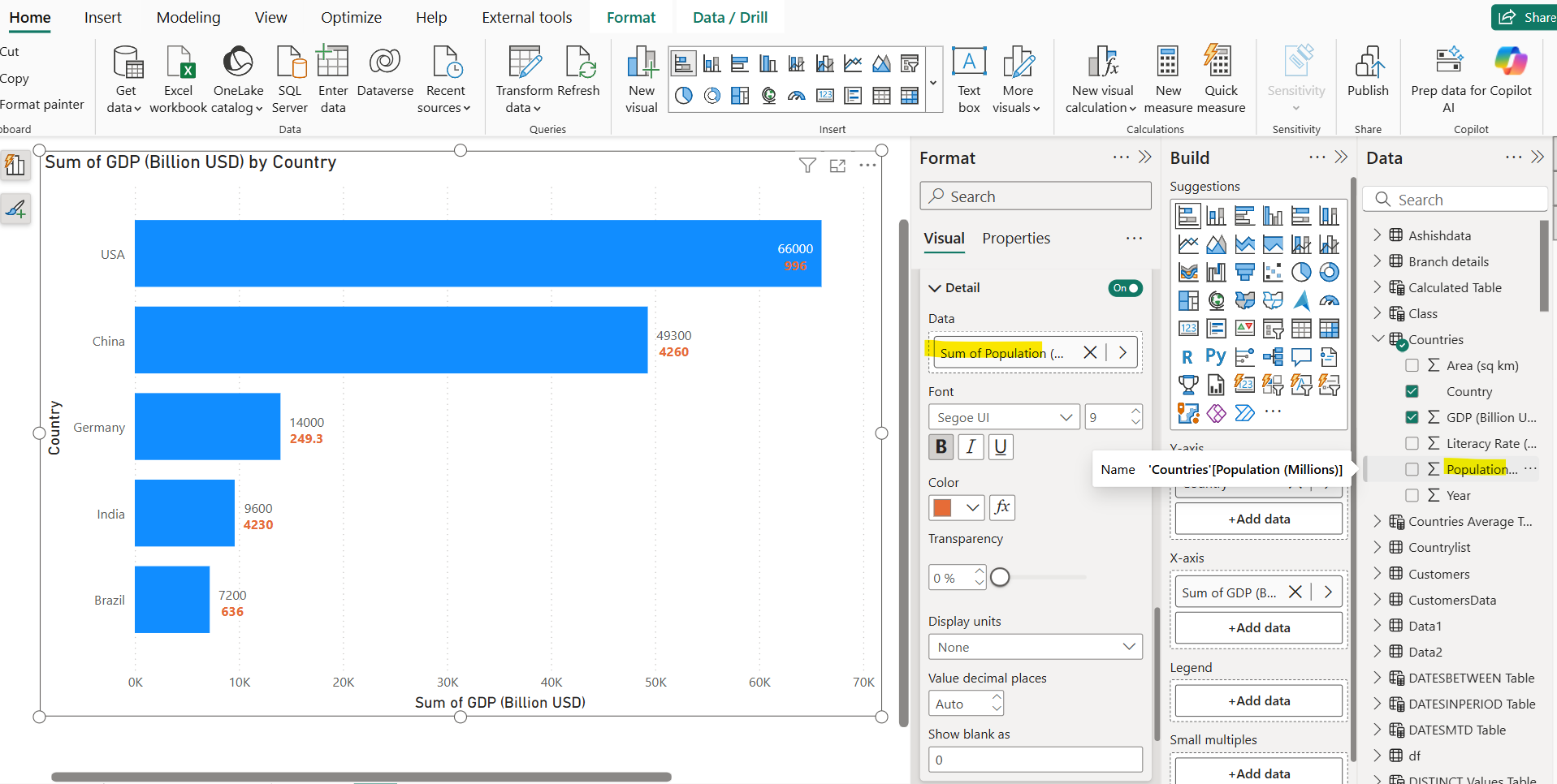
Please note that we can format the color of data labels conditionally also that opens the opportunity to implement a custom logic to return the specify color for particular data point in the visual.
We can add only one detail field or measure in this visual. We can also specify the background colour for the Data labels and its Layout, i.e. Multi-line or Single line.
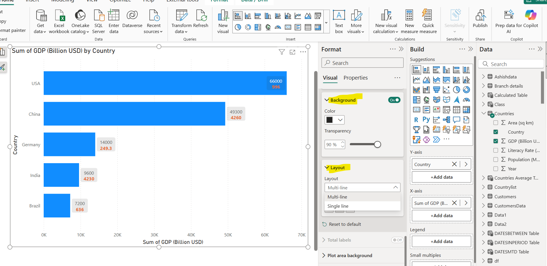
Multi-line layout means that each data label is shown in the separate line, whereas in Single line layout each data label is shown in the single line.
Step 4: In the X-axis section we can specify the Minimum and Maximum range. The range can be specified conditionally also. We can format the values and its display units.

We can specify the Title of the X-axis, and format it.

We can also format the Y-axis, its Title and its values.
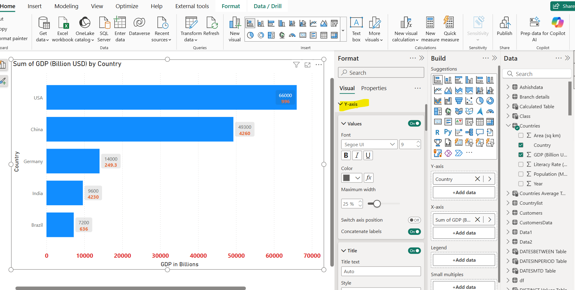
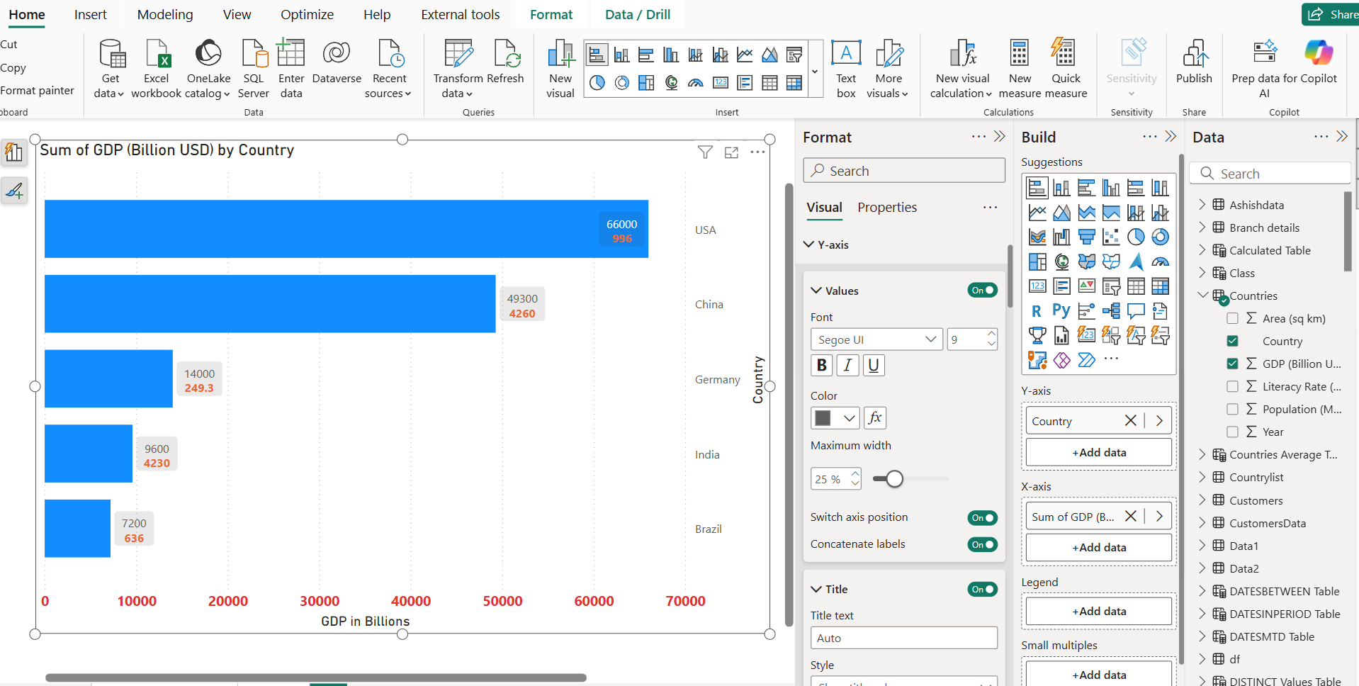
We can also Switch axis position, as it is on left hand side when we set the toggle to on.
Step 5: In the Bars section, we can format the bars of the chart. We can specify a different colour for each category value by selecting the value from the Categories dropdown.
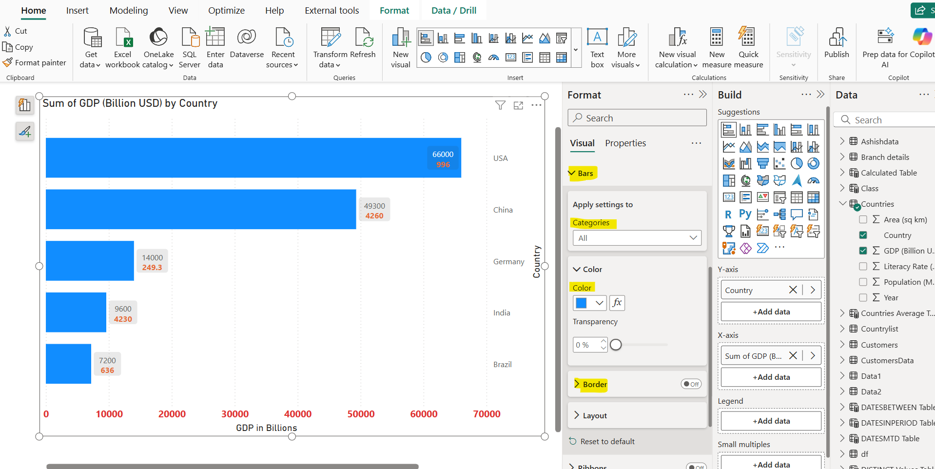
We can conditionally format the colours of the bars. To achieve this, we created a measure that specifies the selected country in the category and assigns the corresponding colour to the bar.
DAX
Selected Country Measure =
SWITCH(TRUE(),
    SELECTEDVALUE(Countries[Country]) = "USA", "Red",
    SELECTEDVALUE(Countries[Country]) = "China", "Green",
    SELECTEDVALUE(Countries[Country]) = "Brazil", "Yellow",
    SELECTEDVALUE(Countries[Country]) = "India", "Blue",
    SELECTEDVALUE(Countries[Country]) = "Germany", "Orange",
    "Gray"  -- Default color for all other countries
)
Click the fx button next to the colour.
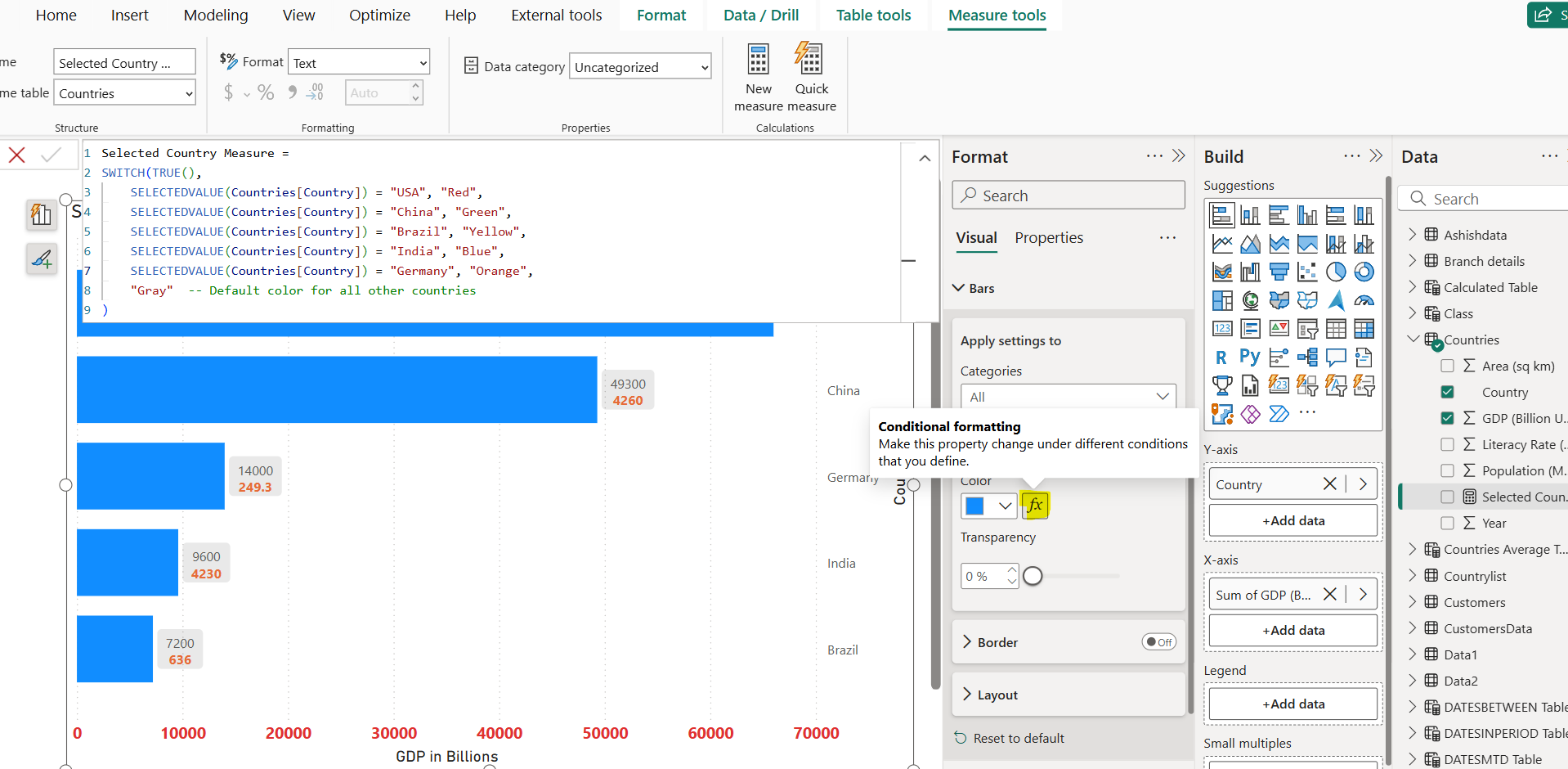
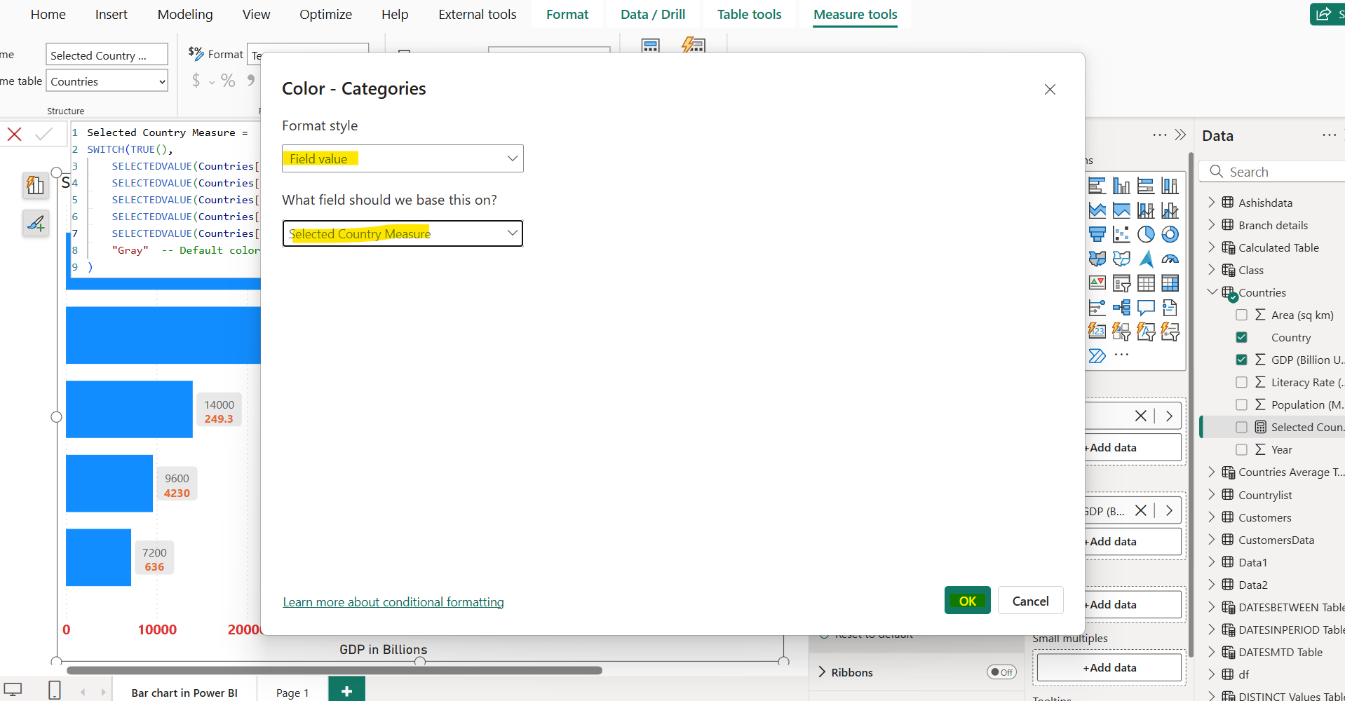
In the conditional formatting window:
- Format by: Field value
- Based on field: Select our new measure (Selected Country Measure)
And then click on Ok to save the changes.
The colours are changed as shown in the image below:
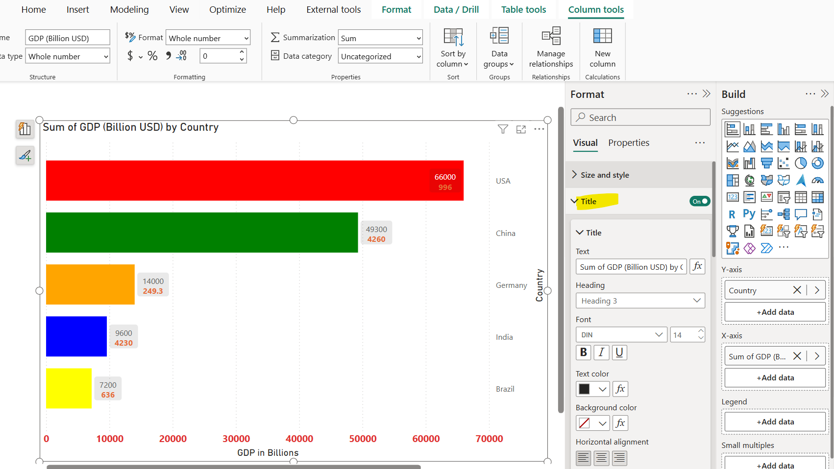
We can also specify and format the Title of the visual.