Visualize data using seaborn
In this exercise, we will learn how to visualize the data using seaborn.
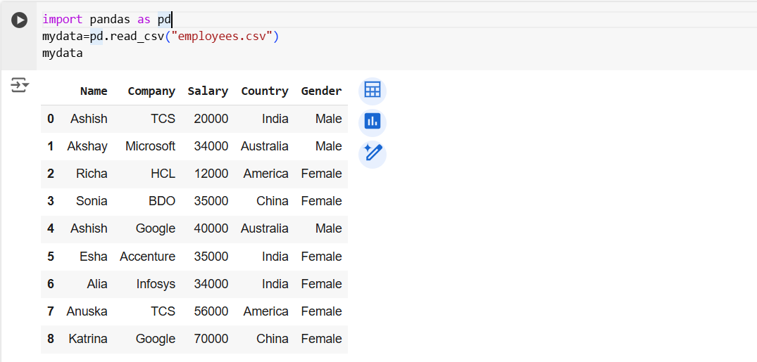
Example: Let’s create the dataframe.
Python
# Import the pandas package
import pandas as pd
mydata=pd.read_csv("employees.csv")
mydata
The output of the above code is shown below:

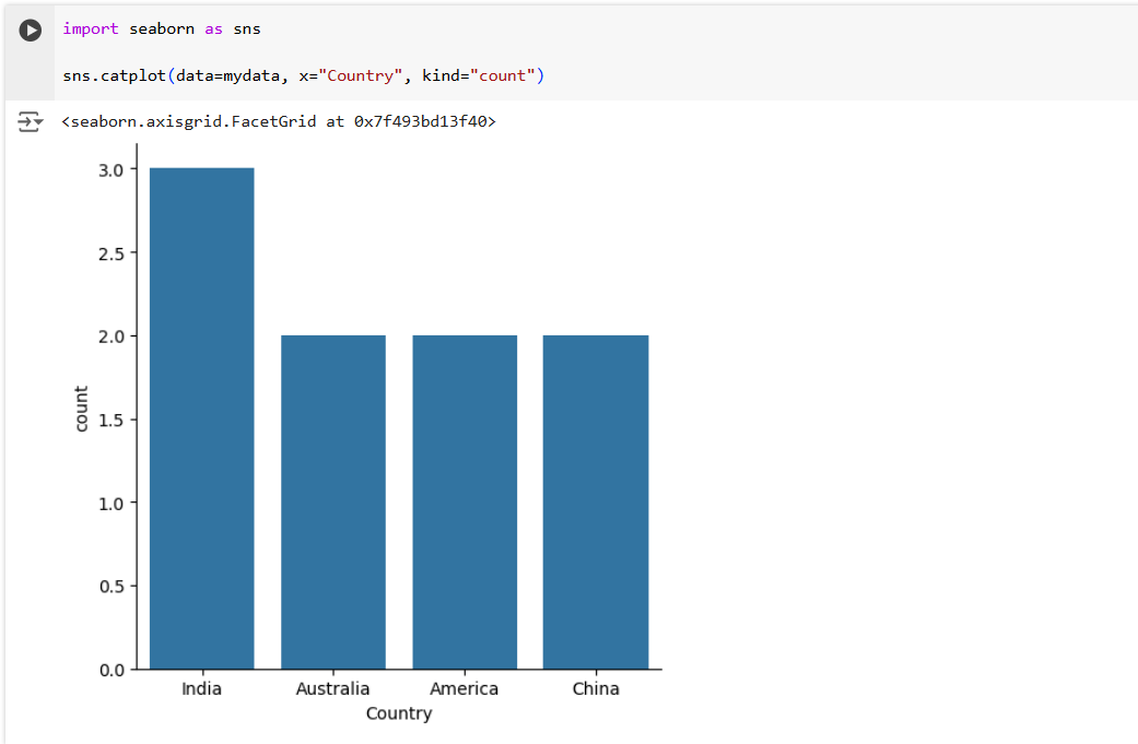
Let’s create a count plot, by specifying the x-axis and on the y-axis it shows the count.
Python
# Import the seaborn package
import seaborn as sns

sns.catplot(data=mydata, x="Country", kind="count")
The output of the above code is shown below:

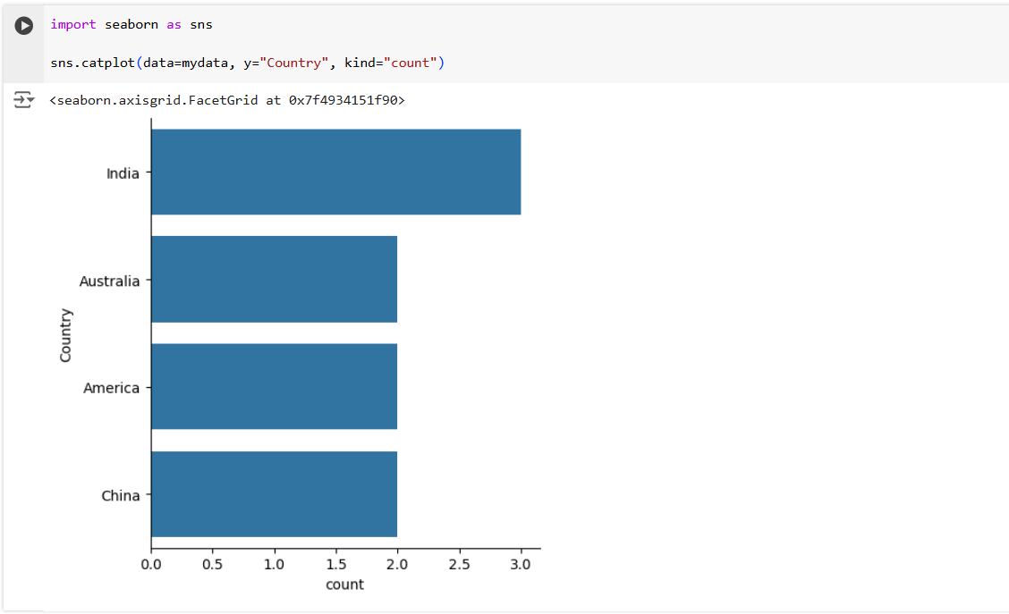
Let’s create a count plot; by specifying the y-axis and on the x-axis, it shows the count.
Python
import seaborn as sns

sns.catplot(data=mydata, y="Country", kind="count")
The output of the above code is shown below:

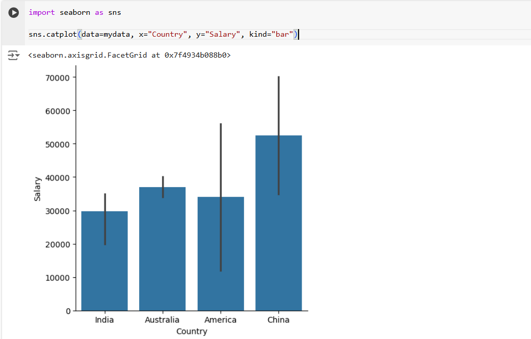
Let’s create a bar plot, by specifying the x and y axis.
Python
import seaborn as sns

sns.catplot(data=mydata, x="Country", y="Salary", kind="bar")
The output of the above code is shown below:
