Visualize data using matplotlib
In this exercise, we will learn about visualizing the data using the matplotlib.
To start using pandas and matplotlib, we first need to import the required pandas’ and matplotlib package by using the following commands:
Python
import pandas as pd
import matplotlib.pyplot as plt
Now in this exercise we are going to create a pie-chart using the matplotlib.
matplotlib.pyplot.pie The matplotlib.pyplot.pie() function is used to create pie charts in Python.
Syntax matplotlib.pyplot.pie(x, labels=None, colors=None, autopct=None, startangle=0, explode=None)
Parameters:• x: The sizes of each wedge. It should be an array-like sequence.
• labels: (Optional) A list of strings to name each slice.
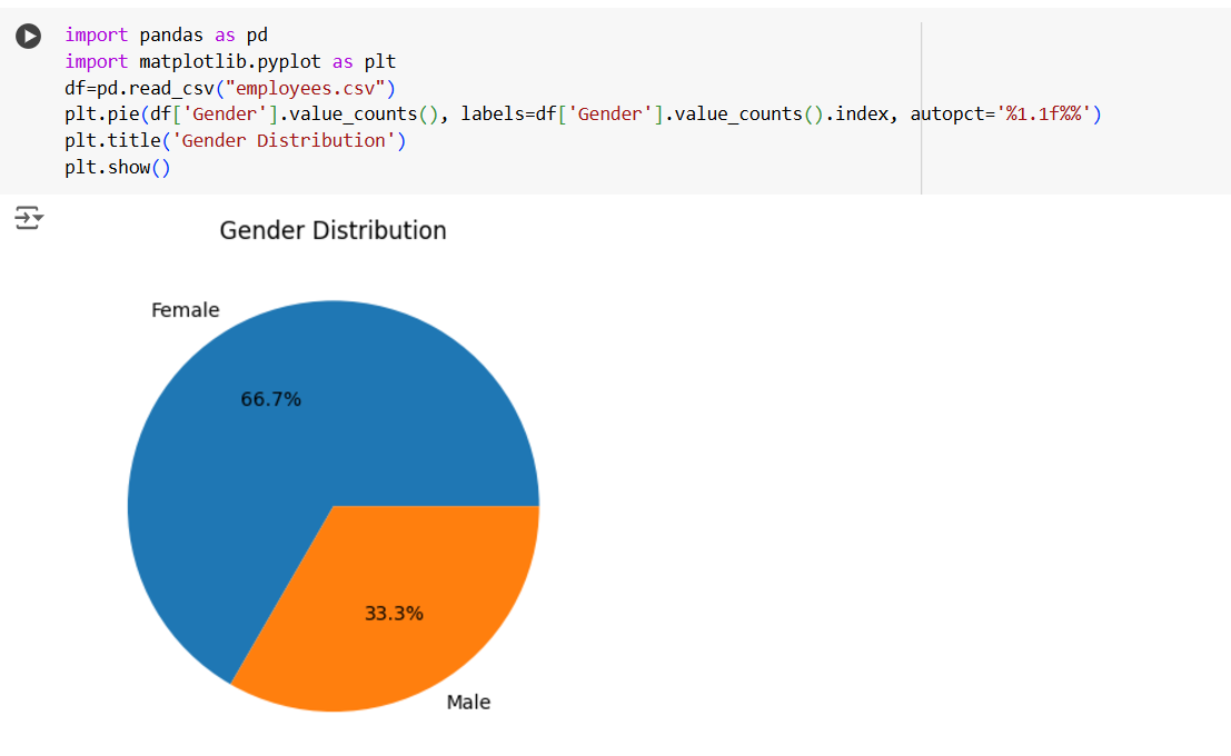
Example: Let’s create a pie chart.
Python
#Import the pandas package
import pandas as pd

#Import the matplotlib package
import matplotlib.pyplot as plt

df=pd.read_csv("employees.csv")
plt.pie(df['Gender'].value_counts(), labels=df['Gender'].value_counts().index, autopct='%1.1f%%')
plt.title('Gender Distribution')
plt.show()
The output of the above code is shown below:
