Text Label control in Canvas Power Apps
In Power Apps, label control is used to display text in a user interface.
The Text label control has the following properties:
1. AutoHeight The AutoHeight property of the Text label control when set to true, it allows the label to automatically specify its height to show all the text in the label. When set to false, it truncates the text to the height assigned. 2. Color The Color property of a label control specifies the color of text in a control. 3. Font The Font property specifies the name of the family of fonts in which text appears. 4. Text The Text property specifies the text that appears on a control or that the user types into a control. 5. DelayOutput The DelayOutput property of the Text label control is set to true to delay action during text input.
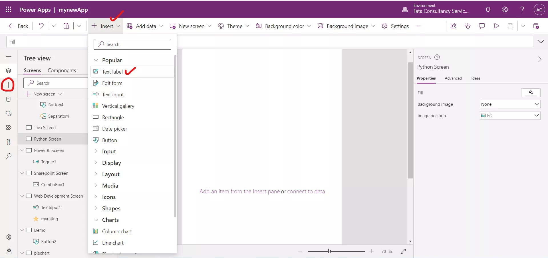
Example:Step 1: In Power Apps Studio, adds a Label control. To add the control, click on the + Insert and then click on Text label.

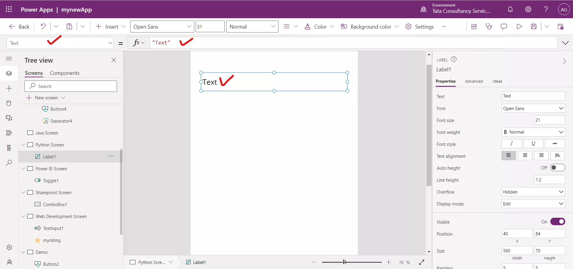
Or we can select the existing label control from the tree view.
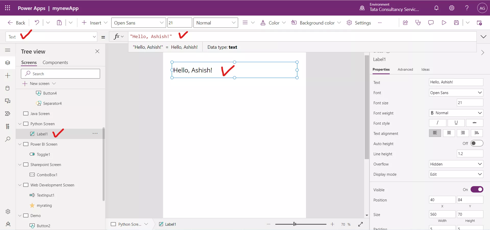
Step 2: The selected control properties are shown on the right. Set the Text property for the Label to "Hello, Ashish!" (Including the double quotation marks) in the formula bar.

We can also set the different properties on the right side of the screen. We can also change other properties such as Font, Font size, Font style and Text alignment.

We can also specify any power apps formula on the Text property of the Text label control to dynamically change the text of the label control. For example, the following formula if written on the Text property of a Text label control then the label displays the current logged in user email id.
Power Apps Formula