Canvas App Components
It is recommended to not use more than 500 controls to the same app. The number of controls in the app can be reduced by leveraging the components in canvas app.
Components are reusable building blocks for canvas apps so that app makers can create custom controls to use inside an app, or across apps.
In this exercise, we will create a component:
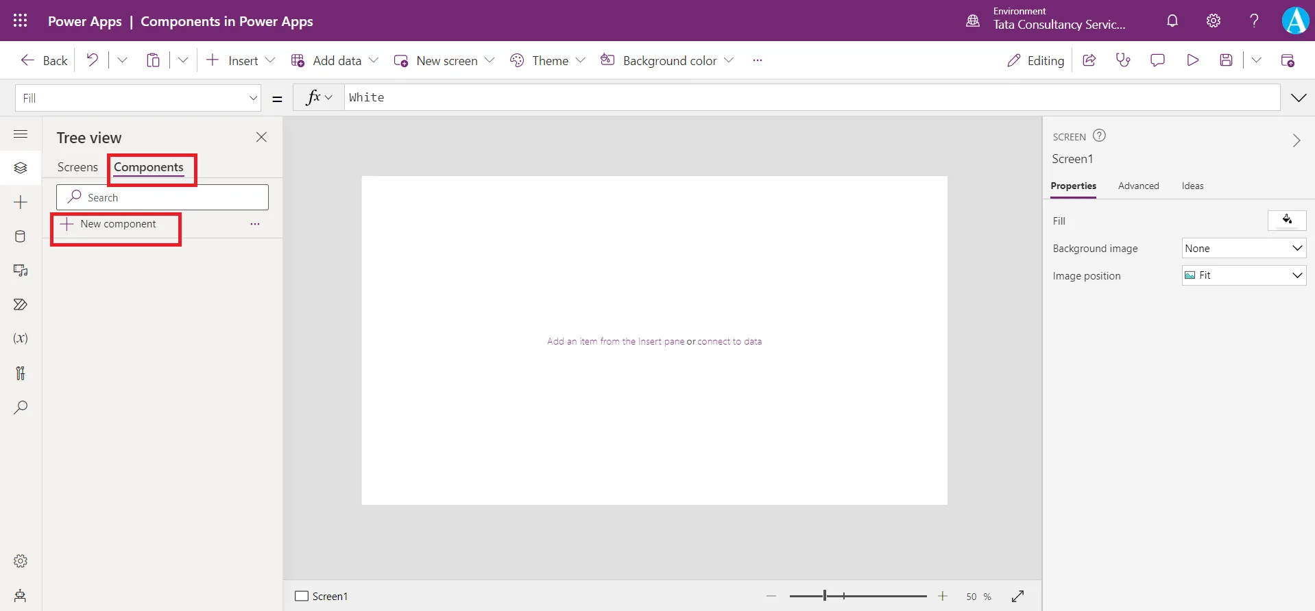
Step 1: To create a component, from the Tree view, click on the Components tab and then select + New component.
Step 2: A component is created with its default name Component1. We can rename this, as we rename the other controls.
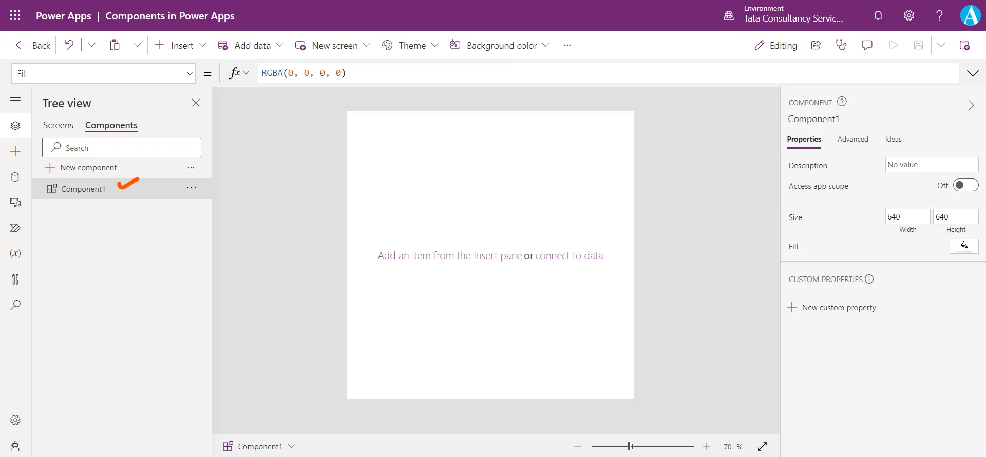
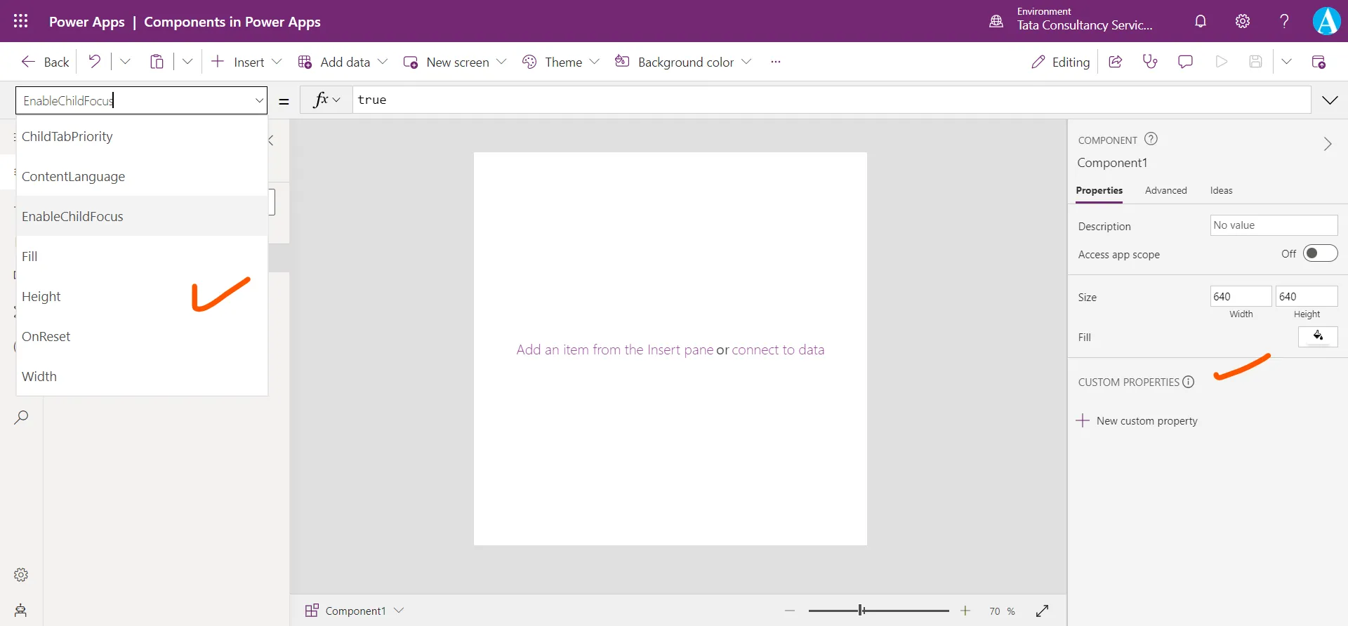
Step 3: There are some properties of the component.
The Width and Height of the component is 640.
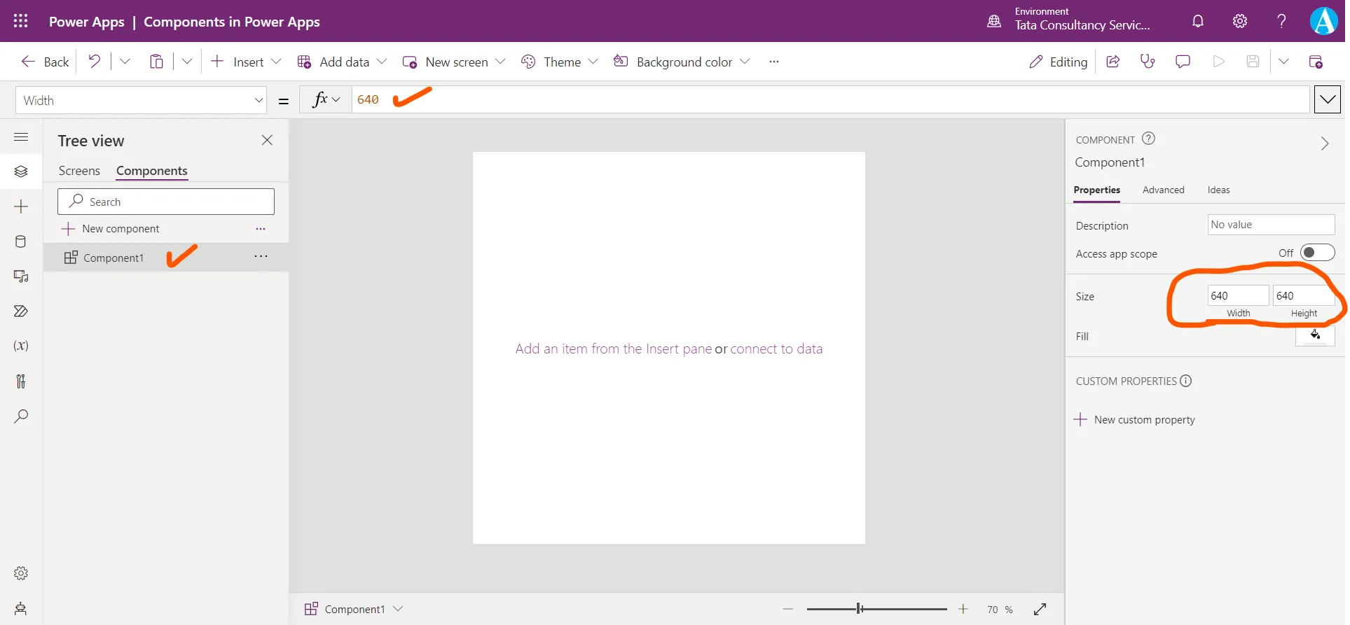
To make the component width equal to the width of the app, we can use the following power apps formula, on the Width property of the component.
Power Apps Formula
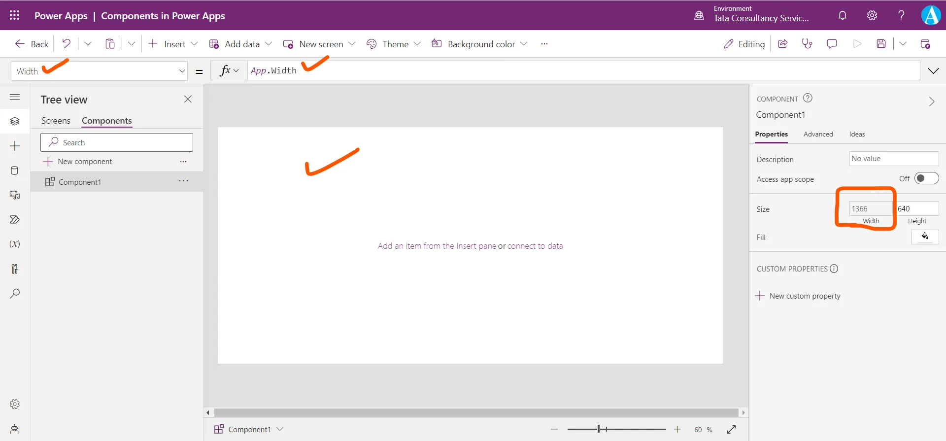
Similarly, we can also set the height of the component to the App height by the following power apps formula.
Power Apps Formula
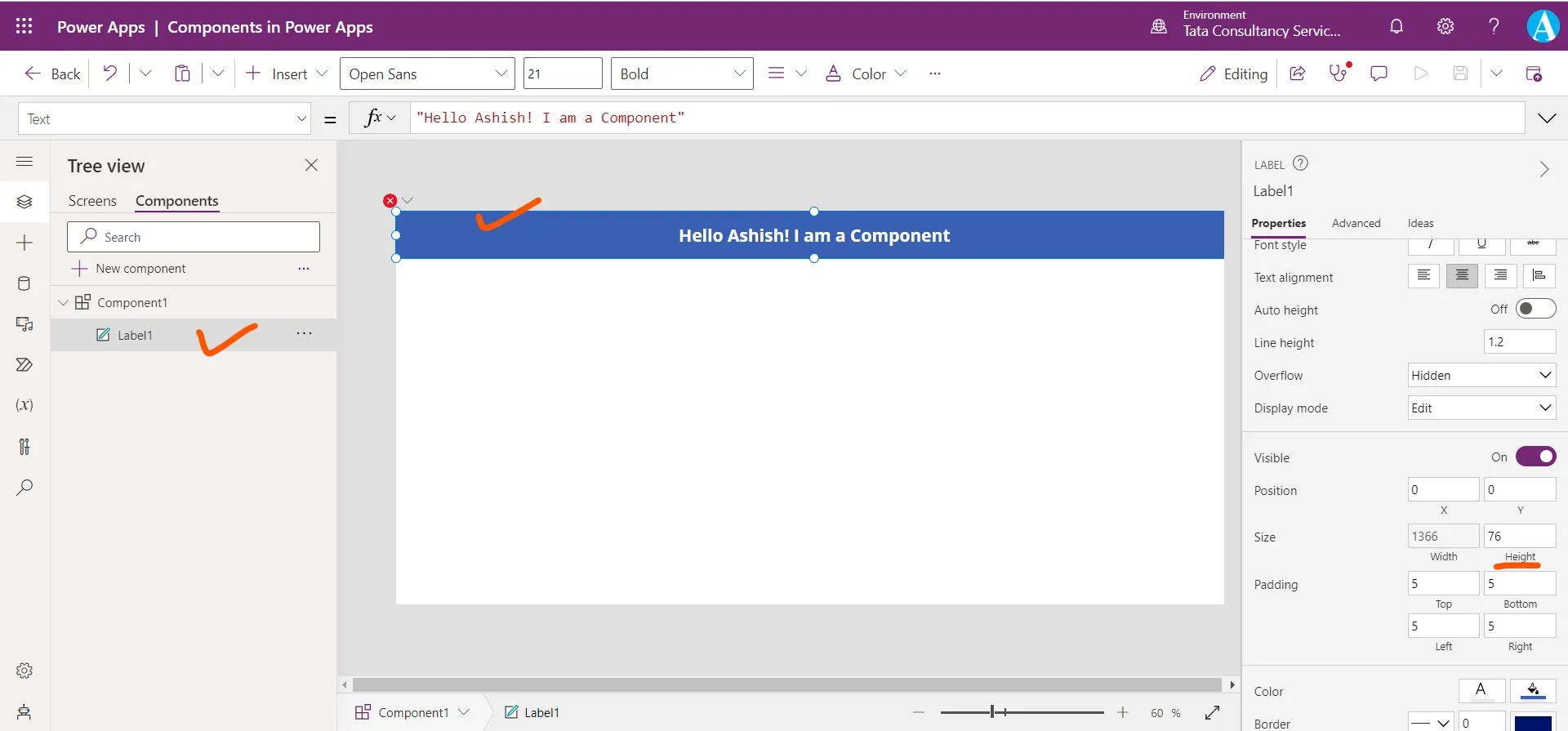
Step 4: Add one Text label control and set its Text property to "Hello Ashish! I am a Component".
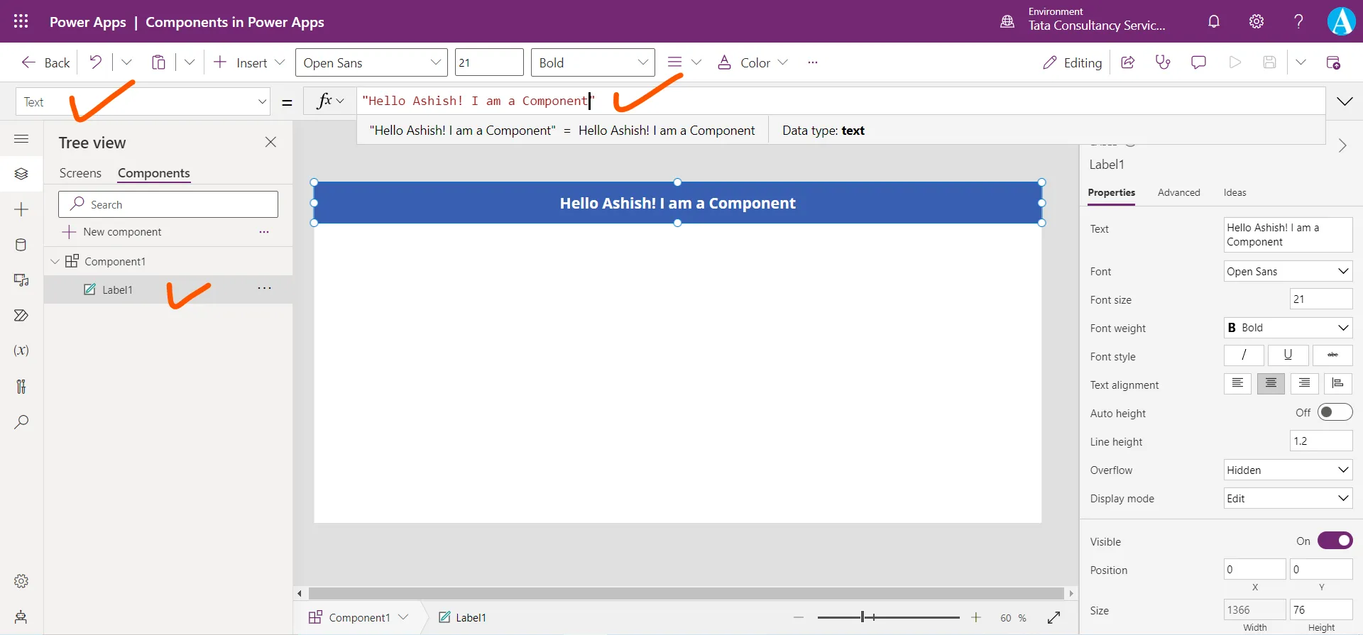
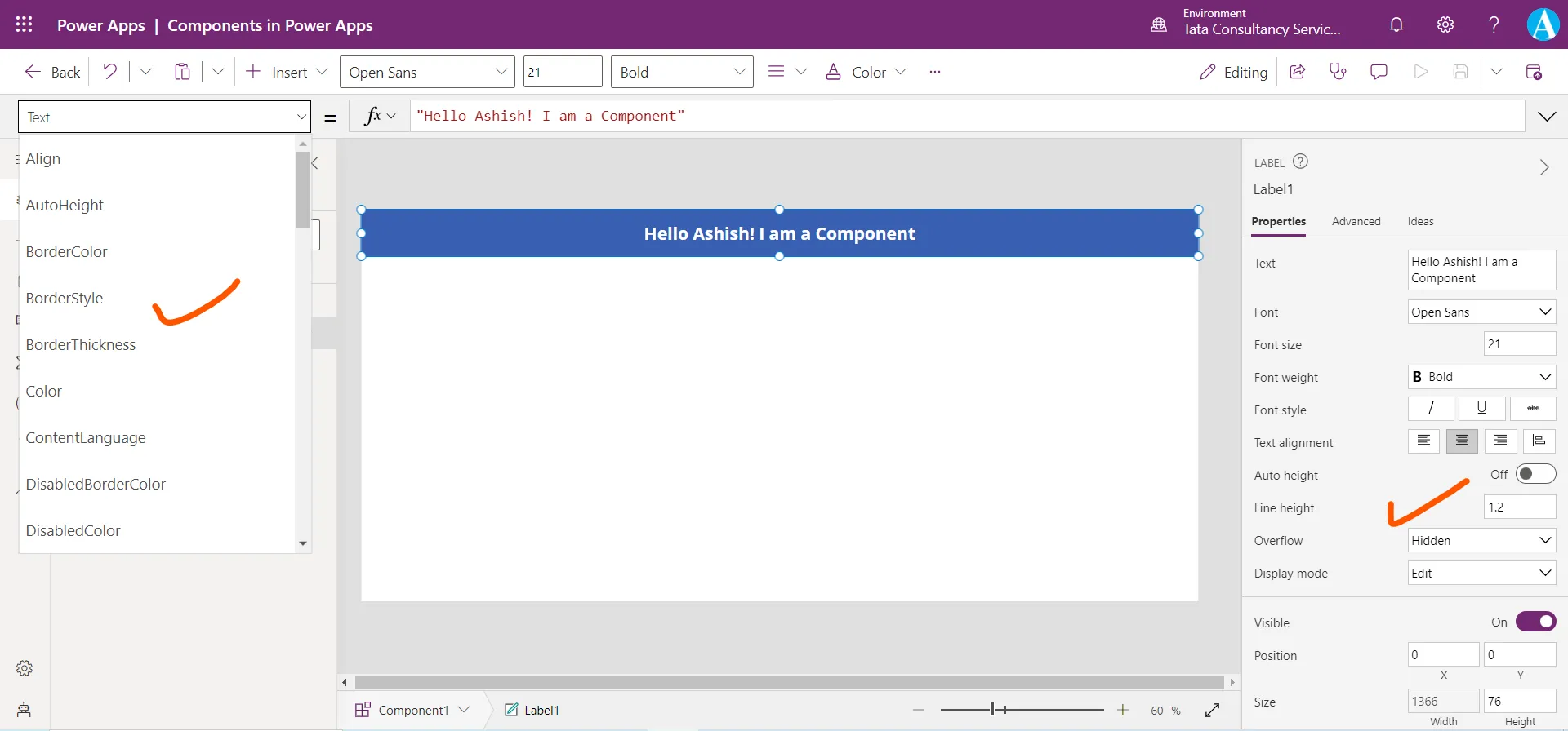
Set its Width to Parent.Width and change its Fill color which specifies the background color, and Color which specifies the text color. We are doing this to make the component beautiful. The label control has all properties like when we use it in a canvas app.
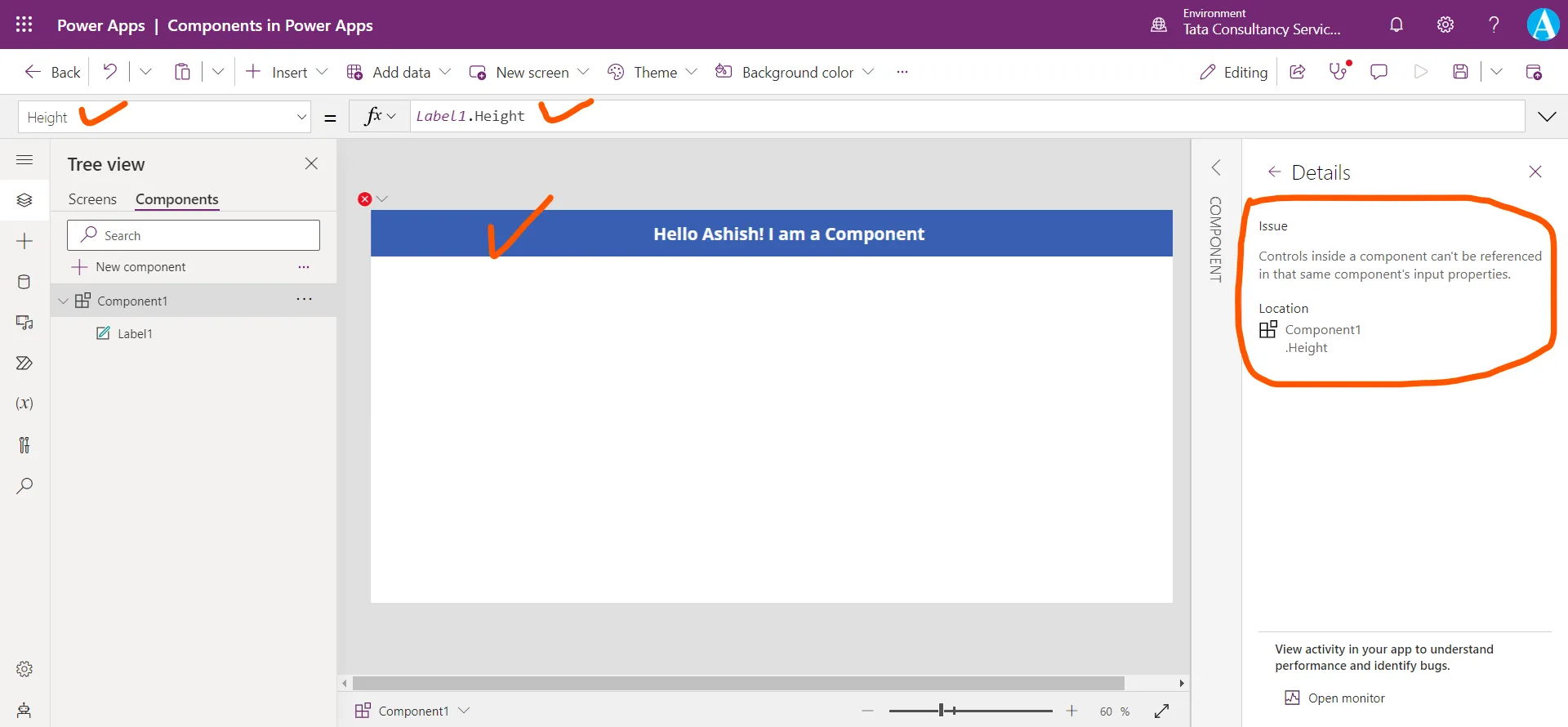
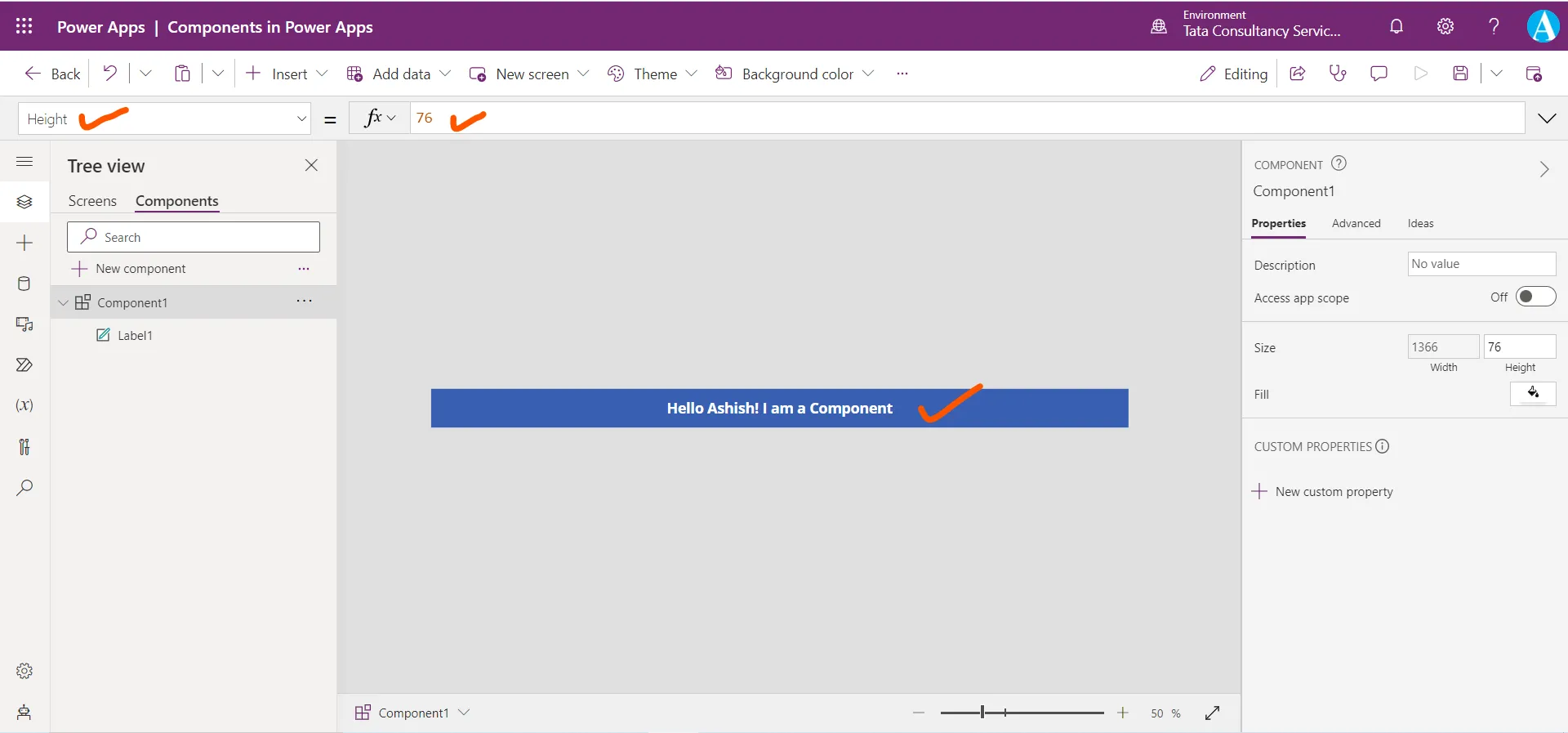
Step 5: Let us set the Height of the Component. If we write the formula Lable1.Height on the Height property of the component, it gives me error. Because we cannot reference a control inside a component in the same component’s input properties.
We can see that the height of the label control is 76.
So, we hardcode this value to the component also.
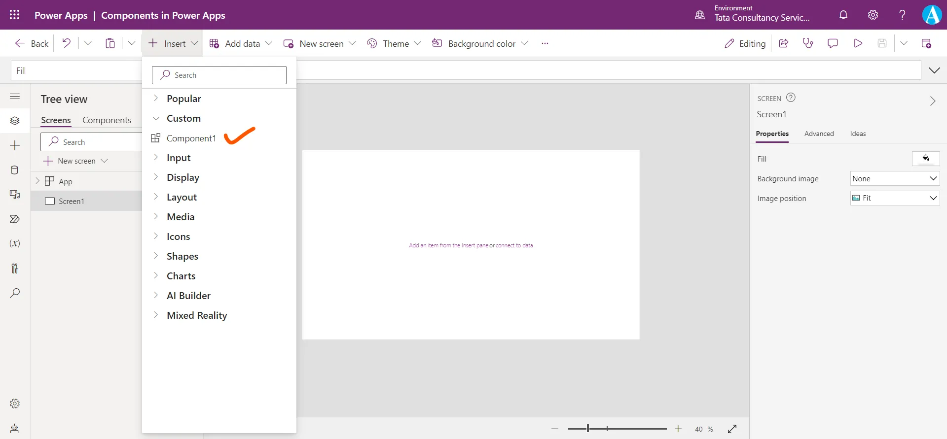
Step 6: Now our component is ready, let us use it on screen. Click on the + Insert, from the Custom section we can see our component. Click on it to add to the screen.
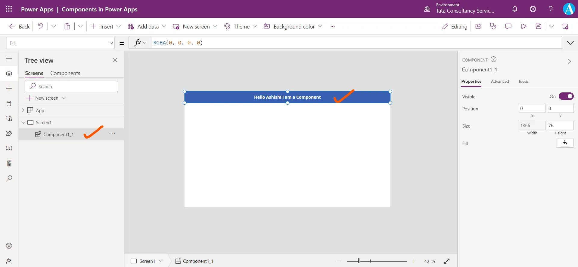
The component is added to the screen, we can drag and place it at the specified position according to our requirement.
Step 7: Add another screen and add component on this screen also. Here, we can drag and place it at any position.
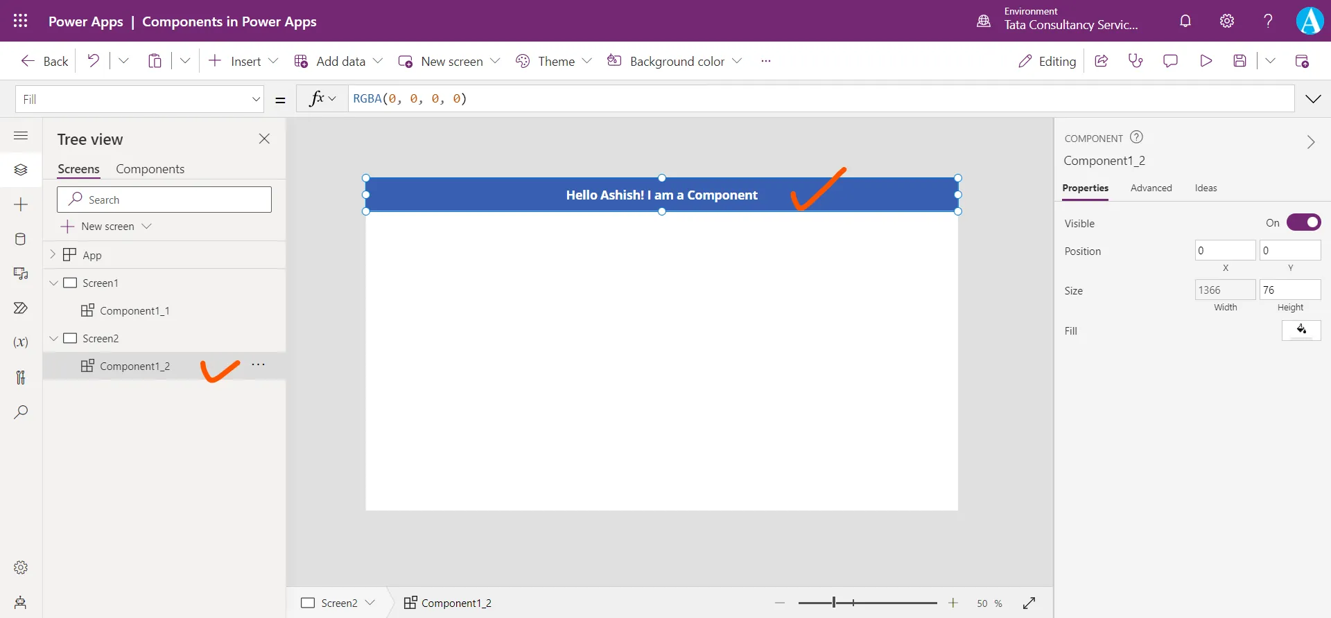
Note: If we want to change the Text inside the label, we are not able to do so. Because the component does not provide such properties.
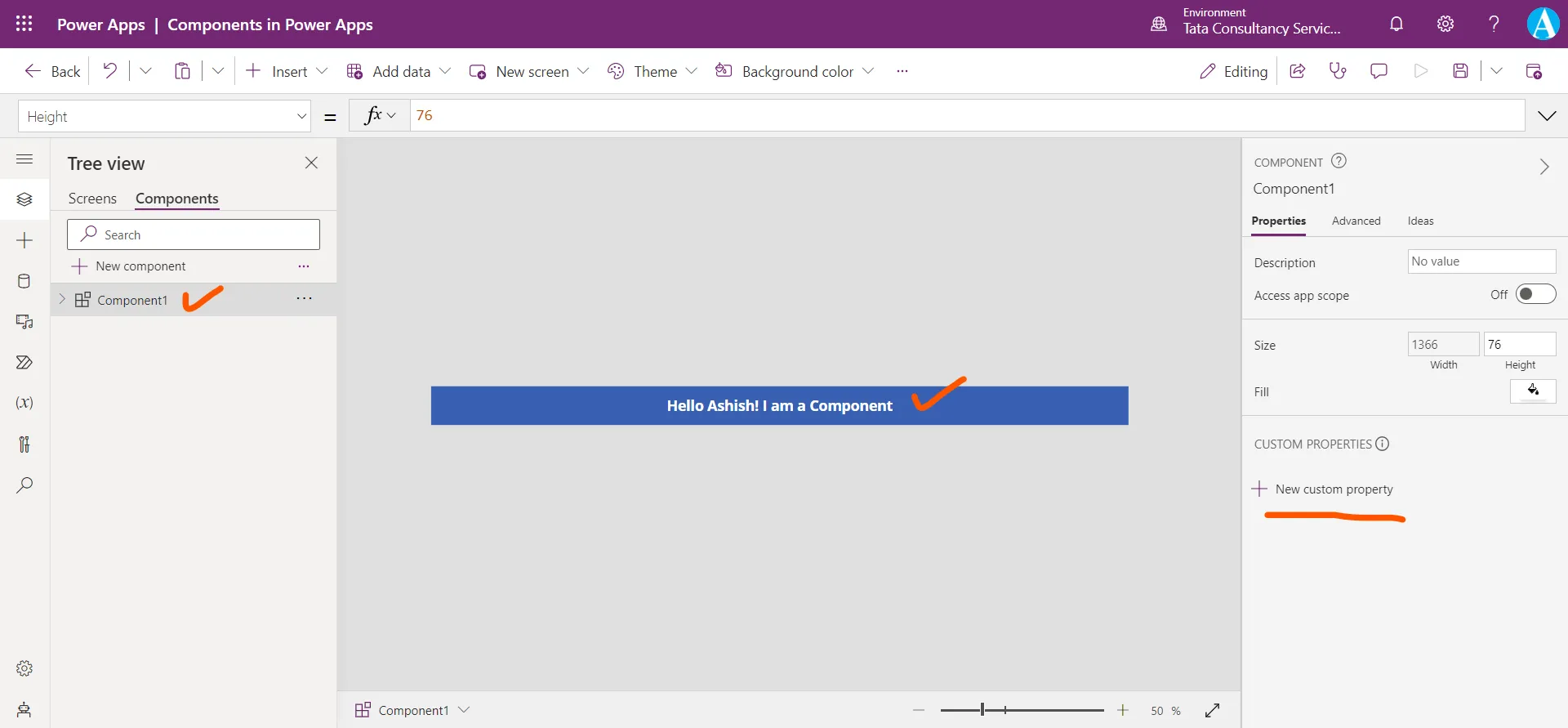
Step 8: We can create our Custom Properties in the Components pane. Let us come to the Components tab and click on + New custom property.
A New custom property pane appears.
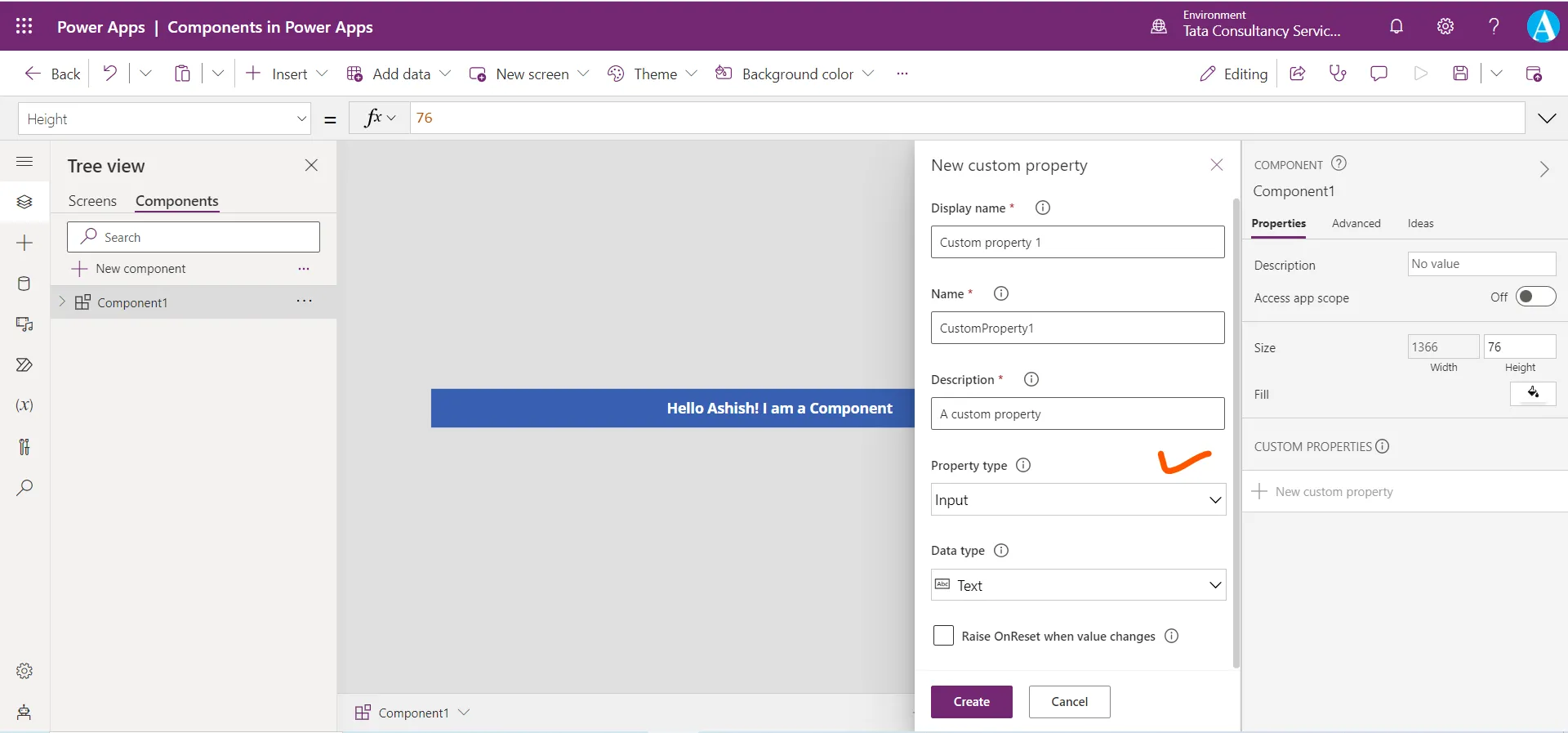
There are following things we have in the New custom property pane.
- Display name: The Display name specifies the name of the property appears in the Properties panel, when we select the component.
- Name: It specifies the property name which is used inside the formulas. The property name cannot include spaces in their name. We refer the property in the formula by using this name, ComponentName.MyPropertyName.
- Description: We can add the description to the property to state its purpose. The Description appears in a tooltip if we hover over the display name of this property in the Properties tab.
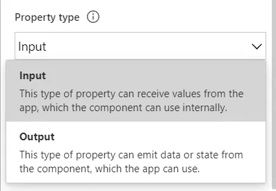
- Property type: It categorizes the custom property of the component as Input or Output.
a) Input: This type of property can receive values from the app, which the component can use internally.
b) Output: This type of property can emit data or state from the component, which the app can use.
- Data type: It specifies the data type for the custom property.
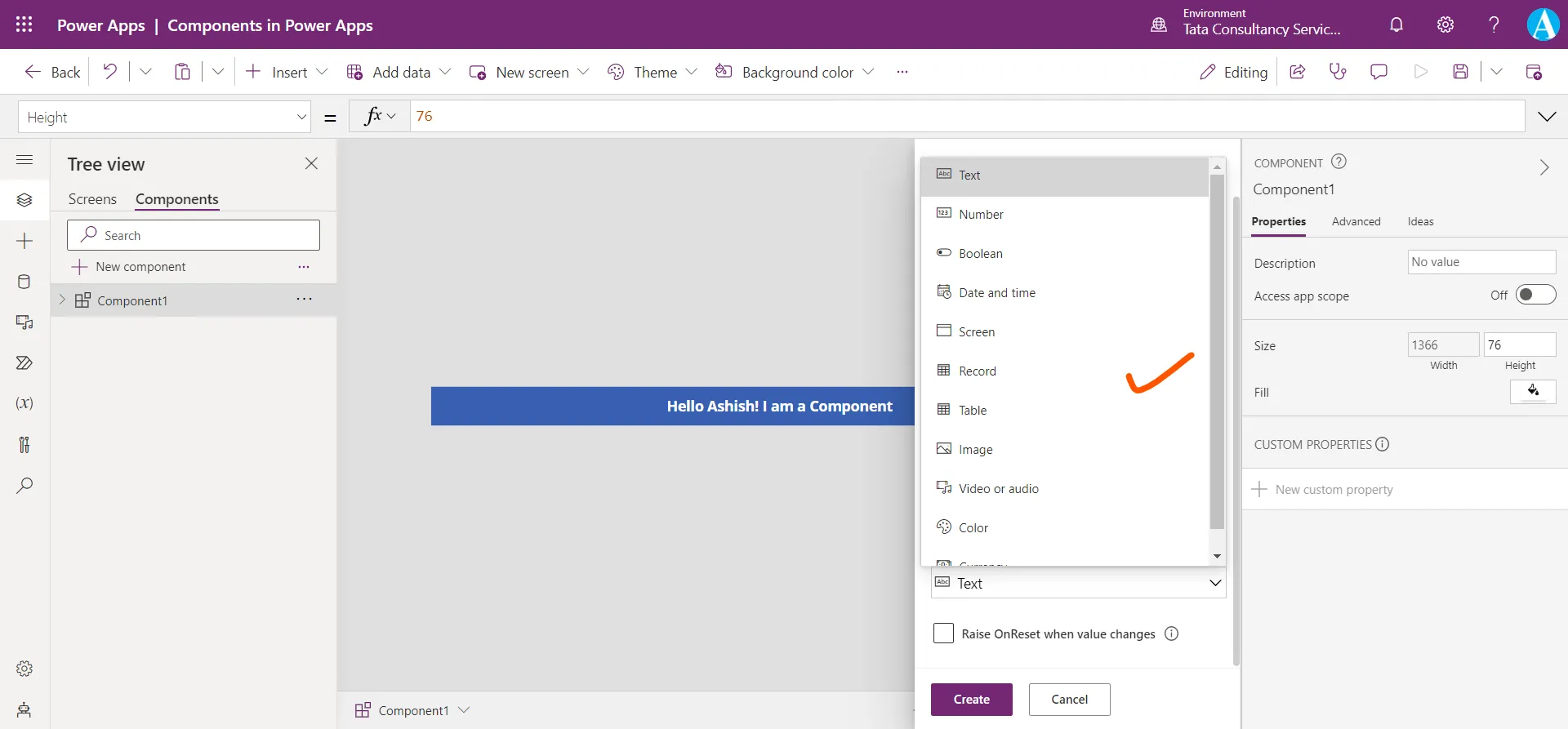
Let us create one custom property, after specifying all the details as shown in the image below, click on Create. Here we have created an Input type property.
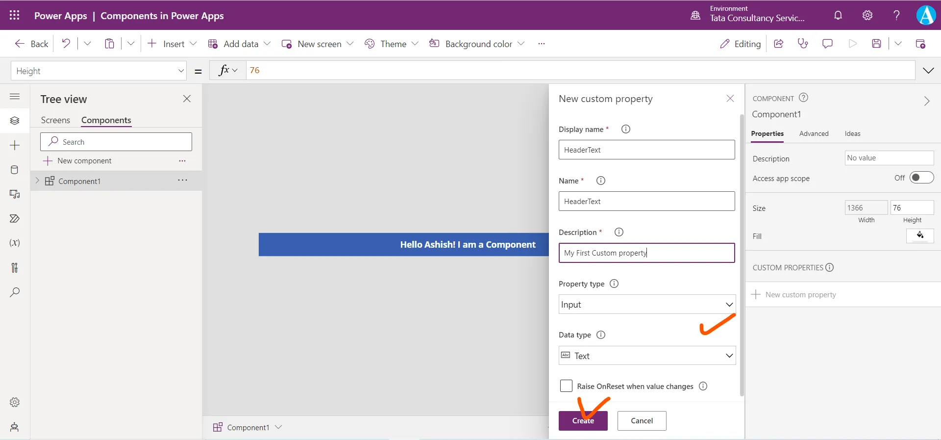
Our property is created we can see it in the following image.
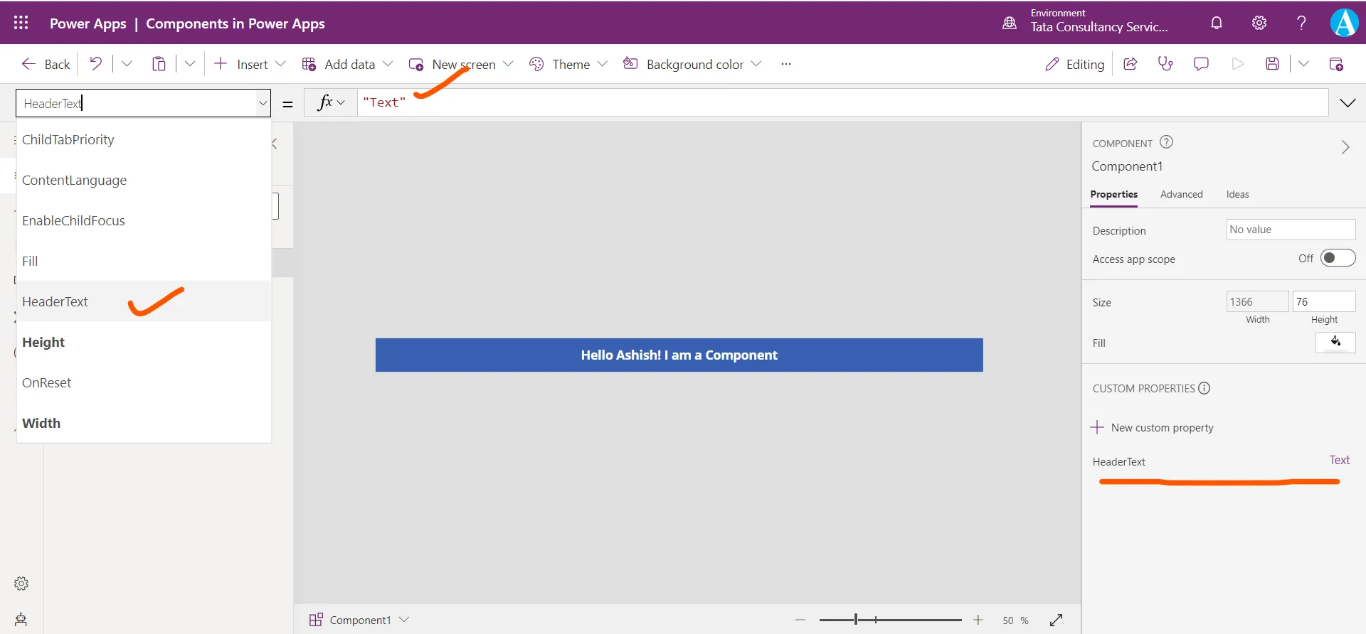
Now we can see in the following image that the Text value is hard coded for the Text label control of the component.
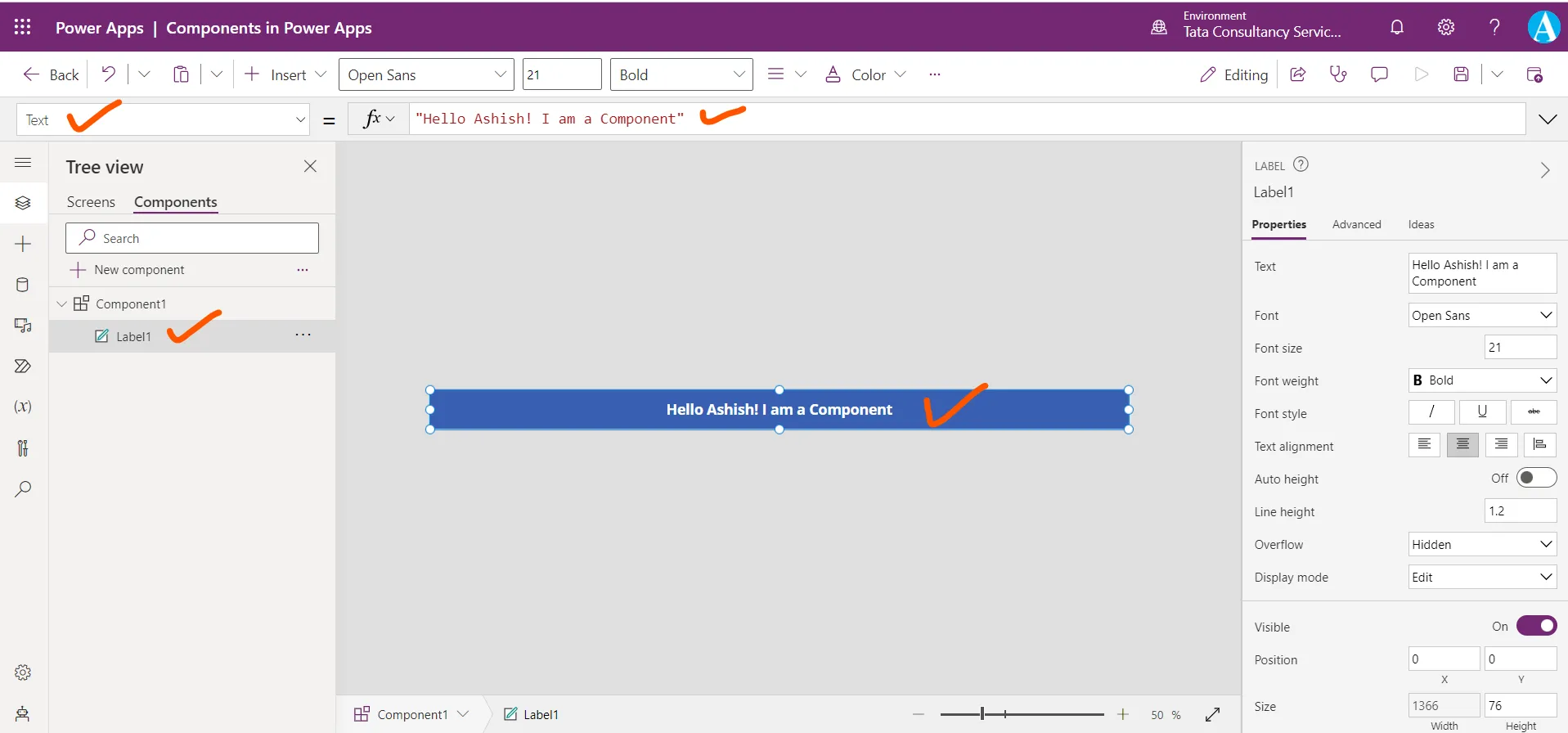
Here, we are referencing the component property inside the control.
Power Apps Formula
Here the syntax used is ComponentName.CustomPropertyName. Here basically whatever text we specified in the HeaderText property of the component, it is shown in the text label control of the component.
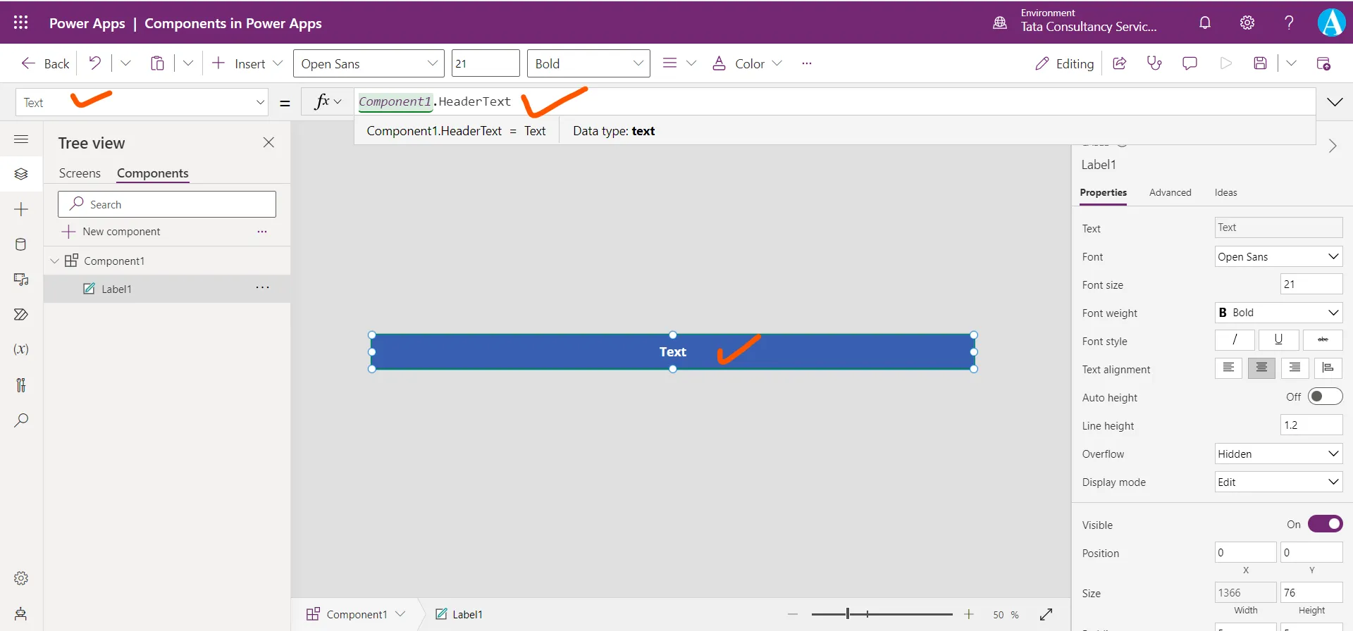
Now let us change the HeaderText property of the component to value “Hello Buddy”.
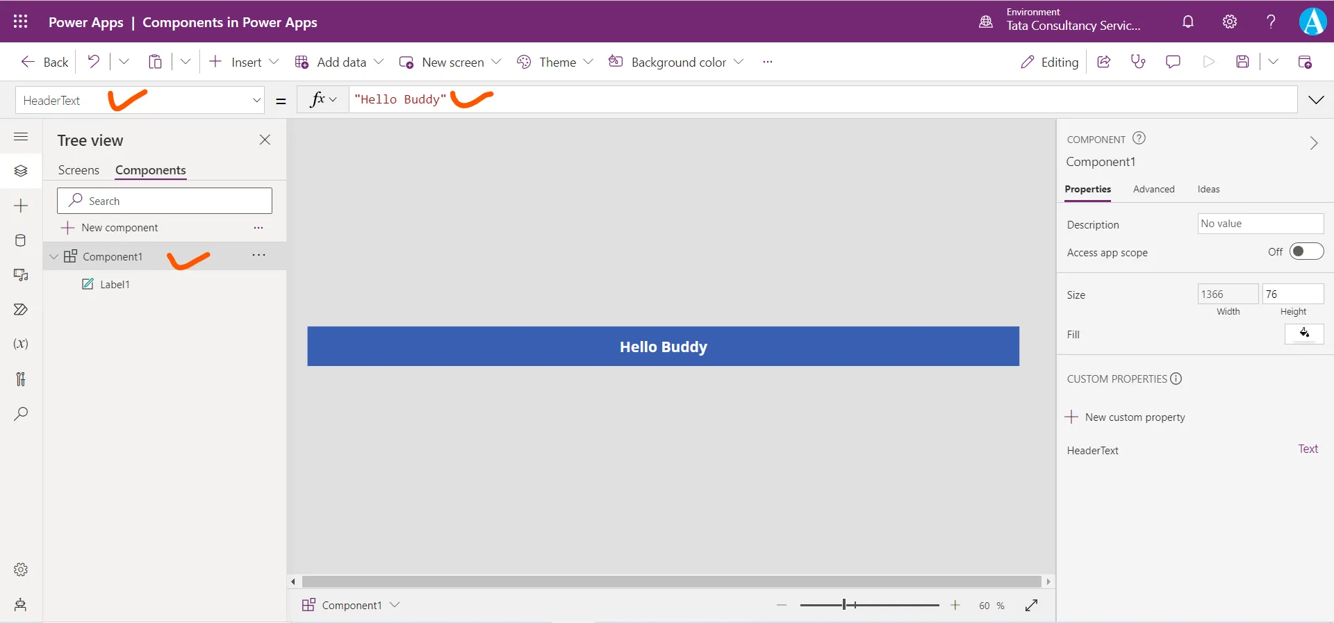
Come back to the screen, here we can see the changes are reflected. Even we can control the component individually.
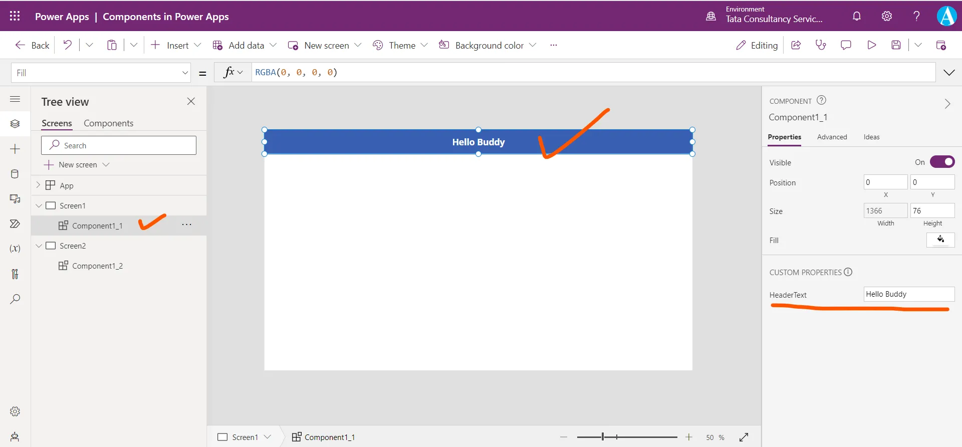
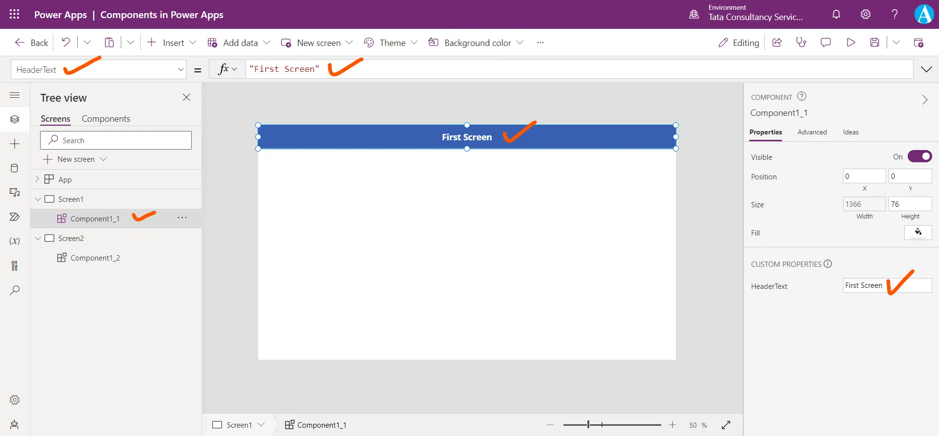
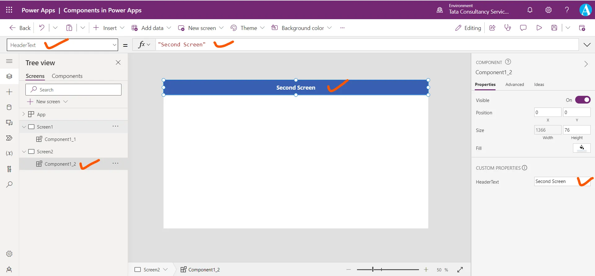
For example, select the Screen1 component and set its HeaderText to “First Screen”, and select the component on the Screen2, and set its HeaderText to “Second Screen”.
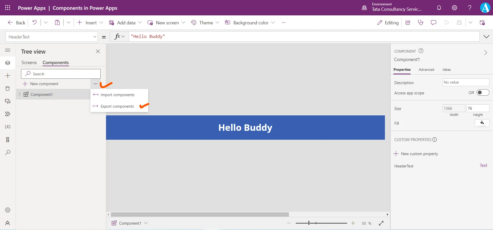
Step 9: Components are local to the app, but they can be downloaded and exported to use in other app. Change in components in one app does not affect the same component in the other app. We can download it by clicking on the three dots on the components tab.
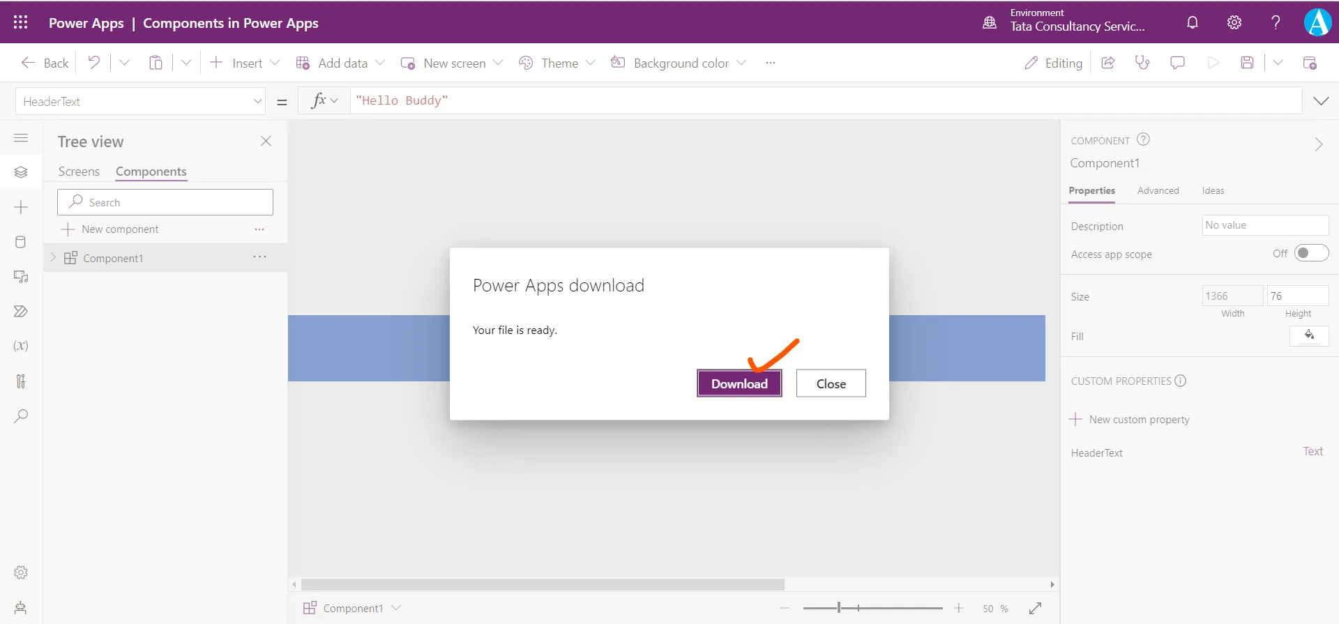
Click on Download. A file with “.msapp” extension is downloaded. In the other app, click on the Components tab and click on the three dots select Import components, and then select Upload file and then select the file to import in the other app.
Note: Here, only component is exported not the screens or the whole app.
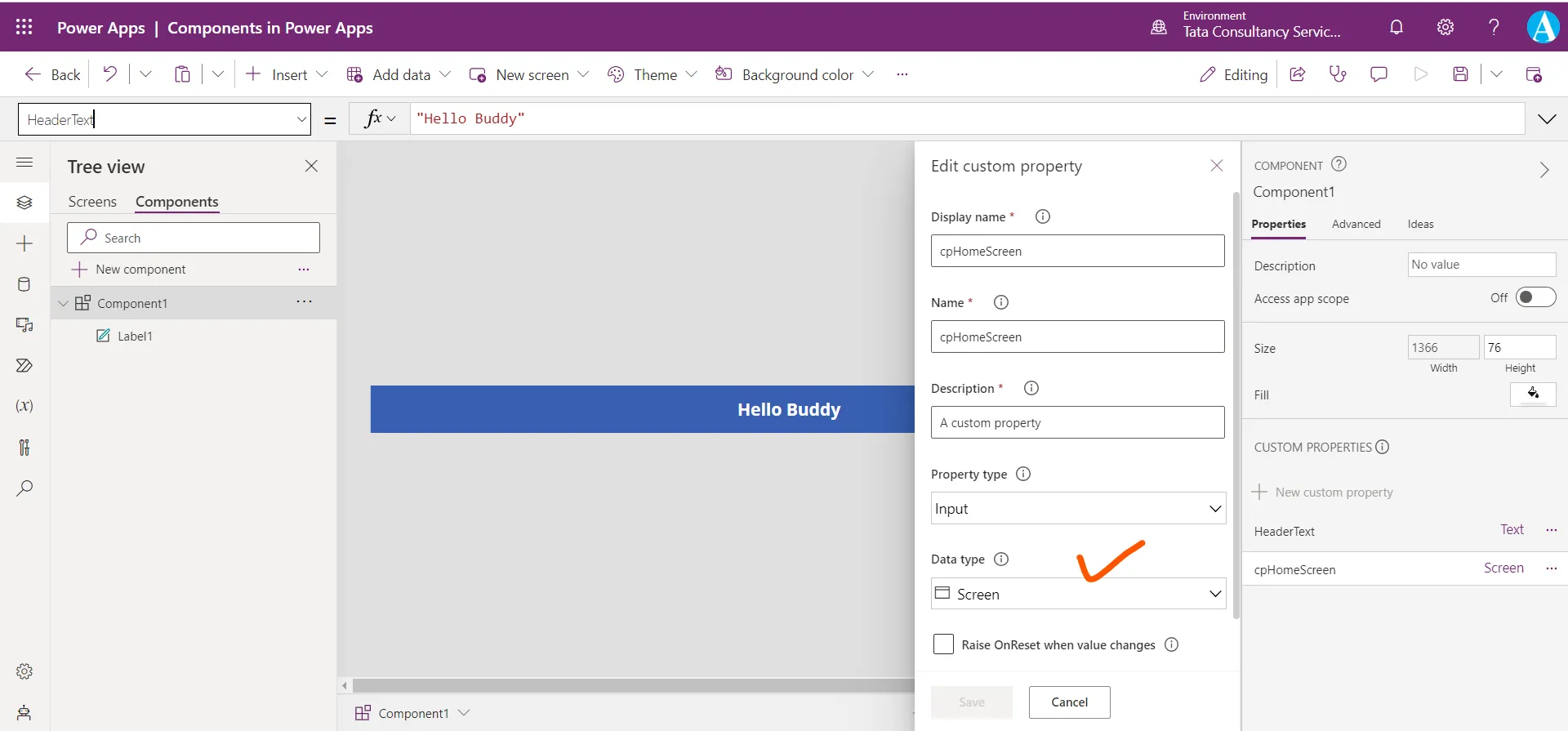
Step 10: Add one more custom property of name cpHomeScreen and of Data typeScreen.
Step 11: Add a Home icon to the component, by clicking on + Insert and from the Icons sections select Home.
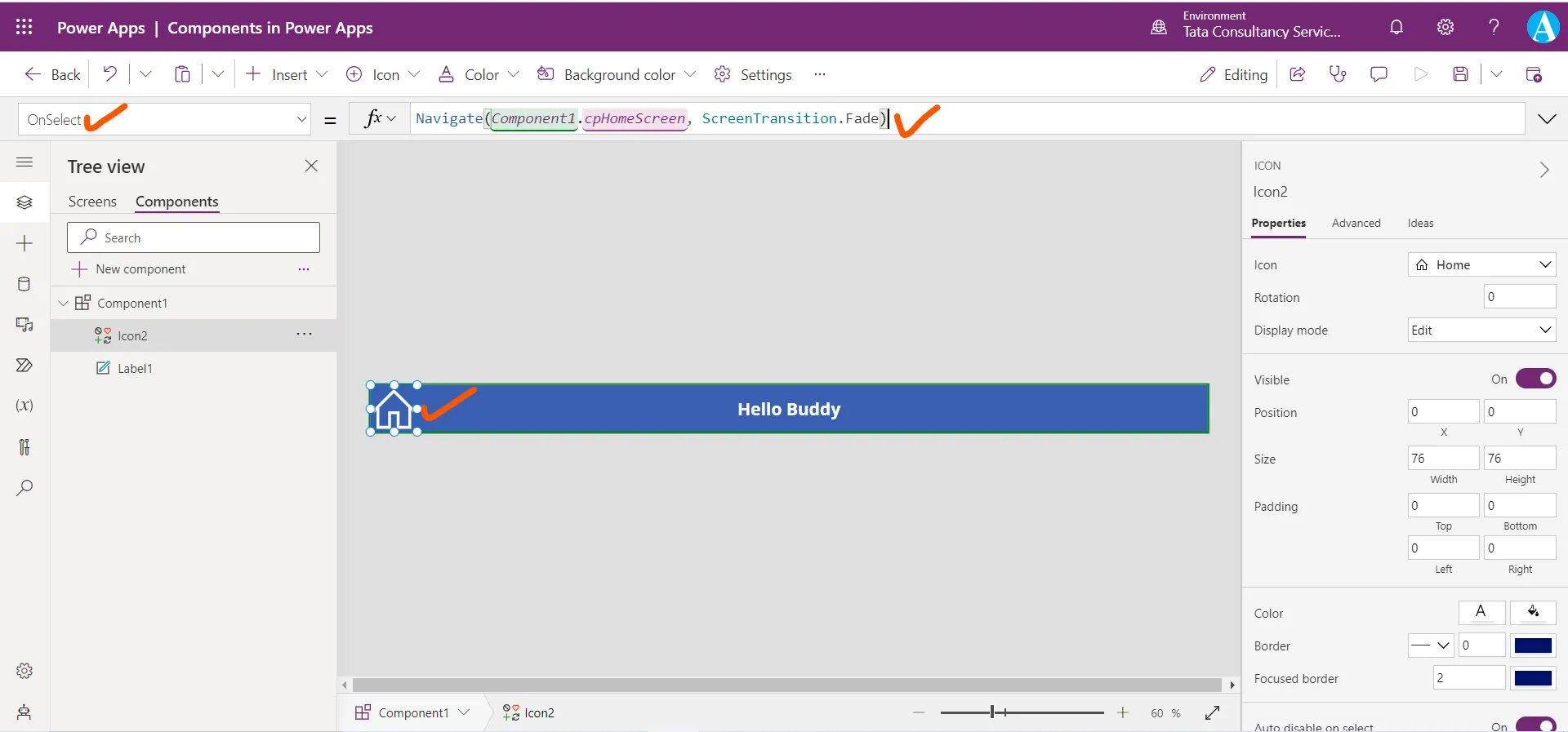
Step 12: Select the Home icon and set its OnSelect property to the following power apps formula.
Power Apps Formula
This formula references the name of the screen from the custom input property of the component cpHomeScreen of data type screen.
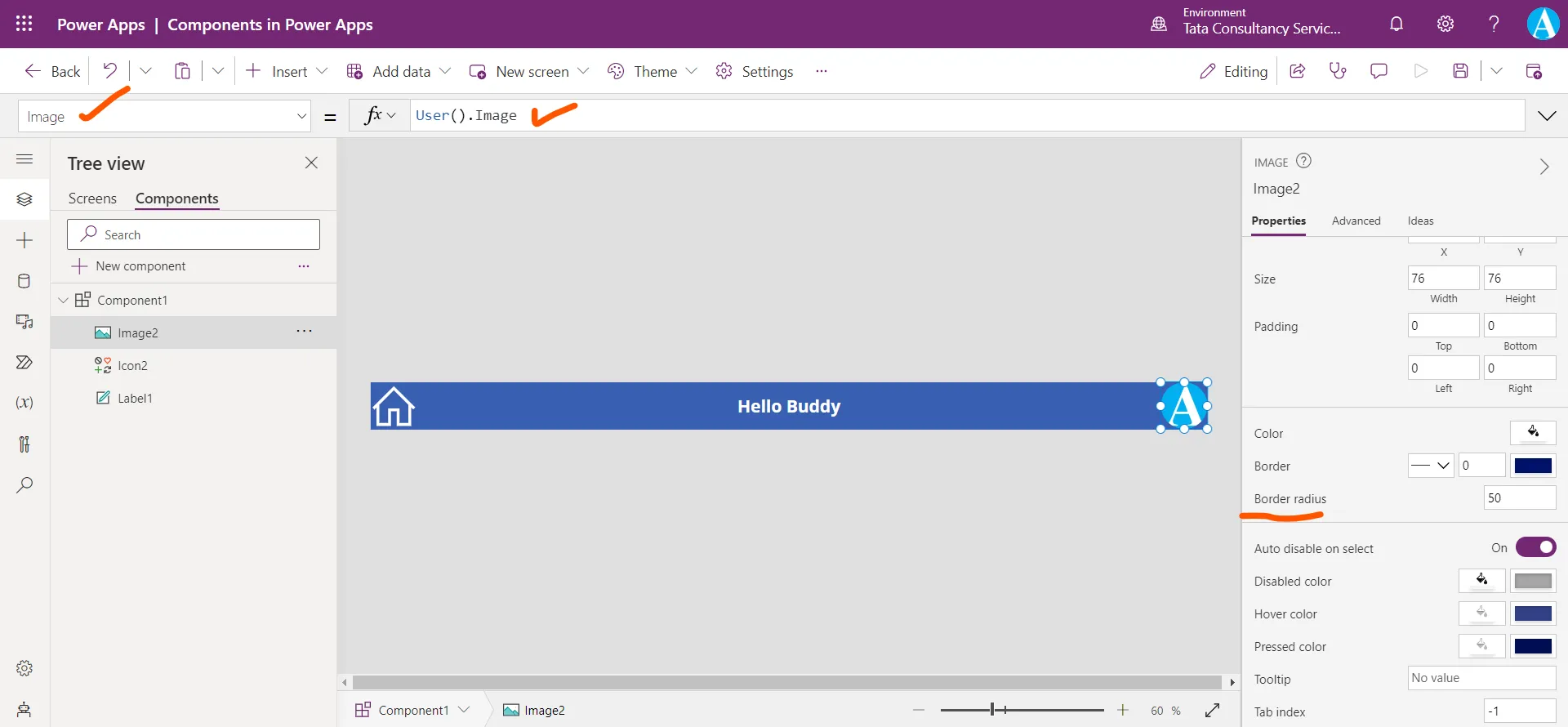
Step 13: Add one image control and set its Image property to the power apps formula User().Image, which displays the image of the logged in user of the app.
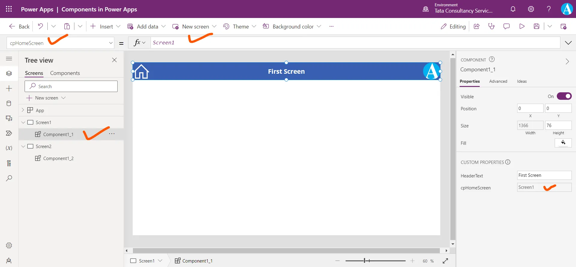
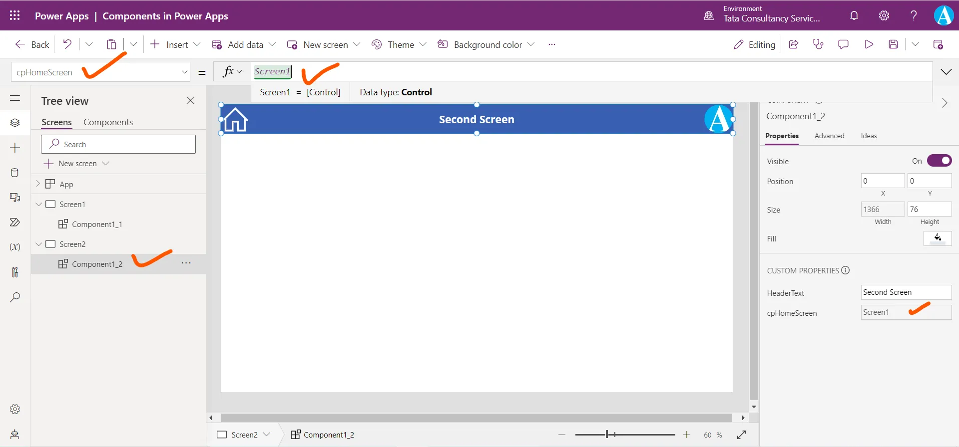
Step 14: Lets come back to the Screen, here the changes are reflected. Set the cpHomeScreen property of first and second screen components to Screen1. Here Screen1 is the name of the screen.
Step 15: Now preview the app and check the functionality.
Create another new component
Let’s create another component which includes a gallery control. And a custom property of data type “Table”.
Step 1: To create a new component, click on + New component.
Step 2: In the Display name, Name, and Description boxes, type the text as MyItems.
Step 3: In the Property type select Input and in the Data type list, select Table, and then select Create.
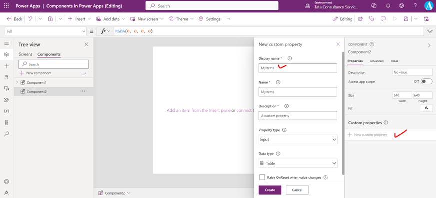
The MyItems property is set to a default value based on the data type that we specified.
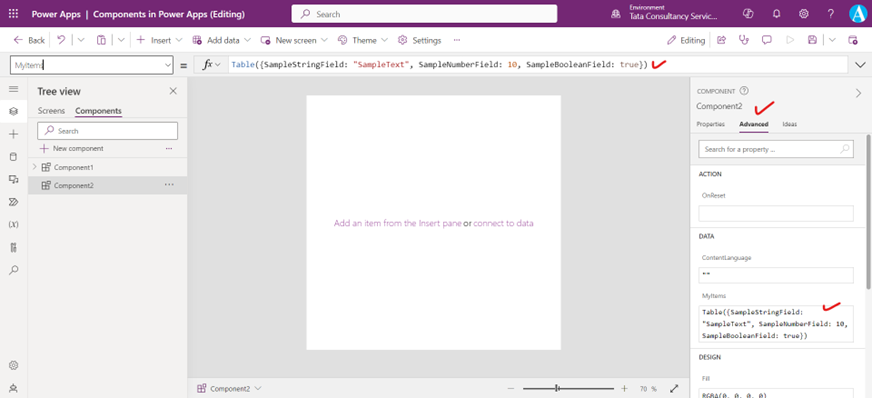
Here we are changing the value of the MyItems property to match the data schema that we want to input to the component.
Power Apps Formula
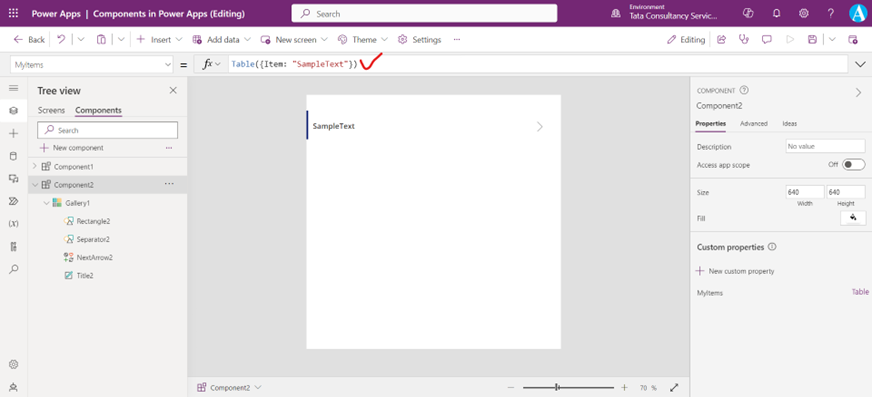
Step 4: In the component, insert a blank vertical Gallery control and select Layout on the property pane as Title.
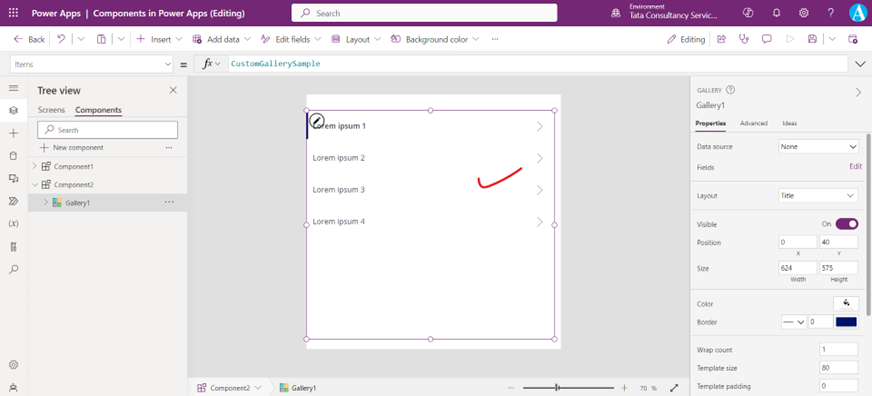
In the Items property of the gallery control to the following expression:
Power Apps Formula
This way, the Items property of the Gallery control reads and depends on the MyItems input property of the component named Component2.
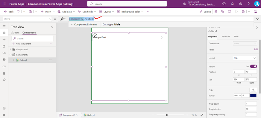
Step 5: Now we will add component to a screen and specify a table of strings for the component to show. In the left pane, select the list of screens, and then select the default screen. On the + Insert tab, and from the Custom section, click on the Component2.
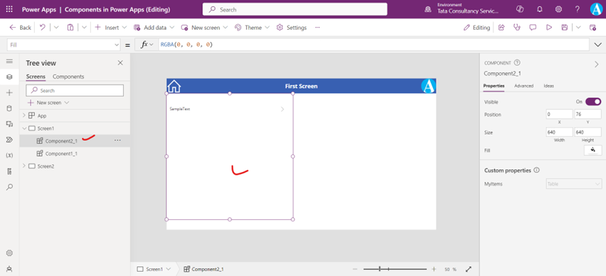
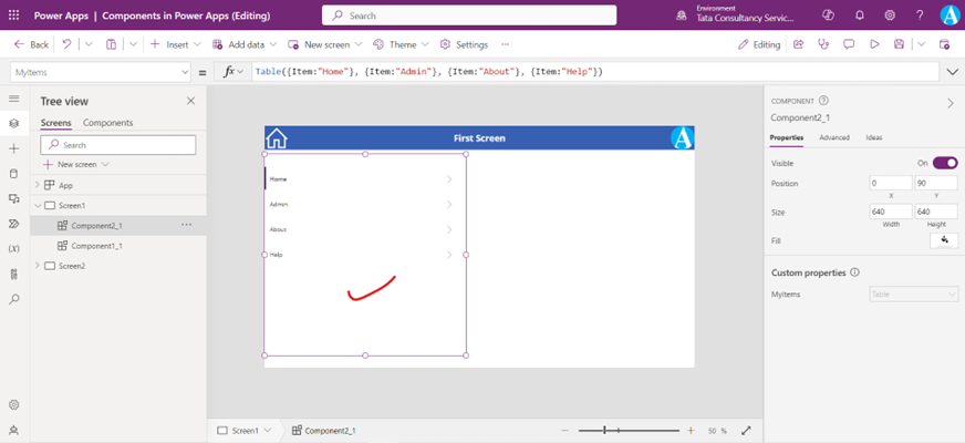
Step 6: Set the MyItems property of Component2_1 to the following power apps formula:
Power Apps Formula
This instance resembles this graphic, but we can customize the text and other properties of each instance.
Create and use output property
So far, we have created a component and added it to an app. Next, we will create an output property that reflects the item that the user selects in the menu.
Step 1: Open the list of components, and then select Component2.
Step 2: In the right-hand pane, select the Properties tab, and then select New custom property.
Step 3: In the Display name, Property name, and Description boxes, type or paste MySelected.
Step 4: Under Property type, select Output, and under Data type, select Text and then select Create.
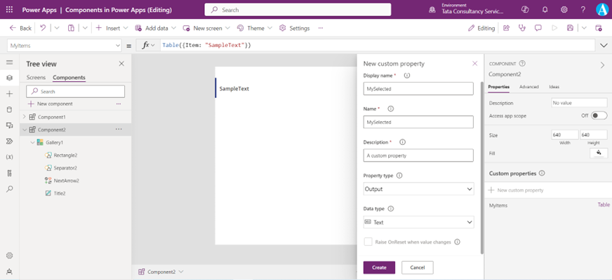
Step 5: On the Advanced tab, set the value of the MySelected custom output property to the following expression:
Power Apps Formula
Here, Gallery1 is the name of the gallery control, Selected is the property of the gallery control which specifies the current selected record, and Item is the name of the column.
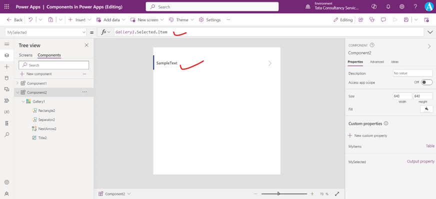
Step 6: On the screen of the app, add a Text label control, and set its Text property to the following expression:
Power Apps Formula
Here, Component2_1 is the name of the component instance (not the name of the component definition), which can be renamed as per requirement. And MySelected is the custom output property name.
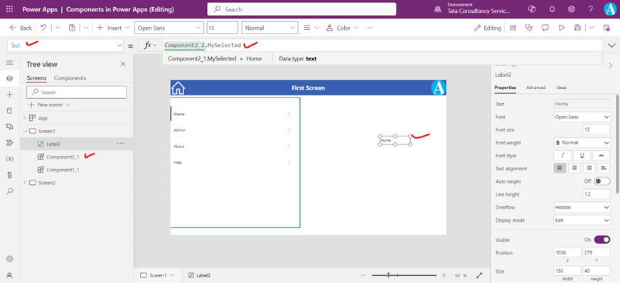
While holding down the Alt key, select each item in the menu. The Label control reflects the menu item that we selected most recently.