Add a scrolling screen to a canvas app
In a canvas app, create a screen that users can scroll to show different items. When we add multiple controls in a section, the controls maintain their relative positions within that section, regardless if it's a phone app or a tablet app.
Follow the following steps to create a scrolling screen:
Step 1: From the Power Apps Studio, select + New screen below the Tree view.
Step 2: Select Templates and then select Scrollable, to have a scrollable screen added to the app.
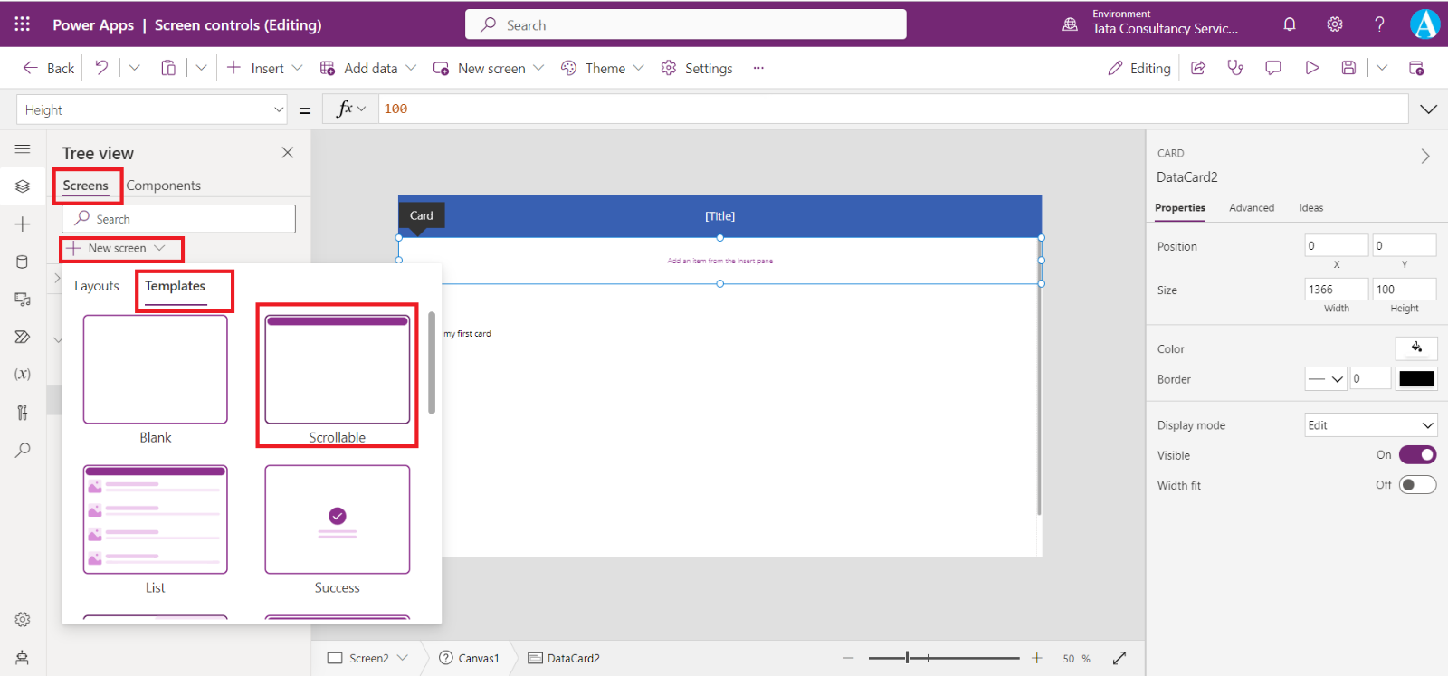
A new scrollable screen is added to the app, as shown in the image below.
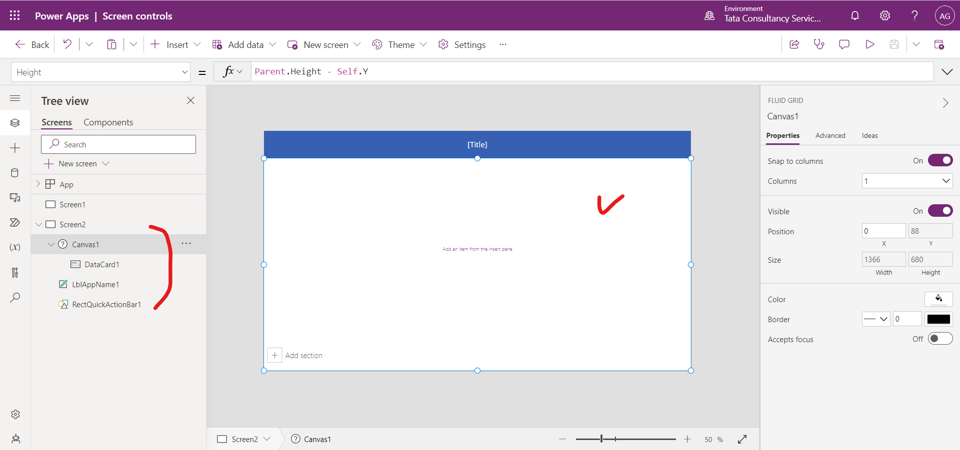
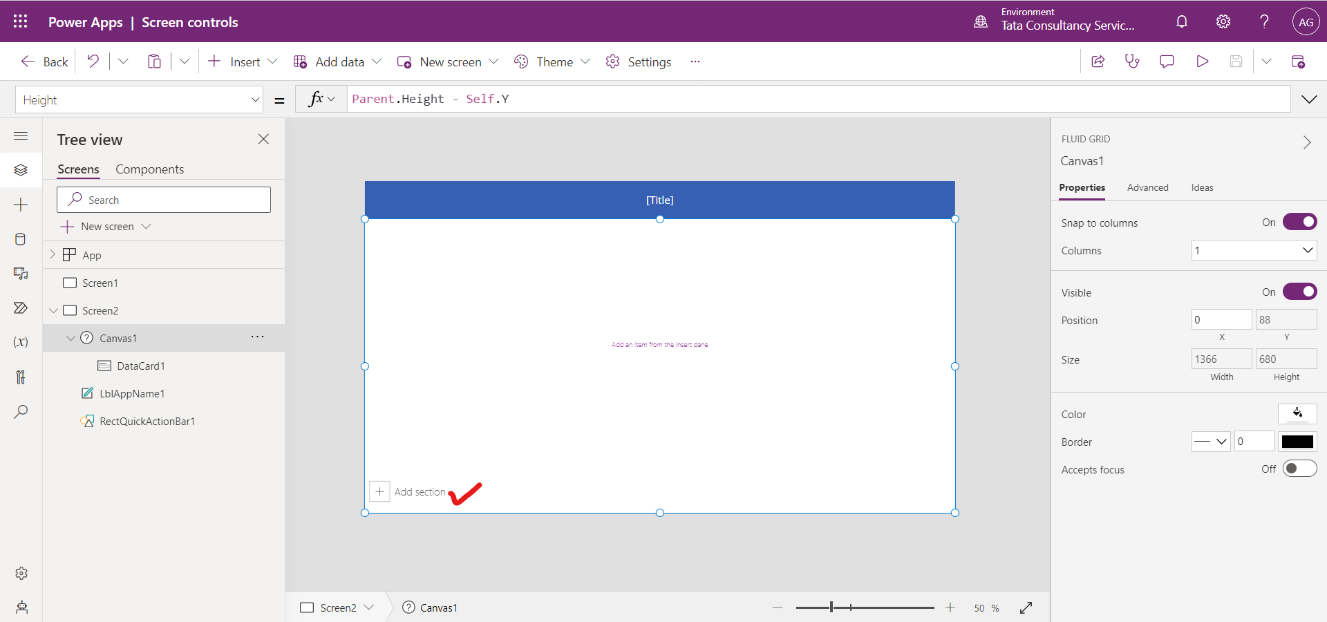
Step 3: Scrollable screen includes a fluid grid with one data card by default. Data cards help separate building blocks on the screen. To make screen scrollable with multiple controls, add more data cards. And then, add controls in data cards as required.
To add data cards, we can select + Add section at the bottom of the scrollable screen. And to add controls in the datacard select the datacard and then select the + Insert at the top menu and then select the control to add to the datacard.
How to move the card on a screen?
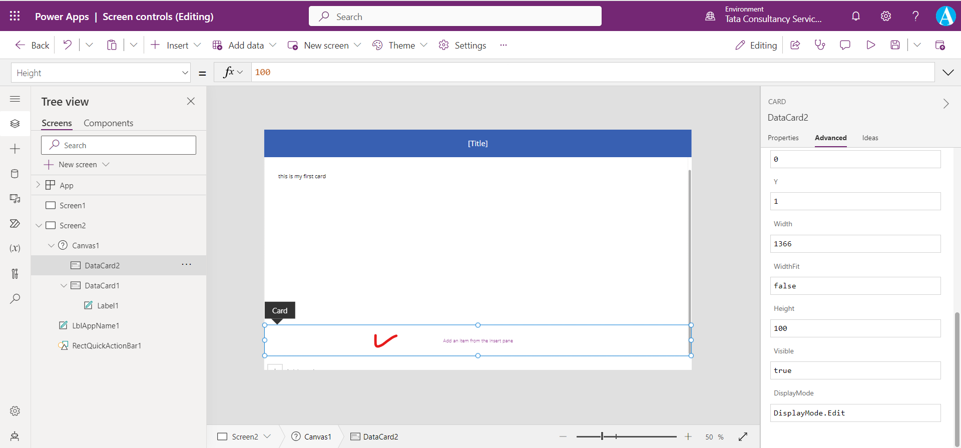
When we hover over the card control then it shows a Card tooltip at the top of the card as shown in the image below, which is marked in red.
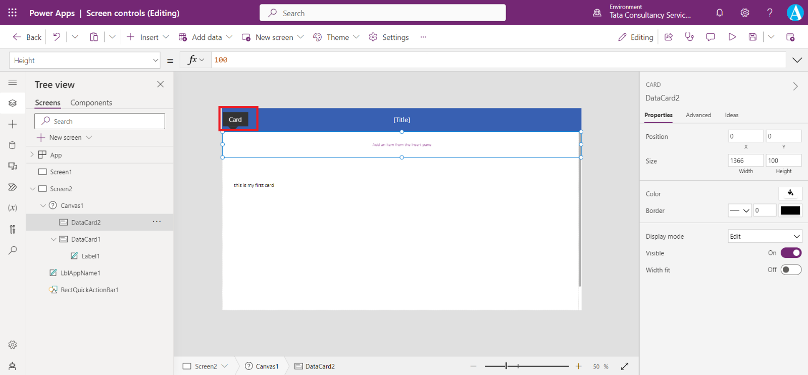
Select this card and then we can move the card where we want to shift the card control on the screen.
Vertical Container and Horizontal Container
Vertical container control positions the controls (Child components) stacked to each other.
Horizontal container control positions the controls (Child components) one after the other.
Properties of the vertical and horizontal containers are: 1. Fill It defines the background color of a control.
2. Height
It defines the distance between a control's top and bottom edges.
3. Width
It defines the distance between a control's left and right edges.
4. Minimum width
It represents the minimum size of the component in the direction of the Fill portions (that is, the parent’s Direction).
5. Wrap
It defines whether the content wraps to a new row or column when it cannot fit. In case of vertical container new columns are created and in case of horizontal containers new rows are created.
6. Direction or LayoutDirection
It defines in what direction the container layouts its child components. Horizontal and Vertical.
7. Horizontal Overflow or LayoutOverflowX
It defines whether the container shows scrollbars or remove content when it is too large to fit. Scroll and Hide.
8. Vertical Overflow or LayoutOverflowY
It defines whether the container shows scrollbars or remove content when it is too large to fit. Scroll and Hide.
9. Gap The Gap property defines the space between containers child components in pixels.
10. Fill portions Defines how the individual component grows when there is more screen real-estate assigned to its parent. The number represents the portion of the extra space given to the component out of all the available extra space claimed by children of its parent. For example, if child A has Fill portions set to 1 and child B has Fill portions set to 2, child A gets 1/3 of the extra space available while child B gets 2/3 of the extra available space.
11. BorderColor
It specifies the color of a control's border.
12. BorderStyle
It specifies whether a control's border is Solid, Dashed, Dotted, or None.
13. BorderThickness
It specifies the thickness of a control's border.
14. Visible It defines whether a control appears or is hidden. It takes the boolean value, i.e., true, or false.
15. X
It specifies the distance between the left edge of a control and the left edge of its parent container (screen if no parent container).
16. Y It specifies the distance between the top edge of a control and the top edge of the parent container (screen if no parent container).
There are multiple different methods to configure scrolling with forms: Use Vertical Overflow property Use of the Vertical Overflow property is a basic method of using a scrolling screen that has a form.
Step 1: Ensure we are using a blank screen, and not a scrollable screen.
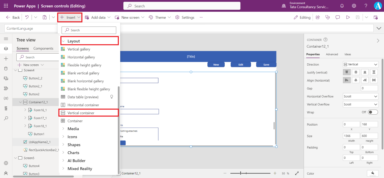
Step 2: Select + Insert >Layout, and then select Vertical container.
Step 3: From the right-side of the screen in the properties pane, select Vertical Overflow property drop-down, and choose Scroll.
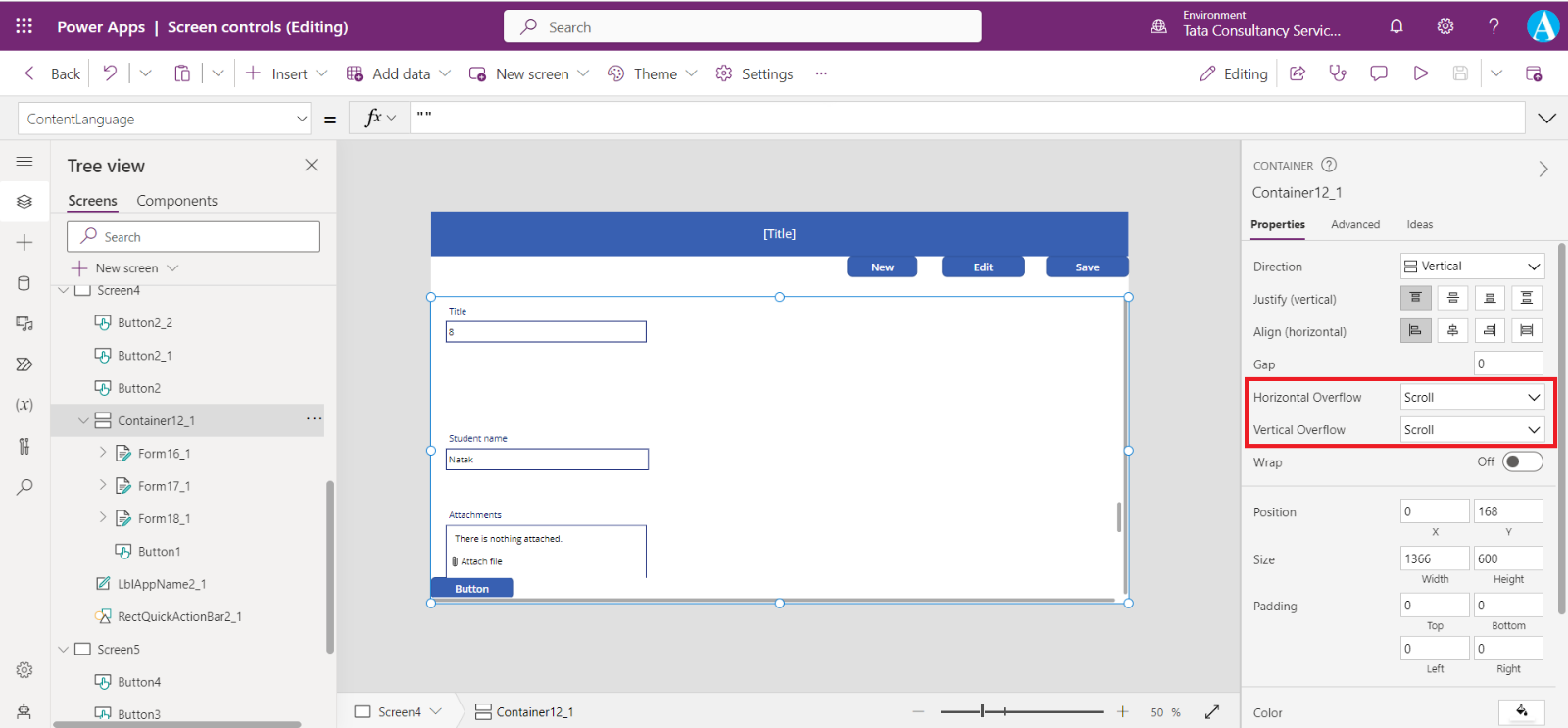
Step 4: Add the edit or display form with the required fields. When the list of fields exceeds the size of the container inside the screen, we will be able to scroll inside the container using the scroll bar.