Slider and Rating control in Power Apps
1. Slider control in Power Apps
The slider control is used to indicate a value, between a minimum and a maximum value that we specify, by dragging the handle of a slider left-right or up-down, depending on the direction that we choose.
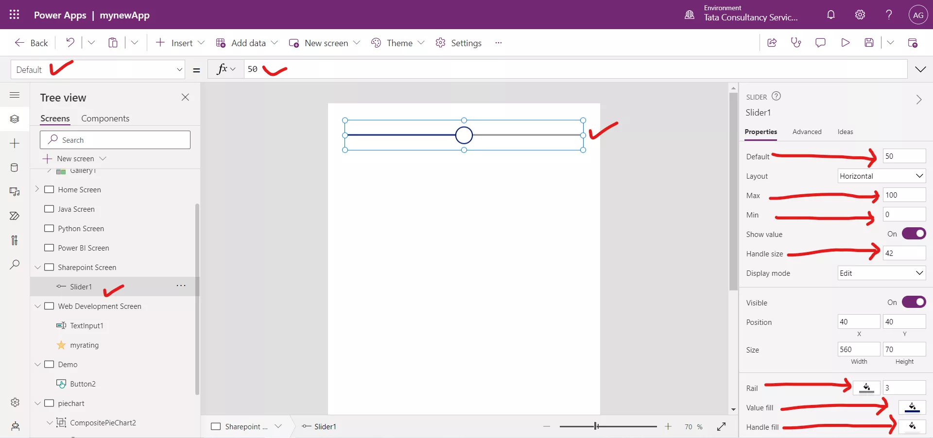
There are the following properties of a slider control: 1. Default The Default property specifies the initial value of a control before it is changed by the user. By default, its value is 50. 2. Max The Max property specifies the maximum value to which the user can set a slider. By default, the value is 100. 3. Min The Min property specifies the minimum value to which the user can set a slider. By default, the value is 0. 4. Value The value of an input control. 5. HandleSize The HandleSize property specifies the diameter of the handle. 6. HandleFill The color of the handle (the element that changes position) in a toggle or slider control. 7. Layout The Layout property specifies whether the user adjusts a slider top to bottom (Vertical) or left to right (Horizontal). 8. RailFill The background color of the rectangle in a toggle control when its value is false or the color of the line to the right of the handle in a slider control. 9. ShowValue Whether a slider's or rating's value appears as the user changes that value or hovers over the control. 10. ValueFill The color of the line to the left of the handle in a slider control. 11. Tooltip The Tooltip property specifies the explanatory text that appears when the user hovers over a control.
Example: To add a slider control click on the Insert then select Slider from the Input section.
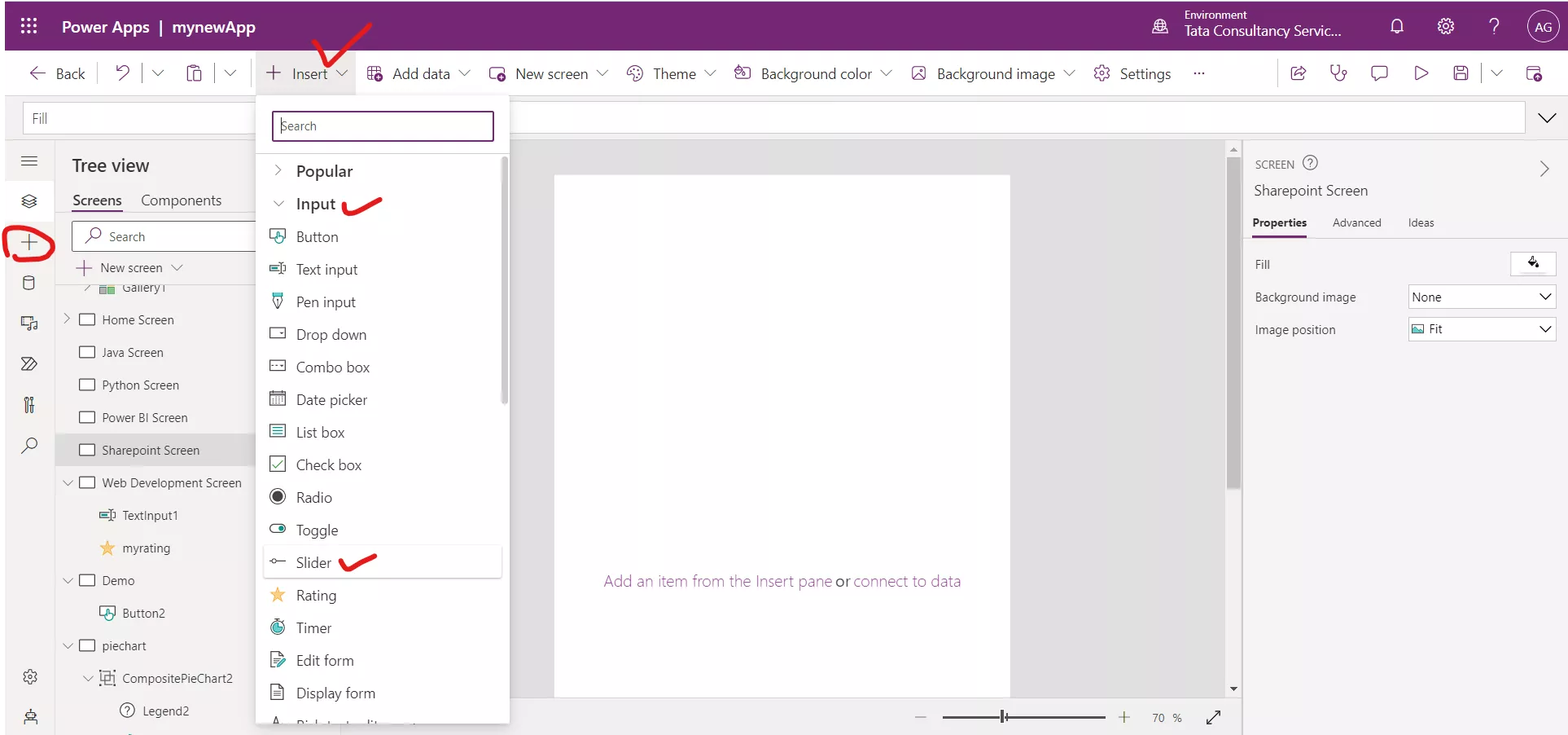
The slider control is added to the screen with its default value 50.
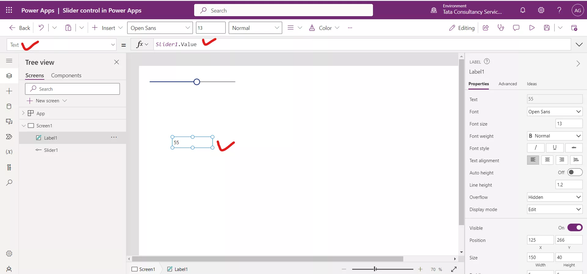
Add a Text label control on the screen and set its Text property to the following formula.
Power Apps Formula
Here, Slider1 is the name of our slider control.
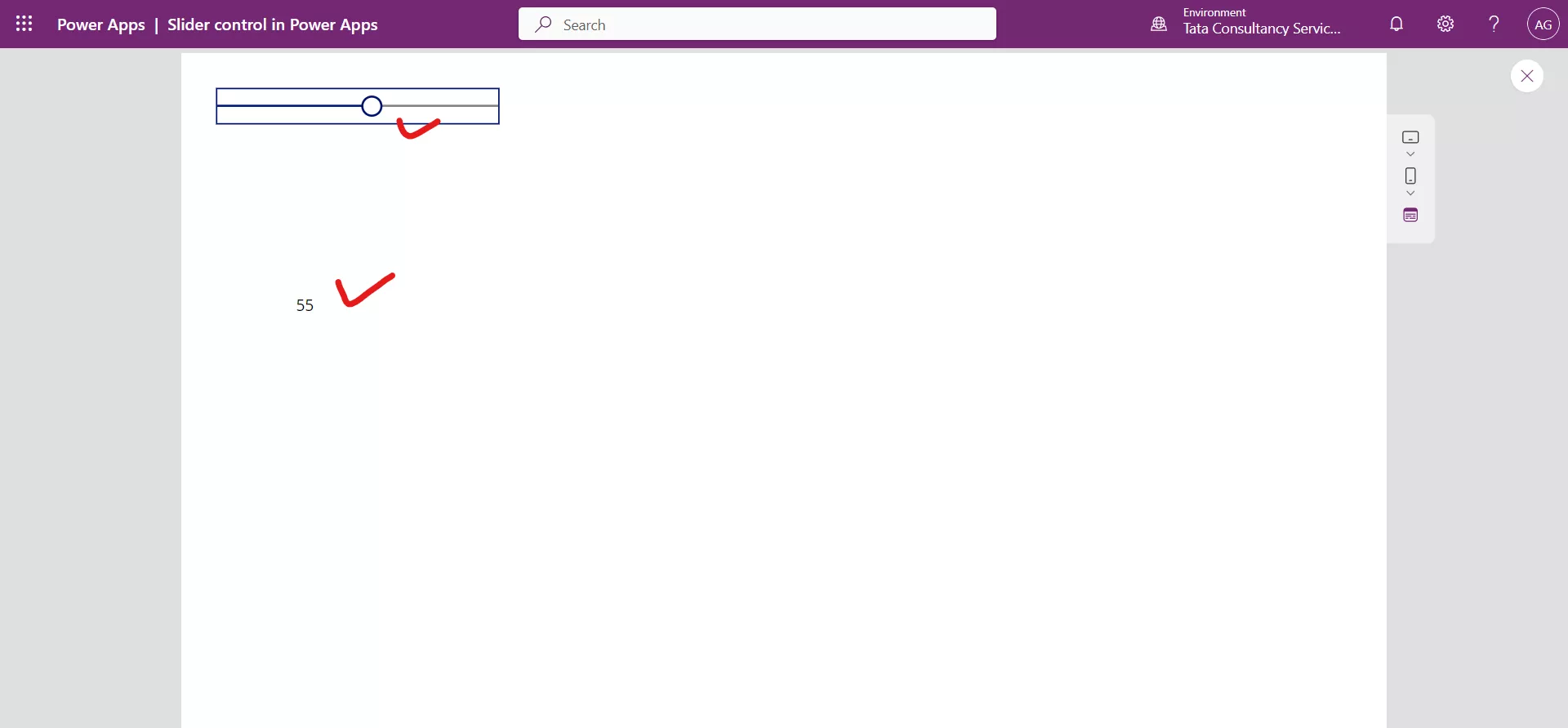
As the slider handle is moved the Text label is also updated according to the slider value.
2. Rating control in Power Apps
A Rating control with which users can indicate a value between 1 and a maximum number that we specify.
The Rating control has the following properties: 1. Default The Default property specifies the initial value of a control before it is changed by the user.
2. Max The Max property specifies the maximum value to which the user can set a slider or a rating.

The Rating control is added to the screen.
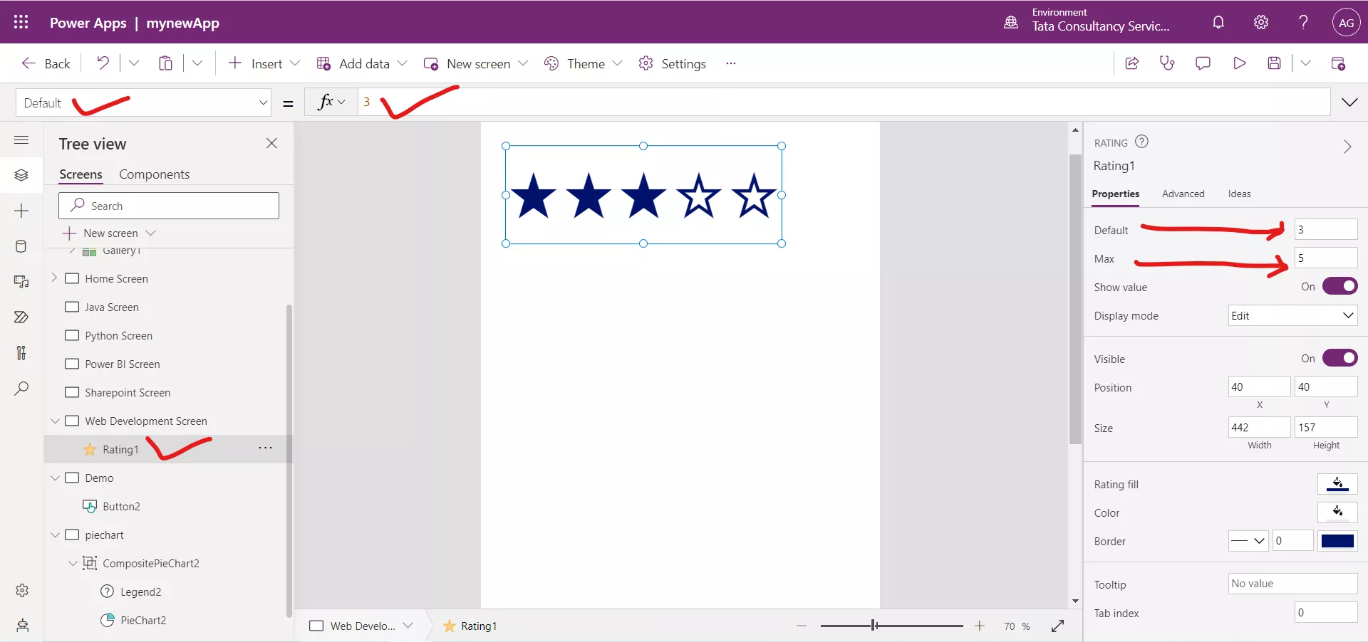
Example:Step 1: Add a Rating control, and name it myrating.
Step 2: Add a Text input control, name it Qualitative, and move it below the Rating control.
Step 3: Set the Default property of the Text input control to "", and set its HintText to this formula:
Power Apps Formula
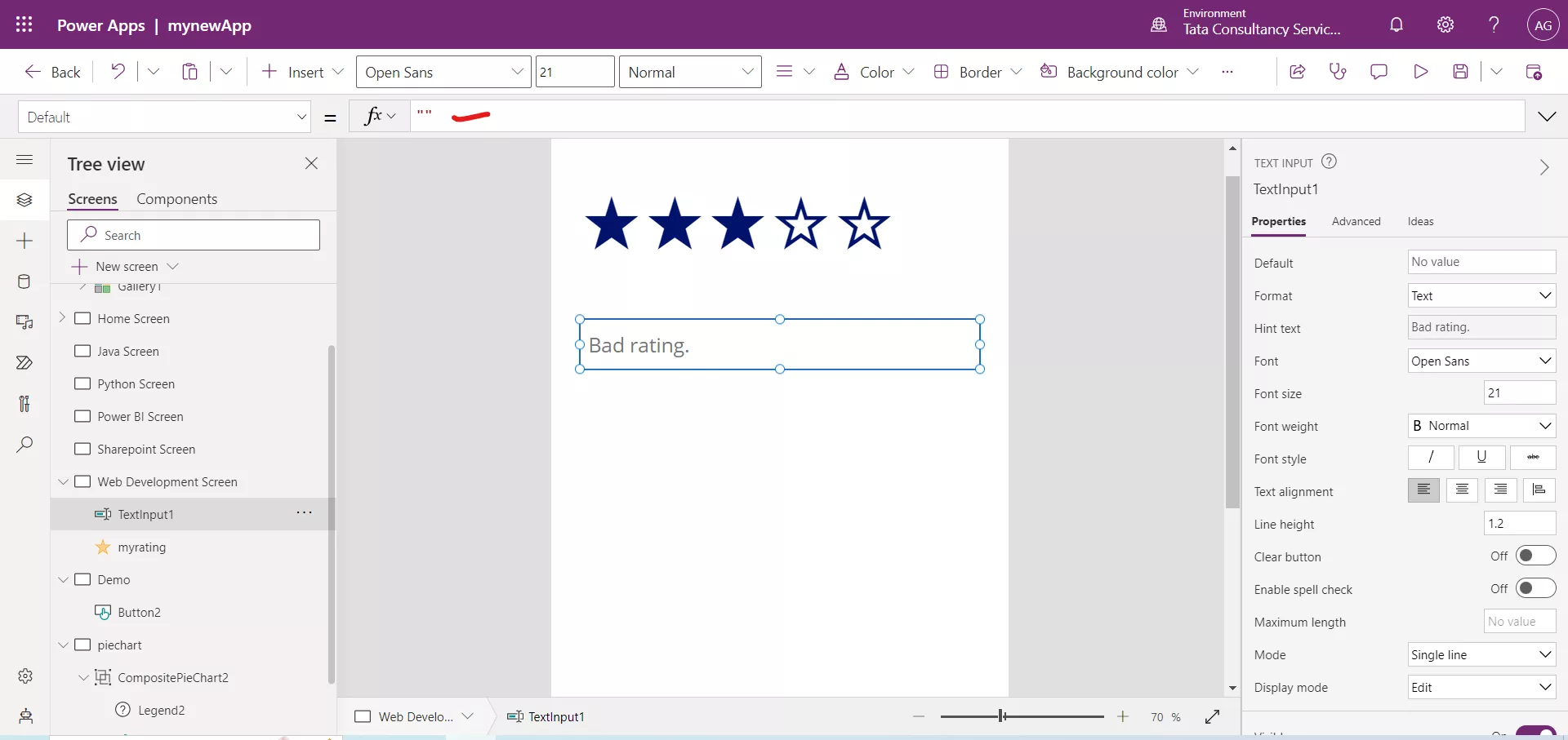
Step 4: Press F5, and then click or tap either four or five stars in the Rating control.
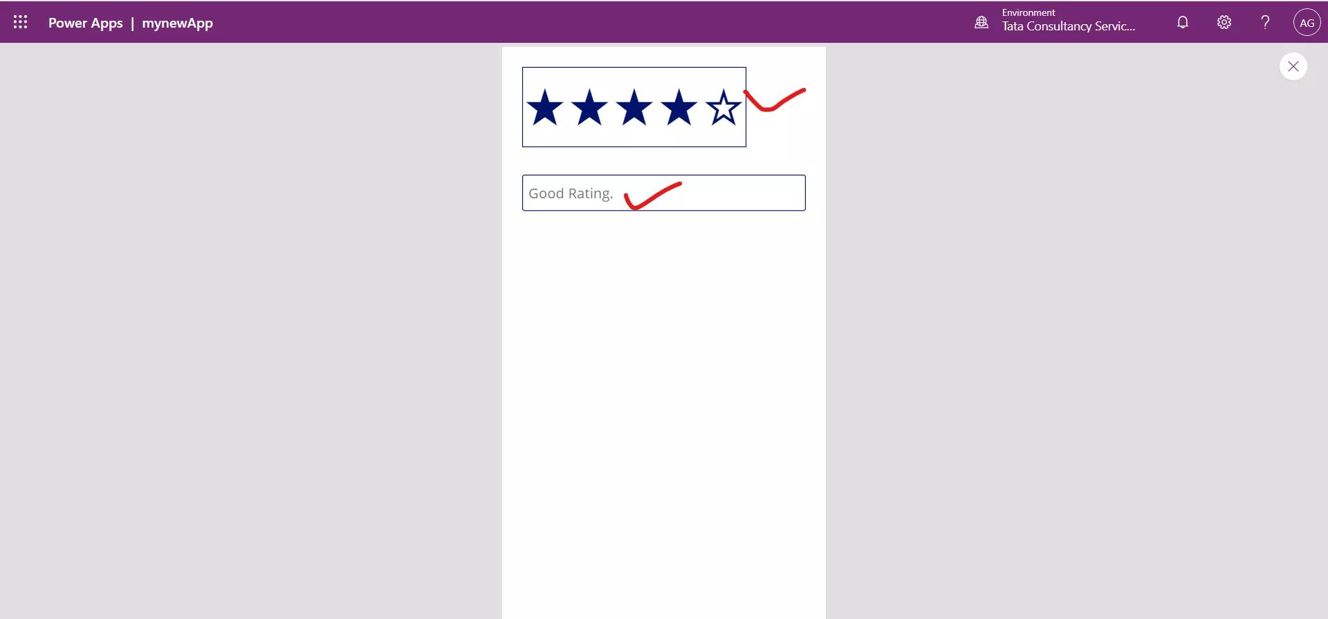
The hint text in the Text input control changes to reflect the Good rating.
Step 5: Click or tap fewer than four stars in myrating.
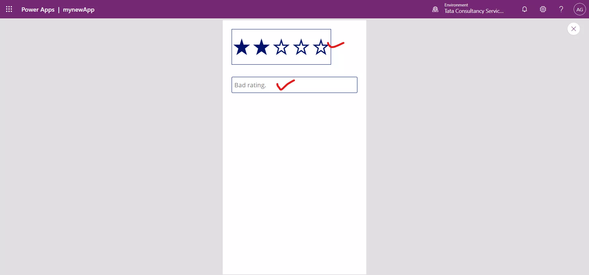
The hint text in the Text input control changes to reflect the Bad rating.
Step 6: To return to the default workspace, press Esc.