Radio, Checkbox and Toggle control in Power Apps
1. Radio control in Power Apps
The Radio control in power apps is an input control that shows multiple options, of which users can select only one at a time.
The Radio control has the following properties: 1. Value The Value property specifies the value of an input control. 2. RadioBorderColor The RadioBorderColor property specifies the color of the circle for each option in a radio-button control. 3. RadioSize The RadioSize property specifies the diameter of the circles in a radio-button control. 4. Reset The Reset property is used to reset the radio control to its default value.
Example: Demonstrate the use of Radio control and its various properties.
Step 1: Select the Insert and select the Radio from the options.
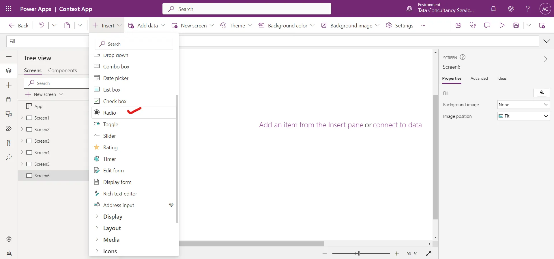
The control is added to the screen with default Items, we can change it according to our need.
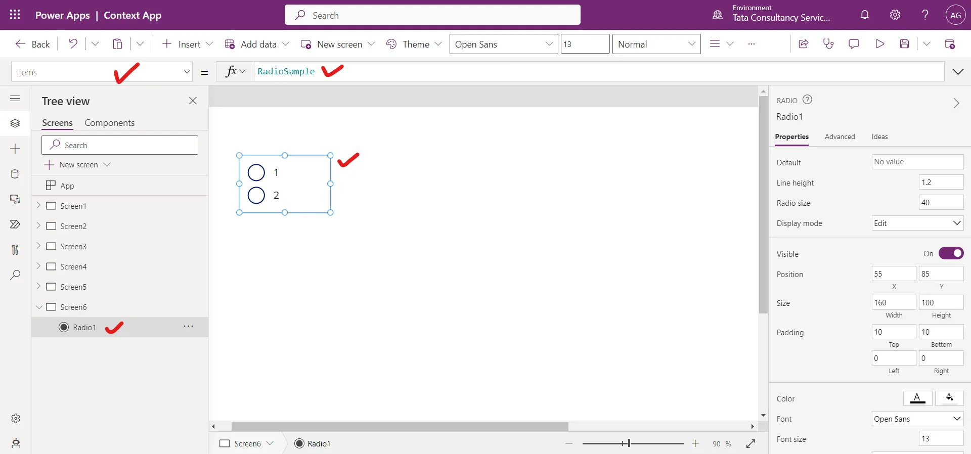
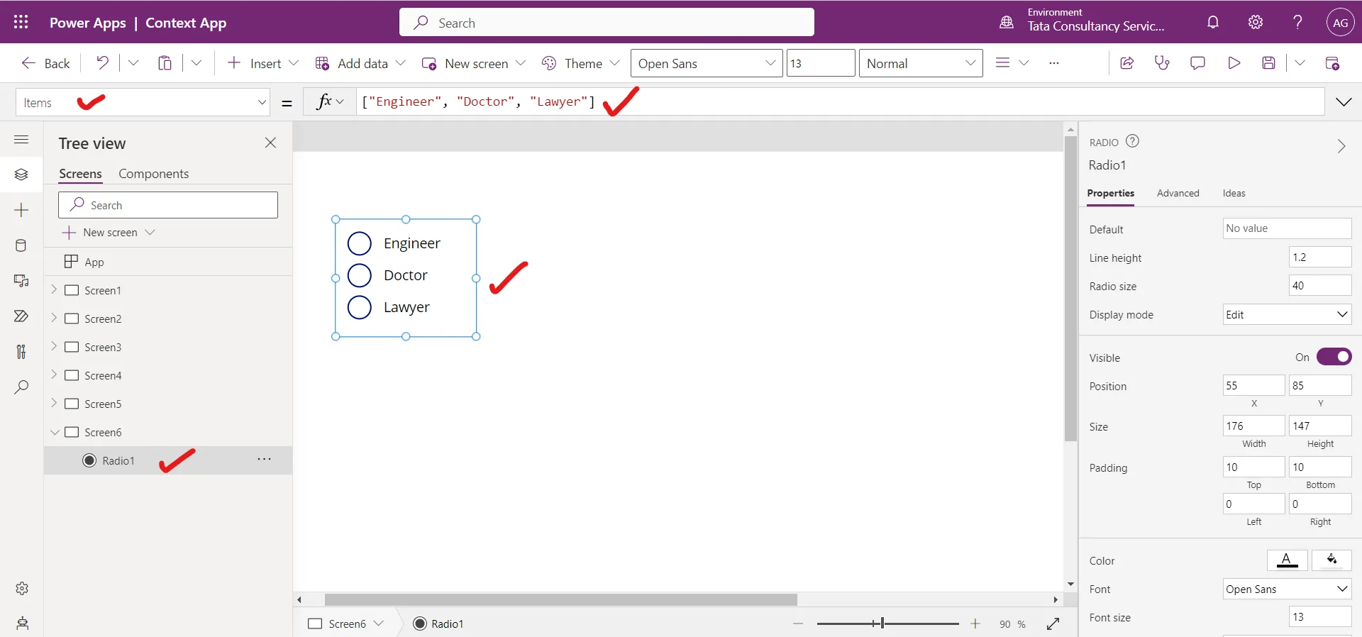
Step 2: The Items property specifies the source of data that appears in a Radio control. Set the Items property of the Radiocontrol to the following power apps formula.
Power Apps Formula
Step 3: Insert a Text Label control, and set the Text property to the following powerapps formula.
Power Apps Formula
Here, Radio1 is the name of the control. The Selected property represents the selected record item from that record we are extracting the Value column, to get the selected value from the radio control.
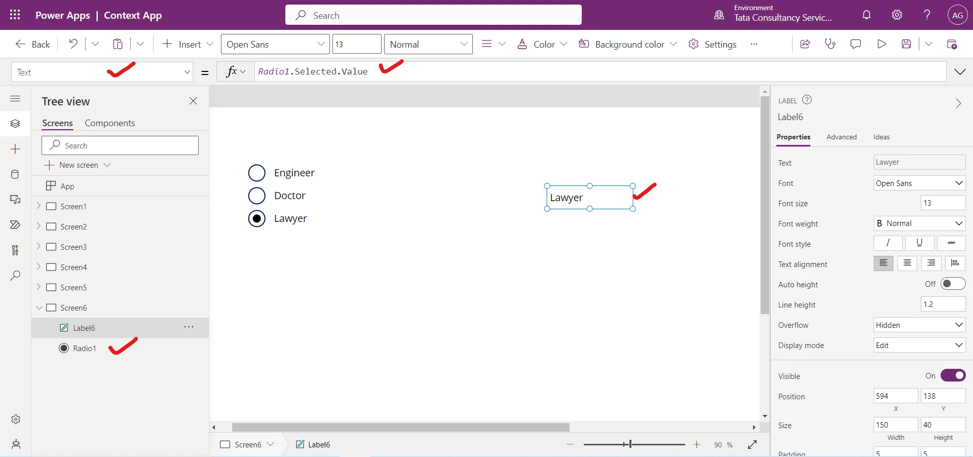
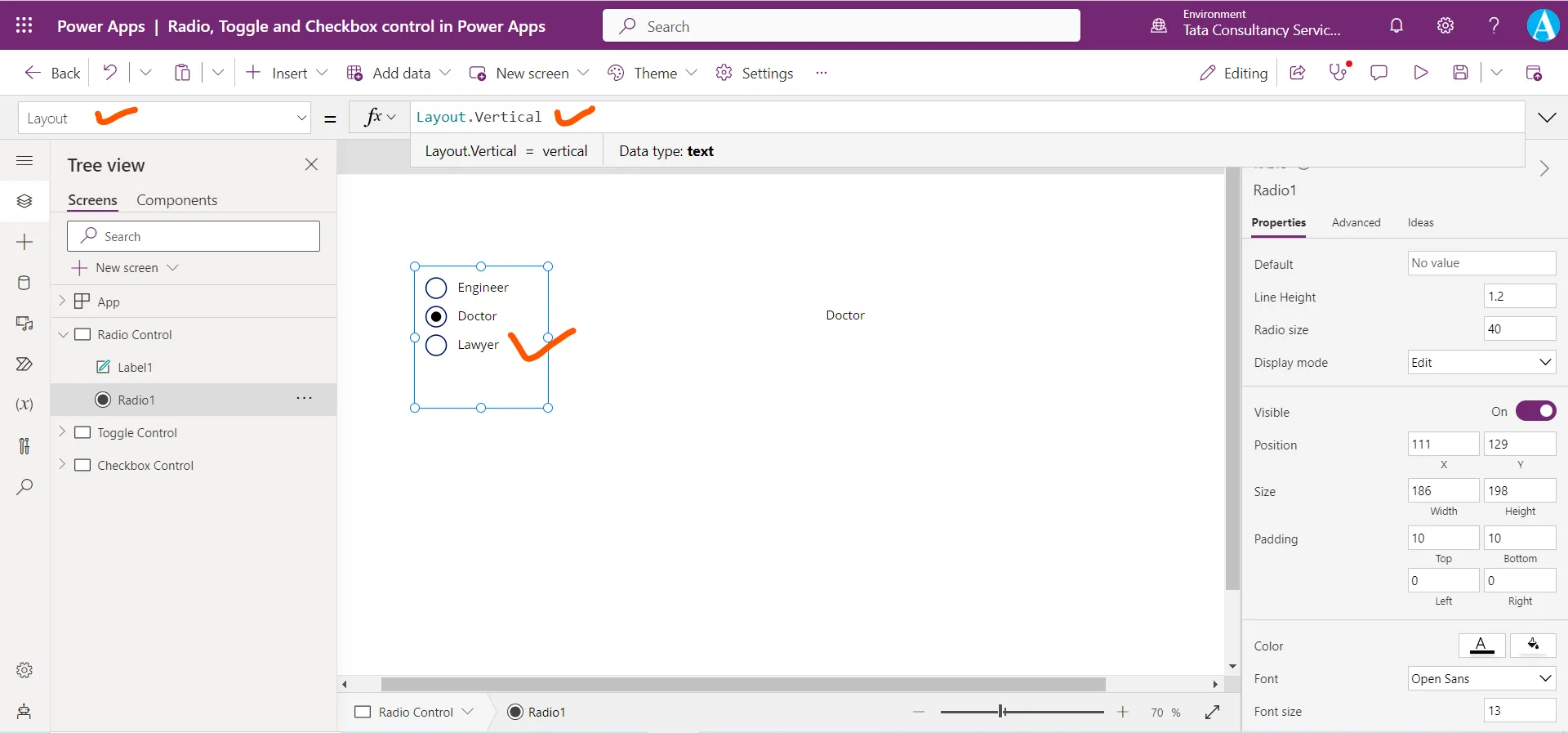
Step 4: The Layout property specifies whether the options of a radio control are laid out vertically or horizontally. The following power apps formula is used to laid the options vertically.
Power Apps Formula
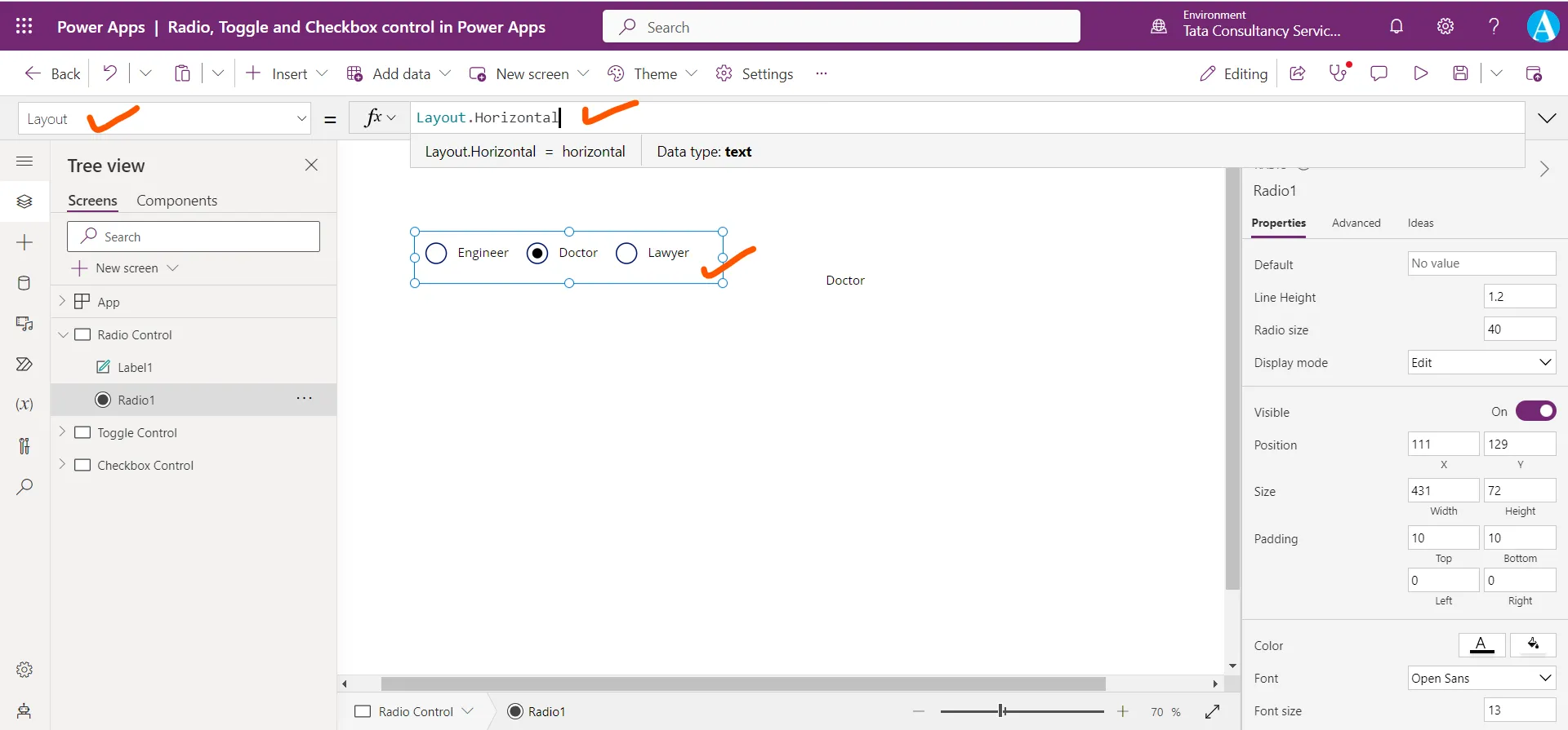
The following power apps formula is used to laid the options horizontally.
Power Apps Formula
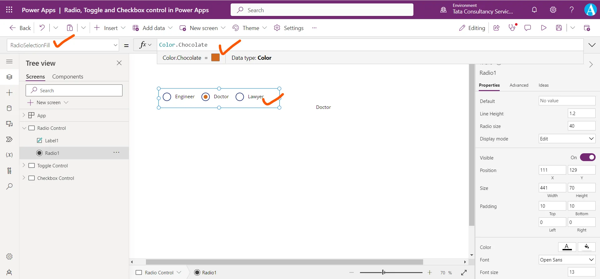
Step 5: The RadioSelectionFill property specifies the color that appears inside the circle of the selected option in a radio-button control.
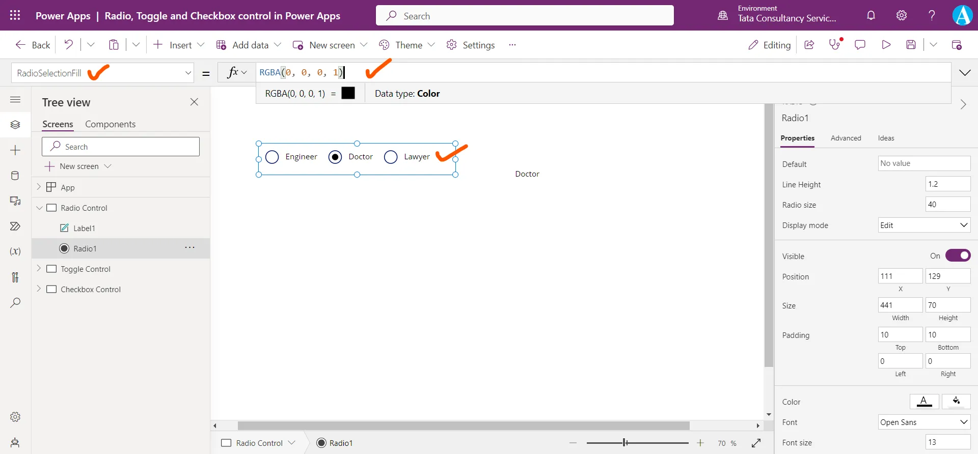
Suppose we give it value Color.Chocolate. The following image shows the difference.
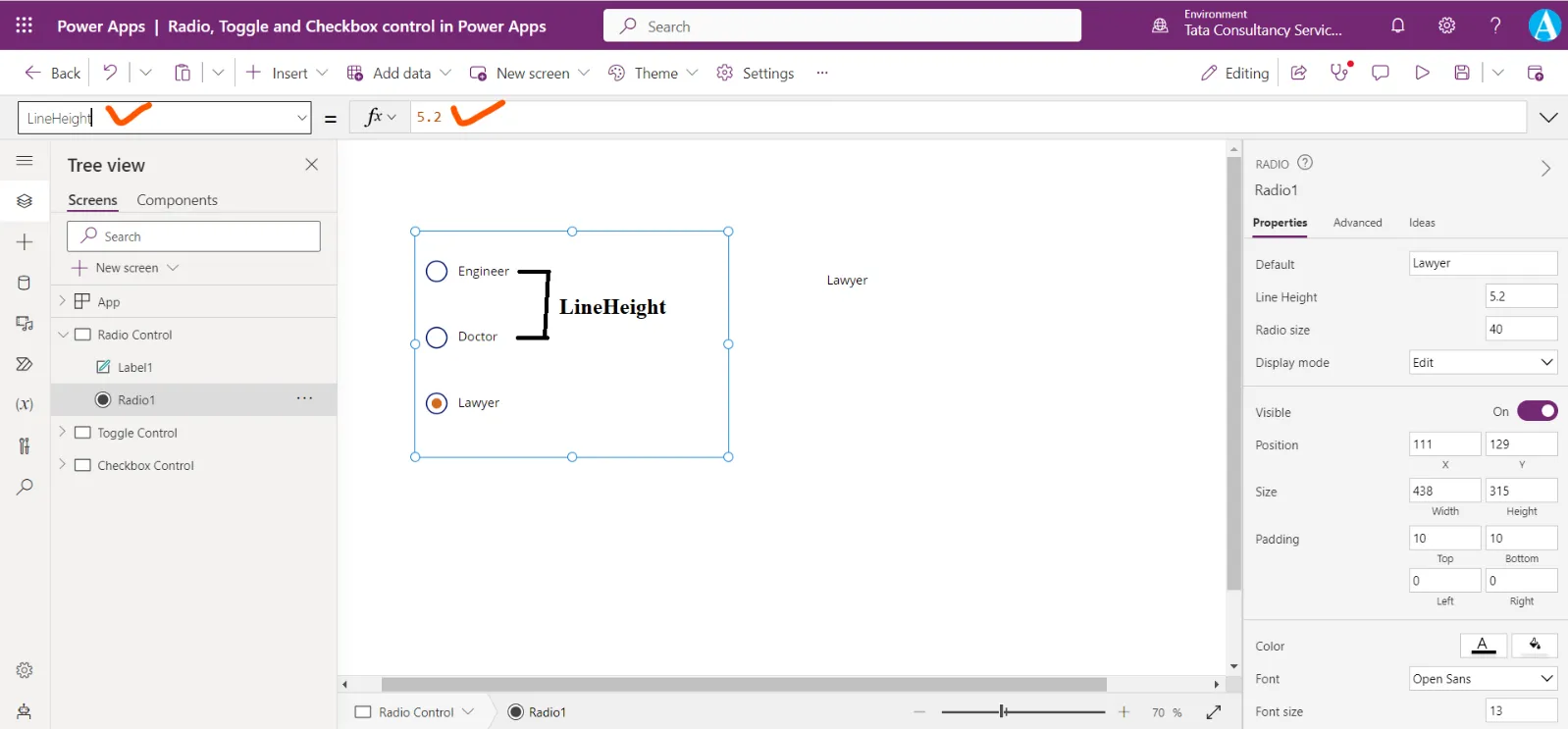
Step 6: The Default property specifies the value of a control before the user changes it. By default, no option is selected, and its value is “”. Suppose we change it to “Lawyer”.

Step 7: We can customize the radio button spacing in Power Apps by using the ‘LineHeight’ property.
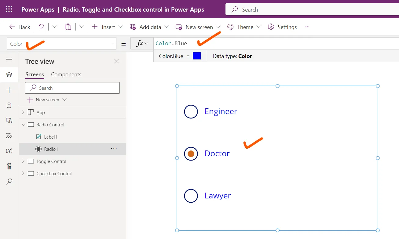
Step 8: The Color property specifies the color of a text in radio control.
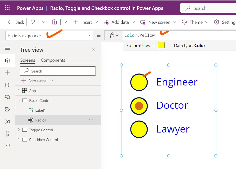
Step 9: The RadioBackgroundFill property specifies the background color of the circles in a radio-button control.
2. Checkbox control in Power Apps A control that the user can select or clear to set its value to true or false.
The Check box control has the following properties:
1. OnCheck The OnCheck property specifies the actions to perform when the value of a checkbox changes to true.
2. OnUncheck The OnUncheck property specifies the actions to perform when the value of a checkbox changes to false.
3. Tooltip The Tooltip is generally a common property for many controls. It specifies the explanatory text that appears when the user hovers over a control.
4. Visible The Visible property is generally a common property for many controls. The Visible property specifies whether a control appears or is hidden. It takes a boolean value, or a formula or variable that returns boolean value. Boolean value means true and false.
Example: Demonstrate the checkbox control and its various properties.
Step 1: Add a Check box control to the screen.
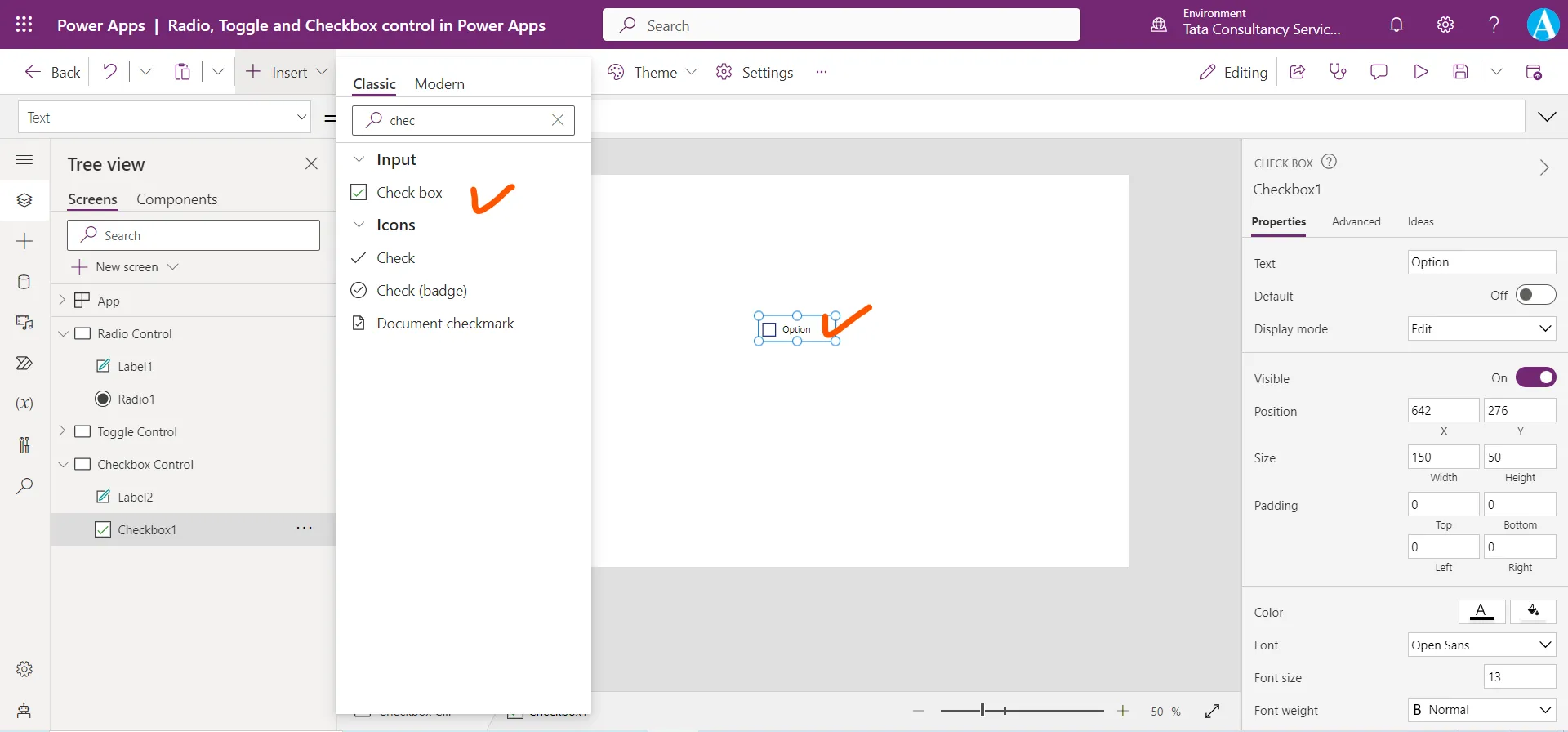
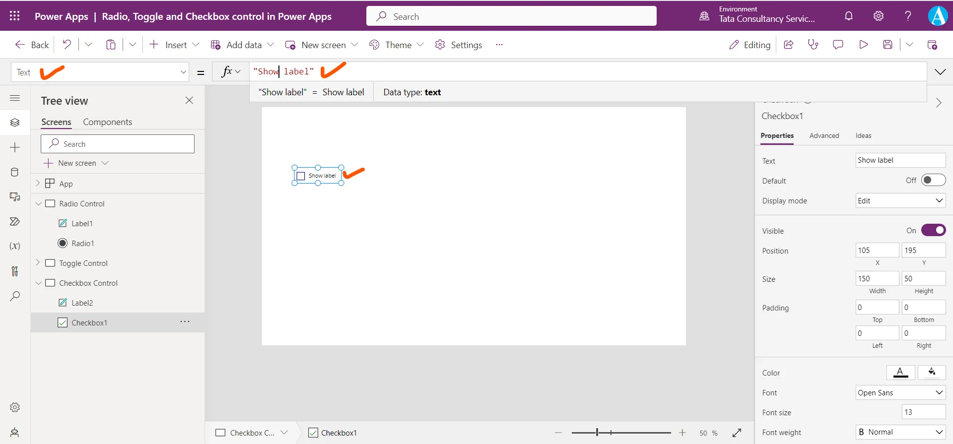
Step 2: Set its Text property to “Show label”. The Text property specifies the text that appears on a checkbox control. Its default value is “Option”.
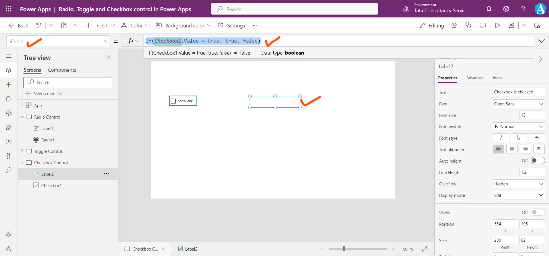
Step 3: Add a Text label control. On the Text label control, set its Visible property to the following powerapps formula.
Power Apps Formula
The Value property specifies the value of the checkbox control, it returns a boolean value. When it is checked it returns true, when it is unchecked, it returns false.
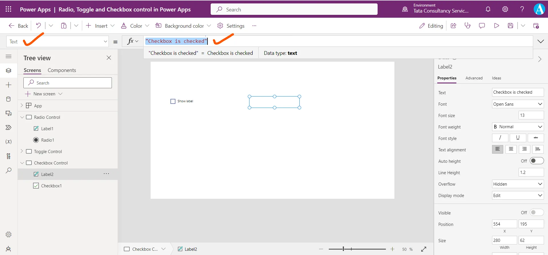
Step 4: Set the Text property of the label control to “Checkbox is checked”.
Step 5: Press F5, click or tap Checkbox to set its Value property to true, and then click or tap Checkbox again to set its Value property to false. The Timer control appears when the Value property of Checkbox is true but not when it is false.
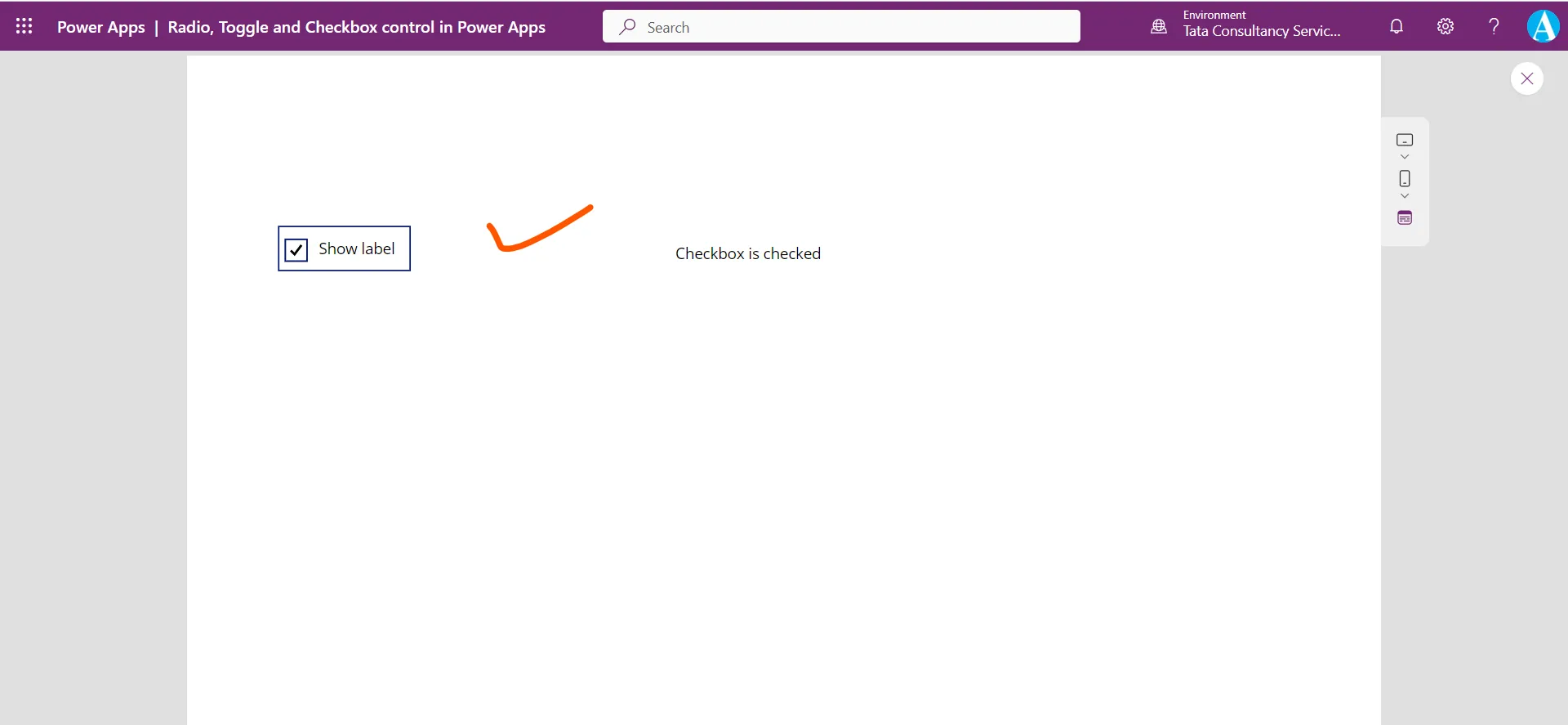
Press Esc or click on X to return to the default workspace.
Step 6: Select the checkbox and set its Color property to the following power apps formula.
Power Apps Formula
The Color property specifies the color of text in a control.
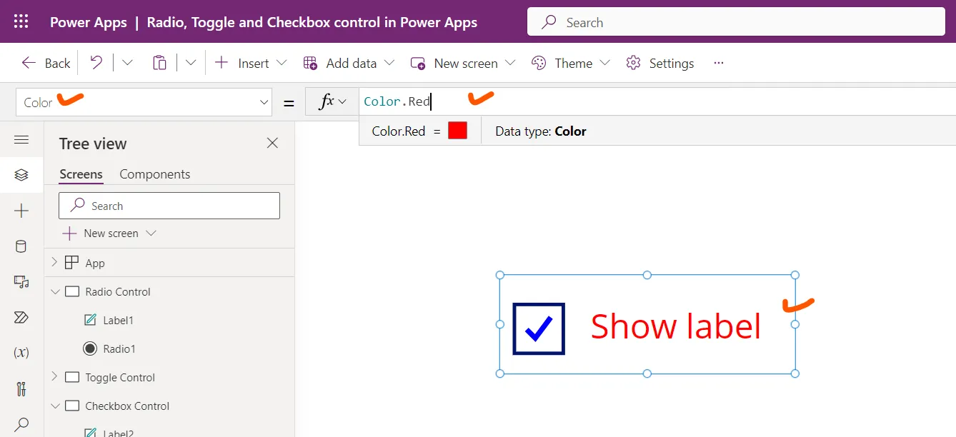
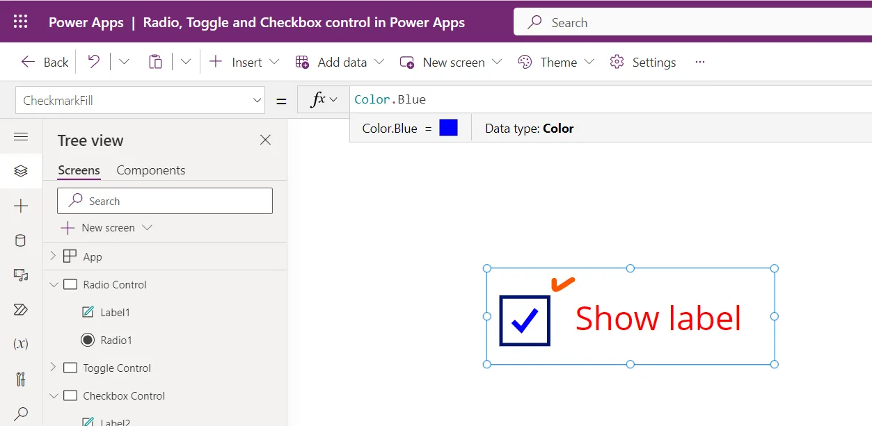
Step 7: Select the checkbox and select the CheckmarkFill and set its value to the following powerapps formula.
Power Apps Formula
The CheckmarkFill property specifies the color of the checkmark in a checkbox control.
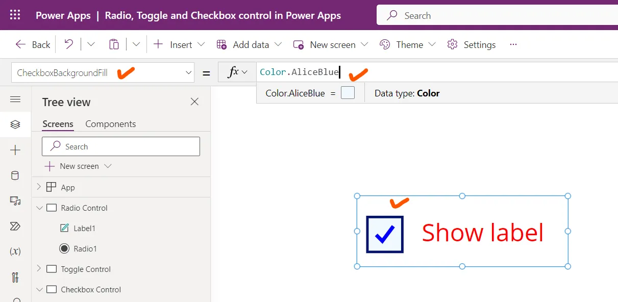
Step 8: The CheckboxBackgroundFill property specifies the background color of the box that surrounds the checkmark in a checkbox control.
Select the checkbox and set its CheckboxBackgroundFill property to the following powerapps formula.
Power Apps Formula
Step 9: The CheckboxBorderColor property specifies the color of the border that surrounds the checkmark in a checkbox control.
Select the checkbox and set its CheckboxBorderColor property to the following powerapps formula.
Power Apps Formula
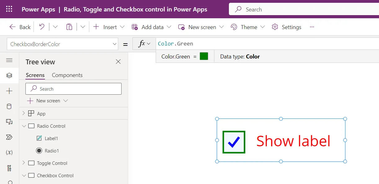
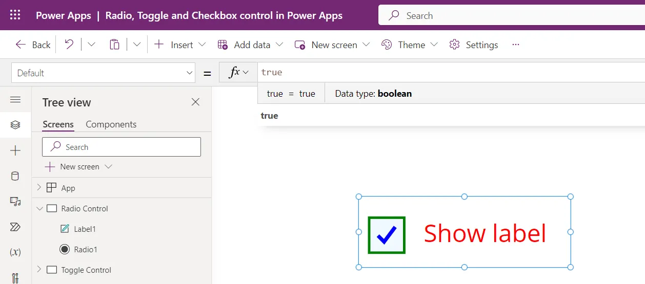
Step 10: The Default property specifies the initial value of a checkbox control before it is changed by the user. In case of Checkbox, it takes boolean value or any function or variable that returns boolean value, i.e., true, or false. By default, its value is false.
Select the checkbox and set its Default property to the following powerapps formula.
Power Apps Formula
It means whenever the power app starts the checkbox is initially checked.
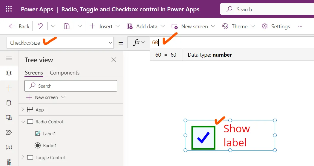
Step 11: The CheckboxSize property specifies the width and height of the box that surrounds the checkmark in a checkbox control.
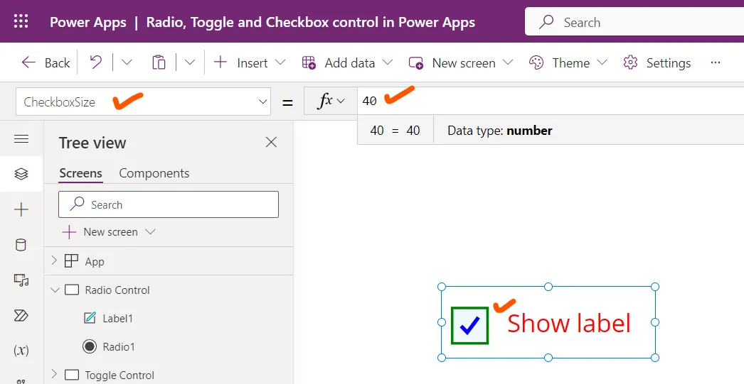
Set the CheckboxSize to 60. We can see that the checkbox size is increased.
3. Toggle control in Power Apps
A toggle control let the users move the handle to turn on and off the control. It behaves the same way as a check box control.
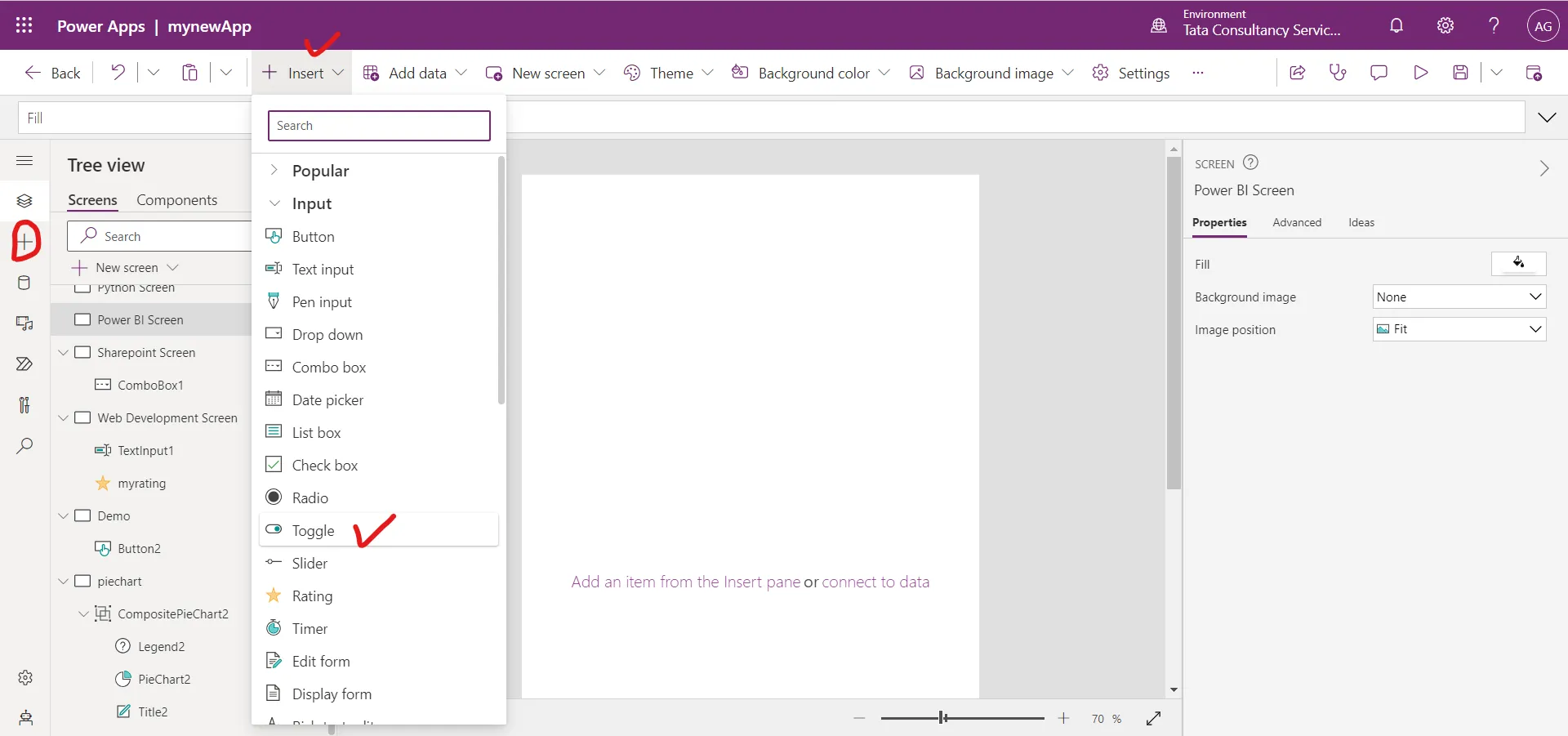
Example: The demonstration of the Toggle control and its properties in Power Apps. Step 1: Add a Toggle control, and name it myToggle or any other name, it is our choice.
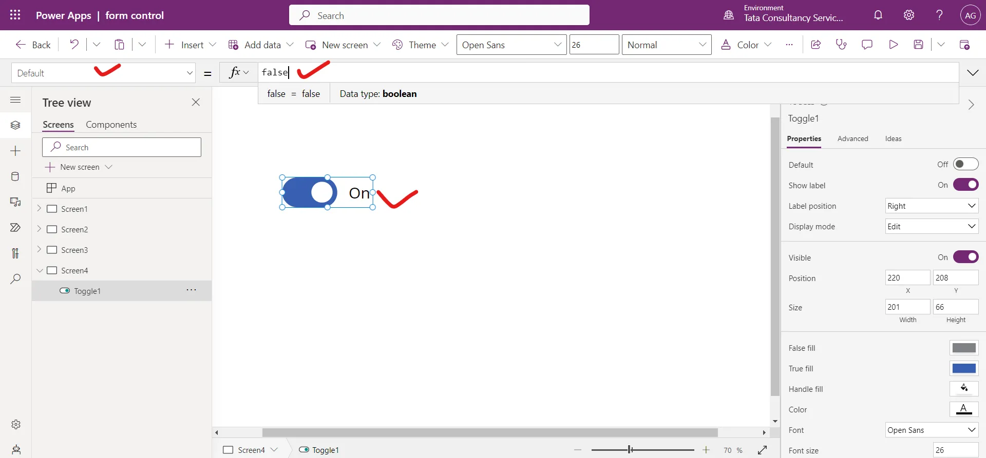
Step 2: The Default property of a control specifies the initial value of a control before it is changed by the user.
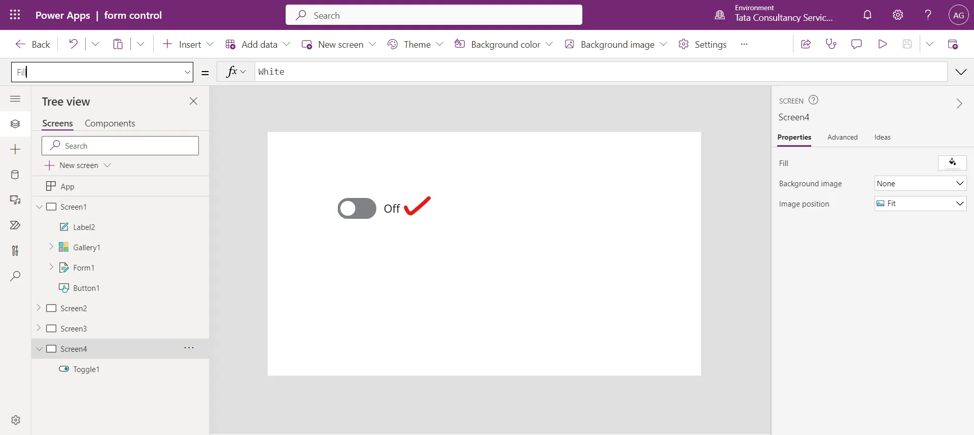
As the Default value is false, if we save the app in this condition with the toggle is in On position, even then when we open the app again, the toggle control is in Off mode.
When we open the app again, the toggle control is in Off condition.
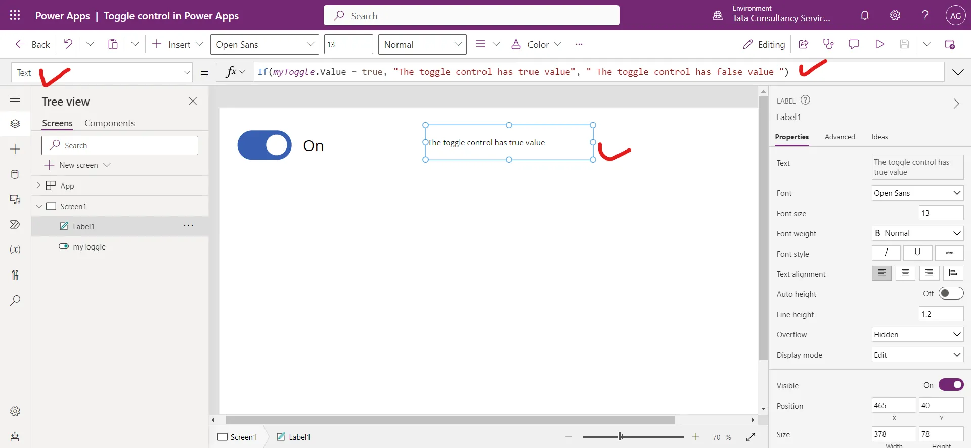
Step 3: Add a label, and set its Text property to the following powerapps formula:
Power Apps Formula
The Value property specifies the value of an input control.
Step 4: Preview the app, and change the value of toggle control. The Text label control shows a different text, depending on whether toggle control is On or Off state.
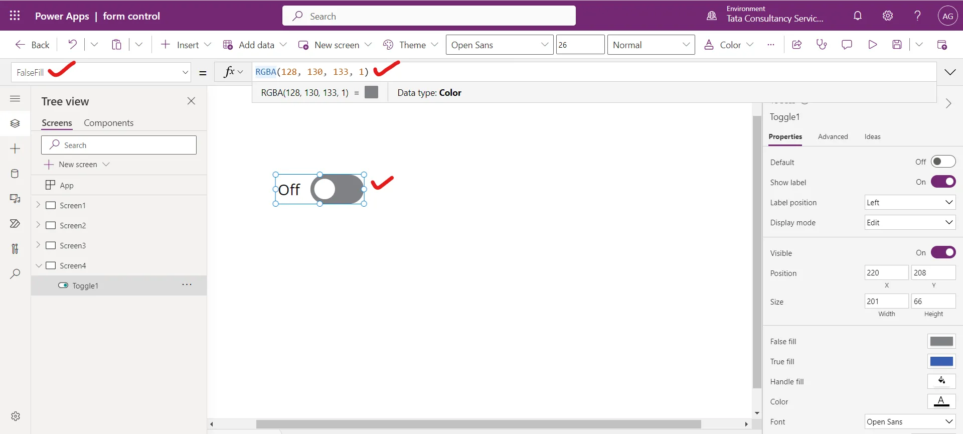
Step 5: The FalseFill property of a control specifies the toggle fill color when the toggle is in off state.
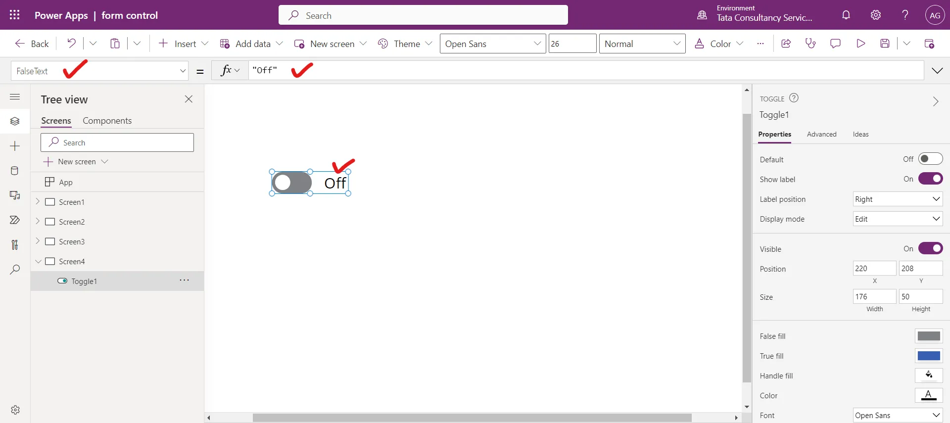
Step 6: The FalseText property specifies the text shown when the toggle is off. By default, it is “Off”. We can also change this according to our need.
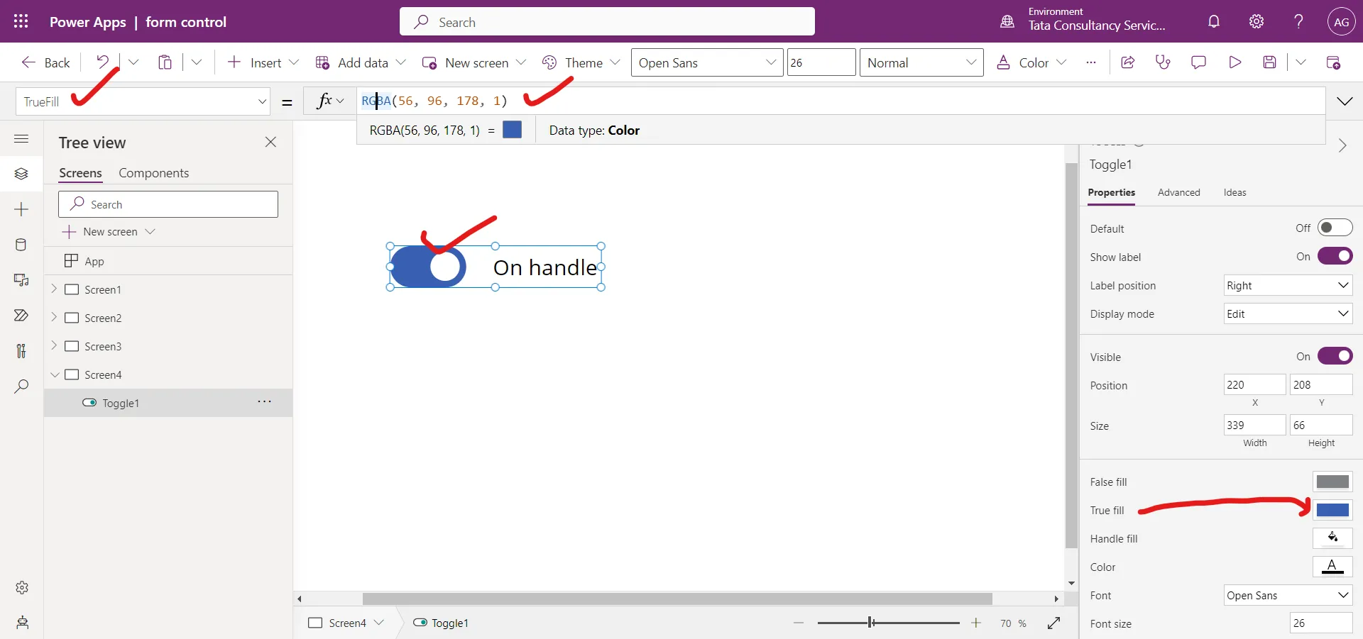
Step 7: The TrueFill property specifies the toggle fill color when the toggle is in the on state.
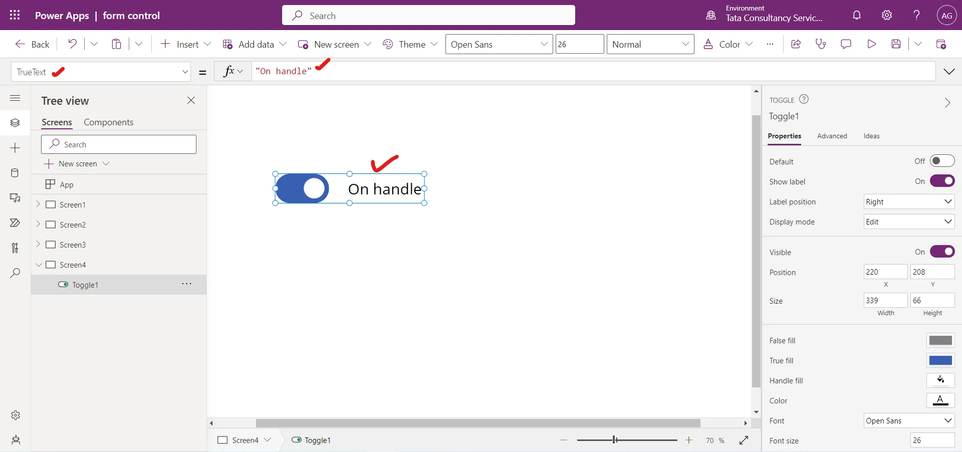
Step 8: The TrueText property specifies the text shown when the toggle is on. By default, it is “On”.
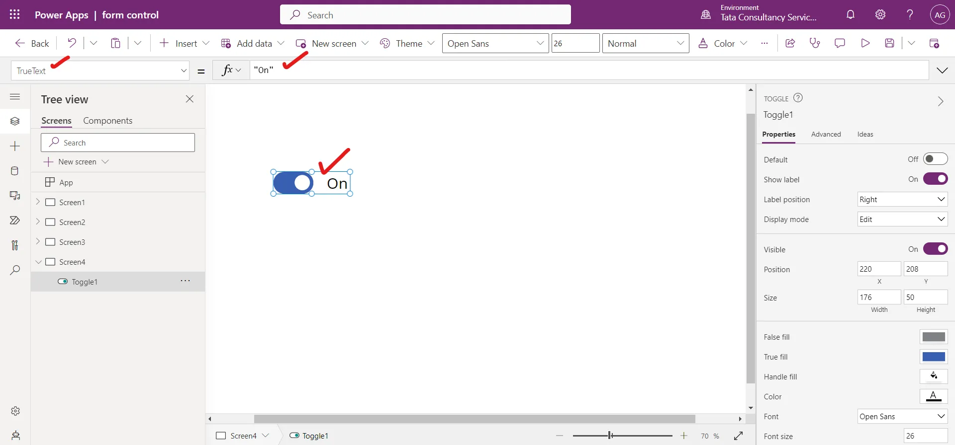
We can also change this text, according to the need. Like in the following image we changed it to “On handle”.
Step 9: The OnCheck property of the toggle control specifies the actions to perform when the value of a toggle changes to true.
Step 10: The OnUncheck property of the toggle control specify the actions to perform when the value of a toggle change to false.
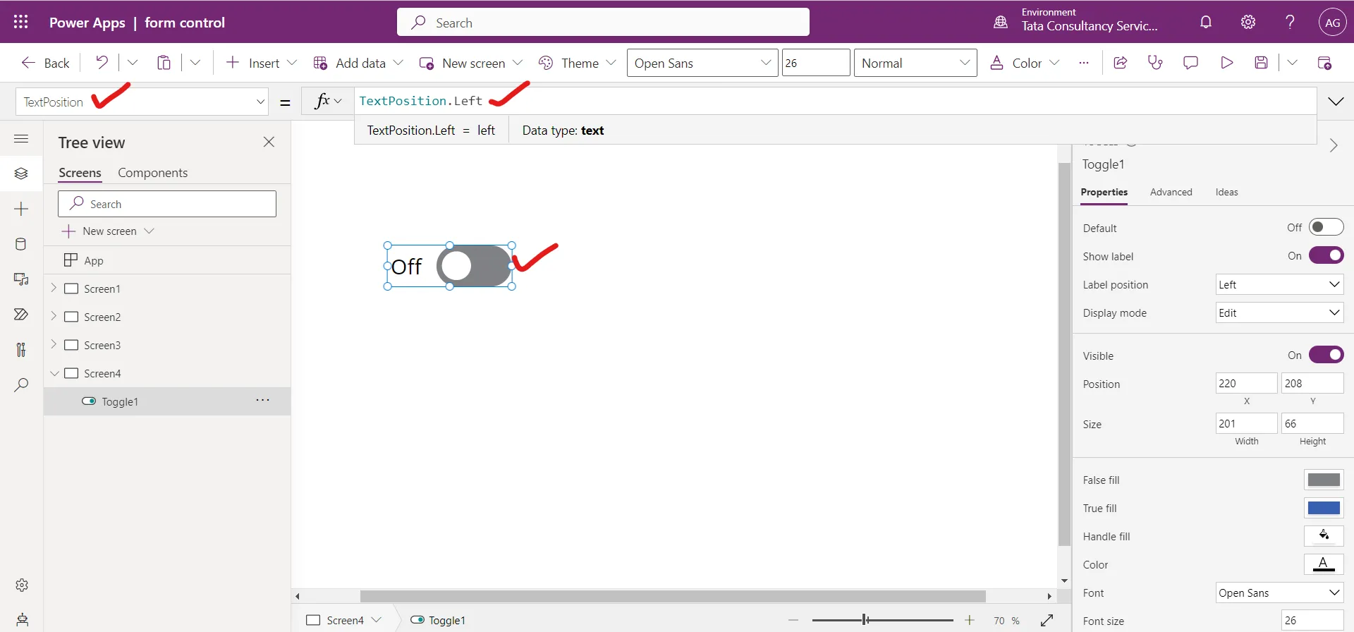
Step 11: The TextPosition property specifies whether the label is to the left or the right of the toggle control.
a) Right side The label is on the right side with the Right value.
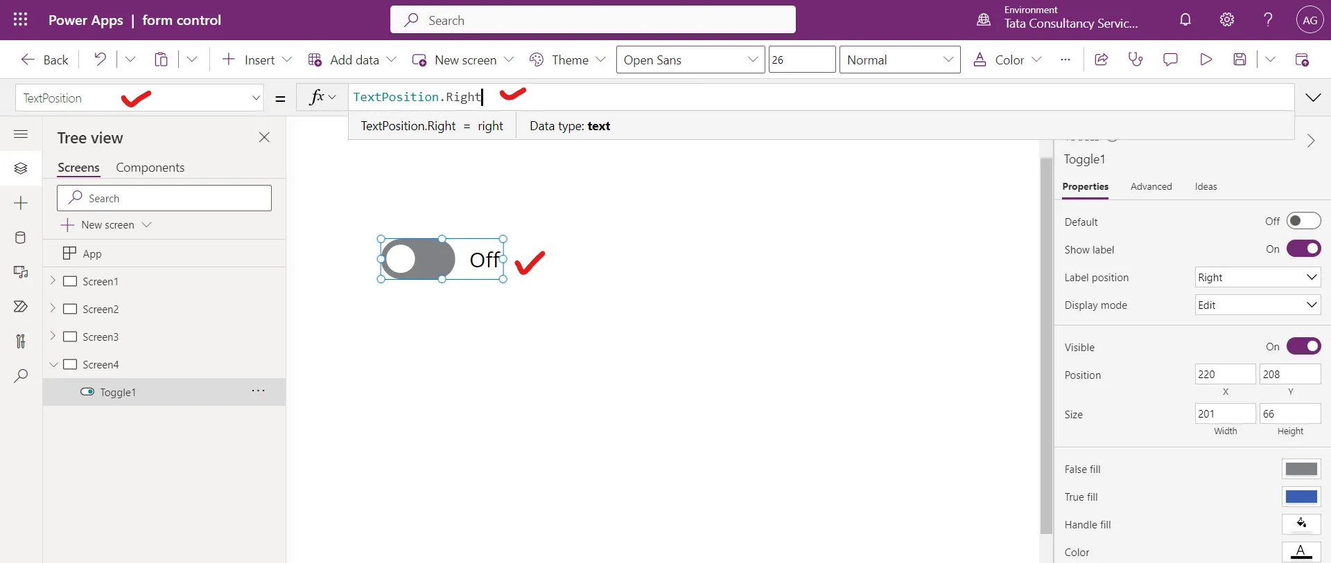
b) Left side The label is on the left side with the Left value.
