Gallery Control in Powerapps
A Gallery control can show multiple records from a data source or a collection, and each record can contain multiple types of data. The Gallery control will repeat same template layout for each row in the table.
We can choose Vertical, Horizontal, and Flexible height Gallery options that contain preconfigured controls. The Blank options provide the same orientations/behaviors, just without preconfigured controls.
If we select the Layout dropdown in the Properties for our gallery, we can select from several types of List views or Gallery views of our data. Notice that we can either search or scroll through the options to find the one that we want. Each view sets a default layout of our data and the available controls. But we can still manually modify the gallery template to add controls and build a design to meet our requirements.
The following are the properties of the Gallery control:
1. Default
The Default property of the gallery control specifies the record from the data source to be selected in the gallery when the app starts up.
By default, the first item in the gallery control is selected by the gallery control. We can make the default selection with no record, by writing the following powerapps formula on the Defaults property of the Gallery control.
Power Apps Formula
2. Items
The Items property specifies the Data source that appears in the Gallery control.
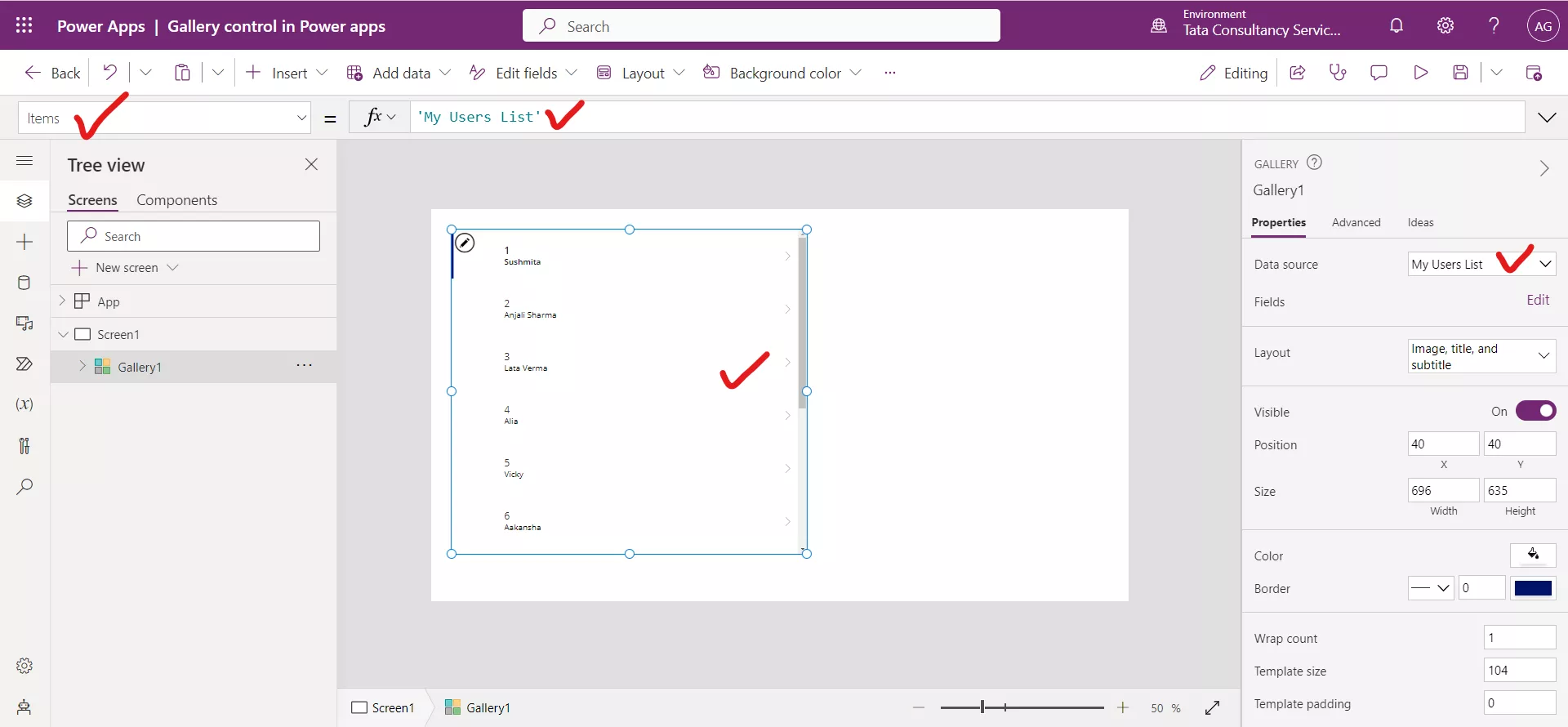
We can use the Filter, Search, and Sort functions in the Items property can manipulate what data the gallery shows.
We can also change the data source of the gallery control by selecting the Data source in the Properties pane for our gallery.
3. Selected The Selected property of the gallery control specifies the current selected item in the gallery control.
4. Visible
The Visible property of the Gallery control specifies whether a control appears or is hidden. The visible property of the controls in the gallery can also be controlled conditionally.
5. X
The X property specifies the distance between the left edge of a control and the left edge of its parent container or screen.
6. Y
The Y property specifies the distance between the top edge of a control and the top edge of the parent container or screen.
7. Fill
The Fill property of the Gallery control specifies the background color of the gallery control.
8. TemplateFill
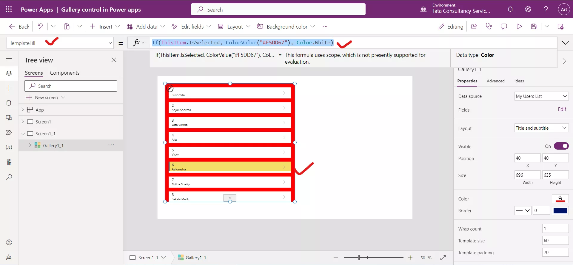
The TemplateFill property specifies the background color of an item in the Gallery control.
By default, the first item in the gallery control is selected by the gallery control. To identify the selected record from the Power Apps gallery, we can use the following powerapps formula to the gallery’s TemplateFill property.
Power Apps Formula
9. TemplatePadding
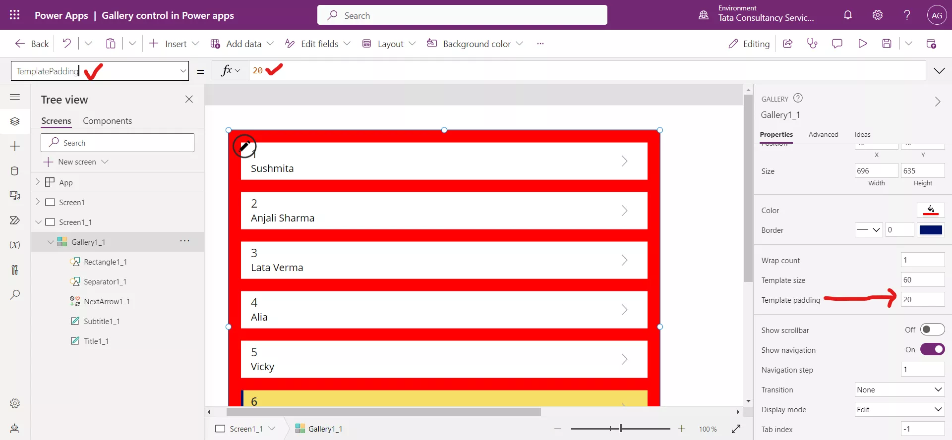
The TemplatePadding property specifies the distance between items in a gallery also it specifies the distance to the gallery container itself.
10. TemplateSize
The height of the gallery item in vertical/portrait orientation. Or the width of the gallery item for a gallery in horizontal/landscape orientation.
11. ShowNavigation
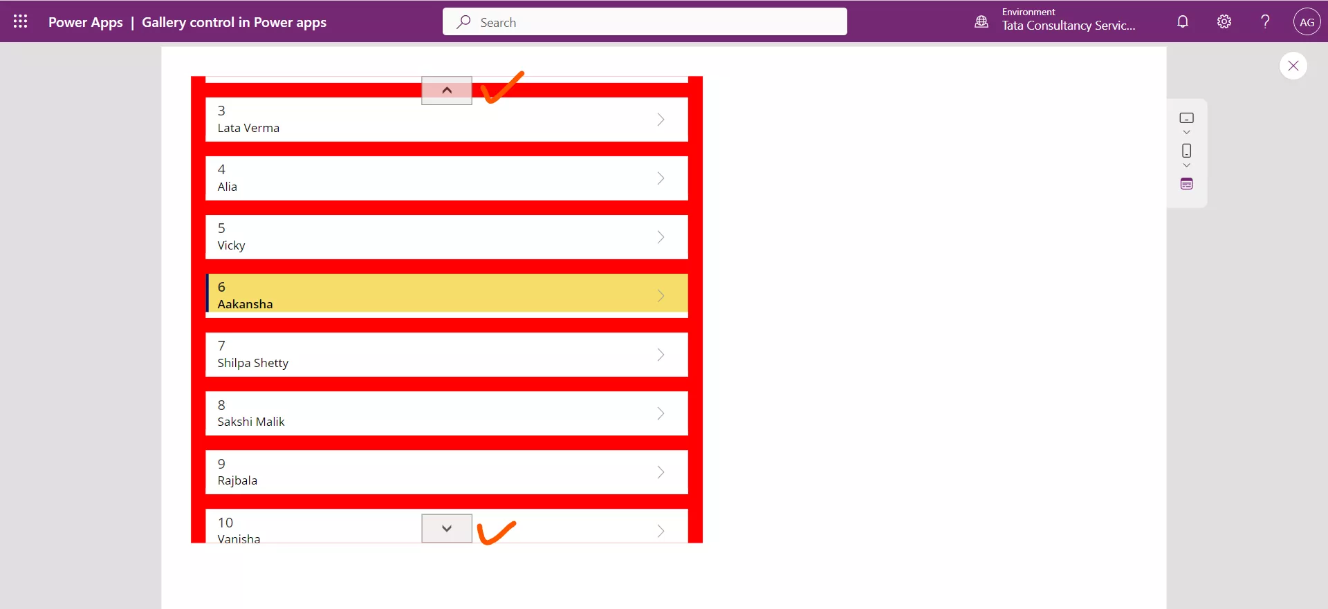
The ShowNavigation property of a gallery control specifies whether an arrow appears at each end of a gallery so that a user can scroll through the items in the gallery by selecting an arrow.
Note: Without selecting the arrow we can also scroll down to see the item in the gallery.
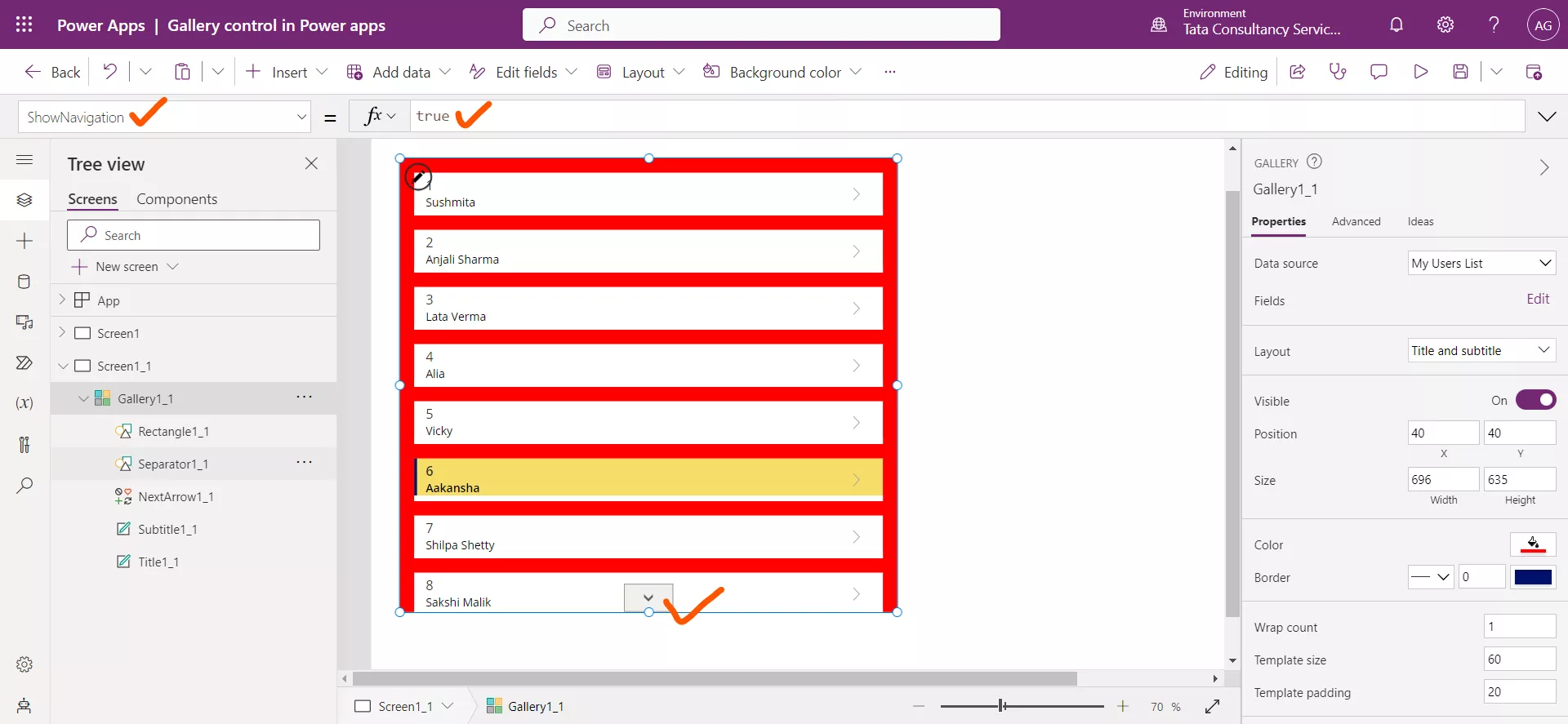
When we go down the arrow is shown at the both ends.
12. NavigationStep
The NavigationStep of the gallery control specifies how far a gallery scrolls if its ShowNavigation property is set to true and the user selects a navigation arrow at either end of that gallery.
13. ShowScrollbar
The ShowScrollbar property specifies whether a scrollbar appears or not in the gallery. This property accepts a boolean value, i.e., true, or false.
14. AllItems
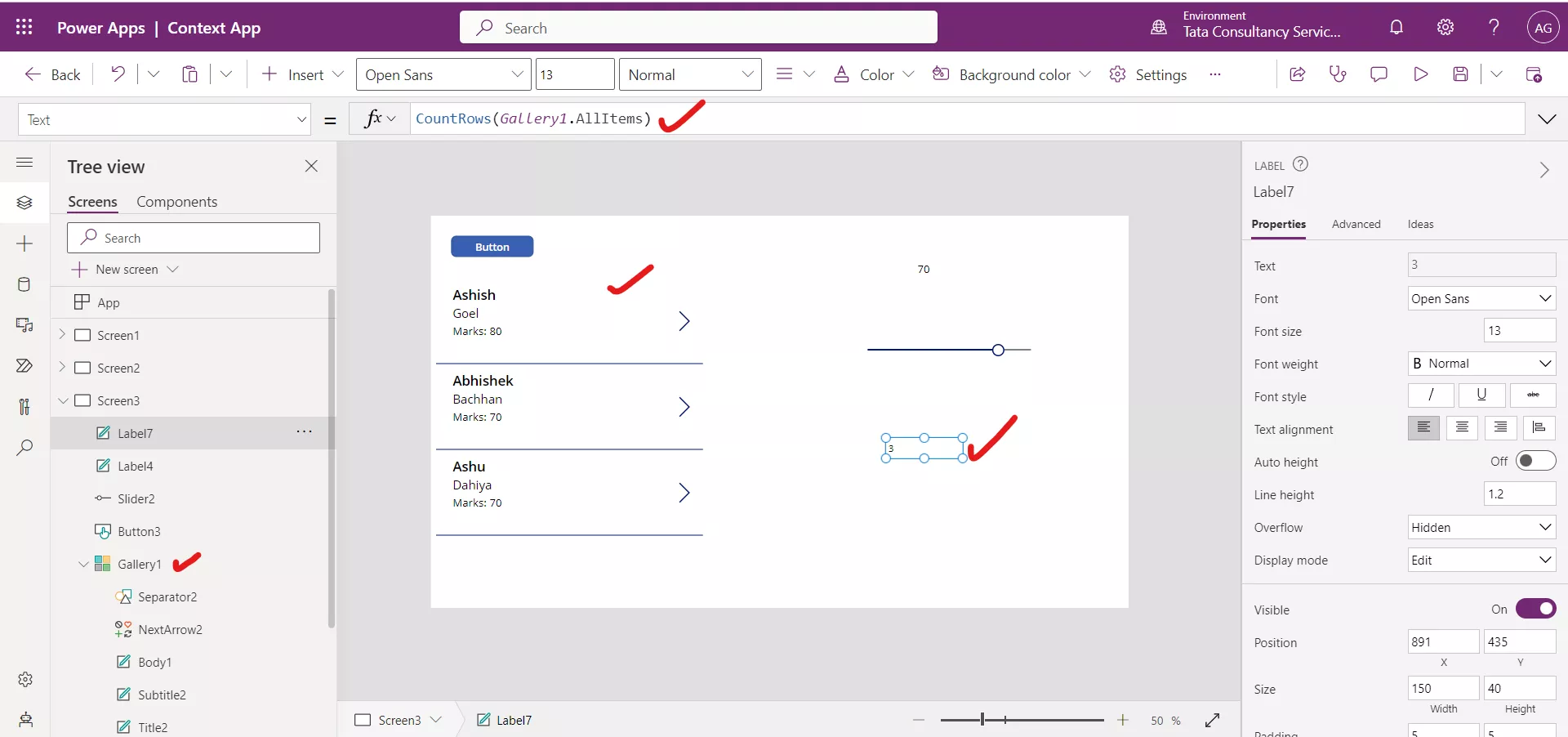
Items that are loaded in the gallery. This may be less than the actual number of Items of the data source. More items may be loaded when the gallery is scrolled. AllItems also contains controls that are used in each gallery item.
Power Apps Formula
15. WrapCount
The WrapCount property species the number of items shown per row or column based on horizontal or vertical layout.
16. Transition The Transition property specifies the visual effect (Pop, Push, or None) when the user hovers over an item in a gallery.
17. Selectable The Selectable property specifies whether the gallery items can be selected or not. This property accepts a boolean i.e, true or false. When set to true the item can be selected and when set to false, selecting an item does not select it.
We can Reset the Gallery control by using the following powerapps formula.
Power Apps Formula
Where, Gallery1 is the name of the Gallery control.