Button control in Power Apps
A control that the user can click or tap to interact with the app. Configure the OnSelect property of a button control to run one or more formulas when the user clicks or taps the control. The button control is frequently used to submit data to the data source.
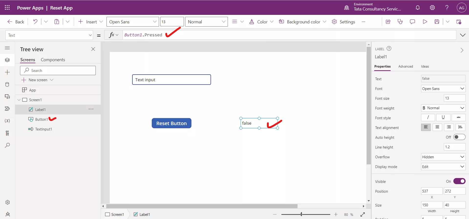
There are the following properties of a button control: 1. OnSelect The OnSelect property specifies the actions to perform when the user taps or clicks a control. 2. Text The Text property specifies the text that appears on a control or that the user types into a control. 3. Pressed The Pressed property specifies the value True while a control is being pressed, false otherwise. 4. PressedFill The PressedFill property specifies the background color of a control when the user taps or clicks that control. Example:Step 1: Select the Insert at the top and click on Button control.
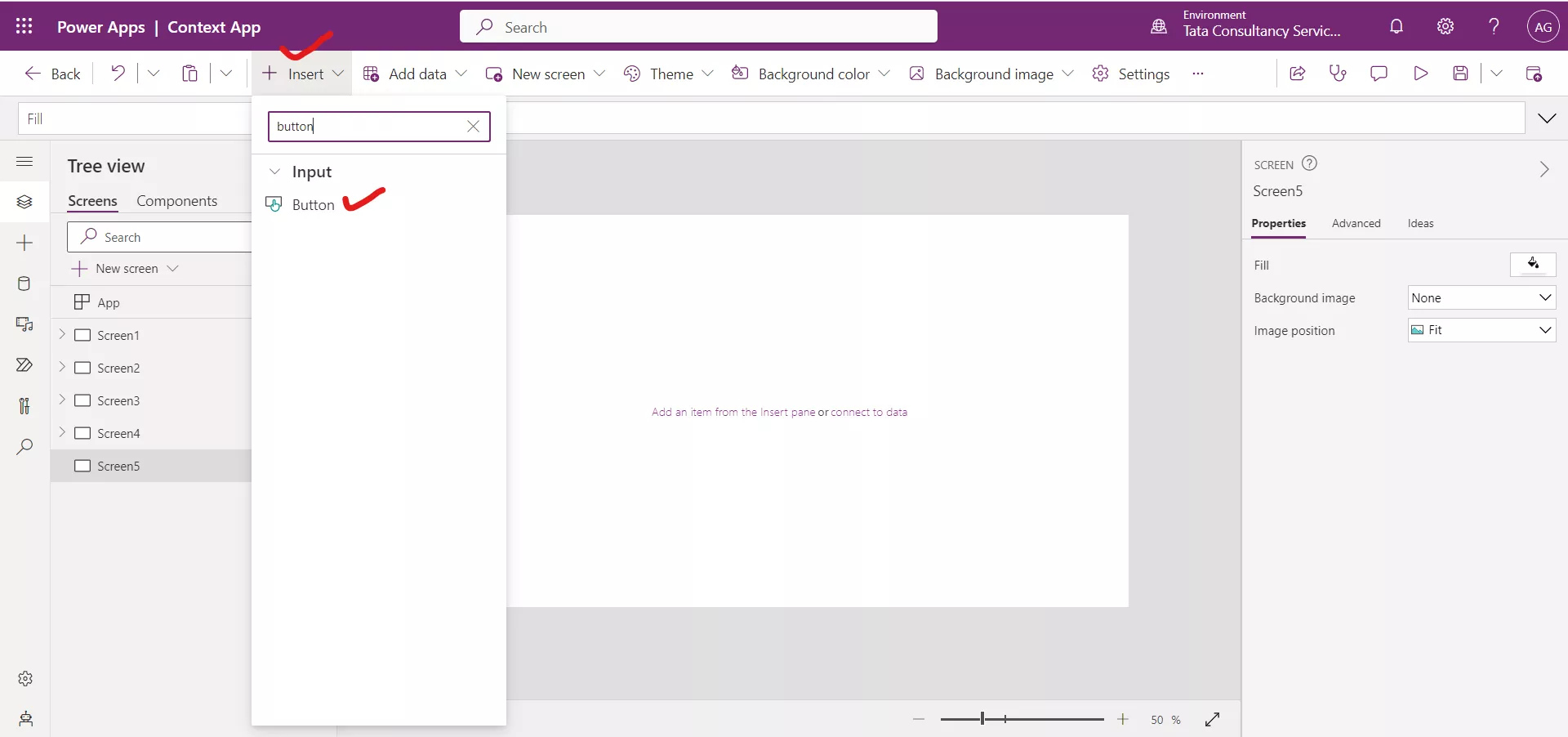
Step 2: Select the buttons and then select Advanced on the Properties pane.
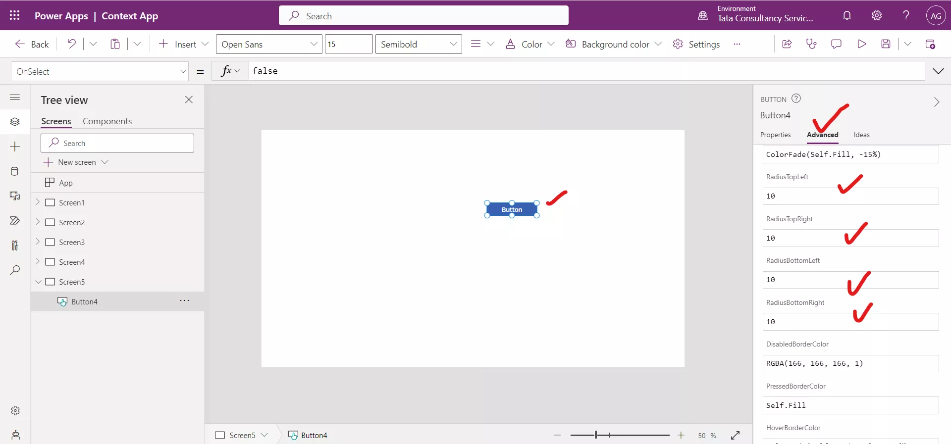
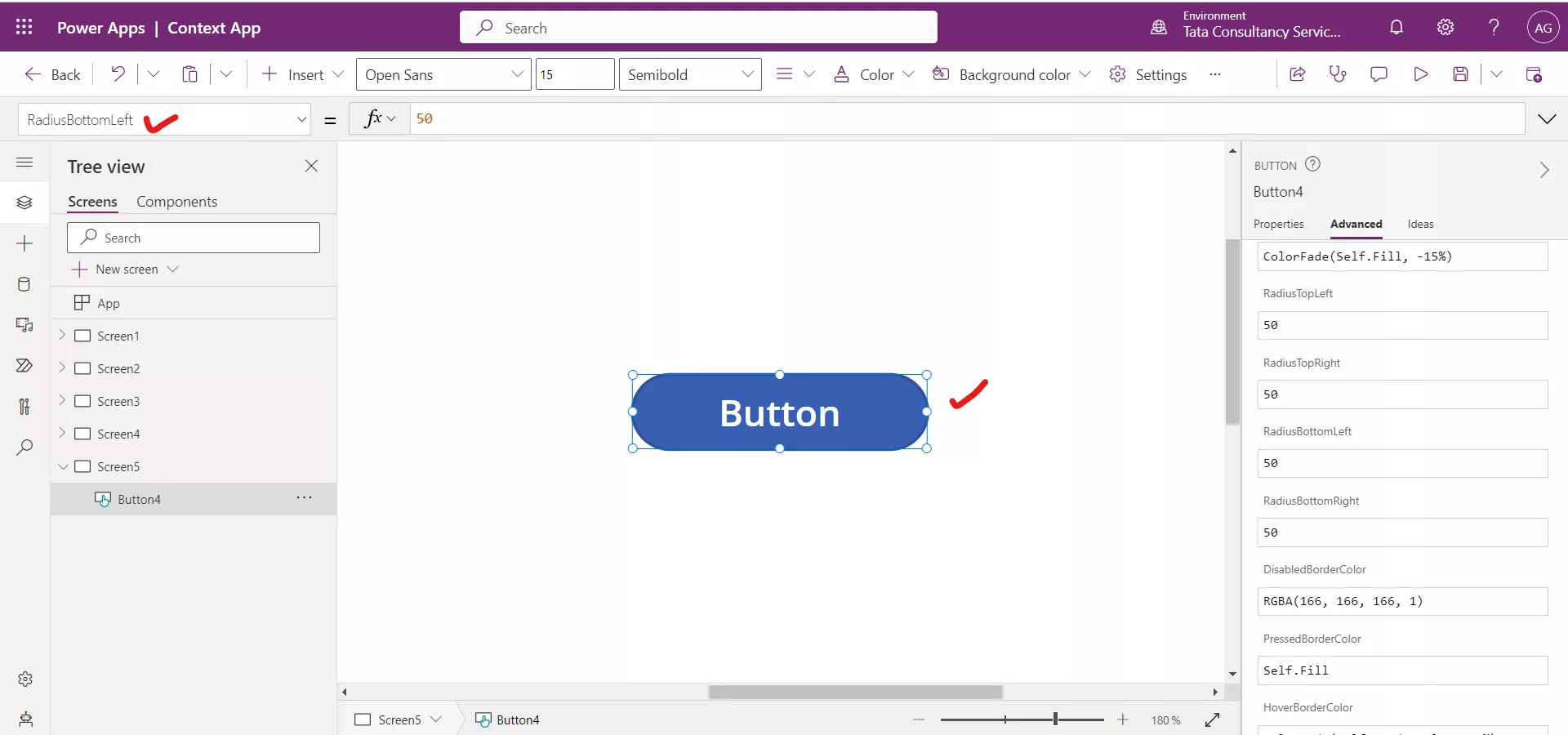
Step 3: Scroll down until we find the four radius properties: RadiusTopLeft, RadiusTopRight, RadiusBottomLeft, and RadiusBottomRight. Replace the 10 with 50. Radius is the amount of curvature for every corner. Our button should appear more rounded now.
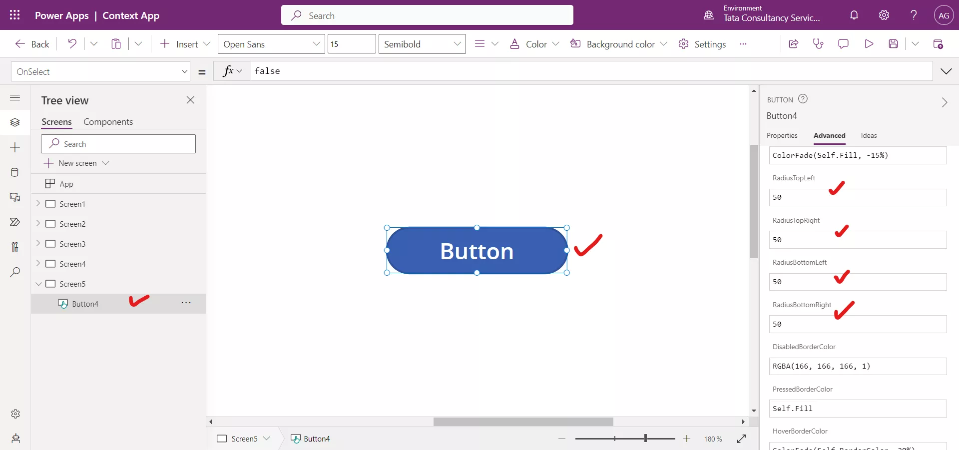
Step 4: We can do these changes by clicking on the properties dropdown and then select the respective property.
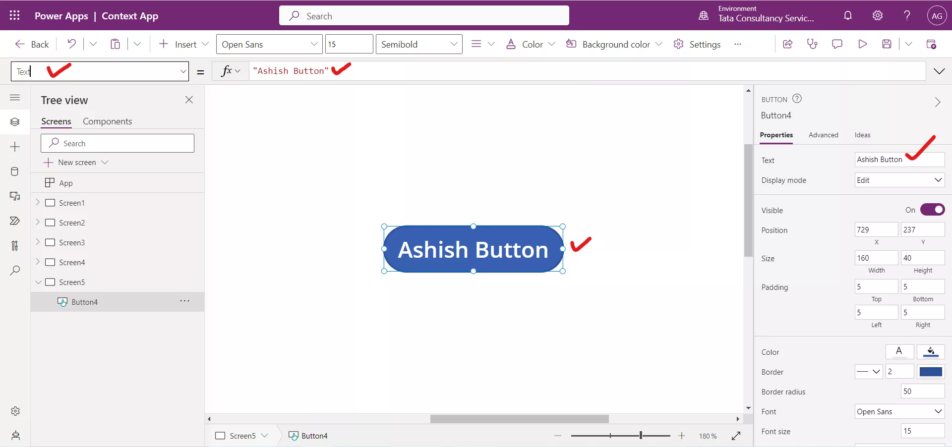
Step 5: Select the Button control and then change the Text property on the Properties pane to Ashish Button.
Step 6: Add a Text label control. Set the Text property of the label control to the following formula.
Power Apps Syntax ButtonControlName.Pressed
Power Apps Formula Button1.Pressed
Here, Button1 is the name of the button control. While the button is pressed the formula returns true otherwise false.
